You are using an out of date browser. It may not display this or other websites correctly.
You should upgrade or use an alternative browser.
You should upgrade or use an alternative browser.
Mandarin Oriental | 776 Boylston St | Back Bay
- Thread starter LeTaureau
- Start date
atlantaden
Senior Member
- Joined
- May 31, 2006
- Messages
- 2,606
- Reaction score
- 2,752
Re: Mandarin Oriental
Thanks, Van, for the really nice slideshow of the Back Bay and also of Mission Hill. You really got around! I have to say that the Mandarin Oriental and Battery Wharf are two of my favorite new developments. Battery Wharf in particular is just about perfect for that location. Both are class acts, look great, and will age even better!
Thanks, Van, for the really nice slideshow of the Back Bay and also of Mission Hill. You really got around! I have to say that the Mandarin Oriental and Battery Wharf are two of my favorite new developments. Battery Wharf in particular is just about perfect for that location. Both are class acts, look great, and will age even better!
Re: Mandarin Oriental
great eye. hadn't thought i'd like any two pictures of the pru apts as well as i like those two. damn shame about the box beside the new england, though -- especially after looking at the what was in the same spot when the new england was being built (different thread).
great eye. hadn't thought i'd like any two pictures of the pru apts as well as i like those two. damn shame about the box beside the new england, though -- especially after looking at the what was in the same spot when the new england was being built (different thread).
Re: Mandarin Oriental
I love the Boylston St. facade. The architect decided to avoid using one of the same three or four types of overdone styles and prefab materials that seem to crop up in every new Boston building. They used their imagination on this one, and it shows.
Being the Back Bay, they had to play it safe to some extent, but they didn't fall into the trap of having it resemble some Kendall Square / South Boston Waterfront cookie-cutter crap. It's not terribly exciting, but it doesn't look like a cheap knock-off of an older style structure. Rather, a respectful modernization.
And best of all...no plasticky paneling to be seen. (well, there is an existing pedestrian bridge connected to structure that features it, but the cheap-looking nastiness ends at the property line)
JimboJones
Active Member
- Joined
- Apr 4, 2007
- Messages
- 935
- Reaction score
- 1
Re: Mandarin Oriental
This is prettier.
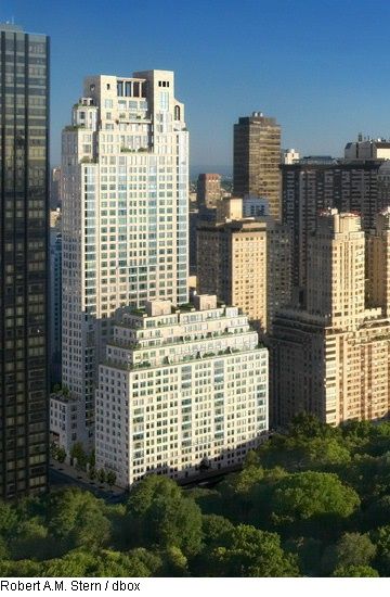
This is prettier.

Re: Mandarin Oriental
True, but many of the apartments in it (15 Central Park West) also cost upwards of $40M. To build that sort of building, you'd need a market for apartments that expensive in Boston.
Also, do you have any idea how many dozen* of influence-peddling NIMBYs would scream about the "Manhattization of Boston"? It'd never get approved.
* The "s" was left out intentionally. There are probably about 12 people in the city who oppose tooth and nail any development, regardless of its quality, that is over 20 stories. Everyone else would love to see a 15CPW built on, say, the Greenway, the Fens or on the filthy stinking carcass of Tremont on the Common (151 Tremont).
Re: Mandarin Oriental
I pass by it regularly, and can say it's pretty close to the renderings.
I hope it's better in person. It seems underwhelming to me in these pictures. Worse, it doesn't really compare well to the renderings, as if changes were made. Disappointing.
I pass by it regularly, and can say it's pretty close to the renderings.
Re: Mandarin Oriental
It feels very generic New York City at street level, and has been since the beginning. Boston's poor reputation precedes it, and the Mandarin group would never have proposed something so vanilla-boring in any of their other prospective markets.
I'm not offended by it--it's a huge improvement over the prior vast concrete and asphalt wasteland--but it's no showpiece to look at daily.
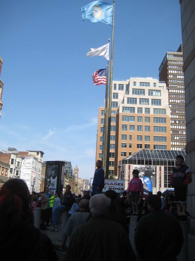
The one positive thing about Marathon Monday is how it forces owners to clean up their properties. It is wonderful to finally have the whole sidewalk open again, even if it's just for the weekend.
stellarfun
Senior Member
- Joined
- Dec 28, 2006
- Messages
- 5,711
- Reaction score
- 1,544
Re: Mandarin Oriental
The relatively new Mandarin in Washington is a non-distinctive quasi French Empire style building, with pre-cast! The Mandarin San Francisco is totally unimpressive on the ground floor; but its the rooms and the view from them that make it a top destination.
It feels very generic New York City at street level, and has been since the beginning. Boston's poor reputation precedes it, and the Mandarin group would never have proposed something so vanilla-boring in any of their other prospective markets.
The relatively new Mandarin in Washington is a non-distinctive quasi French Empire style building, with pre-cast! The Mandarin San Francisco is totally unimpressive on the ground floor; but its the rooms and the view from them that make it a top destination.
Crit Happens
New member
- Joined
- Apr 21, 2008
- Messages
- 18
- Reaction score
- 0
Re: Mandarin Oriental
The design direction was set by the developer a long time before the Mandarin group signed on. Whatever influence the Mandarin group may have had (especially on interiors) this building isn't their creation, so while its design certainly reflects Boston mores, it shouldn't be read as an expression of the Mandarin group's perception of Boston.
Boston's poor reputation precedes it, and the Mandarin group would never have proposed something so vanilla-boring in any of their other prospective markets.
The design direction was set by the developer a long time before the Mandarin group signed on. Whatever influence the Mandarin group may have had (especially on interiors) this building isn't their creation, so while its design certainly reflects Boston mores, it shouldn't be read as an expression of the Mandarin group's perception of Boston.
Re: Mandarin Oriental
You say that like it's a bad thing.
The only thing really bothering me at this point is the Lord & Taylor--which is even more out of place now than before.
It feels very generic New York City at street level, and has been since the beginning.
You say that like it's a bad thing.
The only thing really bothering me at this point is the Lord & Taylor--which is even more out of place now than before.
R
Riverworks
Guest
Re: Mandarin Oriental
Instead of jumping the gun and calling this building misplaced or a "disappointment", why not wait to see what the final product looks like. I imagine that the details will really make this building sing.
I still think this building is very handsome. We need to see more projects like this around Boston; ones of similar scale, proportions, scope, and site engagement (with an exception to bdurden's Lord & Taylor comment).
In regards to bbfen's original comment, I think its great that the ground level feels like "generic New York City" ... hopefully this genericness will encourage the same kind of vibrant street life we already see on streets like 5th Avenue, Park, Madison, etc.
Re: Mandarin Oriental
On my generic NYC comment:
I'm not sure how a generic street wall promotes a vibrant street life. I think it leaves things open for mass retailers. A generic building with generic product. Boring.
I look at the south side of the Pru. The only thriving business is Cheesecake Factory (a mass retailer!), anchoring Huntington & Dalton. There are obvious other problems with that location (the giant gulf between the two sides of the street), but building this way in a city with a marked lack of a grid doesn't make sense to me. Look at the L'Espalier move; it's going to be hidden upstairs behind a generic face, instead of an entrance like the Gloucester Street location. The south side of Boylston between Exeter to Mass Ave is a giant architectural snooze.
Above the Mandarin's first four stories also induces a yawn (and yes, aside from minor details on the entrance, and populating the storefronts, it's complete). Don't rely on pictures, but walk to Comm Ave and Gloucester or Comm Ave and Fairfield and see it. That's really boring!
As dated as the Prudential residences are, the Pru, 111, 101 and the three residences are all unique and very different buildings. And, as hateful as the Dark Vader building or the new wing of the Public Library may be, they're also quite distinct.
The Mandarin seems to have been designed in all possible ways to not make a statement. The street level entrance is the only exception--and one I fully expect to be rebuilt after the first year (the Kenmore Square bus "shelter" style is completely impractical for both the winter precip/wind and for the setting sun in the summer between 4:00 and 8:00).
I'm familiar with the Mandarin Group's Singapore (fits the modern city), Kuala Lampur (grows nicely out of the gardens next to the twin towers), and Hong Kong (blends well with the surrounding buildings) locations. Maybe the properties they're developing in the States are boring because ignorant officials and hysterical residents force them to replicate a damn Target.
The Boston property appears to have begun with aesthetic promise (three fairly distinct buildings) that someone designed the personality right out of. My opinion? A multi-colored turd.
Fail.
stellarfun
Senior Member
- Joined
- Dec 28, 2006
- Messages
- 5,711
- Reaction score
- 1,544
Re: Mandarin Oriental
^^^ None of the Mandarin Oriental hotels opening in 2008 or in the next few years will be owned by Mandarin. (Paris, with a long-term lease, will be the exception.) This includes the yet-to-open hotels in Boston, Chicago, and Las Vegas. These hotels will be operated by Mandarin under a management contract, but owned by others. Mandarin does own some hotels, either outright or partially. For example, it owns 25 percent of the NYC Mandarin, 80 percent of the DC Mandarin, 50 percent of the Singapore Mandarin, and 100 percent of the Hong Kong Mandarins.
^^^ None of the Mandarin Oriental hotels opening in 2008 or in the next few years will be owned by Mandarin. (Paris, with a long-term lease, will be the exception.) This includes the yet-to-open hotels in Boston, Chicago, and Las Vegas. These hotels will be operated by Mandarin under a management contract, but owned by others. Mandarin does own some hotels, either outright or partially. For example, it owns 25 percent of the NYC Mandarin, 80 percent of the DC Mandarin, 50 percent of the Singapore Mandarin, and 100 percent of the Hong Kong Mandarins.
stellarfun
Senior Member
- Joined
- Dec 28, 2006
- Messages
- 5,711
- Reaction score
- 1,544
Re: Mandarin Oriental
Maybe Boston should consider itself fortunate. Here is the street view of the ground floor of the Mandarin Oriental, San Francisco.
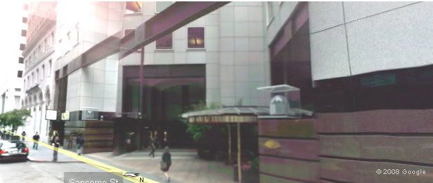
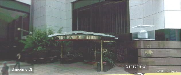
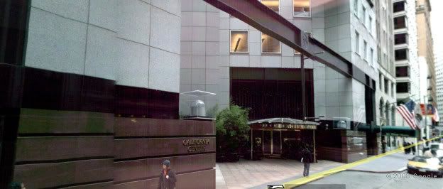
(The buildings on either side of the granite (?) facade are not part of the hotel.)
Maybe Boston should consider itself fortunate. Here is the street view of the ground floor of the Mandarin Oriental, San Francisco.


(The buildings on either side of the granite (?) facade are not part of the hotel.)
Beton Brut
Senior Member
- Joined
- May 25, 2006
- Messages
- 4,382
- Reaction score
- 338
Re: Mandarin Oriental
^^The entry reminds me a bit of the Hynes...
^^The entry reminds me a bit of the Hynes...
Re: Mandarin Oriental
The call for restraint is fair. Let's see how it turns out when all the work is done and stores have moved in. It has a lot to recommend it: height, massing, first floor retail, etc.
It's just... wll... it looks like it's trying really hard to be something it isn't...
The renderings made the masonry so much more appealing, seems to me. I defer to those who see it regularly. It's been several months for me.
My bad. Meant to have more restraint.

