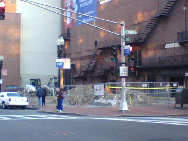
Marriott Moxy Hotel | 240 Tremont Street (Parcel P-7A) | Theater District

Is this the 13 story design that was rejected last year? As far as I know, this is what has been approved this site:
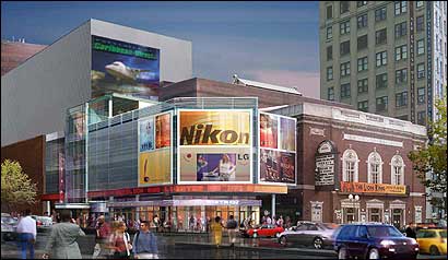
1123849648_5748.jpg


These latest renderings are a huge improvement...but I think I can do without the kitschy light-show.

Then again, with the W going up across the street, maybe it could work.
 
wow i really like that. Talk about engineering on a small lot. That lot is about as big as my garage.
 
bosdevelopment said:
wow i really like that. Talk about engineering on a small lot. That lot is about as big as my garage.
Which one? the 1st or 2nd?
 
Christ, talk about out of place. I can only hope that the surrounding buildings start looking like this or this tower is gonna be a fish out of water.
 
vanshnookenraggen said:
Christ, talk about out of place. I can only hope that the surrounding buildings start looking like this or this tower is gonna be a fish out of water.

I don't understand. Should they aim to make it look the same as all the buildings around it?

They should have just built a clone of the surrounding buildings on this lot.
800px-Praha_Tancici_dum.jpg
 
About the signs: meh, I guess that's progress for ya. At least the architect made it "contextual" by having the signs raise up as high as the theatre next door :roll:

But I like the building itself. The glass reminds me of the horizontal strip window look that was around in the 40s and early 50s, but reassembled on to a thoroughly modern form. Plus those little balconies (balconettes?) on the eastern half of the north facade look like they'll add character to the design rather than make it look junky.
 
bowesst said:
vanshnookenraggen said:
Christ, talk about out of place. I can only hope that the surrounding buildings start looking like this or this tower is gonna be a fish out of water.

I don't understand. Should they aim to make it look the same as all the buildings around it?

I was referring to the first image. What I meant was that with the bright ads it will look completely out of place, not that the architect shouldn't try something new.

I'm not sure why Boston would want an area to look like Times Sq. I live here I fucking hate Times Sq. But thats me.
 
vanshnookenraggen said:
bowesst said:
vanshnookenraggen said:
Christ, talk about out of place. I can only hope that the surrounding buildings start looking like this or this tower is gonna be a fish out of water.

I don't understand. Should they aim to make it look the same as all the buildings around it?

I was referring to the first image. What I meant was that with the bright ads it will look completely out of place, not that the architect shouldn't try something new.

I'm not sure why Boston would want an area to look like Times Sq. I live here I fucking hate Times Sq. But thats me.

OK I see what you're saying. I don't like Times Square much either but even if they put signs on every building of the Boylston intersection it wouldn't even come close to being anything like Times Square. I just think a project like this would be beneficial because it could make the area feel more lively and attract more people/developments. They really need to let bars stay open till 4am and extend the T hours too.
 
bowesst said:
I just think a project like this would be beneficial because it could make the area feel more lively and attract more people/developments. They really need to let bars stay open till 4am and extend the T hours too.

I completely agree....i like it alot, bring it on
 
tommym96 said:
bowesst said:
I just think a project like this would be beneficial because it could make the area feel more lively and attract more people/developments. They really need to let bars stay open till 4am and extend the T hours too.

I completely agree....i like it alot, bring it on

I third that.
 
What ever happened to building over the theater? Wasn't there a proposal that included the air-rights over the theater as well as the lot?
 
The site was quite active today


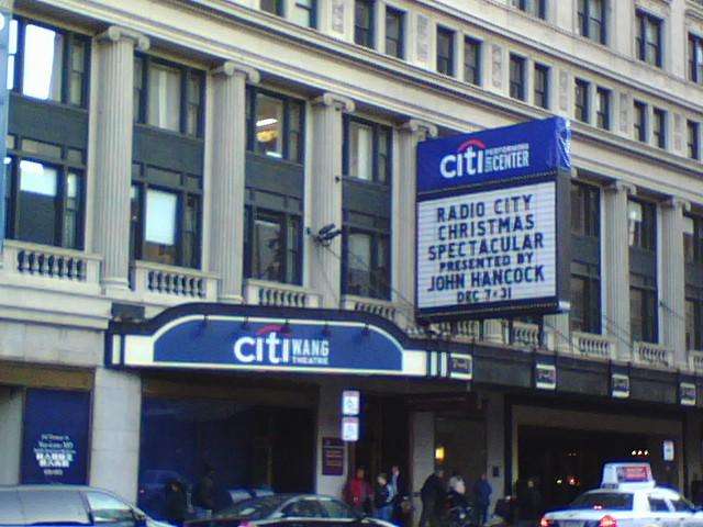
And, uh, CityWang sounds like something the guys at South Park would come up with.. how unfortunate

 
I thought they promised to leave the name of the Wang Theatre alone! Have they defaced the Shubert marquee as well?
 
Yes. The two theatres now have their main signs labelled as "Citi Performing Arts Center" with smaller signs identifying the actual theatre placed on the periphery. Also, the blank north wall to the Schubert now sports a huge ad stating how wonderful Citibank is.
 
If you've got photos of that, please post them too. Hopefully the W Hotel will soon cover that blank wall.
 
The design for the 'Times Sq.' tower is surprisingly nice, straight out of Vancouver. The height is perfect, for the way it lines up with the neighbors. I hope that's what's actually getting built.

justin
 
Which design is going to be built?

The smaller building is the one that was ultimately approved, right? I thought the mid-rise had gone bye-bye.

Anyone know for sure?
 

Back
Top