There’s no reason for it look stately and rational. It’s not like it’s a hospital or anything.That design style says "This bar code isn't reading right. Guess I have to key it in. <pause> Crap. <picks up intercom mic> CAN I GET A PRICE CHECK ON MARGINAL FACADES?"
You are using an out of date browser. It may not display this or other websites correctly.
You should upgrade or use an alternative browser.
You should upgrade or use an alternative browser.
MGH Ragon Building | 55 Fruit Street | West End
- Thread starter 12345
- Start date
Beantropolis
New member
- Joined
- Jun 6, 2021
- Messages
- 65
- Reaction score
- 136
These buildings have all the humanity of a electrical box. It's incredible how ugly most hospital architecture has become. It's as if these institutions have made it part of their corporate mission to deface the public realm. I can't decide whether it's incompetence or sabotage.
andrew.816
New member
- Joined
- Apr 28, 2022
- Messages
- 37
- Reaction score
- 256
These buildings have all the humanity of a electrical box. It's incredible how ugly most hospital architecture has become. It's as if these institutions have made it part of their corporate mission to deface the public realm. I can't decide whether it's incompetence or sabotage.
It's a hospital. Much of the interior is geared towards the quickest and most efficient movement of human beings possible. I'm as critical as anyone regarding instances of inhumane and featureless architecture (hello, blue glass boxes), but for hospitals, I give a pass.
LexSEDotVille
Active Member
- Joined
- Apr 23, 2022
- Messages
- 157
- Reaction score
- 832
10/19
Czervik.Construction
Senior Member
- Joined
- Apr 15, 2013
- Messages
- 1,932
- Reaction score
- 1,162
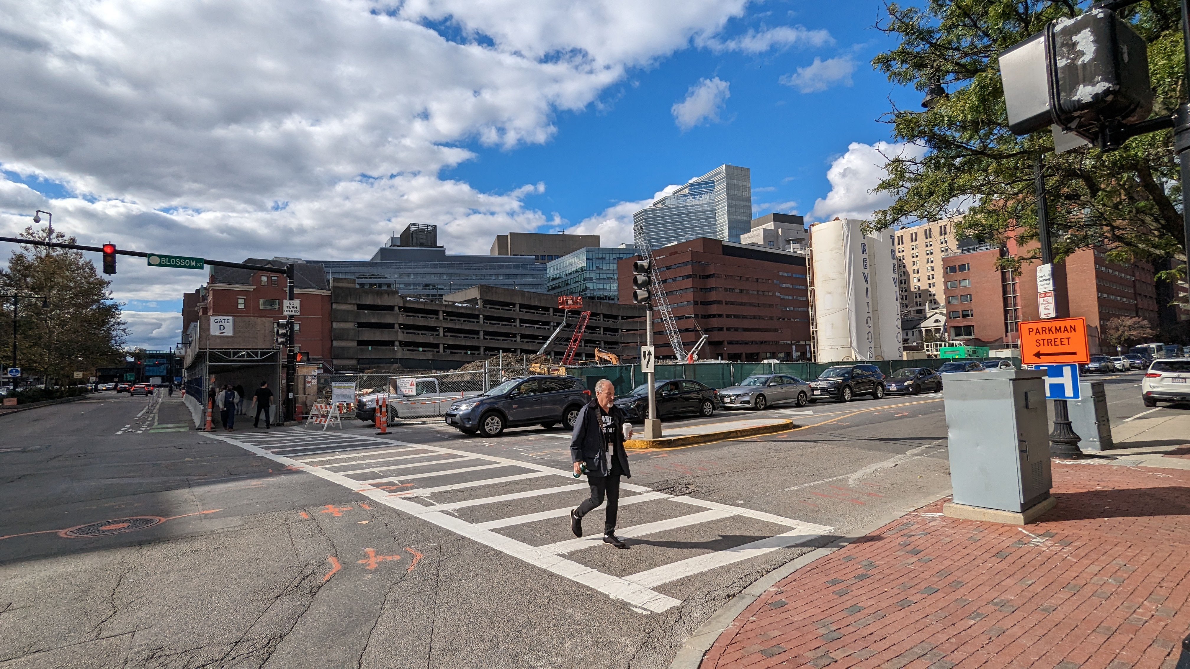
Am I missing something? Looks like nothing has happened in 10 months. Also, is that Louis CK crossing Blossom Street?
Am I missing something? Looks like nothing has happened in 10 months. Also, is that Louis CK crossing Blossom Street?
My (very amateur) guess is that the possible most cutting edge medical facility of the remainder of the 21st century has some very hefty foundational infrastructure (not to mention a possible Blue Line Station/entrance)?
When I was there in September for an appointment it was extremely busy with construction activity and it looked as though they had dug down at least a few levels and there’s also what looks like a large trench presumably for utilities dug under the street connecting to the building sort of across the driveway from Wang.
stick n move
Superstar
- Joined
- Oct 14, 2009
- Messages
- 12,054
- Reaction score
- 18,767
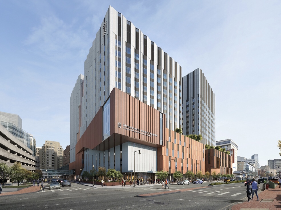
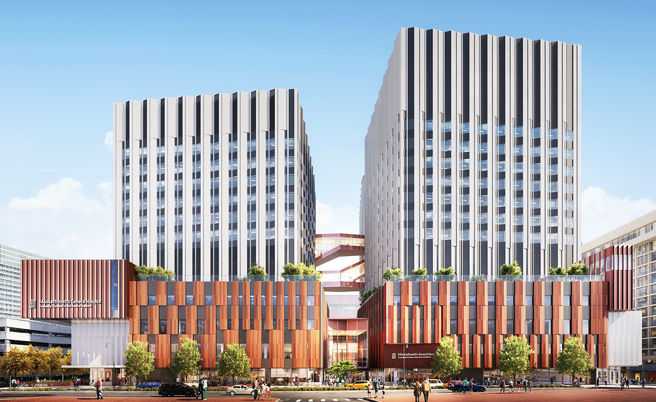
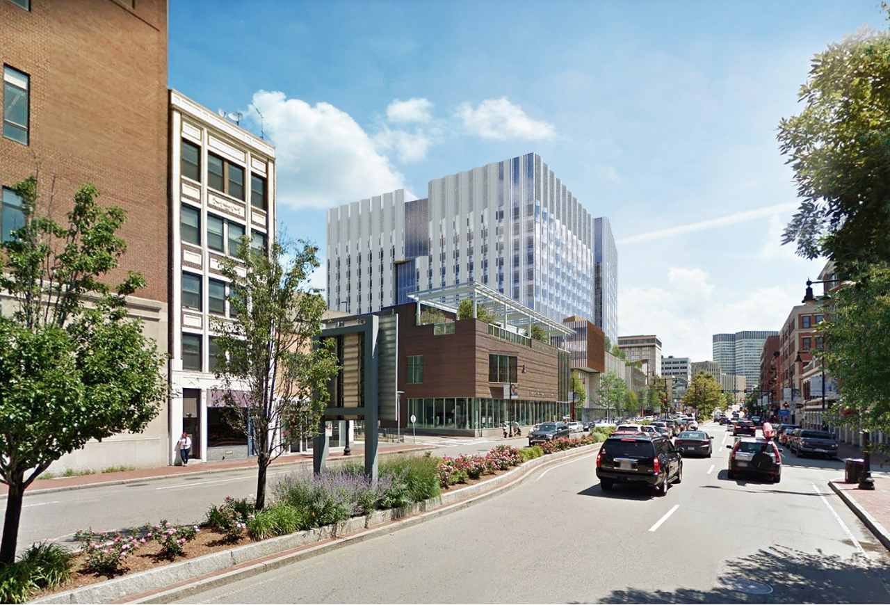
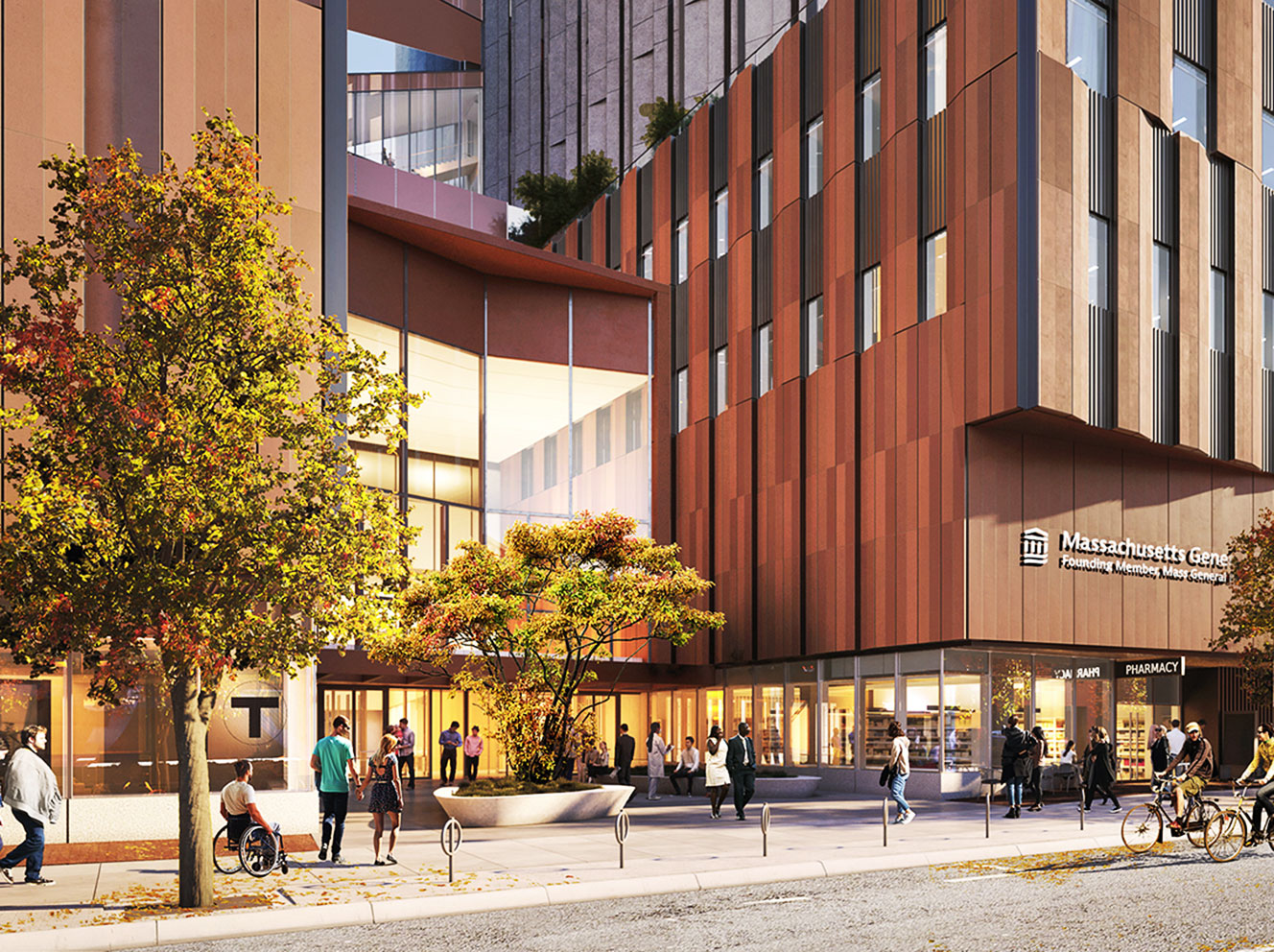
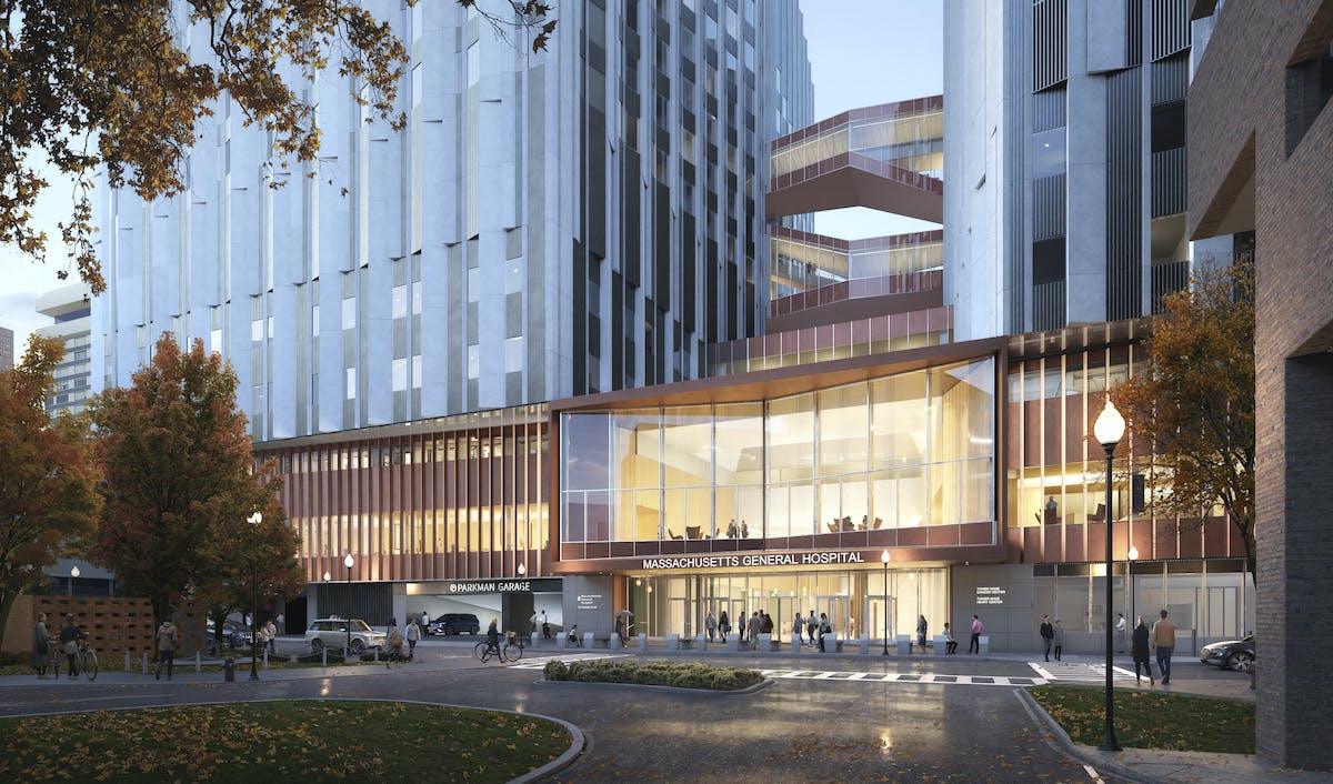
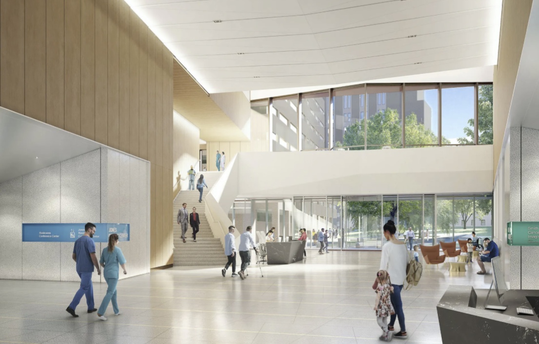
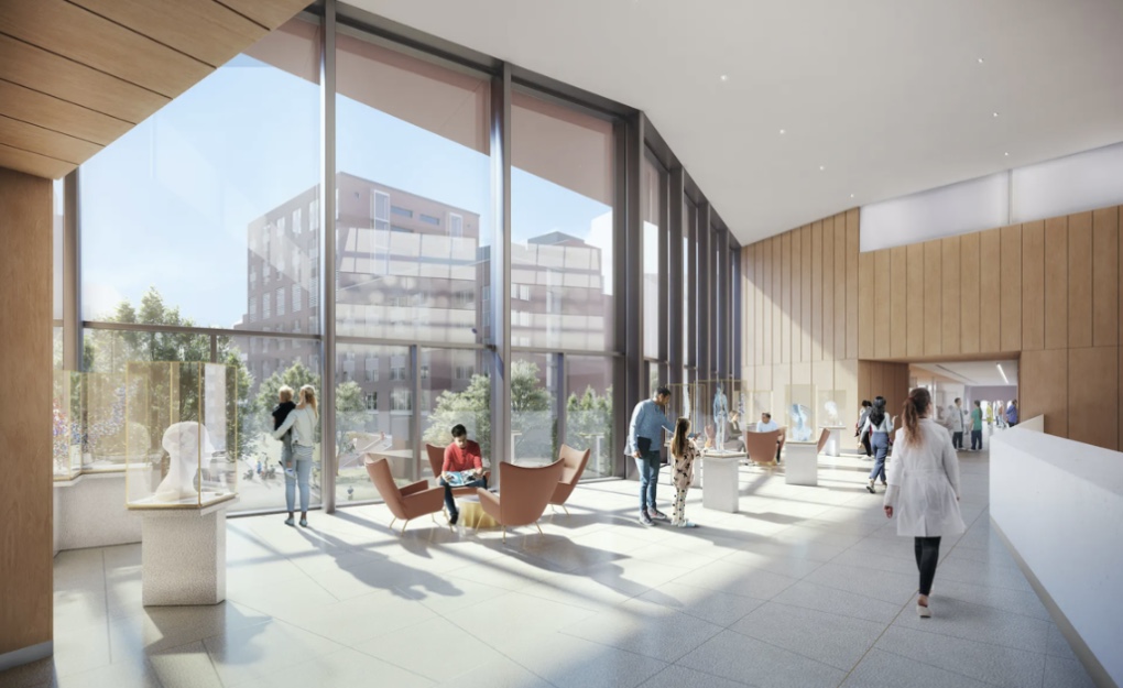
Finally theres more photorealistic renders of the project vs the massing model drawing style renders theyd released previously.
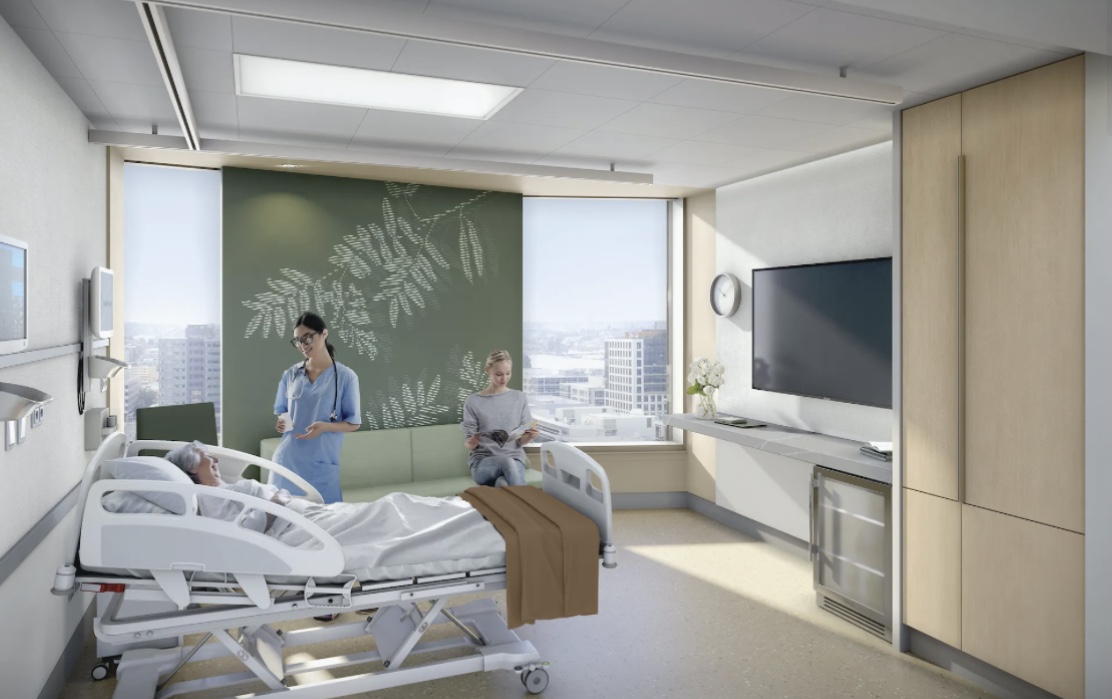
https://giving.massgeneral.org/stories/state-of-the-art-building-closer-to-construction
https://www.nbbj.com/work/massachusetts-general-hospital-phillip-and-susan-ragon-building
https://giving.massgeneral.org/stories/state-of-the-art-building-closer-to-construction
https://www.nbbj.com/work/massachusetts-general-hospital-phillip-and-susan-ragon-building
Justbuildit
Active Member
- Joined
- Nov 27, 2022
- Messages
- 853
- Reaction score
- 2,940
Little Easter Egg there with the T logo, but isn't that pretty far east for where the future Blue Line station will be? Not particularly inspiring, but hey it's another hospital building in the West End...better than the old gas station.
I don't begrudge them the prominent signage at what is basically their new front door, but is the subtitled signage really necessary for this? The renders show it reading:
Massachusetts General Hospital
Founding Member, Mass General Brigham
That seems... Pretty redundant at best, and is kinda self-evident? I know it's actually in their logo, but still, you can simplify for signage. Ford doesn't need to put Ford Motor Company everywhere, the blue oval conveys everything you need to know. It may be different if it was still Partners Healthcare, but the MGB rebrand was wholly to leverage their name recognition, so it's a lot of words that don't communicate anything. At least have the subtitle be something, anything else - the building name once it has one even.
also, while I'm on this topic, while I get why they're using the really anodyne MGB/Partners logo that really just looks like an icon representing "bank", they could still use the shield for at least some visual distinctiveness.
Last edited:
stick n move
Superstar
- Joined
- Oct 14, 2009
- Messages
- 12,054
- Reaction score
- 18,767
It looks like half of the buildings height is mech floors. Theres a huge portion at the top and above the podium. Theres like 13 floors of usable space and like 10 mech floors.
MjolnirMan
Active Member
- Joined
- Jan 18, 2016
- Messages
- 256
- Reaction score
- 575
I don't begrudge them the prominent signage at what is basically their new front door, but is the subtitled signage really necessary for this? The renders show it reading:
Massachusetts General Hospital
Founding Member, Mass General Brigham
That seems... Pretty redundant at best, and is kinda self-evident? I know it's actually in their logo, but still, you can simplify for signage. Ford doesn't need to put Ford Motor Company everywhere, the blue oval conveys everything you need to know. It may be different if it was still Partners Healthcare, but the MGB rebrand was wholly to leverage their name recognition, so it's a lot of words that don't communicate anything. At least have the subtitle be something, anything else - the building name once it has one even.
also, while I'm on this topic, while I get why they're using the really anodyne MGB/Partners logo that really just looks like an icon representing "bank", they could still use the shield for at least some visual distinctiveness.
It may not surprise you to learn that even today, 4 years after the rebrand was announced, MANY internal systems still use the name "Partners". I mean, what are you gonna do, change every computer asset tag sticker? Change every system-wide login URL from "partners dot whatever" to "massgeneralbrigham dot whatever"? Of course not. So people who work at these places constantly say "Partners" this and that, instruction PDFs that didn't need updating except for the new PHC name haven't been updated, but thousands are spent on new horrible signs like this.
Equilibria
Senior Member
- Joined
- May 6, 2007
- Messages
- 7,079
- Reaction score
- 8,302
Nope, that's the spot. This is the far end of the platform from the Red Line headhouse.Little Easter Egg there with the T logo, but isn't that pretty far east for where the future Blue Line station will be? Not particularly inspiring, but hey it's another hospital building in the West End...better than the old gas station.
Equilibria
Senior Member
- Joined
- May 6, 2007
- Messages
- 7,079
- Reaction score
- 8,302
@Arlington @BeeLine this is now the "Ragon Building"
Recommend renaming to "MGH Ragon Building | 55 Fruit Street | West End".
Recommend renaming to "MGH Ragon Building | 55 Fruit Street | West End".
bigpicture7
Senior Member
- Joined
- May 5, 2016
- Messages
- 3,895
- Reaction score
- 9,513
As shown here:Nope, that's the spot. This is the far end of the platform from the Red Line headhouse.
From: https://cdn.mbta.com/sites/default/...-public-meeting-presentation-accessible_1.pdf
