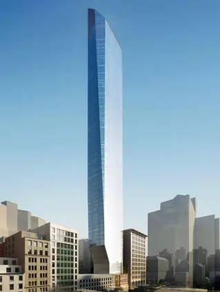
MassDOT Pike Parcels 12 - 15 | Boylston St. and Mass. Ave | Back Bay

I also guarantee that the average price per new unit of the 108-unit project will be higher than the average price per unit of the 342-unit building would be. The most expensive units of the project are the ones that will stay. The cheapest units are the ones that will be cut. Notice that they've cut height of the condo tower by about 15% but cut units in the condo tower by about 33%. The average unit got bigger with these changes.

Put a huge number of 1 br and studios in the early proposals, then come back a few months after the nimby's reach peak seething, you slash them to the types of units you wanted anyway, reduce the # of cars, etc, to make it look like a huge concession. Still; it's partially sort of over the pike. Should have kept the height for all these concessions real or otherwise.

A 625' high a/r low-skyscraper looks INCREDIBLE compared to a 520' highrise.
 
I really like it, even with the height haircut. Did Elkus design that? I thought they were known for boring Seaport boxes?

I sort of looks like a mix between the Bank of America tower and the new Madison Square Park tower, albeit a lot shorter:

madison-square-park-tower-45-east-22nd-street-00.jpg
 

This tower has likely the worst mechanical top treatment I have ever seen. (maybe hyperbole, maybe not) It makes MT's opening a barely noticeable blip in comparison. Of course, the biggest difference is that this one is overshadowed by at least 25 taller buildings and counting.

I believe KZ can provide us with pictures to illustrate this atrocity.
 
Anyone got some new renders for Parcel 15?

my low speed mobile connection is stumbling here in Topanga Canyon w/ the pnf.
 
I think this looks pretty good and actually fits the skyline really well. I dont really care about height right here, its going to the rich anyways, the one site that matters above all is 115 winthrop. That is the one site that has to go to the max height. These actually look better, will add more weight to the back bay skyline, and add a nice sloping away feature.


I think the redesigned podiums look extremely good, this is going to add some high quality street level activation to an area that had none, along with the recently completed 888 Boylston. This is going to look like a completely new area, in a way it is, especially once the parcel going across the pike on mass ave is completed as well.
 
Last edited:
So this version of the project has some pretty major changes:

This was the prior iteration:
IMG_0974.png


Current iteration:
zQgeI7I.png


The preview for the Banker and Tradesmen article highlights some of the biggest changes (https://www.bankerandtradesman.com/2017/09/developer-drops-mass-pike-apartment-tower/):
"Plans to build two residential towers above the Massachusetts Turnpike in Back Bay have been scaled back with elimination of a 182-unit apartment tower and reduction in a proposed condo tower from 160 to 108 units..."
 
Thanks everyone for all the rendering dumps.

Question: What's the program for the podium? It's not an above-ground garage, is it?... cause that would be terrible.

On first look, I was bummed about the mid-rise apartment tower getting axed in this iteration. But the more I think about it, the more attractive I think it not only makes this tower, but also the prospect of redeveloping the Kings/Bukowski/Summer Shack garage next door into a skyscraper. Aside from the Lord & Taylor, I cannot think of a riper site in Back Bay for a Boston supertall. 1000 Boylston and 1 Dalton are definitely buttering up the neighborhood for that inevitable project announcement down the road.
 
i'm skeptical about a redo of the Dalton Garage. The Building Dept made clear to developers [it's off the table] for the benefit of current development plans. They must consider it nearly a crucial asset to the present day + what's going up.

That garage is going to be quite a valuable asset going forward. Maybe a >750' tower could pay the way to redoing it below. But that's a long time for it to be out of service. Then, you'll probably put a significant shadow on Copley Square and historical bldgs there.

Lord & Taylor can be developed in the range of about 280~360'. The higher you get in that limited range becomes progressively more unlikely given the new shadow rules. There's very little wiggle room for this parcel (now).

btw, i call bunk that you need to step up to the height of 1 Dalton/Pru/JHT at Mass Ave. There's a few places between Ipswich St and Mass Ave where you can attempt that overly-praised endeavor.
 
That garage is going to be quite a valuable asset going forward. Maybe a >750' tower could pay the way to redoing it below. But that's a long time for it to be out of service. Then, you'll probably put a significant shadow on Copley Square and historical bldgs there.

Off topic but would a tower at the garage really cause shadows in Copley Square? Doesn't seem like it lines up...
 
Current iteration:
zQgeI7I.png

Could the heights shown here possibly be any more wrong? Let's start from the left...
-888 Boylston is over 300' to the tip, and the 240' that is show is more like 270'

-The Sheraton is almost certainly NOT 360', and if it was it would be to the top of the sign. Not to mention it looks like they drew it over 400'!

-1 Dalton should be rendered with the 699' plus mech, and the mech has it within 10' of the Pru (+ or -, who knows but it should essentially be another Pru)

-30 Dalton might actually be around the right height, except it's very close in height to the Sheraton in real life!

-The Hilton is substantially taller than shown. I actually bet the ~265' or whatever that is listed doesn't include the box on top, and it's really about 290'. This plus the Sheraton are the 2 buildings that the diagram is most wrong about.

-The new building looks to be about on par with 111 Huntington, which is... 554' I believe. (have seen 564' on the FAA site but that might be a pole) Do we really think this one will still be pushing 550'? Maybe it will.

-What is the last building on the right that says 290'? It doesn't exist.
 
If the apartment tower is gone why do they show it in all of the renders? They made new ones to show the shorter condo tower, so why not get rid of of it? I want to see what its really going to look like now.


****edit: Nevermind I take it that the tower being removed is the one in front of the condo tower that shares the same podium. My mistake****
 
What is the last building on the right that says 290'? It doesn't exist.

If the apartment tower is gone why do they show it in all of the renders? They made new ones to show the shorter condo tower, so why not get rid of of it? I want to see what its really going to look like now.

That's not the apartment tower - it's Parcel 12.
 
Yup just realized that when I scrolled up and went to go look for what they are talking about. Thanks.

So thats good to know theres still a good amount of density here, theres 3 towers going up depending on which render of parcel 12 is correct.


The new condo tower looks much better with the angles. Before there wasn't a rhyme or reason to the twisting of the tower, it kind of leaned to one side, and then the roof kind of clashed with the twist. Then adding in the random balconies with some recessed, some external, some small, and some big, it was messy. Right now the two triangles on the side of the tower look very elegant, theres no balconies, and the tower doesn't lean or twist. Getting rid of the balconies probably has the biggest effect for cleaning this tower up, but the angles really drive it home.


The right-side up triangle and the upside down triangle leading into the triangular slanted roof are very nice.


zQgeI7I.png


I love how it also changes shape depending on which side you view it from. It looks different from every side- each side is completely unique.


You will now be able to see the back bay skyline when you are in the south end and it gives a nice stair stepper/step down..... from the back bay skyline.


Finally those above are massing models. The renders that show what the glass looks like looks incredible. The base is also very dynamic and uses the same sort of triangles as the tower.


Last edited:
-The new building looks to be about on par with 111 Huntington, which is... 554' I believe. (have seen 564' on the FAA site but that might be a pole) Do we really think this one will still be pushing 550'? Maybe it will.

-What is the last building on the right that says 290'? It doesn't exist.

One of the tables in the document has this at 544' including mechancials. That looks about right, visually.

The 290' building on the right is a tower at the corner of Mass Ave and Boylston described in Berklee's most recent IMP. The Parcel 12 tower, whatever it ends up looking like, is out of frame on the above render.

http://www.bostonplans.org/getattachment/c14907b0-7e04-4d46-9c1c-bdb25510729c

"A CAC Member asked about the height of the mechanical elements above the highest occupied floor of the proposed western tower. David replied that the mechanical elements will be approximately 45 additional feet higher."

484' + 45' = 529'

...and I stand corrected.
 
544' isn't bad at all. In fact, couple with 1 Dalton, we are essentially getting the equivalent of the Pru and 111 Huntington built again, next door to the originals!

Of course, as with all other large projects in Boston, I'll believe it when I see it. (out of the ground at least)
 
Surprised a Developer would give up that much. Deletion of second tower and 20% reduction of the 1st Tower, That is a lot.
 

Back
Top