MFA Expansion

Status
Not open for further replies.
In the old setup the gift shop was after admission as well - you'd have to go up to the sales desk and ask for a "gift shop pass" if you only wanted to go to the shop. It was complementary and once you had it you could see all the exhibits, since you were past the ticket check. I imagine more than a few people discovered this freebie loophole. I hope the new setup with Remis doesn't reproduce it.
 
Remis stays; the new auditorium is not large, from what I hear. The existing gift shop in the West Wing stays but will be redesigned and shrunk as part of the renovation of that part, now known as the Linde Family Wing.

The new auditorium is terrific. Not large, but wonderfully proportioned with high quality microsuede seating and lots of legroom. Apparently it will only be used for films/video exhibitions--no talks or musical performances (I asked).

The rest of the wing is pretty great. A little too heavy on Colonial New England for my taste and not nearly enough contemporary American or South American art, but lots of galleries and a real wide range. Hopefully some space will be freed up in the European galleries and they can exhibit more contemporary art.
 
^ They had a choice between branding the thing the "American Wing" or the "Art of the Americas Wing". The first choice would have been provincial but would have played to their strengths; the second choice is very cosmopolitan but leaves a lot of obvious gaps. Most critics have given them credit for taking the more expansive view with the implication that their collection will grow to include more Native American and Latin American art; they've already had to make an effort - making a number of acquisitions and requesting loans from other museums - to make the new wing's title even vaguely credible. Hopefully it will indeed grow comfortably into the role over time.
 
The wing includes the Barbara and Theodore Alfond Auditorium, a 150-seat state-of-the-art venue for films, concerts, and lectures, which measures 2,128 square feet and is located on Level G (Ground).
http://www.mfa.org/sites/default/files/newmfaoverview.pdf

Early on there had been talk of a separate entrance for the new auditorium.

I attended a presentation a few weeks ago and they said the underground parking will be in front of the museum when a doner steps forward.

The Americas wing is for art up till around 1975. Art from the mid 20th century to the present will be in seven new galleries that will be in Linde Family Wing for Contemporary Art(the old West Wing) including a gallery dedicated to video and new media. This wing will have it's own director. Opening Sept 2011.
 
Art from the mid 20th century to the present will be in seven new galleries that will be in Linde Family Wing for Contemporary Art(the old West Wing) including a gallery dedicated to video and new media. This wing will have it's own director. Opening Sept 2011.

That's really good to know; as thrilling as the new wing is, ironically it left me a little depressed thinking that the MFA would be pretty static for the foreseeable future. I guess I (like most people, maybe) always want to know that there's something on the horizon--it helps me enjoy the present. :cool:
 
^ They had a choice between branding the thing the "American Wing" or the "Art of the Americas Wing". The first choice would have been provincial but would have played to their strengths; the second choice is very cosmopolitan but leaves a lot of obvious gaps. Most critics have given them credit for taking the more expansive view with the implication that their collection will grow to include more Native American and Latin American art; they've already had to make an effort - making a number of acquisitions and requesting loans from other museums - to make the new wing's title even vaguely credible. Hopefully it will indeed grow comfortably into the role over time.

They've been aggressively growing their collection since 2001 (perhaps earlier, and over 3000+ pieces acquired), none of which were housed in the building until now -- hardly an effort to make the wing's title "even vaguely credible." In fact, this is an opportunity to give credit where it is due.
 
In the old setup the gift shop was after admission as well - you'd have to go up to the sales desk and ask for a "gift shop pass" if you only wanted to go to the shop. It was complementary and once you had it you could see all the exhibits, since you were past the ticket check. I imagine more than a few people discovered this freebie loophole. I hope the new setup with Remis doesn't reproduce it.

Somehow when me and my friends went to the Boston Aquarium he got past without buying a ticket... after waiting in line for firggin 2 hours!
 
They've been aggressively growing their collection since 2001 (perhaps earlier, and over 3000+ pieces acquired), none of which were housed in the building until now -- hardly an effort to make the wing's title "even vaguely credible." In fact, this is an opportunity to give credit where it is due.

Yes, but the growth of the collection wasn't moving in the direction of "the Americas" until the idea for the new wing's purpose was hatched.

The Globe did a piece on how the museum's curators were scrambling to add to the collection in this vein. The examples were all picked up in the last few years:
http://www.boston.com/ae/theater_ar...beef_up_its_collection_the_mfa_went_shopping/

...

BTW, the NYT has a very positive review of the new wing here:
http://www.nytimes.com/2010/11/19/arts/design/19americas.html
 
NY Times review by Holland Cotter

Five years after breaking ground, the new Art of the Americas Wing at the Museum of Fine Arts here is opening on Saturday, and it?s a wow. Almost double-wow. Really good.

I?m not talking about the outside ? your basic blank glass box ? designed by the British architects Norman Foster & Partners, but the inside: 53 well-proportioned galleries, large and small, holding some 5,000 objects, more than twice the amount of Americas material previously on display. And given that this museum?s American colonial collection is the world?s best, more is definitely more.

But what does ?Americas? mean here? That?s the question the new permanent installation asks up front. It?s a big, inclusive word, though rarely treated that way in museums. Usually we get North America, meaning Euro-America, over here; America Indian and Mesoamerica over there, with African and Oceanic; and South America almost nowhere.

http://www.nytimes.com/2010/11/19/a...seum of fine arts&st=cse&scp=1&pagewanted=all
 
Yet more insanely positive reviews--this one from the Financial Times...

A new wing in Boston?s Museum of Fine Arts
By Edwin Heathcote

Published: November 19 2010 18:27 | Last updated: November 19 2010 18:27

To contemporary eyes, the problem with neoclassical architecture is its completeness. Most of the western world?s great museums, built in the stretched century between the French revolution and the first world war, were conceived as temples to the gods of beauty and culture, as perfect, eternal, and symmetrical as the Greek temples that inspired them. There is nothing that can be added to, or taken away from, a classical portico or a colonnade to make it any better.

The Museum of Fine Arts in Boston was among the last of these big neoclassical museums. Completed by Bostonian architect Guy Lowell in 1909, it was conceived as a pendant on the city?s ?Emerald Necklace?, the 1,100-acre chain of parks that snake through Boston, and it faces the marshy landscape of the ?Fens?.

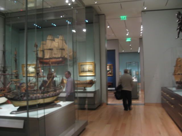
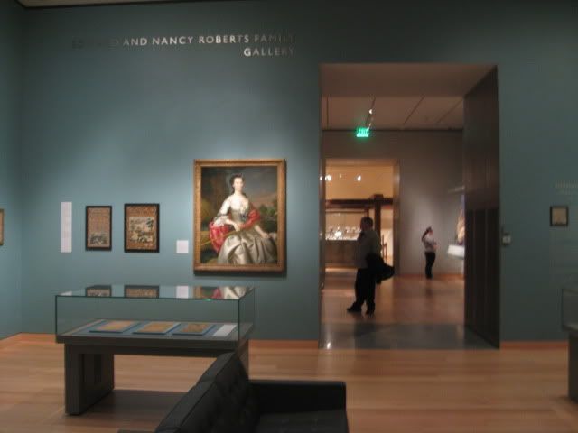
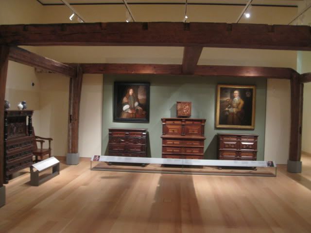
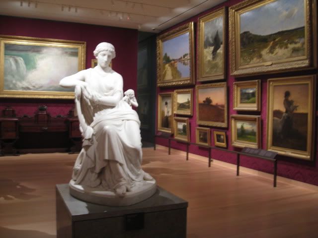
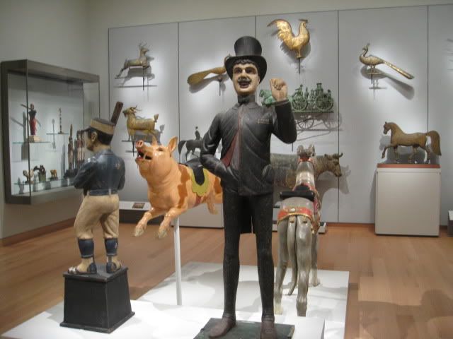
Though the galleries and public spaces are, by international standards, quite small, the museum has the most extraordinary collection of American art, thanks to Boston?s role as the historic heart of the New World. Its holdings include Gilbert Stuart?s portrait of Washington, English-born Thomas Sully?s ubiquitous depiction of the first president crossing the Delaware, and John Singer Sargent?s dynamic deco-classical ceiling paintings. The museum is the home of the dignified East Coast tradition; this is the art of the old New World. But the collection also spans the whole of the Americas, with superb examples of pre-Columbian and Native American work, many of which have languished in storage due to shortage of space.

When the Museum of Fine Arts commissioned Foster & Partners to design its expansion in 1999, the practice was finishing off the British Museum?s Great Court, conjuring a massive lobby from the dark heart of a dusty court. Previously, the architects had demonstrated their facility with classical buildings not only in their transformation of Berlin?s Reichstag but also in the audacity of the Carr? d?Art in N?mes, southern France, a minimal glass gallery that stands beside the real thing, an exquisite Roman temple. That delicate building is still, I think, Foster?s finest.

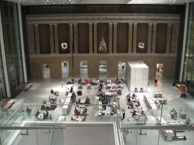
This new wing in Boston ? with its crystalline late modernism set against solid civic stone ? is of a piece with the Carr? d?Art. At the heart of the institution, the architects have created a lofty space ? the Ruth and Carl J Shapiro Family Courtyard ? that is flooded with ethereal light. The expanse of the sky, the changing greenery of the marshy parkland and the structural brick of the original building are all brought into the museum. Clad in pale stone with stairs cantilevered in at one end and slender steel columns supporting a gossamer-thin translucent ceiling, this new space is luminous, its effects achieved with a deceptively simple palette.

It is resolutely part of an emerging trend in big US institutions for tasteful surgical intervention, a counterbalance to the self-consciously expressive icon. Yoshio Taniguchi kicked it off at New York?s Museum of Modern Art and Renzo Piano has become the trend?s tasteful default designer ? with the Chicago Art Institute and ongoing extensions to two nearby Boston museums, the neighbouring Isabella Stewart Gardner Museum and Harvard?s Fogg Art Museum.

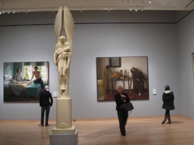
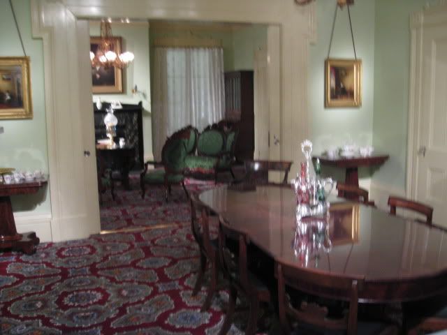
This kind of architecture treads a delicate, occasionally ill-defined line between the corporate and the sublime. At its best, it unfussily brings everything together; at its worst it makes everywhere look the same ? it becomes the architecture of the ubiquitous lobby, bringing the aesthetics of waiting and coffee, the architecture of the airport (at which Foster is so accomplished) into the sphere of high culture. But in Boston, Foster has avoided the pitfalls. Here the central space lifts the soul. After the slightly cramped, darkish entrance of the original building, it prepares the visitor for an ascent through the history of American art, from the intimate displays of colonial rooms through to top-lit galleries of contemporary work.

That Foster?s firm was responsible not just for the building but, unusually, also for the displays and the detail and continuity of the aesthetic from atrium down to vitrine, begins to justify the $345m building budget. But what the architects have also done ? less visibly, perhaps, but more impressively ? is to weave a series of routes around the whole building that allow visitors to wander around the edges of the collections, taking in everything and, if they feel like it, to deviate from the circuit and explore more deeply. The routes are clear and comprehensive, seamlessly navigating the complex collections while maintaining a sense of the landscape and city surrounding them.

The greenery of the Fens is drawn into narrow glazed slots, which act as nodes connecting the different galleries. New glazed walkways have been created around the upper edges of the museum ? modernist loggias that illuminate the space, relieving pressure on the exhibits while creating active elevations. These animate the surrounding parkland, which was neglected and deserted until only a few years ago. These loggias are close in character to those Foster made at the Sackler Gallery above the Royal Academy in London and bridge the new and the old with similar success.

From the outside, the building blends the kind of slick glazed fa?ade that encases Foster?s riverside offices in south London, and a solid surface punctuated by seemingly random openings. This faux randomness has become a bit of a clich? in recent years, but in fact the openings coincide with the windows of the period rooms, so the domestic interiors behind them are naturally illuminated. Once you realise this, the fa?ades make perfect functional sense. The pale stone sits comfortably with the severe Beaux Arts of the original building and the whole ensemble stretches and pulls the city out into this landscape in a way that never quite occurred with the oddly isolated original.

There is nothing flashy here ? no architectural acrobatics, no attempt at communication through jarring juxtaposition, no sense of struggle with the old structure ? just good, understated galleries and clarity. When the museum was built, the neoclassical tradition to which it belonged was coming to an end. It would enjoy one final flourish in the government buildings and memorials of Washington, DC, and then disappear. The modernist language used by Foster is nearly as old now as was that Beaux Arts language then. It will be intriguing to see how well they last together.

Art of the Americas wing, Museum of Fine Arts, Boston, opens on November 20, www.mfa.org

Edwin Heathcote is the FT?s architecture critic
.
 
I had a good time at the museum.

Instead of listing all the positives, I will be grumpy and list my complaints:

-Museum designers continue to ignore those with visibility less than 20/20. Placing the description card all the way at the back, with a glass barrier to prevent getting closer, with tiny text = bad.


-The new area confuses museum circulation. It's very hard to see the whole museum without repeating rooms or sections.

-Behind the new galleries there is a hidden area with a hallway, a resting room, bathrooms and a "behind the scenes exhibit". Sort of a pain to find, and will be ignored.

-The rooms themselves were good, but the art itself was missing some oomph. Also, the placement was odd, going from one room to another was like entering a new planet.

-Needs more dinosaurs

-With the exception of a small basement area, "americas" means "new england area".


That being said, I recommend a visit, and there is a LOT to see. At least for my visit, 90% of the people were in the new area, leaving the rest of the museum as a private tour essentially.

Also, the new rooms make the old ones seem dated, something I'd never thought before.

IMG_7939.jpg


IMG_7940.jpg


IMG_7941.jpg


IMG_7942.jpg


IMG_7943.jpg


IMG_7945.jpg


IMG_7948.jpg


IMG_7949.jpg
 
nice photos!
I personally think the circulation is terrific--I always know where I am, where I've been and in which direction to go next. The central gallery (actually two tandem galleries) have four smaller galleries on the left and right in a carre formation. Coming off those carres (continuing in the same direction from the central gallery) are walkways to mini-wings of 4 or 5 smaller galleries. The pattern seems to repeat on every floor except the basement floor (where the Fresh Ink exhibit currently is--really terrific exhibit, btw).
I am notoriously bad at navigating large spaces (and I used to get lost all the time in the Old Wing until I figured it out through osmosis), but the New Wing seems very logical. AND (if that wasn't enough) it has bathrooms!!
I agree that while this is supposed to be about the "Americas," the US and especially New England predominate. A little colonial Latin American art goes a long way (how many suffering Christs do you need to get the point that He died for our sins? A bit like Renaissance chubby baby and Madonna scenes) but the richness of late 19th/early 20th century Southern Cone + Brazil is really given short shrift. I wonder if they just don't have it in their collection or if there wasn't enough room to show it... When they open the Contemporary Wing next year, maybe they can move some of the US stuff into that wing to make room for more modern Latin art.
 
Here is how i felt after going to the Museum.... i have been working on this for a few days, sorry it is so long.


So I went to the new Wing at the Museum of Fine Arts yesterday and I was left with an overwhelming feeling of ? ?Meh.? I was so excited, epically for the new late 20th century stuff as it is my favorite period in modern art history. I have to put this down in writing and I figured that the people that read this board would most appreciate what I have to say. The following is part architectural criticism, part art criticism, and part curatorial criticism, and part just how I felt.

So as I turned the corner and entered the new lobby I was excited by what I saw. A vast space with three of the four new floors of galleries just being visible, with what is obviously the most important artworks placed so that you can see them from the lobby (The Sam Adams portrait and the Boit daughters portrait jumped right out). Everything seemed to make perfect sense, three stories above ground, one below, and I was anxious to go see what on display.

My friend and I decided to start on the bottom floor and work our way up as it seemed that the galleries were meant to be viewed in this progression, starting at ancient American art and ending with late 20th century. The bottom floor started off great, especially the room full of model ships, quite possibly the most interesting gallery in the whole new wing, but I started to feel a real break down in the apparent chronology of the wing. I get the subtle layout of the bottom floor with the art from the peoples of the old world flanking the art of the peoples of the new world, but I didn?t real like it. Also, I was again thrown off by the gallery of Native American art and pottery. All the other galleries in the wing grouped things by time and place while this one placed pre-Columbian bowls and pottery right next to paintings and vases created after 2000. Very strange, almost like they consider all works created by Native Americans to be of the same caliber and variety no matter the time period. Now this would have been more appropriate if the same thing was done in other galleries throughout the wing, such as placing Eames Chairs next to the wall of colonial ladderbacks later on the wing, but that was not done.

The next two floors were kind of a blur to me? I just am not excited by American portraiture and realism, but what really caught me off guard was the strange layout of the building on these floors. The exterior hallway, while impressive, seems completely pointless and hides galleries so that most people visiting the museum will not even realize they are there. Plus each floor has 2 satellite galleries, for lack of a better term, that are down a short glass hallway with only a small door in an alcove to reach them by. Now I did love the galleries with the weathervanes and hilarious alligator baptism certificate, but again I bet a large chunk of visitors miss this gallery because it is behind two doors and around a corner. Also, the recreated rooms on these floors are beautiful, especially the one with 1800?s French wallpaper, but the labels informing you of what the room is and what is in it are down by your ankles. I had to crouch down to read them, and at one point I actually had to kneel on the floor. I feel bad for an old person with poor vision trying to read it. I understand wanting to keep the barrier low between the viewer and the room, but leaving the descriptions down there is just odd. While I am discussing signage, I would also like to state that there were multiple times when I was in the galleries and saw a marble sculpture, or light fixture, and it would take me way too long to find the label. I would often find them in almost nonsensical places.

Now the late 20th century floor was more than a disappointment. It was almost as if someone in charge went ?Wait! We don?t have any art for the late 20th century floor! Here, take this list of famous American artist and go buy one thing from each of them! I don?t care if they are any good, we just need the names!? it drove me absolutely crazy. You walk up the stairs and there is this amazing David Smith (with no label to be found mind you) which gets your hopes up for a great collection, but mediocre art by famous artists is all that follows. "Lets put out 8 early Pollock's so no one notices we don't have any from after he starts his dripping method! Here is a Motherwell! well it looks nothing like his main style and there is what looks like a square dick in one corner... but it's a Motherwell!" I mean they have all the names, but I would much rather see 5 amazing works by lesser known artists than this.
Now a lot of the works on the top floor are interesting if you know the history of the artists, but if you don?t, you are just looking at really mediocre stuff. Now I do have to give them credit for the breath of Calders they have on display, which amazed me, as well as the collection of O?Keefe ( who I don?t really like that much), and the epic Frank Stella painting, but all this was outweighed by the tons of chafe around it. One of the things that got me the most upset was when I noticed this really good work by an artist I had never heard of before. It was a kind of American Suprematism, which I never knew existed, but it was tucked away in a back corner of an alcove, while the spot of honor across from it in the main gallery was taken by a display of pink, plastic cups, in the shape of pineapples. Don?t even get me started on the Maxfield Parish they have displayed on a wall all by itself, while the Wyeth they have is relegated to a wall with two or three other works.

Now I did enjoy myself, but in closing I think that the Museum could have done much better. They have the best curators, the most money, the largest selection of art, and this is what they come up with? No wonder the ICA is doing so well. The most telling point of my visit was that, in my opinion, one of the best new artworks for the wing they have on dispay, an Andy Warhol oil and screen print of Mick Jagger, is located, of all places, in the ticket lobby. It got me so excited for what ended up a complete ?Meh? of a day.
 
Just checked this out today and I think it is fantastic! When I first walked into the new courtyard I was stopped in my tracks by the space. Well done. My only nit pick would be that I wish Foster had aligned the stairs along a symmetrical axis. Other than that, amazing. Even more so with the snow today which made it feel like a reverse snow globe.

The galleries are gorgeous. I love how they make the art really stand out and breath. When I walked through the older galleries afterwards I felt cramped and overwhelmed. I love how the curator played with different ways of portraying the art and how the exhibit flowed. I've spent the last 5 years exploring the galleries in NYC and this is easily better than what the Met or MoMA has in terms of exhibition space.

My favorite part of the new wing were the little surprises when you left exhibition rooms. You would walk down a corridor and discover a stature beautifully framed by a two story hallway, or the behind-the-scenes parts where you could interact with the exhibit to better understand what exactly goes into the business of an exhibition. And the views of the Fenway were very nice, something they no doubt took from the new ICA. A place where you could rest and refresh yourself (bathrooms++) while not having to leave. Smart!
 
My opinion is very close to Van's. The new galleries are some of the best-curated I've seen - mixing art, furniture, fashion, and more mundane artifacts to give a great sense of the time period. From what I understand, the "holes" in the exhibits are not indicative of weakness but of ambition. When the new Contemporary wing opens, I think they'll aim for a lot more cohesion in the American wing, and try to boost it with new aquisitions (probably especially in Latin American).

My one architectural complaint concerns the new enclosed courtyard. A great space for sure, but in its current use it doesn't exhude the kind of gravitas I think it should. Essentially, an upscale cafe takes up probably 60% of the courtyard, smack dab in the middle - which gives it some of the same ambiance as an airport terminal. Luckily, this is an easy fix, should they ever decide to change it up.
 
Shepard, you stole my comment. I was going to say, that's got to be the most expensive cafeteria ever built.

When they have events, the courtyard is awesome. I've not been inside during a regular day, but the photo above shows it as kind of a boring space. I believe they didn't want to clutter it up with lots of sculptures, etc., but perhaps they'll add some things over time.

I think Christmas caught them off guard. There doesn't have to be a lot of decorations but two wreaths and a "holiday" tree is the new definition of "austere".
 
Status
Not open for further replies.

Back
Top