You are using an out of date browser. It may not display this or other websites correctly.
You should upgrade or use an alternative browser.
You should upgrade or use an alternative browser.
Miner St. Developments | Fenway
- Thread starter briv
- Start date
DudeUrSistersHot
Banned
- Joined
- May 25, 2006
- Messages
- 315
- Reaction score
- 0
christ ablarc, not every building can be an architectural masterpiece. there are many buildings in boston worthy of criticism for being impressively bad; these do not belong to that group.
PerfectHandle
Active Member
- Joined
- May 25, 2006
- Messages
- 233
- Reaction score
- 32
DudeUrSistersHot said:christ ablarc, not every building can be an architectural masterpiece. there are many buildings in boston worthy of criticism for being impressively bad; these do not belong to that group.
True. And this one is better than a parking lot.
That's what I said.PerfectHandle said:True. And this one is better than a parking lot.
PerfectHandle
Active Member
- Joined
- May 25, 2006
- Messages
- 233
- Reaction score
- 32
ablarc said:That's what I said.PerfectHandle said:True. And this one is better than a parking lot.
Seemed like a pretty accurate judgment to me.
BACKGROUND BUILDINGS are the very backbone of a city and serve to define its character. We need to re-learn how to make them simultaneously a little plain and a little interesting --like Shirley MacLaine.
Beacon Hill gets its look from dormered brick boxes, often with bowfronts. These are generally anonymous but crisply detailed with big windows, stone accents and fine casework. They make a satisfying bed of lettuce for the Hill?s few genuine architectural monuments ?most of which are by Bulfinch-- including the State House.
Or thrust together in communal anonymity to make a larger overall form, these have the power to produce Louisburg Square ?which thus rises to monumentality itself?like a colonial organism comprised of zooids.
The South End?s background buildings extend the Hill?s pattern of inspired anonymity, while composing themselves much more often into Louisburg Squares. Where they don?t, they sometimes lapse into machine order (identical parts repeated without hierarchical organization: a-a-a-a) --though little ornamental delights like cast iron stair rails inspire admiration.
Back Bay strives to temper the deferential interaction of its parts with individual (and sometimes individualistic) design; most houses differ markedly from their immediate neighbors. Most were designed individually by architects with varying degrees of budget and talent; because of a similarity of size and scale , however, the whole manages to lapse into a generalized anonymity not too different from the South End?s.
In Back Bay, an occasional limestone mansion arrived fashionably late to function as a landmark. Often more ornate, bigger and swishly exotic in style (French or Beaux-Arts), these prima donnas provide a welcome element of stylish swagger.
North End tenements collaborate over time to form canyons of bricky streetwall. Many such low-income dwellings feature admirable machine-made ornament that exceeds in visual complexity and interest anything we?d lavish today on such supposedly luxurious housing as you?d find in the Ladder District.
It?s that new stuff that seems impoverished and inadequate, and of course the reason is that it features such very large areas of unrelieved machine order: a-a-a-a, no ornament for the eye to admire, no generous detailing. This is not anonymity; this is banality.
Truth is, we?re not very good at making background buildings, because Modernism cast its searchlight on all but the most utilitarian components of an ornamental vocabulary, and declared the presence of the devil's work.
Better a dull, new building, however, than a parking lot.
Every building is better than a parking lot.
.
Glad you agree.PerfectHandle said:Seemed like a pretty accurate judgment to me.
TheBostonBoy
Active Member
- Joined
- May 8, 2007
- Messages
- 442
- Reaction score
- 0
Ya parking lots suck!!!!!! :twisted:
- Joined
- May 25, 2006
- Messages
- 7,034
- Reaction score
- 1,865
It's a shame they are going to use brick (or fake brick) for that. It would be great if they could go far out and get something shiny. It is so small that it would fit in and stand out but not dominate the area.
I recently saw a couple new low rise public housing buildings in New York that had this cinderblock and some shiny material. It was crazy looking but totally fit the scale and neighborhood.
I recently saw a couple new low rise public housing buildings in New York that had this cinderblock and some shiny material. It was crazy looking but totally fit the scale and neighborhood.
kennedy
Senior Member
- Joined
- Feb 12, 2007
- Messages
- 2,820
- Reaction score
- 7
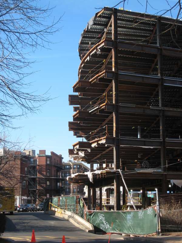
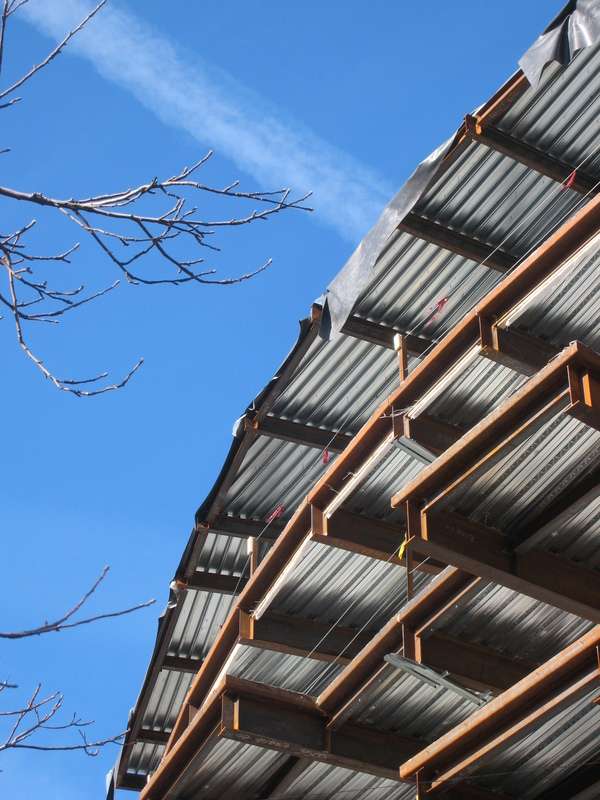
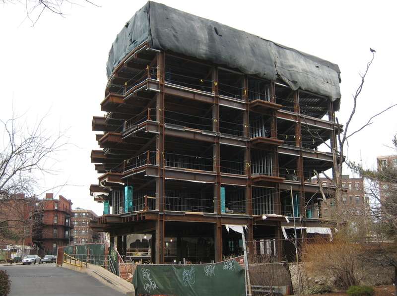
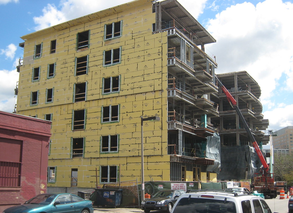
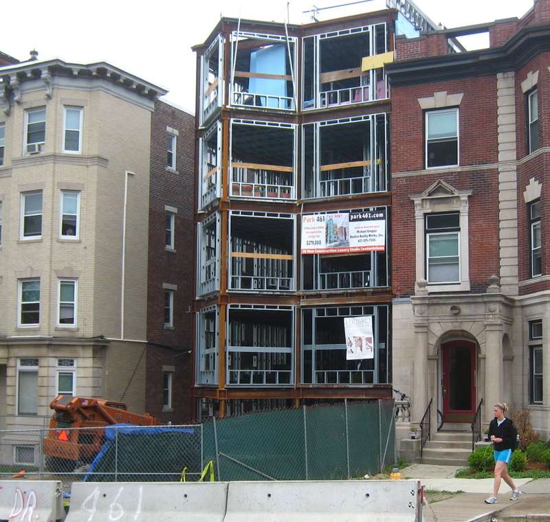
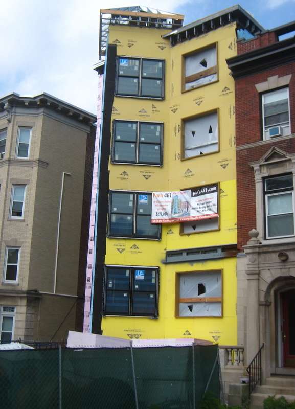
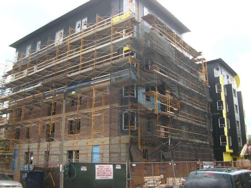
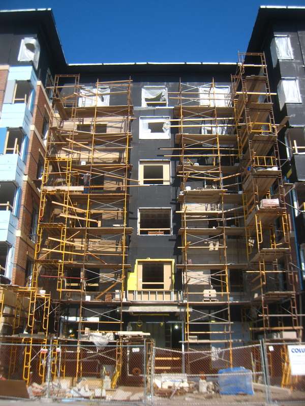
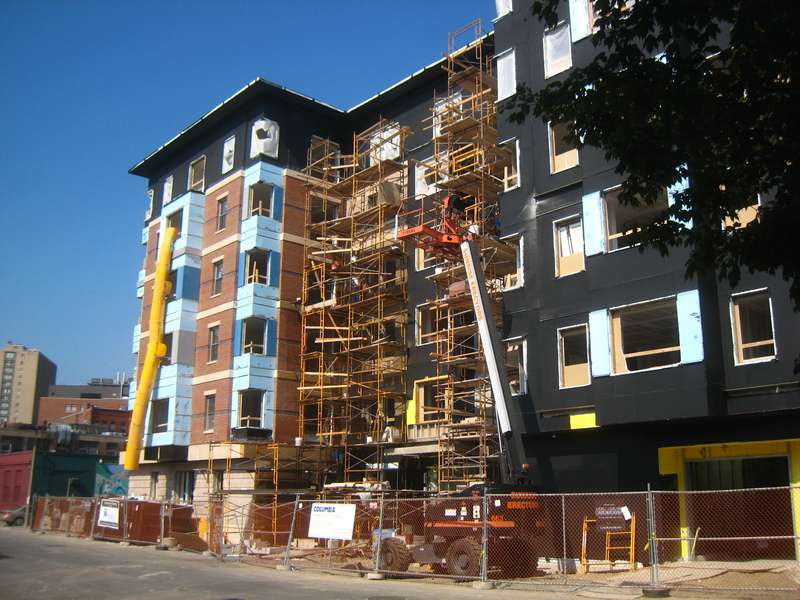
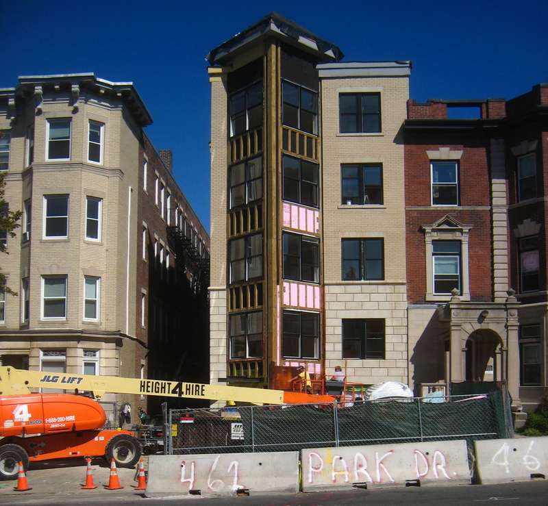
In one of the pictures, it shows all but the top floor bricked, and they top has the black paper. It actually looked really good. And I agree, the small part would have looked cool as like one of those Tokyo-style steel boxes.
Good observation. Accidents of the construction process often produce designs better than the ones intended.kennedy said:In one of the pictures, it shows all but the top floor bricked, and they top has the black paper. It actually looked really good.
- Joined
- May 25, 2006
- Messages
- 7,034
- Reaction score
- 1,865
It is kind of conservative but it is still nicer than most of the new construction in the rest of the city.

