I want to first say I'm glad this project is going up and that it has all the right pieces to be a nice design. It's leagues better than most stuff going up of the same scale.
So, not to be a negative Nancy, but I think that brick building has terrible detailing. Everything is segmented with misaligned joints and strips of reveal that look like afterthoughts.
For example, look at the way the splayed out brick on the flat face is just a repeated module. There's nothing wrong with that alone, but the joints where is meets the standard bond to the left is just a gap. There's no system for where what joint lines up with the surrounding fenestration.
Then right below that module, there's a tiiiiny horizontal sliver of brick (below every module). Why? Why wouldn't they align the full panel with the bottom/top edges of the windows?
The splayed brick is panelized in a confusing order too. In the last shot it looks like it's expanding left on each floor up. But the other facade doesn't follow that rule in any way. Like they couldn't decide if they wanted to embrace a patch-work effect or some larger figure/movement implied through the panels.
There are some quality materials, material effects, and moment details here which I think are captivating to most people. But it's arranged in a really haphazard way.
 IMG_5843 by Bos Beeline, on Flickr
 IMG_5845 by Bos Beeline, on Flickr
 IMG_9510
 IMG_9511
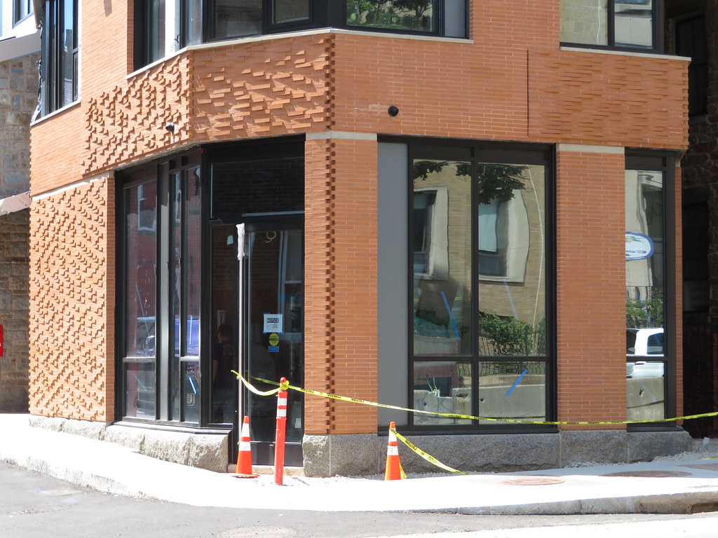 IMG_9512
 IMG_9514
 IMG_9338
 IMG_9340
 IMG_9341
 IMG_9343
 IMG_9345
 IMG_9346
 IMG_9349
 IMG_9350
 IMG_9351
 IMG_9352
 IMG_5226
 IMG_4363
 IMG_4373
 IMG_4372
 IMG_4371
 IMG_4850
 IMG_4851
 IMG_4852
 IMG_4853
 IMG_4855
 IMG_4857
 IMG_4860
 IMG_4858
 IMG_4861
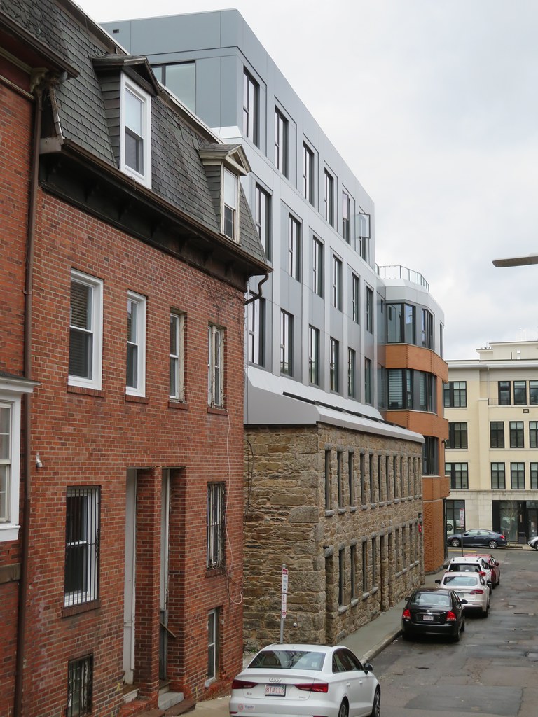 IMG_4864
 IMG_4865
 IMG_4869
 IMG_4871
 IMG_4873
 IMG_4870
 IMG_8554
 IMG_8555
 IMG_8574
 IMG_8557
 IMG_8558
 IMG_8562
 IMG_8564
 IMG_8572
 IMG_8566
 IMG_8568
 IMG_8570
 IMG_8571