You are using an out of date browser. It may not display this or other websites correctly.
You should upgrade or use an alternative browser.
You should upgrade or use an alternative browser.
New Lansdowne St.
- Thread starter statler
- Start date
underground
Senior Member
- Joined
- Jun 20, 2007
- Messages
- 2,390
- Reaction score
- 3
Architecture aside, I don't understand the complaints about this becoming a HOB. When it comes down to it, the programing will more or less be exactly the same. Sure, the new space is larger, but if you think that small local bands were playing the Avalon/Axis, you're living in a dream world. In fact, the show line up posted further up this thread reads more or less exactly like an old show line up for the Avalon/Axis.
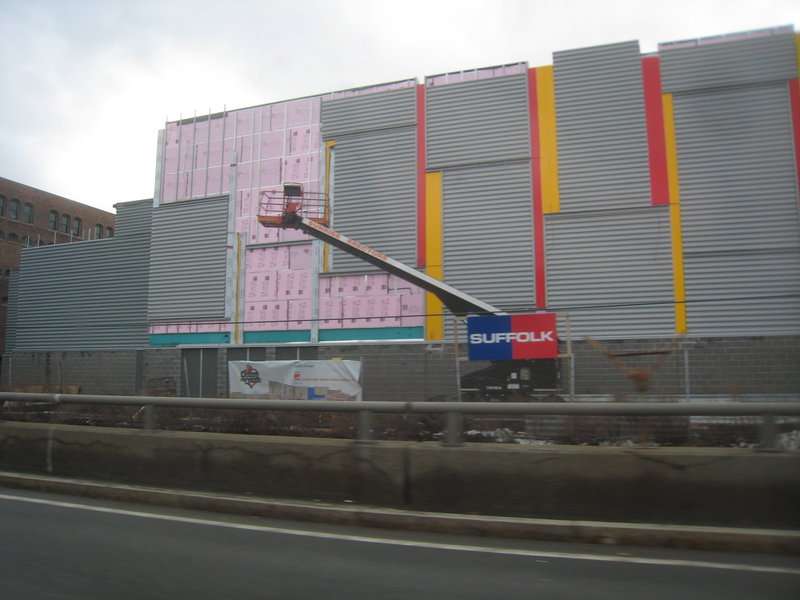
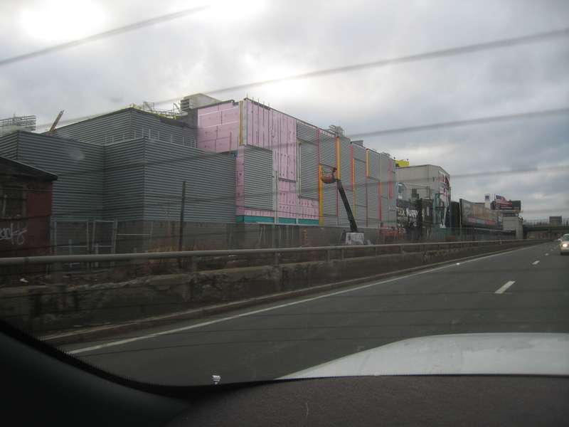
The one picture shown above is the facade facing the pike... moreover its the back side of a club, hence it is a big, blank wall.
Corrugated metal and bright colored panels can create a nice facade if designed properly. Hard to tell from this picture at 60 mph.
I'm not sure what the criticism is, did someone expect limestone and fluted columns?
Corrugated metal and bright colored panels can create a nice facade if designed properly. Hard to tell from this picture at 60 mph.
I'm not sure what the criticism is, did someone expect limestone and fluted columns?
- Joined
- May 25, 2006
- Messages
- 7,034
- Reaction score
- 1,865
Unfortunately the pictures of the front I took didn't come out but I implore you not to judge this building until you see the front. It is a half assed piece of shit.
disturbanist
New member
- Joined
- Jun 6, 2008
- Messages
- 72
- Reaction score
- 0
I took these this afternoon.


briv
Senior Member
- Joined
- May 25, 2006
- Messages
- 2,083
- Reaction score
- 3
Unfortunately the pictures of the front I took didn't come out but I implore you not to judge this building until you see the front. It is a half assed piece of shit.
You weren't kidding. Wow, that's bad.
Looks like they dropped a highway sound barrier on a strip mall.
commuter guy
Active Member
- Joined
- Feb 1, 2007
- Messages
- 894
- Reaction score
- 130
Oh my .... absolutely wretched. I thought the turnpike side was bad until my eyes were forced to view the front facade. Wonder if this passed throught the BRA's vigorous "design review" process.
Ron Newman
Senior Member
- Joined
- May 30, 2006
- Messages
- 8,395
- Reaction score
- 13
There's got to be a better way than that to build a windowless box. This screams out "I'm temporary, someone please demolish me soon!"
If it's a House of Blues, why didn't they try to imitate the architecture of the original Cambridge one?
If it's a House of Blues, why didn't they try to imitate the architecture of the original Cambridge one?
- Joined
- May 25, 2006
- Messages
- 7,034
- Reaction score
- 1,865
If teh entire place was just that corrugated steel part with strips of color it would at least be interesting, if not ugly. This is just offensive, trying to be contextual and sucking, hard. I want to write more hate for this building but it just isn't worth my time.
There's got to be a better way than that to build a windowless box. This screams out "I'm temporary, someone please demolish me soon!"
If it's a House of Blues, why didn't they try to imitate the architecture of the original Cambridge one?
Ron, I bit my tongue a lot through this thread. I understand your fondness to the old House of Blues, but could never figure out how to explain to you that this is the exact opposite of everything the original was loved for.
Now that you've seen pics, maybe my original rant on this project make more sense ... it's pretty bad, isn't it?
czsz
Senior Member
- Joined
- Jan 12, 2007
- Messages
- 6,043
- Reaction score
- 7
So this is where the Port of Boston is stacking its shipping containers now that the SBW is being developed.
As for the rest of it - I always thought the next level of ironic chic would embrace suburban monotony, but not this fast! Party at Lowe's!
As for the rest of it - I always thought the next level of ironic chic would embrace suburban monotony, but not this fast! Party at Lowe's!


