New T Map

kz1000ps

Senior Member
Joined
May 28, 2006
Messages
8,721
Reaction score
9,511
Below is a partial screen grab. The full map can be found here.

0screengfrab.jpg


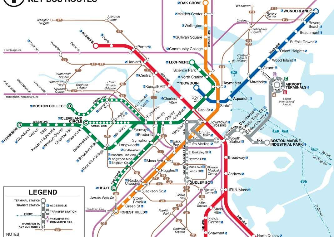
Take A Closer Look: T Has New Subway, Bus Maps

Sep 21, 2009 10:17 am US/Eastern
BOSTON (WBZ) ?

If you stopped looking at the T subway maps years ago because they never change, it's time to take another look.

The MBTA unveiled a new set of maps Monday to replace outdated ones across the city ? some of which are more than 40 years old.

"For the first time ever the maps will display connections to key bus routes to and from subway stations," the MBTA announced in a prepared statement.

T officials used the Government Station stop on the Green line as a prime example of why they maps were in dire need of an update.

Three brand new maps there will include:

* A line map identifying current stations along the Green Line that will replace a sign with outdated Green Line stops;
* A system map depicting connections to the subway and key routes;
* A neighborhood map identifying places of interest in the surrounding Government Center area that has not been updated since station modernization in 1967.

"These maps will replace outdated, incorrect maps and will for the first time ever provide commuters and tourists with up-to-date information about our network of subway, bus, ferry and commuter rail lines," outgoing Transportation Secretary Jim Aloisi said in the statement.

The MBTA is also working on updating its commuter rail maps.

Link
 
...and from Bostonist

Wishful Thinking? New MBTA Maps Include Silver Line Connector

By Rick Sawyer in News on September 21, 2009 10:45 AM

Today at 11 a.m., the MBTA will reveal brand new system maps to replace the old, outdated ones scattered throughout subway stations across the system. The new maps will include crucial updates?the E Line, for instance, hasn't gone to Forest Hills since 1985?as well as new features, like the routes of key bus lines, including the 1, the 22, the 39, the 57, and the 66. It's about time. Some of the system maps in T stations haven't been replaced since 1967, making them hilarious artifacts that show buildings that were never built and subway lines that no longer exist. (One map reportedly still shows the A Line, which went to Watertown... until 1969.)

But the new maps might not be much better. As seen at the right, the new system map shows "the new Silver Line Connector to South Station from Washington Street," which, the astute among you might point out, does not exist.

The last we heard, the MBTA had ditched its ambitions to dig a giant hole underneath the Common, and had opted for a more modest Bus Rapid Transit (BRT) connection between New England Tufts Medical Center and South Station. The BRT project was slated to cost a mere $100 million, as opposed to $2.1 billion for the "little dig" under the Common, and was to be subsidized by federal stimulus money. Of course, nothing has been built yet, and the BRT is not expected to go into operation until 2012.

Is including the Silver Line connector on the new map a case of wishful thinking? Is this a folly we're going to be laughing about in 2015 while we're still going from Chinatown to South Station by foot?

Link
 
I'm split; on one hand the added bus routes are a really great idea since they give some context to where certain lines connect and also deal with the psychological problem people have with transit (that is, if you don't present the bus as part of the network people have a harder time wanting to use it.), but on the other hand they really messed up a pretty attractive map.

That Silver Line connection really could have been handled better, graphically, too.

Edit: They FINALLY make it clear that there is a connection between Park and DTX. The black line they uses to use was too hard to see.
 
A gray fungus grows.
Chinatown is devoured.
All for a bus line.
 
Very nice, Shepard
At first I did not get it
Now I see the light
 
This makes it all the more absurd that the Silver Line is colored as if it were a full fledged mass transit line.

And with the connector wishfully inked in, it's now quite literally a lie.

PS: ALL of these "key" bus lines would, ideally, become (or revert to) light rail. DC is in the process of replacing some of its most crowded lines in this way.
 
lowercase capitals? what was wrong with the clear, consistent typeface of the old map? this looks absolutely terrible
 
The SL connector isn't exactly a lie... from what I've read it will start running overground in the next week or so.

Still, I feel horrible for the inevitable tourist who, getting off at South Station and looking to get to his/her Back Bay hotel, consults the map and proclaims "Silver line to Orange line. Rapid and easy!"


By the way, why is replacing these maps such a big-to-do here? From what I can tell in NY, each map is a large printed piece of paper placed inside a plastic frame. When the map changes, they open the frame and replace the piece of paper. The map there seems to change constantly and often reflects temporary medium-term service changes. What do we do here that makes it so much more difficult? Pay 100 Fort Point artists to produce a map on etch-a-sketch, seek widespread community approval, and silkscreen the result onto permanent slabs of stone that can't be touched for 25 years?

--

Edit: one more observation... Arlington has arrived on the T map! How will residents prepare for the indigent loiterers who will inevitably arrive on the next 77 bus and stay permanently?
 
I don't like the inclusion of the buses because it clutters the map. Also, the inclusion of the Silver Lie is garbage and it will add to confusion for tourists expecting a subway train. It's interesting how the T will print a non-existent branch that it wants to build but erase any mention of the Arborway which it hopes to never rebuild.

Didn't they redo these just a few years ago at great expense along with the claim that all maps would be updated?
 
God, please some tech entrepreneur just offer to sponsor a series of LCD monitors in stations with a constantly updated map that can show delays, headways, and other RT changes. I will gladly accept this being branded with obnoxious Silicon Valley logos. The same software could broadcast to handheld apps.

It would be a huge improvement, AND savings.
 
Addition of a few key bus lines is good. Silver Line needs to be shown as a bus line, which is all the hell it is (sleazy deception that fools only the first-time gullible).
 
God, please some tech entrepreneur just offer to sponsor a series of LCD monitors in stations with a constantly updated map that can show delays, headways, and other RT changes.

I returned from Japan with much the same sentiment. They could have piloted it on the Blue Line, to better assist the traveling public. As it is, these new Siemens Blue Line cars have the vibe of a Rubbermaid bin, the apotheosis of value-engineering. It's the only kind of engineering the MBTA does.
 
They missed a clear opportunity to upgrade the #1 bus to the Gold Line and the #66 to the Copper Line. That could have been two new "subway" routes for the ink-related costs of thicker lines on the map.
 
By the way, why is replacing these maps such a big-to-do here? From what I can tell in NY, each map is a large printed piece of paper placed inside a plastic frame. When the map changes, they open the frame and replace the piece of paper. The map there seems to change constantly and often reflects temporary medium-term service changes. What do we do here that makes it so much more difficult? Pay 100 Fort Point artists to produce a map on etch-a-sketch, seek widespread community approval, and silkscreen the result onto permanent slabs of stone that can't be touched for 25 years?

In Boston's defense it's not like service changes that much. In NYC they have to deal with literally thousands of maps so paper is cheaper. If Boston only needs to update their maps every 10 years or so (not even) then they have more leeway.
 
According to a new article, Joe Pesaturo said that the connection is starting next month.

MBTA upgrades maps, some 40 years old
By Noah Bierman, Globe Staff

The MBTA began a two-year effort this morning to upgrade its rapid transit maps -- known as spider maps -- in its stations, along with some neighborhood maps that haven't been upgraded in more than 40 years.

The new spider maps show 15 key bus routes, for the first time, along with subway lines, commuter rail lines, and the Silver Line enhanced bus service. The first map went up today in Government Center station. Eventually, the new maps will go up in every subway, commuter rail stop, trolley stop, and bus terminal. Smaller maps with a few less details will go up in subways and trains.

The T replaces old route maps every few years, but this is the first major systemwide upgrade in a long time, though officials could not say exactly how long.

The neighborhood map that was also replaced in Government Center had not changed since 1967, when the station was known primarily as Scollay Square. It showed, for example, the old elevated highway where the Rose Kennedy Greenway now sits, as well as a planned linear office building near Faneuil Hall that instead became the Holocaust Memorial.

The new spider maps still have a few quirks -- including showing a Silver Line link between from Washington Street to South Station that will not be in service until next month. "Would you prefer we put up maps now and then again in a month?" said Joe Pesaturo, MBTA spokesman, in response to a question about potential confusion. "It's already been over 40 years."

The map replacement project is expected to take two years and cost a total of $500,000 -- including labor and production, Pesaturo said.

http://www.boston.com/news/local/breaking_news/2009/09/mbta_upgrades_m.html
 

Back
Top