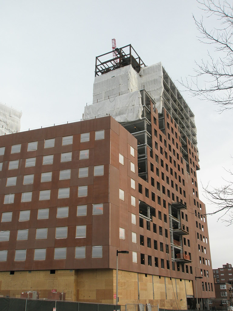
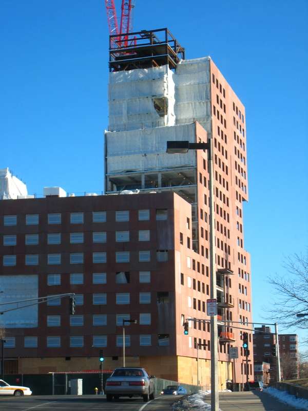
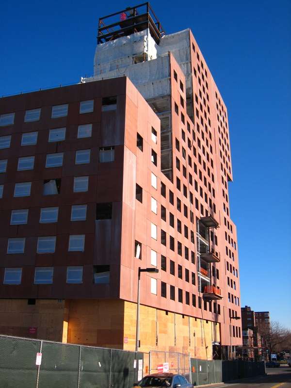
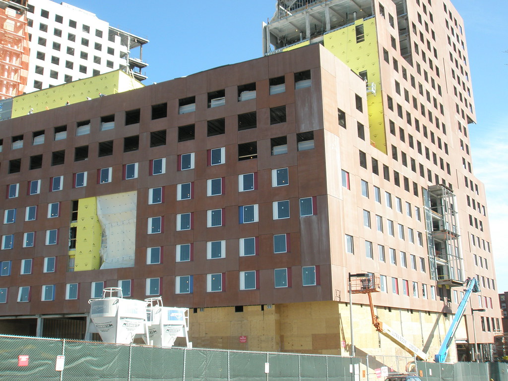
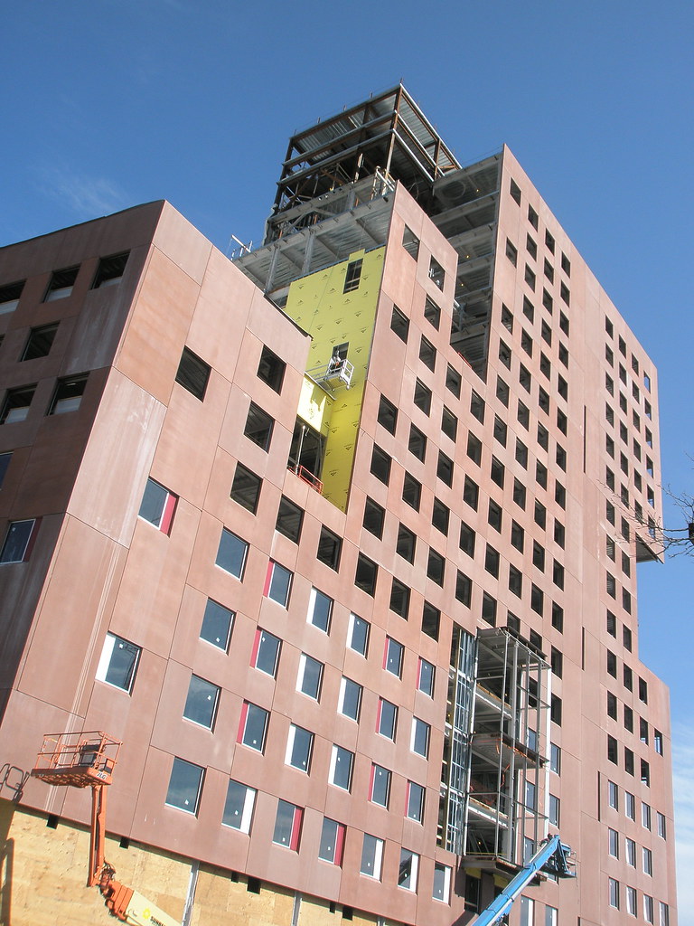
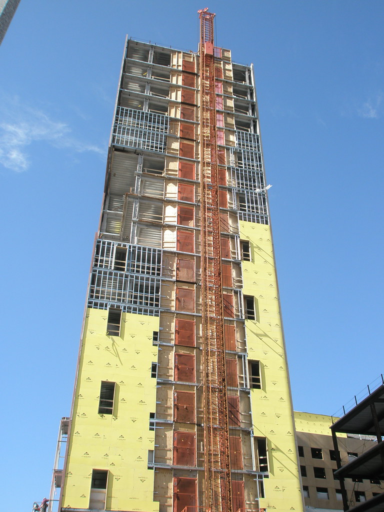
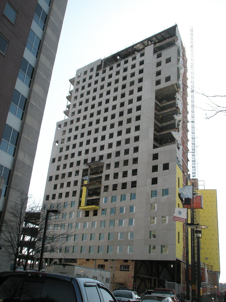
The "skin" of this building is truly cheap and ugly. Apparently there wasn't much attention paid to quality control when the slabs were being manufactured as the colors don't come close to matching. Unbelievably the "brick" color and the "sandstone" color are not consistent and some slabs are several shades off from their neighbors. I can't believe Northeastern would trash this very high visibility location. Penny wise and pound foolish.
You are using an out of date browser. It may not display this or other websites correctly.
You should upgrade or use an alternative browser.
You should upgrade or use an alternative browser.
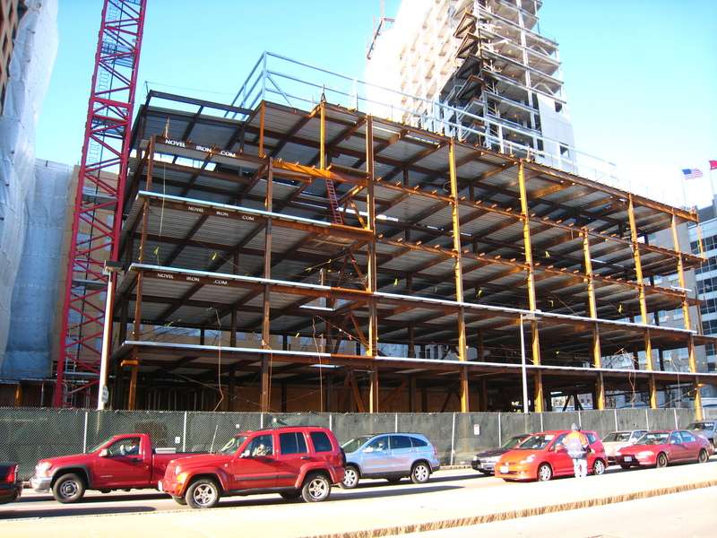
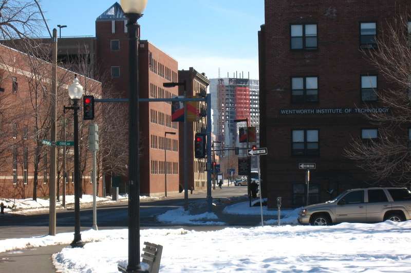
Northeastern eyes dorms
- Thread starter KentXie
- Start date
Why does so much Greater Boston new construction look like this?
(Rhetorical question, I know the answer.)
Beton Brut
Senior Member
- Joined
- May 25, 2006
- Messages
- 4,383
- Reaction score
- 354
Strangely, the massing and color appear contextual with the public housing across Tremont Street.
Baker House this ain't...
Baker House this ain't...
BarbaricManchurian
Senior Member
- Joined
- Mar 12, 2007
- Messages
- 1,067
- Reaction score
- 65
OK like I said earlier, this looks like absolute shit. At least have fake brick, or (know this is unlikely) a stunning glass facade, to put a modern contrast to a beautiful historic neighborhood. I can stand fake brick, but awful painted concrete (seriously looks like cardboard) can't go on ANY building at this low quality. This is terrible, it would be a disgrace even in developing countries and cities like Dallas, NY, etc...
czsz
Senior Member
- Joined
- Jan 12, 2007
- Messages
- 6,043
- Reaction score
- 8
put a modern contrast to a beautiful historic neighborhood
There's a neighborhood here? And history? I only see the ugly 90s(?) BPD HQ and the ugly midcentury projects nearby.
...which is why, no matter what they use on its skin, this thing is a huge improvement.
kz1000ps
Senior Member
- Joined
- May 28, 2006
- Messages
- 9,187
- Reaction score
- 13,721
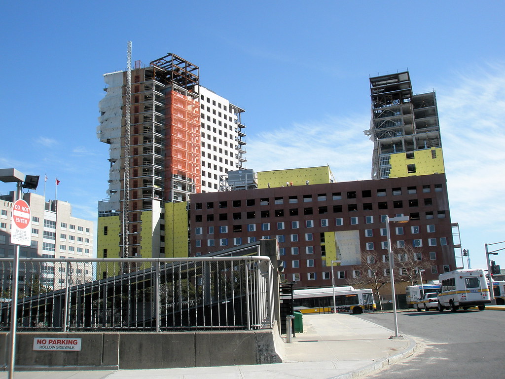
I also dont get why it seems like different sides are different colors.
I noticed that too yesterday. For instance, the west tower (next to Ruggles St) is red on its north and west facades, yet its beige on the east. I'll post some pictures of it in a little bit.
The entire facade reeks of incompetence. I can't wait to see how cheap the window frames will look!


im reserving final judgement for this building until its 100% complete
^ Our judgment on this forum has no influence anyway. If it did, however, this would be a policy of impotence masquerading as objectivity.

TomOfBoston
Senior Member
- Joined
- Mar 29, 2007
- Messages
- 1,272
- Reaction score
- 512
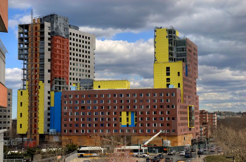
So one tower is sort of beige and the other tower is sort of blotchy red????
The only thing I truly dislike in all the recent NU expansion is that useless strip of grass along Ruggles Street.
That strip of grass is to allow Ruggle St to be widen to 4 lanes. NU supports this but the project people are against it.
I also think NU will not accept an inferior product.
I was by this building today and have to say that this is truly one mean and ugly building.
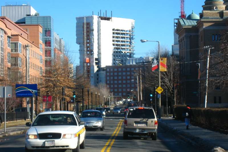
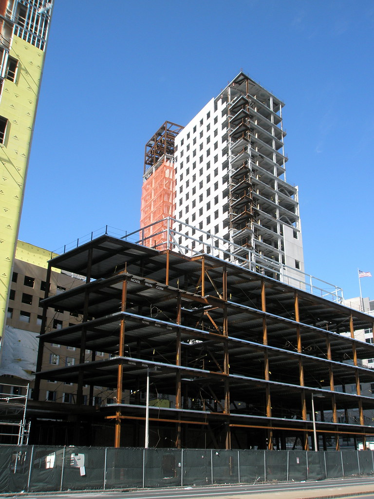
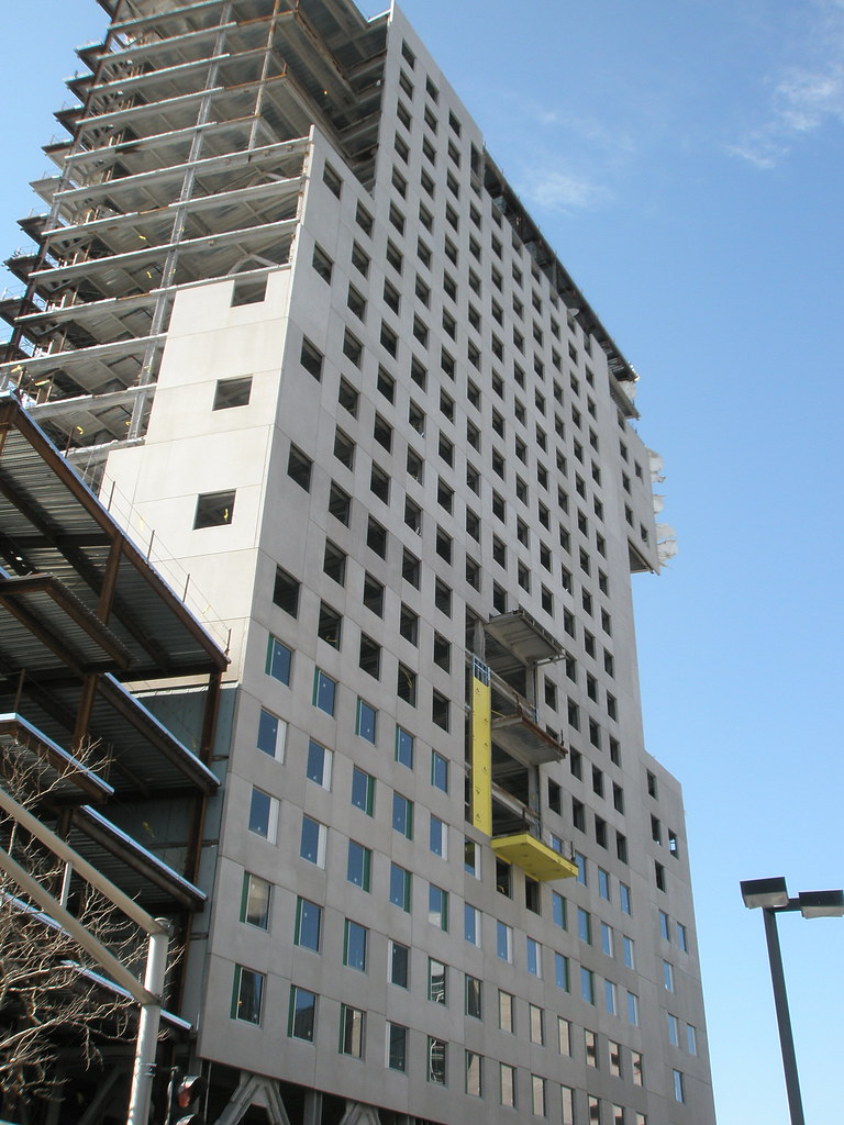
Approaching it from Columbus it's at its best; Columbus finally feels like it has a real termination point instead of fizzling out into vacant lots, and as has been previously said, the white tower (facing Columbus) is its best face. It's actually not too bad.
BUT, the red tower is awful...nothing but huge mis-matched red (salmon-red is more accurate) pre-cast panels. The windows, with the operable portions painted primary colors, look like they were taken from a 1970's public school.
This is truly an unfortunate piece of architecture that could have/should have been a positive link between the Longwood/Fenway area and Roxbury.
Last edited:
dshoost88
Senior Member
- Joined
- Apr 14, 2008
- Messages
- 2,189
- Reaction score
- 2,731
I really doubt Northeastern is gonna keep the red. Afterall, it doesn't show up in any of the renderings. The photos don't really do the building justice. Up close, it's much nicer and really melds in well. And even if they do keep the reddish, I'm sure once all construction is done next year it'll be just as beautiful as the rest of the newer buildings on campus. I'm a student at Northeastern, and personally I like the building. It's great that they're going to have a dining hall at Parcel 18 because it's much closer to West Village residents. Also, they're aiming for LEED gold certification with this building from what I've heard.