Ode to Brutalism

Interesting link from an artistic viewpoint.

30 pictures. Yes, I find the angles and sculpture of it compelling.

Now, who can tell me the total number of humanoids in the sum of those pictures?

Sadly, THAT'S the point.

As was mentioned by someone else above, that's only partly true - obviously the photographer waited to get people-less pics.... now, whether you think these buildings actually look better as art pieces or can still look great when filled with people is another question.


Thanks for the link, statler. Paulo Mendes da Rocha is a rockstar with concrete.

Hoping to see this at MoMA some weekend:

Toward a Concrete Utopia: Architecture in Yugoslavia, 1948–1980

The range of expression is wide, from purely utilitarian to visionary futurist grandeur.

And a more humane take on hard modernism, in scenic Iceland. I'm embarrassed to say that I was unfamiliar with Högna Sigurðardóttir's work.

Definitely need to get to NYC before that closes. Looks awesome.
 
- obviously the photographer waited to get people-less pics.... now, whether you think these buildings actually look better as art pieces or can still look great when filled with people is another question.

I understand the unpeopled aesthetic, but it's become overused, and to your point, unhelpful in broadening the audience for challenging architecture.

These folks seem to be having a lovely time:
barbican-exterior-3_2.jpg


barbican-exterior.jpg


The Barbican is arguably the greatest "one-hit-wonder" in British Brutalism. With the exception of Murray Edwards College at Cambridge University, there's nothing Chamberlin, Powell and Bon's portfolio possessed of Barbican's symphonic and moody futurism.
 
Barbicon, the C7 building in Harvard Sq, the Aquarium and the Christian Science Plaza all prove one thing: brutalism can work if it has well designed urbanism. People love well defined and designed urban spaces. Shit, that's why suburban malls were so popular; they were the urban market in a self contained bubble.

Too many people are too concerned with how a building looks and not how it works within the city. City Hall would be an icon if it was surrounded by a plaza that people wanted to use. I love the Paul Rudolph Hurley Building to death but that is going to be far harder to urbanize.
 
Are most beton brut structures uninsulated? It seemed to be an era with a lot of single-pane glass and a pre-1973 sense of cheap heat (or building in southern Europe where all you need is thermal mass).

What did they do with Le Corbusier's museum at Harvard? How do they keep the floor from getting freezing cold where it juts over the foundation(s)?
 
I understand the unpeopled aesthetic, but it's become overused, and to your point, unhelpful in broadening the audience for challenging architecture.

These folks seem to be having a lovely time:
barbican-exterior-3_2.jpg


barbican-exterior.jpg


The Barbican is arguably the greatest "one-hit-wonder" in British Brutalism. With the exception of Murray Edwards College at Cambridge University, there's nothing Chamberlin, Powell and Bon's portfolio possessed of Barbican's symphonic and moody futurism.

The massive difference between the Barbican and the 30 pictures of locations in that previous link are the ground floors of the buildings

Compare your two Barbican pictures that have windows, doors and openings inviting interaction and the blank walls of the link's 30 locations.

Humanity can be accomplished with Brutalism, but the architect needs to be deliberate to achieve it.

.
 
Last edited by a moderator:
Awesome. Not really brutalism but amazing.

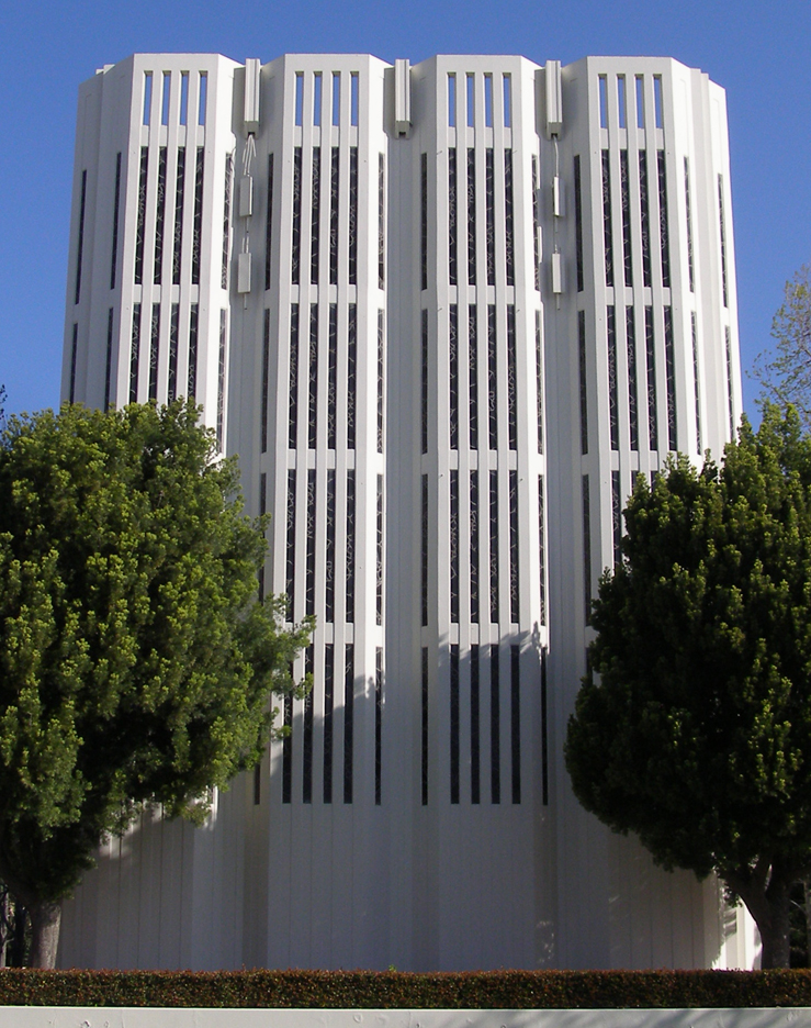
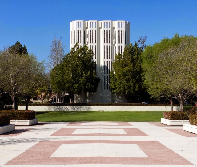
I was at Claremont two weeks ago for the first time — wow. Soooo much 60s modernism. I spent most of my time at the School of Theology and it's a perfect campus; the chapel (Kresge Chapel) is seriously worth visiting. If I ever make a Flickr account I'll post my pics, since what's online doesn't do it justice.

Here's a few, though:
pommod.jpg

Edward+Durell+Stone+Claremont+School+of+Theology+7.jpg

KresgeChapel_ARG.JPG

Blog%2028%20Sep%2009%20Claremont%20chapel.jpg

IMG_04251.jpg


And next door is this amazing bank, by Millard Sheets, 1967 (I think). No good pics online but this gives the idea.
 
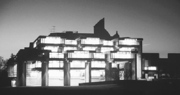
I've always liked UMass Dartmouth by Paul Rudolph:

umass-dartmouth_evening.JPG

That is one of the ugliest campuses on God's green Earth. It looks like the architect got drunk while watching the Jetsons and then switching over to a Star Trek episode from the Klingon home world.
 
That is one of the ugliest campuses on God's green Earth. It looks like the architect got drunk while watching the Jetsons and then switching over to a Star Trek episode from the Klingon home world.

A subjective judgement can go either way on architecture, especially brutalism. I love that campus, so that's my subjective take on it.
 
That is one of the ugliest campuses on God's green Earth.

Building on Charlie's reference to subjectivity and the forces that drive the formulation of tastes and the gravitational draw of aesthetics, I consider music a prime indicator of visual and spacial preferences. Wright said that "Architecture is frozen music," so it's no great leap of logic. Further, Rudolph's aggressive, even obsessive devotion to micro- and macro-geometry is a surely a development of his interest in Wright. The rhythmic drive of the plans and elevations of both architects is crystal clear.

So what does Rover listen to? There are no incorrect responses, and no intent at judgement. I'm genuinely curious about why you can easily dismiss the work of an architect I hold in the highest esteem.
 
Not saying that UMASS Dartmouth is the ugliest campus but when I was visiting colleges 10 years ago UMASS Dartmouth was one of the colleges I went to. After the tour I remember talking to my mother and took it off my list because it honestly felt like I was in a Jail the whole time I was touring. The programs at the college were interesting but I couldn't see myself living in a jail for 4 years of my life. Back then I didn't have an interest in Architecture so maybe I would view Dartmouth in a different light now but I vividly remember wondering why anyone would want to live in such place.

Anyways that is my anecdotal feelings and experience with Dartmouth which might shed a light on what a non architecture enthusiast feels when exposed to Brutalism.
 
I've been recently, and I just feel like the architecture is aesthetically beautiful (in some cases) but more as a an art piece or a sculpture; living there and interacting with it in that way is so different and not as pleasant. I think this also has a lot to do with how spaced out the campus is, so its more than just the architecture.
 
UMD has done a pretty good job of renovating some of the Rudolph buildings in recent years. I grew up going to summer camps during the “prison” days when the glass went unwashed, the concrete was crumbling, and the interiors were dark and dingy. They’ve gone to great lengths to improve the experience and I think they’ve done well. You may always hate it, but if you haven’t been in +/- 10 years, you’ll be surprised if you go back now.
 
Holy crap these are bad. Theres a couple examples that came out good, but overall this has to be the worst architectural style...ever. I dont think theres anything wrong with saying overall this was one huge mistake. It goes with the times though, the 50s had a horribly wrong view of what the future was going to be aesthetically, culturally, technologically... because nothing that became of the future had been laid yet. That made it a completely skewed vision that was 100% wrong and it deviated so far from the norm that it was detrimental. Things that “work” are natural progressions, these were not, thats why they dont hold up.

It was a look towards the future, before having any idea of what that was, where none of the groundwork for the future had been laid yet, and on top of that forgetting the past. Recipe for disaster...and it was. The future is never a clean break from the past, its always a progression, brutalism was a clean break, thats why it doesnt work. Once the 60s hit the cultural groundwork of the future had been laid, the 70s the aesthetic, and 80s the technological groundwork was laid. The times we live in now are all progressions from things that were laid then and before as well. Brutalism of the 50s was about forgetting the past and looking towards the future before any of the foundation had been laid. I think thats why its so disconnected...from everything.

Also I dont think we “have” to keep the absolute duds, just because theyre “historic”. That means youre stuck with mistakes forever. Thats unfair. I think the important pieces should be kept, also spread out as too many in one place is bad, but unfortunately so many of them are so cold and disconnected that keeping them is a detriment to everything you have. Some schools may be cold and unforgiving forever if they have no choice but to keep this stuff. Thats a tough position to be in.

I think we need to have a real conversation about this stuff and what to do with it, because a lot of it is detrimental to keep around. Do we need to keep it as is? How much can it be changed? Should we just get rid of the real bad stuff? Is this era even important? Things like the city hall are a DISASTER, but now we have to have a conversation about how to keep it... that sucks. Unfortunately this was also the time of urban renewal so theres lots of it and as bad as it is it had a HUGE impact. Were going to be affected by it forever like with the west end, but in lots of cases if you do it right it can be beneficial like creating the greenway from the central artery. It could have been worse too like the highway through central sq or the cross manhattan expressway...yikes.
 
Wright said that "Architecture is frozen music," so it's no great leap of logic. Further, Rudolph's aggressive, even obsessive devotion to micro- and macro-geometry is a surely a development of his interest in Wright. The rhythmic drive of the plans and elevations of both architects is crystal clear.

That's amazing, because before I read your post I was also thinking Rudolph's work at UMass Dartmouth is reminiscent of the prairie style of Frank Lloyd Wright. The horizontal elements are pronounced, the elements of the buildings overall are more fine than massive, not the heaviness present in some of the other architects' brutalist works.

I am probably somewhat biased because I graduated from SMU in 1976 (now UMass Dartmouth), got a BS in Civil Engineering, then a masters degree elsewhere later. I loved it there, and I loved the buildings. I was the first ever in my family to go to college so it has sentimental value for me as well.
 
Not saying that UMASS Dartmouth is the ugliest campus but when I was visiting colleges 10 years ago UMASS Dartmouth was one of the colleges I went to. After the tour I remember talking to my mother and took it off my list because it honestly felt like I was in a Jail the whole time I was touring. The programs at the college were interesting but I couldn't see myself living in a jail for 4 years of my life. Back then I didn't have an interest in Architecture so maybe I would view Dartmouth in a different light now but I vividly remember wondering why anyone would want to live in such place.

Anyways that is my anecdotal feelings and experience with Dartmouth which might shed a light on what a non architecture enthusiast feels when exposed to Brutalism.
The experience is as important as the aesthetics. When my mother used to have to drag me to City Hall for whatever reason as a kid, the size and maze-like qualities were fascinating, not to mention the dark atmosphere. I just wanted to explore it, even if, in reality, there's nothing too interesting in there. I like Brutalism for that reason - what others see as inhuman and foreboding I see as dramatic and captivating.

I guess that's just as much a function of nostalgia, though. I have the same feelings for postmodern as well, since many of the big, flashy, fun buildings of my childhood were things like the various Gallerias that went up in the 80s and 90s.
 
I toured UMD in 1995 and ended up attending for a year before transferring to AZ (talk about a huge difference). But anyway - I liked the campus a lot. It was visually interesting. I was an art/animation student, so maybe that's why I was drawn to it. Subjective indeed. But I'm also a huge Star Wars fan. So maybe I wanted to pretend I was on another planet my entire freshman year?
 

Back
Top