Old Port Square (née Canal Plaza) | Portland

I'd be fine with reindustrialization, to be honest, and that includes the grain elevators (there were originally two at GT, which I don't remember, and a smaller one near Hobson's Wharf which I remember well).
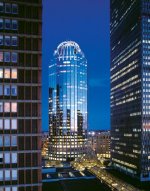
 
1766075890252.png
 
It's one thing to suggest building industrial grain elevators again ... it's another when designing what is so obviously an ugly pencil/needle d*ck of a building.

The facade - yup, will be great for birds to nest and shit all over, bravo on that brilliant and well thought out design.
The top - probably a great location for nests and bird shit, an errant trash bag blowing in the wind ... who knows?
The angled corners - why the f*ck would you even do that? It doesn't "ADD" any "ooh-la-la" to the design.

Want something that will actually resemble a lighthouse and not a cheap solar patio light ... look at 111 Huntington in Boston. Build THAT.

Methinks the architect has never seen a lighthouse in their lives ...
 

Attachments

  • Lantern1.jpg
    Lantern1.jpg
    110 KB · Views: 36
  • 111_Huntington_Avenue.jpg
    111_Huntington_Avenue.jpg
    67.2 KB · Views: 41
  • 111_Huntington_Avenue_2.jpg
    111_Huntington_Avenue_2.jpg
    66.9 KB · Views: 40
Last edited:
Here's a couple more.....glass tower in Denmark.....lighthouse style tower in Russia.
r59xkjm5br7c1.jpeg
khimki-russia-june-3-2019-mayak-residential-complex-under-construction-in-form-of-a-lighthouse...jpg
 
Even 432 Park Ave NYC is "basic" and doesn't need to look stupid with anything on top.

Same w/220 Central Park South, 111 West 57th, One Madison, One57 ... you don't need a superfluous top
 

Attachments

  • 432_Park_Avenue,_NY.jpg
    432_Park_Avenue,_NY.jpg
    2.7 MB · Views: 33
I guess I'm in the minority here, but I don't mind the design. It's not my favorite but I'm not upset about it. Also, they said they took inspiration from lighthouses... That doesn't mean the building is actually supposed to look like a lighthouse, which is good, because that would be pretty corny.
 
I definitely prefer this design to that of the R2-D2 building, in fact the "hat" reminds me of the one on that building's neighbor, 101 Huntington.
 
It's one thing to suggest building industrial grain elevators again ... it's another when designing what is so obviously an ugly pencil/needle d*ck of a building.

The facade - yup, will be great for birds to nest and shit all over, bravo on that brilliant and well thought out design.
The top - probably a great location for nests and bird shit, an errant trash bag blowing in the wind ... who knows?
The angled corners - why the f*ck would you even do that? It doesn't "ADD" any "ooh-la-la" to the design.

Want something that will actually resemble a lighthouse and not a cheap solar patio light ... look at 111 Huntington in Boston. Build THAT.

Methinks the architect has never seen a lighthouse in their lives ...
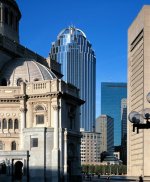
Sorry- but 111 Huntington is AWFUL and dated.
 
Screenshot 2025-12-19 at 6.00.42 PM.png

From an article today in the Portland Press Herald by Hannah LaClaire with the primary focus being on whether this approved 30 story tower will lead to even more of them in Portland. Surprisingly positive read with some support from individuals that I normally would not expect. If the paper could only get the height of The Casco correct, the gap between 204' when compared to 380' does not seem as drastic when compared to 190'.
 
Last edited by a moderator:
IMG_2986-1268x2048.png
If the building had a few setbacks as it reaches the crown, it would look much less awkward and wouldn’t appear so top heavy for a relatively modest highrise.
Just an observation.
 
Last edited:
This is what it would look like without the crown. Honestly, I like it better with it than without.

View attachment 69568
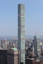
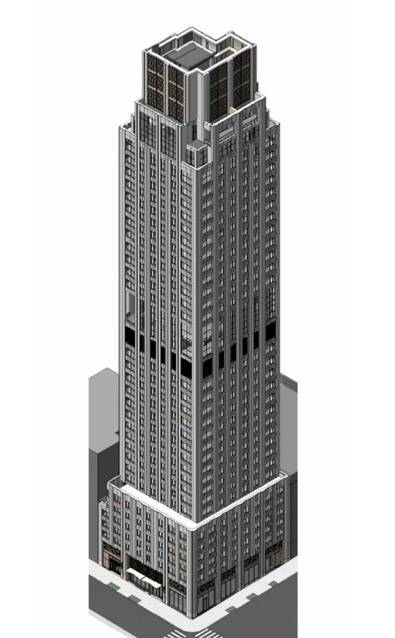
For me, this is reinforcing the sentiment that I just think the building as a whole is unattractive. The hat may be the first jarring element the eye lands on, but it's not the only thing keeping the building from looking better. Obviously it's all subjective, some people like it. But the more I look at it, the less I like about its appearance (again, the scale/height are fine - great even).
 

Back
Top