You are using an out of date browser. It may not display this or other websites correctly.
You should upgrade or use an alternative browser.
You should upgrade or use an alternative browser.
One Post Office Square Makeover and Expansion | Financial District
- Thread starter JumboBuc
- Start date
BosDevelop
Senior Member
- Joined
- Jul 25, 2006
- Messages
- 1,511
- Reaction score
- 351
David Z:
Where in Weston if you don't mind me asking? Doublet Hill area?
Where in Weston if you don't mind me asking? Doublet Hill area?
David Z:
Where in Weston if you don't mind me asking? Doublet Hill area?
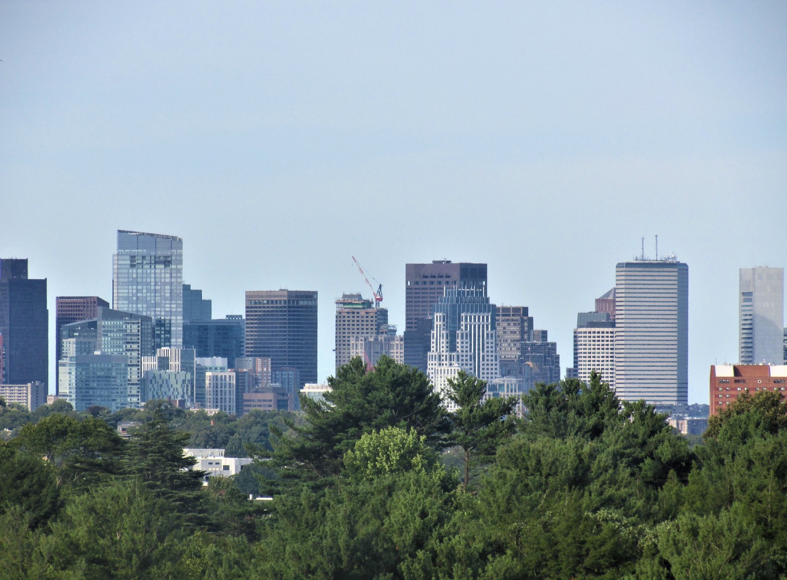
Yes that's exactly where it was. There's a small opening in the trees right near the top of it. It's a very narrow view but if you're standing in the right spot you can capture the full skyline.
citydweller
Active Member
- Joined
- Aug 23, 2019
- Messages
- 438
- Reaction score
- 684
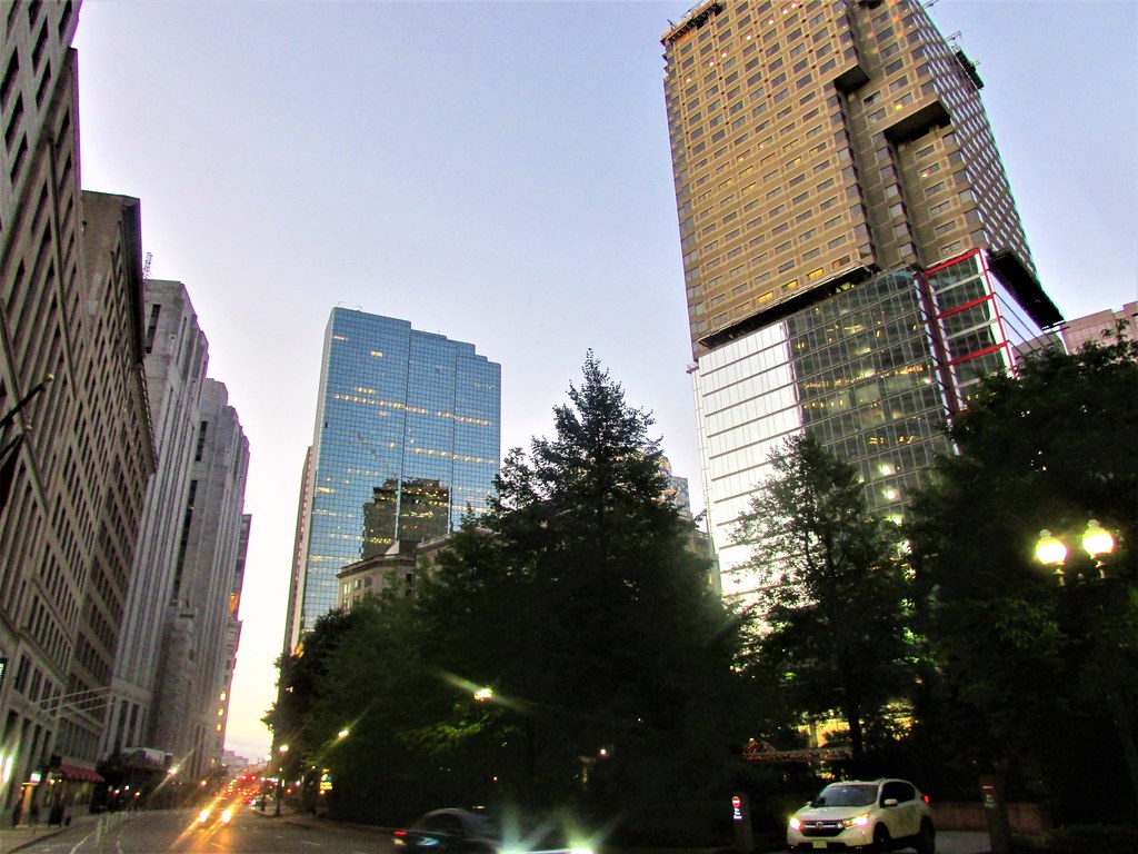
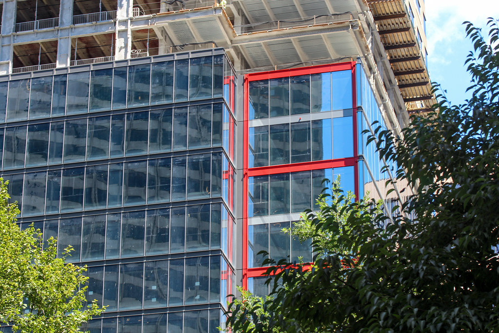
I was skeptical about this makeover but the high quality reflective glass is really exceeding my expectations and changes the appearance to the point that it looks like a completely different building. much improved.
- Joined
- Jan 7, 2012
- Messages
- 14,062
- Reaction score
- 22,726
 IMG_2060 by Bos Beeline, on Flickr
 IMG_2061 by Bos Beeline, on Flickr
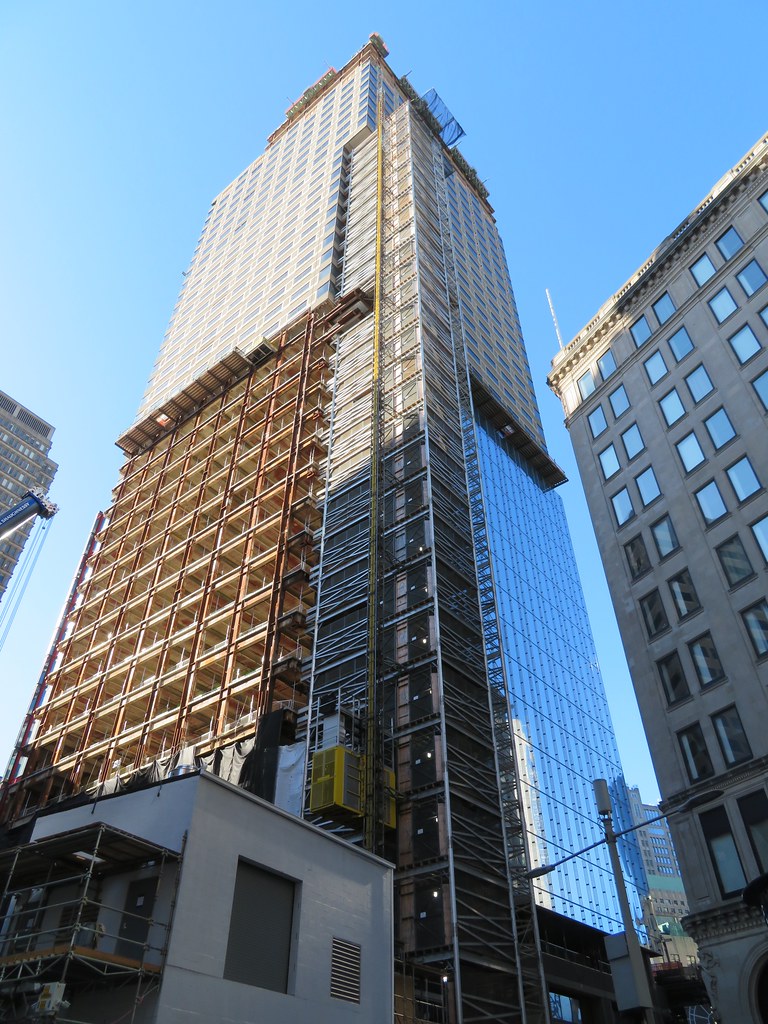 IMG_2063 by Bos Beeline, on Flickr
 IMG_2065 by Bos Beeline, on Flickr
 IMG_2083 by Bos Beeline, on Flickr
 IMG_2084 by Bos Beeline, on Flickr
 IMG_2085 by Bos Beeline, on Flickr
 IMG_2282 by Bos Beeline, on Flickr
 IMG_2286 by Bos Beeline, on Flickr
stick n move
Superstar
- Joined
- Oct 14, 2009
- Messages
- 12,066
- Reaction score
- 18,807
Its going from being 1POS to 1 post office square...
Massachoicetts
Active Member
- Joined
- Jun 4, 2019
- Messages
- 573
- Reaction score
- 713
Can One Beacon do this... ?
stick n move
Superstar
- Joined
- Oct 14, 2009
- Messages
- 12,066
- Reaction score
- 18,807
I definitely wouldnt want blue glass for one beacon. Thatd be way too much. I honestly think its perfectly fine as is, as a background building with a Boston red-brown pallette. Its literally the perfect background building for downtown being just a box with its Boston esque color.
You dont want too many blue glass boxes or it becomes anywhere else fast and you also dont want too many busy standout towers either or you end up with Londons sq mile skyline. I say let it be and build more new towers to add to the solid base downtown has.
You dont want too many blue glass boxes or it becomes anywhere else fast and you also dont want too many busy standout towers either or you end up with Londons sq mile skyline. I say let it be and build more new towers to add to the solid base downtown has.
i wasn't advocating for blue glass, necessarily -- id welcome *any* recladding/rehsaping of one beacon (or one federal). a crown, a spire, some color variance, lit-up at night. anything. i get the "boston-esque" color scheme (as you put it, although you could pretty compellingly argue that there are plenty of other cities in the country and the world where "brick" is the historical color palette), but these squat, blocky, file-cabinet monstrosities (i'm looking at you verizon tower) do nothing positive for the skyline from a distance or for the urban experience from street-level. any re-imagining -- such as what's going on with one post office sq. -- would be a massive upgrade. we don't have so many skyscrapers that we can afford to have two of the few be a "background building" if they're going to be so goddamn ugly.
.....we don't have so many skyscrapers that we can afford to have two of the few be a "background building" if they're going to be so goddamn ugly.
We have 20 over 500' and 23 over 150m. Out of those, I would say the stand-out ones include:
-John Hancock Tower
-Prudential (aesthetics aside it was groundbreaking and remains fairly unique)
-1 Dalton
-Millennium Tower
-Federal Reserve
-1 Boston Place (I like it, it's evil like Darth Vader, basically our mini version of Chicago's John Hancock Center)
-International Place (aside from the unfortunate Palladian windows)
-111 Huntington
-2 International Place
-Exchange Place (very LA-like)
-Sudbury
-60 State Street
-State Street Tower (soon to revert back to 1 Lincoln)
That's 13 out of 20 buildings over 500' that stand out from the crowd.
Add in the Custom House and Old Hancock and we're up to 15 out of 23 150 meter buildings.
Now add in the upcoming State Street headquarters, upcoming Winthrop Square, and upcoming Pinnacle. Even saying SST sucks (or Winthrop, leaving 1 of 2 off) we'd be at 16/24 standouts for 500', and 18/27 standouts for 150m. Is it really that terrible of a haul? That's literally 2/3 of our top level towers in the "solid/stand-out" category. We have a lot more color and variation (except height variation) on the skyline than most North American cities, and the 4 tallest are all exceptionally high quality.
1 Beacon is not great, but I think it does have maybe the nicest color of all the "brown box" buildings. It's more burgundy than brown, and the black recessed windows are also different from pretty much everything else in the city. I think you could make an argument that the Pregnant Building also belongs in the list above, as how many buildings bulge out like that? I guess you could make it a "pick 'em" with something like 1 Boston Place, depending on preferences. But they both stand out in their own ways.
I am as critical of the skyline as anyone, but the variety of colors, styles, and materials is absolutely top notch. It is eclectic, and has both quality and quantity. All we're missing is a bit more height.
By the way, to tie it back to this thread, I have pics pending and I'm not as thrilled with the reboot as some of the rest of you.
Personally, I don't like blue glass - - it anonymizes buildings and glosses over the texture of different levels/stories to a building. It's so much easier to understand the beehive of what is occurring in a non-glass anonymized building. The Pru is butt ugly compared to the Hancock, but far more interesting on a human scale. The Hancock is a perfectly smooth Ken doll, if you know what I mean........When first built, it was great when it was fairly unique to its surroundings in the Back Bay. More recently, glass had been increasingly overused in the Seaport, but we seem to be seeing a counter wave there now that gives me hope.
Cities are more interesting with DETAIL. Ask yourself, aside from your predisposition towards these two cities, which one would you find visually more interesting. Personally, I hope Boston stays more like the second example and doesn't slide towards the first.
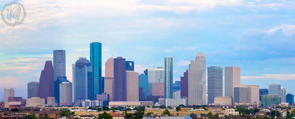
or
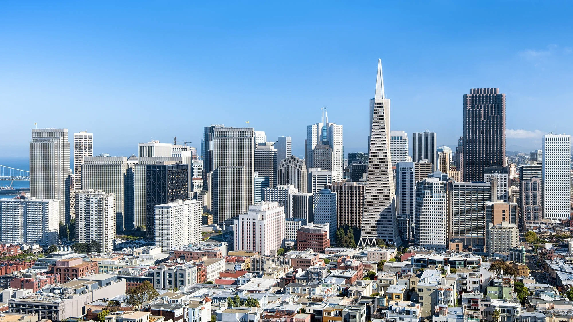
Cities are more interesting with DETAIL. Ask yourself, aside from your predisposition towards these two cities, which one would you find visually more interesting. Personally, I hope Boston stays more like the second example and doesn't slide towards the first.
or
Last edited:
From 9/11 click in to view larger. Glass looks good, but it's also becoming obviously fatter as it goes up, and will lose the cantilevers as well. The proportions of the original were pretty decent, but now it's going to be like another Hub on Causeway.
 IMG_2696 by David Z, on Flickr
 IMG_2697 by David Z, on Flickr
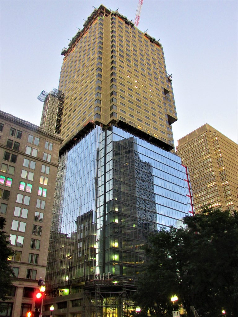 IMG_2698 by David Z, on Flickr
Another of my bigger issues with this is that we already have a better glass tower 2 doors down. I don't want TOO much glass, or we'll start to resemble a shapeless blob, like Austin is developing into. New State Street is glass (albeit the building I'm most looking forward to in the whole city), plus Winthrop Square Tower and South Station Tower will be glass too. That's going to be a large change for downtown! I would like to see some sturdier looking claddings in the next boom or we will go from glass-starved to glass-drowned.
 IMG_2704 by David Z, on Flickr
 IMG_2705 by David Z, on Flickr
 IMG_2707 by David Z, on Flickr
 IMG_2708 by David Z, on Flickr
 IMG_2713 by David Z, on Flickr
 IMG_2696 by David Z, on Flickr
 IMG_2697 by David Z, on Flickr
 IMG_2698 by David Z, on Flickr
Another of my bigger issues with this is that we already have a better glass tower 2 doors down. I don't want TOO much glass, or we'll start to resemble a shapeless blob, like Austin is developing into. New State Street is glass (albeit the building I'm most looking forward to in the whole city), plus Winthrop Square Tower and South Station Tower will be glass too. That's going to be a large change for downtown! I would like to see some sturdier looking claddings in the next boom or we will go from glass-starved to glass-drowned.
 IMG_2704 by David Z, on Flickr
 IMG_2705 by David Z, on Flickr
 IMG_2707 by David Z, on Flickr
 IMG_2708 by David Z, on Flickr
 IMG_2713 by David Z, on Flickr
Last edited:
- Joined
- Jan 22, 2012
- Messages
- 5,078
- Reaction score
- 1,661
I hadn't realized they were building out the cantilevers. That's a bummer.



 IMG_2494
 IMG_2530
 IMG_2534
 IMG_2591
 IMG_2678