One Post Office Square Makeover and Expansion | Financial District

i've been hoping 1 Boston Place could get a skin redo for several years... That what's happening Post Office Square would be such a wonderful fix at 1 Boston Place or 1 Beacon – that it's not so far-fetched – is incredible.

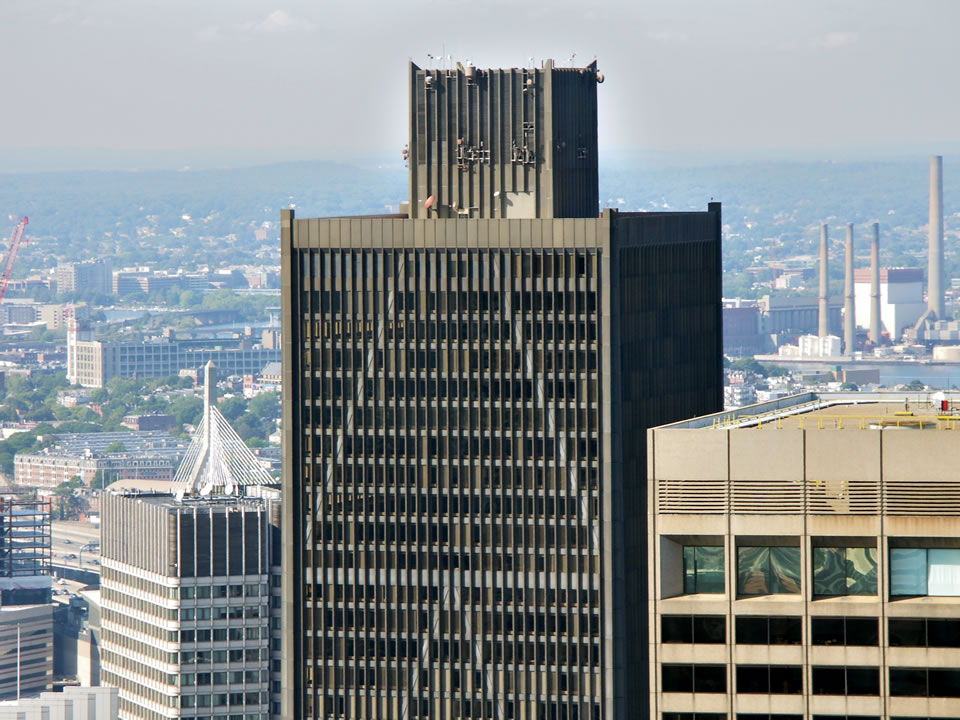
I've always hated the brown box on top of 1 Boston Place so much that I actually contacted them a year or two ago to see if they ever considered changing it or hiding the box with some type of crown. They responded that they had considered it, but it wasn't in the plans right now. Here's hoping. That thing is stain on our skyline.
 
I love 1 Boston Place. It's Boston's very own John Hancock Center / Willis Tower type design. I just think it needs a new paint job.

I also don't want them to reskin 1 Beacon. Out of all the "Brown Box" buildings I think it has the nicest color. It's more of a burgundy color and has almost a reddish tint.

With the new towers combined with the 1 POS reskin, we will have plenty of glass in the skyline. Too much glass, in my opinion, is NOT a good thing. I like seeing all the different colors and styles. Look at Austin for a skyline that has too many glass towers and not enough substance behind it.
 
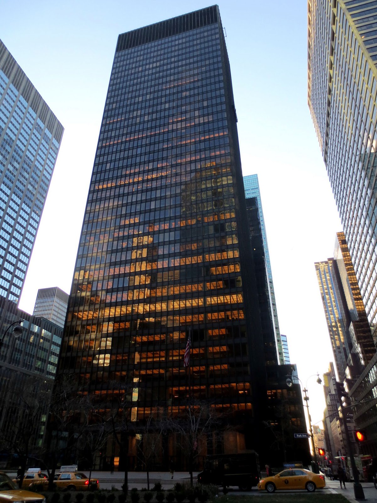
i like 1 Boston Place's cladding very much. . It's a less extravagant knock of of the Seagram Bldg, but still iconic imo. i would love to see the mechanical screen to extend to the outer walls of the tower, and the existing cladding recovered to a satin shine. It's weathered matte appearance looks like crap.
 
So whos gonna rip the renders? Ill do it if need be when I get home.
 
^ See post 95 for all the renders.

I also don't want them to reskin 1 Beacon. Out of all the "Brown Box" buildings I think it has the nicest color. It's more of a burgundy color and has almost a reddish tint.

Ditto. The color is quite rich, and the facade has great dimensionality. One Federal is the brown box that is most in need of an upgraded identity, IMO.

And I too like One Boston Place. The box top is definitely weird, but like odurandina said: polish it up and I think it'd be good for another 50 years.
 
^ See post 95 for all the renders.


Ditto. The color is quite rich, and the facade has great dimensionality. One Federal is the brown box that is most in need of an upgraded identity, IMO.

And I too like One Boston Place. The box top is definitely weird, but like odurandina said: polish it up and I think it'd be good for another 50 years.

You guys are right. I'm wrong. This is an architectural wonder and pure gem.

1bp7405.jpg
 
^ LOL, I do feel like eating my words a teeny tiny bit. I guess I would add that that building is very hit or miss for me: sometimes I see it and really like its aesthetic, and sometimes I see it as straight up fugly.
 
It's one of 2 black buildings on the skyline, and the only 1 that really has any sort of impact. It was the only downtown building that stood out from the North until Millennium Tower was built. Boston doesn't need more blue-glass, particularly at the expense of one of the city's more unique looking buildings and colors. For me the above picture just reiterates that the entire building needs a fresh coat of paint, nothing more.
 
I've always hated the brown box on top of 1 Boston Place so much that I actually contacted them a year or two ago to see if they ever considered changing it or hiding the box with some type of crown. They responded that they had considered it, but it wasn't in the plans right now. Here's hoping.

Wow. i was thinking of doing the same. instead i asked around at Bostonplans if anyone had ever inquired with the owners about fixing the unsightly scar....

The answer i got was, as far as he or she knew, 'no.'

The Seagram Bldg including specifically it's bronze exterior is an official NYC historical landmark.


Last edited:
You guys are right. I'm wrong. This is an architectural wonder and pure gem.

1bp7405.jpg

I say leave the box where it is, an build a glass and steel penthouse tiara around it (to the height of the the box, and out to the plane of the existing tower) with 3-4 stories of penthouse / event space.
 
Na this is an actually truly unique building that “is” Boston. That famous painter cant remember his name painted it in a winter picture. The guy where u need special lighting for his paintings. Keep it as is.
 
Has anyone also suggested the old State St Bank tower at 225 Franklin as another strong candidate for this treatment?
 
I'm loving the discussion here. I have always loved 1 Boston Place. It is so unique, yet also reminds me the Hancock Center in Chicago as DZ mentioned.

I really appreciate everyone saying nice things about 1 Beacon St. All your comments are changing my mind, and making me like it again the way I did when I was younger.

I have always loved 225. And I agree that with the 1POS recladding and all of the new glass towers going up, it is important to retain the brick.

When I first started working in Boston, my girlfriend at the time (who didn’t spend much time in town) came up one night to go out with me. We were walking down Beacon from Bowdoin toward Tremont and she goes “wow, that building is massive!” It’s one of the few times I’d heard her comment on architecture. I’m not sure how I feel about it - it’s defimitely as unique as a bland box can be and it triggers feelings from even casual observers, but that corner could be better utilized and it sure is a fatty.

I do like 1BP and I always have. It’s one of the least offensive towers in town in my opinion. I also have always liked 225 which I think people will continue to warm up to as Boston gets more all glass towers. It’s a great contrast and an overall nicely done building.
 
Its (one of) our only truly unique towers that when you see it you know its Boston. Its unique, has a black facade which we need more of, cross bracing, and the box on top is unique. 60 state st is my favorite building in the city but its still kind of an anywhere tower. Many of our towers are anywhere in the 70's towers but I feel like this one is different. Id like to keep it as is. We NEED a black glass tower, and NEED a new limestone high rise now that its back en vogue and NYC has perfected it. Those two things are missing and needed. The limestone "art deco" tower's are in every city... hell providence even has one, and they are true gems that are needed in any good skyline. I dont know why there hasnt been one proposal (besides liberty mutual which came out fantastic). If we could build one in the 600' range and although unlikely put a copper crown/spire on it it would do wonders for our skyline. Buffalo has great art deco, obviously NYC/Chicago, Detroit, we need at least ONE. Its a must have for any good skyline. Somebody please propose a 30 park type tower for this city. Preferably with a crown like 40 wall st.

This era passed us but it has come back around again and is now being done very well, come on Boston you can do it.... The limestone towers going up in other cities don't have spires we can top all of them if we did one.

This is now possible again... We got beaten to death with brutalism, lets get some art deco please.
1200px-40_Wall_Street.jpg
 
Hate this expansion or love it- I personally like it, its going to give downtown a refreshment. Its going to feel like we have a new building and progress is happening downtown in a spot where it was not possible without this reclad. We know theres not much space and this is an interesting way to make new out of the old and give a feeling of new/progress where a tower already was and there is not much space to actually achieve this.

Plus a new lit crown is good. Like I think Odrunadia said Boston at night looks like the death star. That was very very well put. In a way it looks nice, but in another it looks like the city is asleep. Lit crowns make it "look" like its still vibrant even if its not.

JKuGMqBh.png
 
How about the Prudential Bldg?Is there any more dated tower on the planet?
I know it's an old cliche but put arms on it and it Dr.Smiths favorite robot from Lost In Space.
 
I think Boston would riot if the pru was touched. I like it, especially up close its very intricate. Id say leave it, but thats me. I would though like to see renders of what could be done, maybe even add some floors to it. Id like to see what could be done but in the end Id prob say keep it. The pru is the north star of Boston. Yes its ugly but theres a difference between being ugly in a bad way and in a good way. The pru is ugly in a good way.
 
i love 40 Wall St.... but we'll never get something that incredible.

cuz we're not wealthy enough.....
 

Back
Top