One Post Office Square Makeover and Expansion | Financial District

This looks infinitely better than what is there right now... and I like the new render more than the previous one. What the fuck are you people bitching about?

I think a lot of people, myself included, really like the illuminated crown on the first render. They seemed to have gotten rid of it on the most recent render. Boston isn't exactly drowning in buildings that are well-lit at night. This would have been a subtle, elegant addition.
 
What the fuck are you people bitching about?

The design is tacky.

They flat out murdered the aspect ratio and basically gave it Seaport proportions on a larger scale.

It appears they are cutting the height of the original tower.

I have a pretty simple fix that would look a lot better. Just add a triangle-type crown on top. It could even be hollow, like something similar to Mellon Bank in Philadelphia. It would be a "buddy" of 2 International Place on the skyline, and really offset the stumpiness of the current proposal. It would also probably be pretty cheap in the scheme of things.
 
no dice. no pointy crowns or offsets. flat or slanted roofs or nothing.
 
Where did these new images come from? Source?
 
The design is tacky.

They flat out murdered the aspect ratio and basically gave it Seaport proportions on a larger scale.

It appears they are cutting the height of the original tower.

What are you seeing that I'm not seeing? Because it looks the same height to me, minus the "lantern" thingy.
 
What are you seeing that I'm not seeing? Because it looks the same height to me, minus the "lantern" thingy.

I was under the impression that the lantern replaced the glass top that is there now. If that was indeed the case then it's losing height.
 
I was under the impression that the lantern replaced the glass top that is there now. If that was indeed the case then it's losing height.

It looks to my eye like they reduced the top double-height floor to single height and did away with the little pointy fingers sticking up in the air. It is the same number of floors.

I also liked the lantern thing, but its not a big loss. It is certainly a minuscule impact on the mass and proportions of the building.
 
Where did these new images come from? Source?

http://www.bostonplans.org/getattachment/5d46991a-5f85-4789-80d9-636bbc2bea09

This is a massive upgrade to whats there tower cladding wise and ground level wise and Im not majorly disappointed with the new crown, as long as its lit, which they haven't shown yet if its going to be or not. If it is then Im not too disappointed with this, but the last 2 renders show the old version lit and not the new one so this could be bad.
 
It looks to my eye like they reduced the top double-height floor to single height and did away with the little pointy fingers sticking up in the air. It is the same number of floors.

I also liked the lantern thing, but its not a big loss. It is certainly a minuscule impact on the mass and proportions of the building.

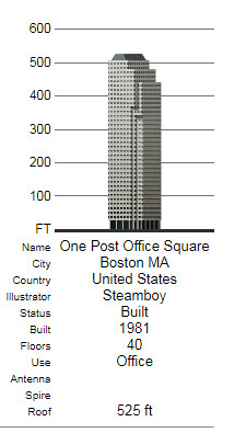
I think there's something slightly lost in translation in our conversation. The current design has that little glass hat at the top, that basically brings it from ~505' to 525'.

Capture by David Z, on Flickr

I was under the impression that the "lantern" piece was replacing that glass hat, and rising to the hat's original height. Thus, the removal of the "lantern" also removes that ~20' from the building. It does look like it will stay just over 500', but ultimately be reduced from 525' to ~505'. It offends my sensibilities to chop off the top section of a top 15 (height) building in our already stumpy skyline. It's made worse that the tower itself becomes much wider, while losing height. This is why I think a crown, even just a simple triangle, would go a long way to mitigating the additional width.
 
Your overuse of the word 'tacky' is tacky.

I'm sorry I don't like that thing you like, but I used the word once then jokingly quoted myself. I'm sure there are things that other people like that you don't like. No need to be offended.
 
Yea it looks like they just cut the top off for some reason from the clear glass up to the top of the lantern. Idk if thats a restaurant or obs deck there but that seems like its gone. Idk why this always happens... just keep the damn thing. It actually had a possible restaurant, a non flat roof, interesting crown, it was lit at night, why get rid of that if theyre not even building a new tower just doing a new facade. Regardless this was one of the ugliest buildings ever so Im glad its happening to this. This and one devonshire are garbage towers... the two worst in the city. This one has crappy concrete and a stupid massing, one devonshire has cheap white panels and shitty massing again

One Devonshire needs a facadectomy too, just no more blue glass. Black glass would be great. Cover up that friggin above ground garage as well then fix the absolute trash massing and roof here.
one-devonshire-place_john-w-cahill3.jpg


It looks like from the clear glass up is gone and thats the only difference.
Mqxw4OBh.jpg
 
Last edited:
I was under the impression that the "lantern" piece was replacing that glass hat, and rising to the hat's original height. Thus, the removal of the "lantern" also removes that ~20' from the building. It does look like it will stay just over 500', but ultimately be reduced from 525' to ~505'. It offends my sensibilities to chop off the top section of a top 15 (height) building in our already stumpy skyline. It's made worse that the tower itself becomes much wider, while losing height. This is why I think a crown, even just a simple triangle, would go a long way to mitigating the additional width.

Take a look at the first few images here:

http://www.archboston.org/community/showpost.php?p=310187&postcount=95

It looks like they were going taller with the lit crown then essentially brought it back to roughly where the height is now. I don't think any height is going to be lost. I bet it still ends up getting a fee fret tacked on.
 
Sux the lit crown is gone. It added a floor to the top of the tower too then another floors worth of glass then a half floor of decorative elements. I wonder if the added height was too much of a pain? Great project just sucks to see this.
 
Lazy. Uninspired. Typical. (That the "torch" element is the center of discussion here speaks volumes - what else is there to discuss?)

Mr Golden at the BCDC notches another bland addition to our cherished city. He continues to nibble destructively at the fabric of our urban realm.

Did I love this building? No. But like it or not, the current building is an attempt (arguable, okay, if you insist) at design and, equally important, a place-marker for a period in time. These markers are important for historical cities. Not every marker needs to be of our colonial era. Or an icon of design.

No city survives without growth, without change. And not everything can be saved, it's true. But what is lost is lost forever. Maybe this loss is not a seminal loss - agreed - but it is a symptom of a greater ailment. A lack of vision.
 
Did I love this building? No. But like it or not, the current building is an attempt (arguable, okay, if you insist) at design and, equally important, a place-marker for a period in time. These markers are important for historical cities. And not every marker needs to be of our colonial era. Or an icon of design.

No city survives without growth, without change. And not everything can be saved, it's true. But what is lost is lost forever. Maybe this loss is not a seminal loss - agreed - but it is a symptom of a greater ailment. A lack of vision.

This.
 

Back
Top