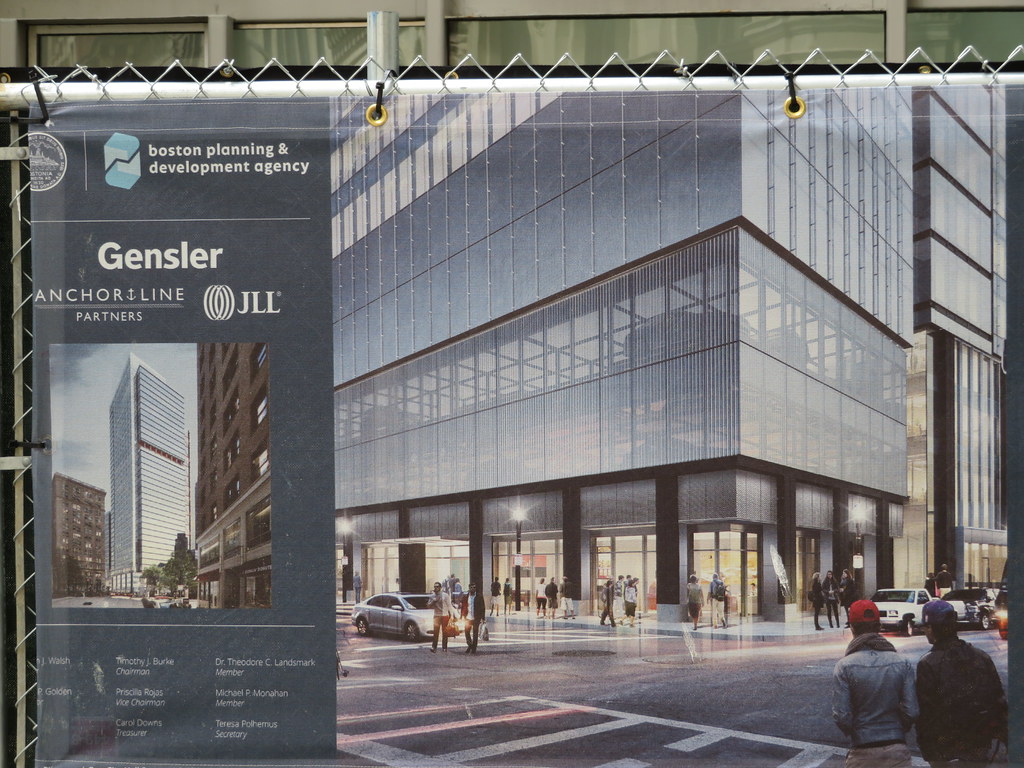
I might be in the minority here, but I think the redo works, and I’m into the red bracings and highlights - if they end up executed well in a way I’ve seen in some great Hong Kong towers. I think this will be differentiated from Exchange Place in that it will appear to have sharp lines and less opaque glass, whereas Exchange Place has those early 80s curved edges and darkly-opaque glass.
You are using an out of date browser. It may not display this or other websites correctly.
You should upgrade or use an alternative browser.
You should upgrade or use an alternative browser.
One Post Office Square Makeover and Expansion | Financial District
- Thread starter JumboBuc
- Start date
stick n move
Superstar
- Joined
- Oct 14, 2009
- Messages
- 13,361
- Reaction score
- 23,945
Yea Im in the same boat. If nothing else Id love to see this and One Devonshire reclad. I could live with just those (downtown). One Devonshire is a Superturd. The people saying to reclad One Boston Place are crazy imo.... you cant reclad the famous Thomas Kincaid painting, that would be a sin.


I might be in the minority here, but I think the redo works, and I’m into the red bracings and highlights - if they end up executed well in a way I’ve seen in some great Hong Kong towers. I think this will be differentiated from Exchange Place in that it will appear to have sharp lines and less opaque glass, whereas Exchange Place has those early 80s curved edges and darkly-opaque glass.
I feel the same way. This is a massive upgrade over the ugly facade the building currently has. These types of facades do not hold up well over long periods of time. Glass on the other hand does.
odurandina
Senior Member
- Joined
- Dec 1, 2015
- Messages
- 5,328
- Reaction score
- 266
to those saying it's gonna be too much glass Downtown;
wtf? the whole damn Downtown & Waterfront is brick, rock & hideous, aged out concrete. Thank Christ we got some badly needed glass at Winthrop & Post Office Sq, TD Garden and MT.
wtf? the whole damn Downtown & Waterfront is brick, rock & hideous, aged out concrete. Thank Christ we got some badly needed glass at Winthrop & Post Office Sq, TD Garden and MT.
Yea Im in the same boat. If nothing else Id love to see this and One Devonshire reclad. I could live with just those (downtown). One Devonshire is a Superturd. The people saying to reclad One Boston Place are crazy imo.... you cant reclad the famous Thomas Kincaid painting, that would be a sin.
I can see someone eventually buying 1 Boston Place and filling in the top part. It'd be expensive, but there's probably 5-10 floors worth of unused height there.
I can see someone eventually buying 1 Boston Place and filling in the top part. It'd be expensive, but there's probably 5-10 floors worth of unused height there.
Is that the building with the ugly square box on top of it? I wish they'd make some type of crown or screen to cover that. Probably my most hated tower in Boston.
Brad Plaid
Senior Member
- Joined
- Jan 17, 2013
- Messages
- 1,310
- Reaction score
- 1,559
One Boston is fine as is. It looks powerful, a strong contrast to the anemic-looking weaklings found here in abundance.
I don't hate One Boston Place, I kind of like the visible X bracings, reminds me of the John Hancock Center in Chicago (although not as nice).
One Federal and it's near-clone One Beacon are my two least-favorites.
hearty agreement with both points. i've made the comparision before (and maybe you have, too?) b/w one boston and the hancock center. also think it looks like darth vader's personal office-building.
one federal and one beacon are absolutely loathesome. MT did a lot to draw away focus from those two monuments to non-creative thought and winthrop and congress street will also help from certain angles, but... man i'd love for either or both to be found to be structurally unsafe b/c that's the only way they'll get torn down. either of them would be the ugliest building in hartford or louisville. to call them "ugly" is an insult to ugly buildings.
One Boston is fine as is. It looks powerful, a strong contrast to the anemic-looking weaklings found here in abundance.
Yeah. A real beauty. :roll:
https://www.usrtp.com/71/records/6/1bp7405.jpg
I don't hate One Boston Place, I kind of like the visible X bracings, reminds me of the John Hancock Center in Chicago (although not as nice).
One Federal and it's near-clone One Beacon are my two least-favorites.
Agreed. I actually would go as far as to say I like 1BP. Far more offensive examples abound in the area. 1 Beacon, One Federal, The Devonshire, and One P.O. Square are indisputably uglier as far as I'm concerned. I think there are a few others that you could easily make the argument against as well.
Beton Brut
Senior Member
- Joined
- May 25, 2006
- Messages
- 4,383
- Reaction score
- 354
One Boston Place is our Seagrams Building, spare, austere, and purposeful. It’s a brilliant backdrop for the Old State House, as countless photographers will tell you. Pietro Belluschi was a master architect, and this is his best work in town.
J
jpdibenedetto
Guest
When....
theSil
Active Member
- Joined
- Apr 4, 2016
- Messages
- 329
- Reaction score
- 525
Huh, wasn't familar with Pietro Belluschi. The Darth Vader associations with One Boston Place are funny because I always thought his cathedral in San Francisco looks very "Sith". Given that it was built in 1971, Belluschi's work very well could have played a role in inspiring the architecture of Star Wars, as a lot of other Bay Area locations notably did.
- Joined
- Jan 7, 2012
- Messages
- 14,172
- Reaction score
- 23,677
odurandina
Senior Member
- Joined
- Dec 1, 2015
- Messages
- 5,328
- Reaction score
- 266
Menino and Flynn actually did us worse than White's garbage towers.
That takes effort.
Love our Seagrams of Boston Tower. Just fix the crown w/ some type
of ornamental ring to clean up the awful geometry up top.
That takes effort.
Love our Seagrams of Boston Tower. Just fix the crown w/ some type
of ornamental ring to clean up the awful geometry up top.
- Joined
- Jan 7, 2012
- Messages
- 14,172
- Reaction score
- 23,677
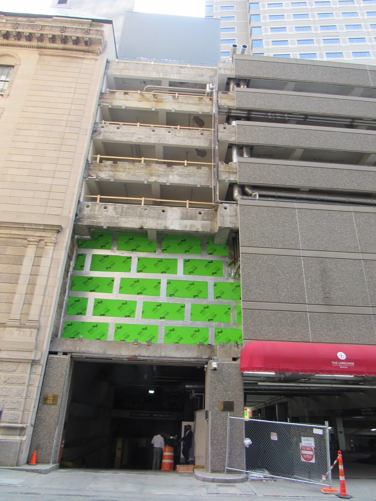
Still not a lot of visible activity, but we do have some new signs.
 https://flic.kr/p/2gkuZCx
 https://flic.kr/p/2gkv2dg
 https://flic.kr/p/2gkv97U
 https://flic.kr/p/2gkuZCx
 https://flic.kr/p/2gkv2dg
 https://flic.kr/p/2gkv97U


