You are using an out of date browser. It may not display this or other websites correctly.
You should upgrade or use an alternative browser.
You should upgrade or use an alternative browser.
One Post Office Square Makeover and Expansion | Financial District
- Thread starter JumboBuc
- Start date
whighlander
Senior Member
- Joined
- Aug 14, 2006
- Messages
- 7,812
- Reaction score
- 647
DZH -- another bunch of nice images
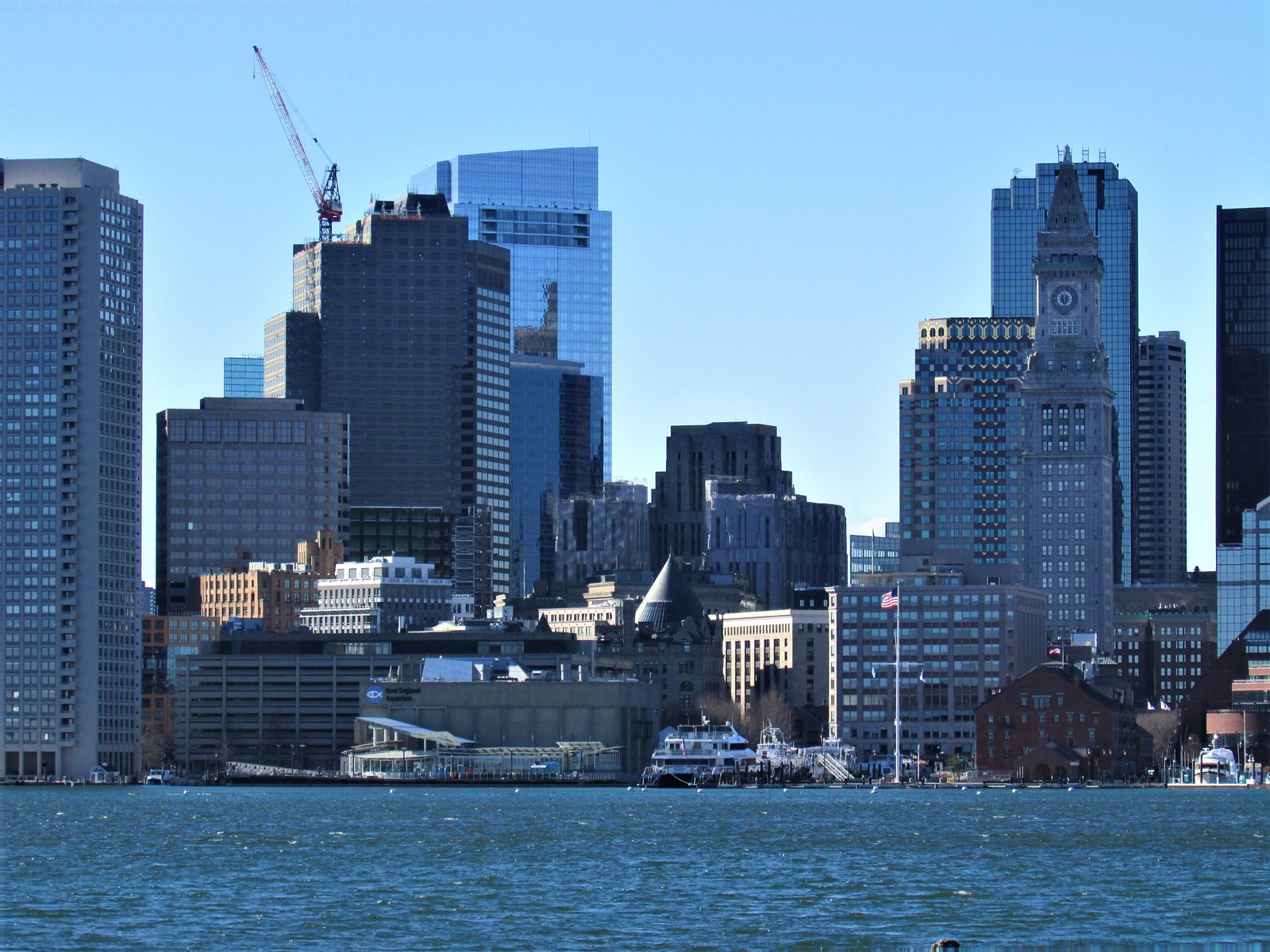
As the One POSq turns from concrete to glass -- we are going to have some great low sun-angle reflections to make into iconic images
As the One POSq turns from concrete to glass -- we are going to have some great low sun-angle reflections to make into iconic images


Boston02124
Senior Member
- Joined
- Sep 6, 2007
- Messages
- 6,936
- Reaction score
- 7,088
Boston02124
Senior Member
- Joined
- Sep 6, 2007
- Messages
- 6,936
- Reaction score
- 7,088
Boston02124
Senior Member
- Joined
- Sep 6, 2007
- Messages
- 6,936
- Reaction score
- 7,088
 IMG_9880
 IMG_9913
 IMG_9936
Czervik.Construction
Senior Member
- Joined
- Apr 15, 2013
- Messages
- 1,964
- Reaction score
- 1,235
I know the new skin is a bit dull, but the all-glass look will spice up the square.
Hopefully the red is enough to offset the loss of the cantilevers. They really stood out, particularly in silhouette. It's also a pretty fascinating form when you look straight up it from Post Office Square. That shape may never be replicated again in a building, anywhere.
Street view.

 www.google.com
Above in google earth 3d. This link in particular really helps show the true shape of this building. Hold "control" and you can use your mouse to spin the view around and see just how weird this building really is/was.
 www.google.com
Street view.
Google Maps
Find local businesses, view maps and get driving directions in Google Maps.
Above in google earth 3d. This link in particular really helps show the true shape of this building. Hold "control" and you can use your mouse to spin the view around and see just how weird this building really is/was.
Google Maps
Find local businesses, view maps and get driving directions in Google Maps.
Suffolk 83
Senior Member
- Joined
- Nov 14, 2007
- Messages
- 3,024
- Reaction score
- 2,512
Wow the banality of Boston's buildings has really gotten to some people here. There's barely any red on this thing, are we sure it's even going to be noticeable from Eastie?
Life Coach Mike
Active Member
- Joined
- Aug 26, 2019
- Messages
- 322
- Reaction score
- 487
I've totally missed anything red on this makeover. In any case, I think it's the restructuring of the massing that most disturbs me. I liked the oddities this building brought, though I wish the windows had been larger and the surface color less banal and more in keeping with the Post Office building across the square. I also liked the original polychromed lobby. It was pleasant to view from the sidewalk and offered some depth. But then someone bought stock in white marble and swathed nearly every Boston office building's lobby in it. Anyway, I'll pass judgment until I see it in person in one of my returns to Boston. The key for me will be street level, whether there's something interesting to visit other than other upscale fast food/coffee shop.Wow the banality of Boston's buildings has really gotten to some people here. There's barely any red on this thing, are we sure it's even going to be noticeable from Eastie?
") For me, this reclad does a ton to make the whole Financial District seem fresh and newer. Major fan.
For me, this reclad does a ton to make the whole Financial District seem fresh and newer. Major fan.
To me, it makes the building look a lot shorter. Talk about truly terrible proportions. They should have at least changed the top to like, a triangular crown or something. It would kind of play off 2 International Place. Instead, they took away the 1 good thing about the tower (cantilevers) so it's really hard to get excited about this.
citydweller
Active Member
- Joined
- Aug 23, 2019
- Messages
- 487
- Reaction score
- 766
To me, it makes the building look a lot shorter. Talk about truly terrible proportions. They should have at least changed the top to like, a triangular crown or something. It would kind of play off 2 International Place. Instead, they took away the 1 good thing about the tower (cantilevers) so it's really hard to get excited about this.
Totally agree. I hope the end result is far better than that previous rendering.
JeffDowntown
Senior Member
- Joined
- May 28, 2007
- Messages
- 5,048
- Reaction score
- 4,226
This desperately needs a statement topper.
Pend978
New member
- Joined
- Jun 11, 2019
- Messages
- 33
- Reaction score
- 55
Just looks clunky to me. Way too much going on with it. And the plain box on top is boring and lazy. I'm all for a little more glass in that part of the skyline, but this just doesn't work.To me, it makes the building look a lot shorter. Talk about truly terrible proportions. They should have at least changed the top to like, a triangular crown or something. It would kind of play off 2 International Place. Instead, they took away the 1 good thing about the tower (cantilevers) so it's really hard to get excited about this.
whighlander
Senior Member
- Joined
- Aug 14, 2006
- Messages
- 7,812
- Reaction score
- 647
Jeff -- This building is now all about the interface with the Langham Hotel at the street and few floors up levelThis desperately needs a statement topper.
Huge improvement in the building overall by getting rid of the ugly brutish and brutalist exterior panels and the truly ugly parking garage. I always felt that placing the brutalism next to the graceful elegance of the old Federal Reserve was like making a beautiful model walk about in one of those turn of the 19th-20th C Swimming Costumes.