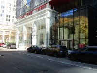
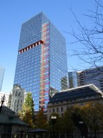
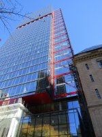
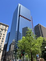
Generally I feel like the red bracing is the only standout feature of this re-clad, but this angle is somehow strangely very visually pleasing.
You are using an out of date browser. It may not display this or other websites correctly.
You should upgrade or use an alternative browser.
You should upgrade or use an alternative browser.
One Post Office Square Makeover and Expansion | Financial District
- Thread starter JumboBuc
- Start date

bigpicture7
Senior Member
- Joined
- May 5, 2016
- Messages
- 4,068
- Reaction score
- 10,551
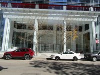
There was something about today's overcast / sightly misty conditions that made this one pop (8/9):

bostonbyfoot
New member
- Joined
- Feb 16, 2023
- Messages
- 21
- Reaction score
- 87
Nice shot. The milk street bike lane seems like its coming along nicely.
Suffolk 83
Senior Member
- Joined
- Nov 14, 2007
- Messages
- 3,024
- Reaction score
- 2,512
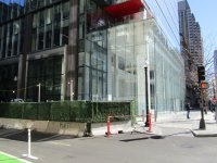
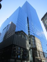
I like what you did thereWhat an improvement over the old, ugly 1 POS.
Boston02124
Senior Member
- Joined
- Sep 6, 2007
- Messages
- 6,936
- Reaction score
- 7,088
I’ve been up in this building before and after the renovation the views are much better
- Joined
- Jan 7, 2012
- Messages
- 14,173
- Reaction score
- 23,688
Boston02124
Senior Member
- Joined
- Sep 6, 2007
- Messages
- 6,936
- Reaction score
- 7,088
Boston02124
Senior Member
- Joined
- Sep 6, 2007
- Messages
- 6,936
- Reaction score
- 7,088
themissinglink
Senior Member
- Joined
- Jan 13, 2018
- Messages
- 2,035
- Reaction score
- 5,621
9/11

stick n move
Superstar
- Joined
- Oct 14, 2009
- Messages
- 13,480
- Reaction score
- 24,519
This building was in my opinion the ugliest high rise building in boston (that speckled one in cambridge crossing isnt in boston) and one of the ugliest non wacky shaped building I had seen. For basically a background building that was pretty much a box it was horrendously ugly. Now that its cleaned up Id say its one devonshire. Looking up one devonshires height I couldnt believe its shorter than the raffles boston hotel, jfk building, russia wharf, the old hancock building, custom house tower…etc. I guess it being downtown makes it seem taller.
As far as this building I think they did a solid job. I dont want many more glass buildings after sst and raffles, but I think the ones we got added a good splash of modernity to the 70’s inspired skyline. For a while even with the new buildings the skyline still basically felt the same as it always has, but I think sst has finally broke critical mass.
As far as this building I think they did a solid job. I dont want many more glass buildings after sst and raffles, but I think the ones we got added a good splash of modernity to the 70’s inspired skyline. For a while even with the new buildings the skyline still basically felt the same as it always has, but I think sst has finally broke critical mass.
The updated version looks better up close but worse on the skyline. With all the other new glass towers it kind of feels like one too many, and with its multiple patterns it also looks sloppy the further out you go. It's hard to explain but it simultaneously seems to disappear while still not neatly blending into the rest of the city. Up close though it's very high quality.
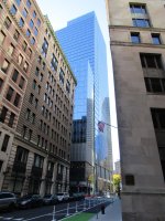
I guess my other issue, even up close, is that Exchange Place is better and is just a hop, skip, and a jump away.
Honestly, I'm tired of the glass. It's time to switch to some other material(s) for the next half dozen significant (500'+) towers, whenever we get them. On a macro level the city is slowing losing its more pleasing, earth-tone color palette and starting to look "colder" with too much blue glass.
The updated version looks better up close but worse on the skyline. With all the other new glass towers it kind of feels like one too many, and with its multiple patterns it also looks sloppy the further out you go. It's hard to explain but it simultaneously seems to disappear while still not neatly blending into the rest of the city. Up close though it's very high quality.
I guess my other issue, even up close, is that Exchange Place is better and is just a hop, skip, and a jump away.
Honestly, I'm tired of the glass. It's time to switch to some other material(s) for the next half dozen significant (500'+) towers, whenever we get them. On a macro level the city is slowing losing its more pleasing, earth-tone color palette and starting to look "colder" with too much blue glass.
I agree. Too much glass is 'anonymizing' (if there is such a word). Cities used to build buildings with interesting detail. Now, so much is just uniform glass shielding. That being said, this particular building's reno is an upgrade over what it was before.
stick n move
Superstar
- Joined
- Oct 14, 2009
- Messages
- 13,480
- Reaction score
- 24,519
Yea after SST and the couple other blue glass towers wrap up I agree we should get back to the tones that made bostons skyline warmer. Ive always seen boston as having red brown and grey tones which are as stated more earthy tones.The updated version looks better up close but worse on the skyline. With all the other new glass towers it kind of feels like one too many, and with its multiple patterns it also looks sloppy the further out you go. It's hard to explain but it simultaneously seems to disappear while still not neatly blending into the rest of the city. Up close though it's very high quality.
I guess my other issue, even up close, is that Exchange Place is better and is just a hop, skip, and a jump away.
Honestly, I'm tired of the glass. It's time to switch to some other material(s) for the next half dozen significant (500'+) towers, whenever we get them. On a macro level the city is slowing losing its more pleasing, earth-tone color palette and starting to look "colder" with too much blue glass.
https://www.bostonmagazine.com/arts-entertainment/best-views-around-boston/
Now the current skyline has a lot more blue in it and thats ok to add a splash of modernity and have a few examples from this era in architecture for the future, but I agree itd be nice to go back to more solid facades with these colors in them.
One of my favorite towers in the city has always been 60 state st with its red facade. Id like to see more of that.
Link
Lyrik at parcel 13 has a more structured facade as well and with its bright white facade it looks great, more of that would be nice. The aquarium garage tower with its white facade was a huge loss imo.