Photo of the Day, Boston Style - Part Deux

Status
Not open for further replies.
This was never an upscale block, really. In the late 1970s it was best known for a couple of quality photo-finishers, Subtractive Technology and Colortek, along with Johnson Paint and Trident Books (still there) and Avenue Victor Hugo Books (sadly gone). There's also a Newbury Comics (presumably the original one), and until recently a large chain music store (first Tower, then Virgin).

A useful block, rather than an upscale one.
 
That would have been excellent. Maybe it would be a good fit in the future Downtown Crossing?

Bean is moving very slowly and conservatively into the branch-store business. They may want to see how the Burlington store does before adding more here. But I do see this on their website: "New Stores Opening Soon - 11/16 Mansfield, MA". (Anyone know where?)
 
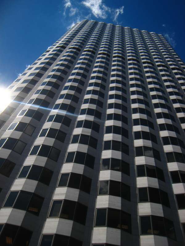
170977253-L.jpg
 
(sigh)...lasting materials, sharp design. It was ahead of its time.

It does look nicer without the suburban lawnscape out front (and office parky rear end out back), admittedly.
 
czsz said:
It was ahead of its time.

Sure was -- Nice pic, Bos77. If forward thinking is a measure of a building's value, this may be our finest tall building. I love the Hancock, but it's the end of the line -- the last of the great glass-curtain skyscrapers, sublime in its minimalism. But in the Fed, Stubbin's presaged Foster, Rogers, and Piano and opened the door to High Tech Expressionism. He also designed some modest but lovely homes that were forthrightly modern, but earthy in their materials and relation to their sites.

I don't hate SOM's mostly sympathetic addition to the Volpe Terminal (Terminal E) at Logan, but it saddens me a bit that the original Stubbins design has been lost. With all of that white enameled space-frame, it was Boston's first High Tech building.
 
kz1000ps said:
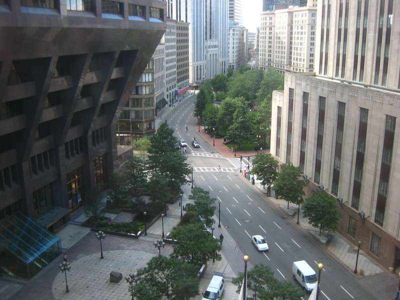
Here's a random shot sort of showing 185 (to the right) and the wasted space that is the plaza in front of 100 Federal a.k.a. the "pregnant building."
img8087sq6.jpg

depends on what you call wasted. this area is/was pretty heavily used by bank employees (i was one 10 years ago) during lunch and coffee breaks.

the entire area (and more?) below the driveway and plaza is a cafeteria--or was in 97. the glass that sticks out from the building goes over an escalator that goes to the near end of the cafe. I always thought it would be cool to have that glassed in area extended. the cafe is large enough for a considerable fraction of the 5k employees to sit down at one time, which means that it is long, wide, low, and dark. good food though.

switching gears -- on the Art Deco front, is the telecommunications building across from the JFK, just down from Gov't Center an example?
 
this area is/was pretty heavily used by bank employees (i was one 10 years ago) during lunch and coffee breaks.

But how much valuable land in Boston ought to be surrendered for the purpose of a one-hour seasonal activity? Especially when Post Office Square is practically across the street...
 
There is a theory that open space is the cure for the city's ills. The problem is that not all open space is equal and too much can create dead zones.

Boston Common, Union Sq in NYC and in San Fran all are lively active places with diverse peoples and uses. But there are plenty of other parks that no one uses, for various reasons.

Modernist plazas fail miserably because there is no real use for them. They were created because it allowed the towers next to them to be built taller. The problem is that open space still equals "good" and if you ever tried to fill it in there are still people who would fight tooth and nail against it. This is not the case for places like Government Center but it is the case for small and equally underused spaces that could just as well be used for housing.
 
czsz said:
this area is/was pretty heavily used by bank employees (i was one 10 years ago) during lunch and coffee breaks.

But how much valuable land in Boston ought to be surrendered for the purpose of a one-hour seasonal activity? Especially when Post Office Square is practically across the street...

i wouldn't defend this little area from any kind of development -- but there are less used "front yards" in the downtown. biggest problem is the way the building hangs over. A couple story building would fit, but wouldn't be worth the effort for the land owner.
 
Awesome! I especially like the first picture, you never really see that building from that perspective, and it is hard to notice the ridges unless you're right there. Great! 8)
 
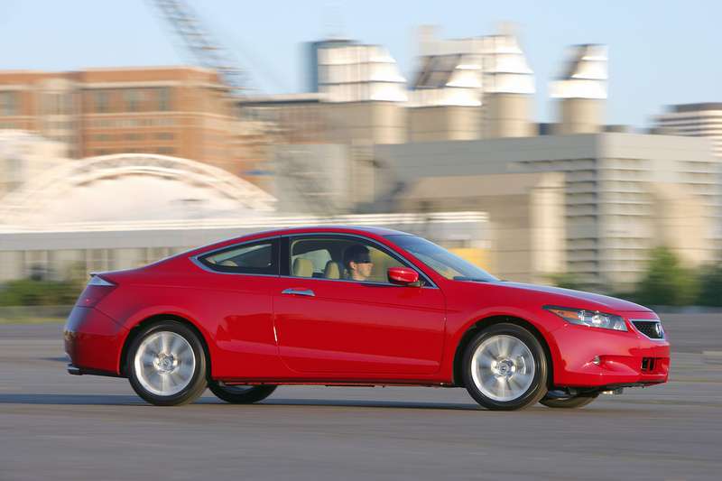
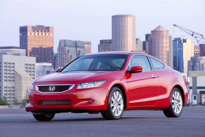
Ok so I'm catching up on my car news for the week, and one of the big events was Honda releasing official images of their 2008 Accord. So I'm going through them, and I come across this:

2008hondaaccordcoupe14ru9.jpg


Holy familiar sights, Batman -- I know that place! And sure enough there's a couple other photos with Boston as the background, such as this one:

2008hondaaccordcoupe12ry3.jpg


Say what you will about the car's styling (de.ri.va.tive), but it's cool to know that auto companies are aware of the wondrous paved facilities our waterfront has!

http://www.autoblog.com/photos/2008-honda-accord-coupe/360893/
 
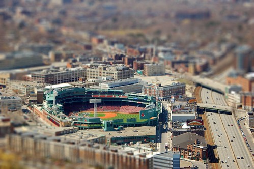
That's a wicked good Fenway model...so detailed...
 
^^ Are you joking or did you not read the link?
 
^^^^^^^^^^^
And many more beauties!!! It's like people watching, you see all kinds! Only in NYC...maybe Hong Kong comes in second with the # and variety of high rises.

Bowesst, very cool! You made it to the "Top of the Rock!" Have yet to make it there when I'm in NYC though it's on the top of my list of things to do.
 
Status
Not open for further replies.

Back
Top