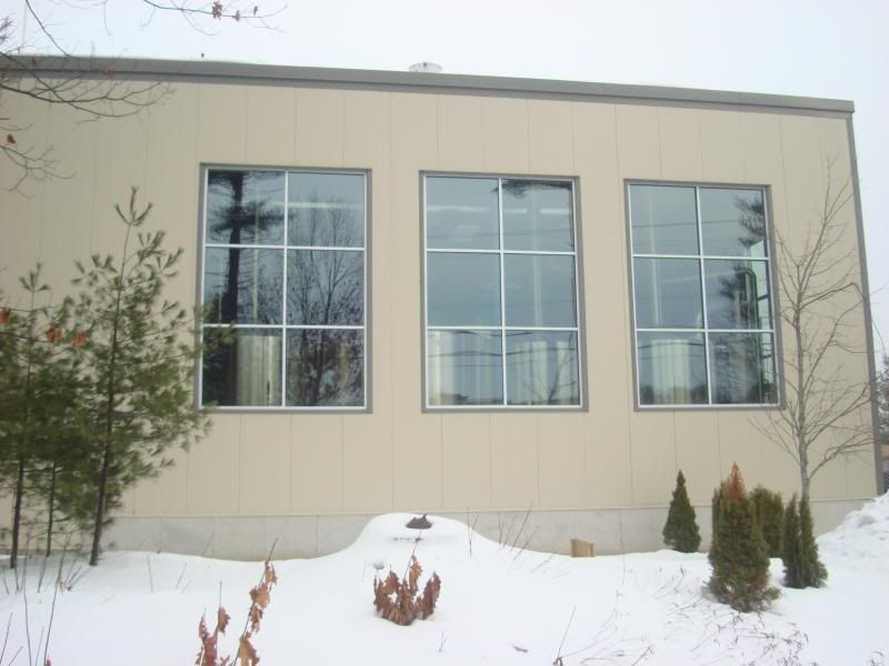
I have no problem with it not being brick, and maybe it looks better in person when the patterns in the panels stands out better. I actually like the contrasting subway tile section, and the thing on the back is like some weird-ass industrial casing; it looks more like a piece of equipment than part of a building (or maybe it's the protective case for the building), and I find that interesting. But the gray itself, at least in full daylight without the lighting effects, is just... bleak.
But you're right that it's better than the parking lot. Incidentally, in the Compare-and-contrast department, right now Google Maps has the two new hotels (Hyatt and the Courtyard) visible in it's top-down view, but in 45° view it flips to pre-construction, showing the parking lots.

