P
PortlandArch
Guest
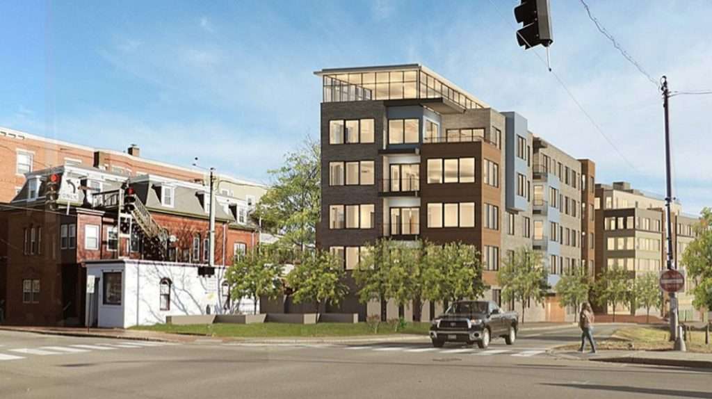
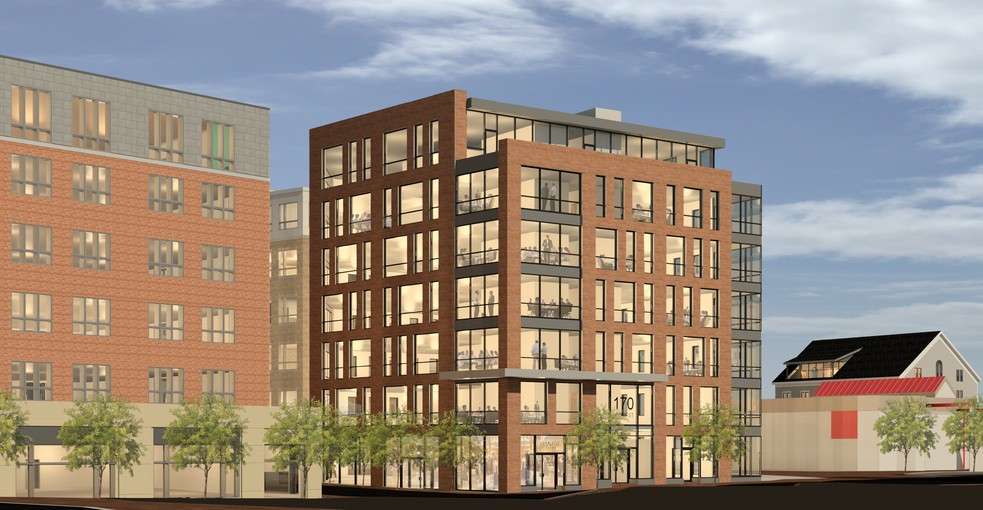
The rendering from the article
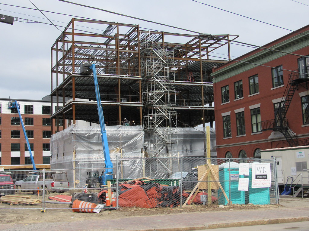
Looks extremely similar to Luminato, and that's not a bad thing. I like the design. The two buildings combined definitely help Franklin St. feel more urban.
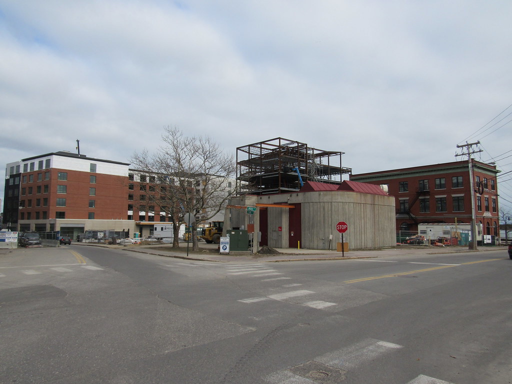
I think the rendering is misleading in regards to how Franklin Street will look on completion of the second building (also, the two projects look very similar to me, almost indistinguishable to the average passerby I would imagine). If you look at the other image, of the blank site (shown in the article), you can see it's from the same angle (or pretty close) as the rendering, yet Luminato is pulled way back from the street. I think the artist pulled it forward to make it look more like a traditional urban street, but I could be just looking at it wrong. Either way this is good news for this section of the City.

