Portland, ME - New Construction Continued

They showed the plans on ch 6 last night for the approved 3 million dollar Casco bay ferry terminal. Lot of glass, looks great
 
I really like the design of that ferry terminal expansion/renovation. Looks almost like an Apple Store or the entrance to an aquarium.
 
The original St. Lawrence church was a real beauty, so I'm glad they are doing something different instead of trying to recreate it using the cheap materials that we tend to see on new projects. This will be a great addition for the neighborhood. I know it's a tight space, but I do wish that more could be done to address Congress Street and Munjoy Street other than a (I'm assuming) brick wall. Even if it does get built exactly as proposed in this rendering, it is better than the current empty lot.

2rr6hav.png
 
I wouldn't go as far as "Yuck", but my first impression is not a good one. That building would fit better on the West End than the East End. Brick isn't exactly the dominent building material used on the East End, aside from the fire station, that old school building they just turned into condos on Emerson Street and what I think is an out-of-place apartment building on Morning Street between Moody and Wilson Streets.
 
I think something like this would fit better:

LIZO-A-popup.jpg


Westbury Theater, Westbury, NY

Source: New York Times, "A New Stage for Old Theaters", By Marcelle S. Fischler, Published: July 21, 2011

Edit to add: Obviously not the same size, given the size of the lot on Congress Street...but I like the design in reference to how it would fit on Munjoy Hill.
 
Last edited:
History doesn't stop in 1890 and neither should architecture.

I think the design could be very elegant with the massing shown. It will require doing something more interesting than a blank brick wall, and I'd prefer to see some cladding more sympathetic to the neighborhood. But there are all kinds of things that can be done, in terms of material, texture, pattern and so forth to make a blank wall visually interesting, while adding to the "dialogue" between buildings in the neighborhood.

In my experience, projects like the one in Rockport, which seems rather out-of-scale, are the exception to the norm in terms of historical stagecraft in architecture. Much more often, the details that make that building interesting are omitted for budget reasons or simply because not many people know how to design and proportion a Victorian-style building in 2012. Furthermore, cheap materials and faux-historicism rarely resemble the real thing, and look insulting next to buildings that are actually old.

I hope that Munjoy Hill will not seek instant age and history or pretend its Disney World, but demand a modern but contextual building for this site. The old building was beautiful, but if it can't be rebuilt, the best response won't be to pretend that another old building was there. I think this project, if executed well and if the community demands something interesting and sympathetic, could be yet another example of juxtaposing old and new, which Portland does better than any other New England city in my opinion.

Of course another option could be to design something in more of a contemporary vernacular vein, borrowing materials, motifs and patterns from neighborhood buildings. I think this would be a good way to enhance the blocky massing of the project. But the fact is that this building, by necessity of its program, will be much taller and larger than its neighbors. Dressing it up with Victorian details will look like someone simply stretched one of its neighbors into an abnormal scale. It will look weird.

Fair enough. I hope that you're right in that something is done to make the building more interesting and speak better with the neighborhood. I just feel the current concept design is TOO far out of touch with the neighborhood.
 
Fair enough. I hope that you're right in that something is done to make the building more interesting and speak better with the neighborhood. I just feel the current concept design is TOO far out of touch with the neighborhood.

I hear you, but from the looks of it, it's a very preliminary design and rendering. If it was built as drawn, it would be very out-of-place and a pretty bland building. But I would imagine that they'll be refining the facade and so forth, and getting input from the neighborhood should help ensure that it is in keeping with the surroundings without mimicking them.

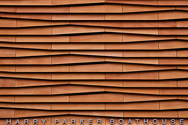
There are some wonderful examples of modern, fairly boxy buildings have wonderfully elegant facades. I could see taking influence from the wood-framed, clapboard and shingle-sided buildings in the neighborhood, and doing something like the Community Rowing Boathouse in Brighton, MA. It's a beautiful building, and while I'm not sure of the budget of the arts center, I'm sure they could do something more interesting than a blank brick facade.

Community-Rowing-Boathouse-by-Anmahian-Winton-Architects-1-588x391.jpg


harry_parker_boathouse.jpg
 
I think yuck about sums it up. The massing isn't what gets me. The lack of historic design isn't what gets me. It's the lack of detail and attention paid to Congress Street, a very prominent spine throughout the downtown and the heart of a thriving neighborhood center in this area. This is purely and simply bad urban design. In fact, it's a lack of design. It's like the project architect said the top and bottom matter and the middle was not only neglected but turned into a purely utilitarian element of the project. Like an HVAC cover. Only problem is, it's a majority of the project. Blank brick walls are never good for urbanism, ever. Build big, build modern, fine, but just build something that people will enjoy being near. This type of blank architecture has never been successful in urban centers. That's because regardless of what the design considerations are in a vacuum, this building fits into a context, and that context demands attention to the usability of space. This building detracts from not enhances the usability of Congress Street. I'm not sure this can satisfy HP review.
 
I should also note that this is expressly "value engineered" architecture. Designed in a manner calculated to save money. I get it but....guess where the cost savings came from? I'm guessing not the theater seats. The building isn't a testament to a certain design mentality, it's what a budget cap looks like.
 

Back
Top