Portland Museum of Art Expansion | Portland

Portlander

Senior Member
Joined
Apr 14, 2010
Messages
2,526
Reaction score
5,479
The PMA is in the planning stages of a major expansion of its downtown campus which will include a new 6 or 7 story building as the centerpiece on the current site of the former Children's Museum. The architect for the project is expected to be chosen by the end of the year after a design completion that will eventually be narrowed down the four that best meet the museum's vision and future goals. The PPH article reported that the new structure will be around 60,000 SF which will more than double the museum's exhibition space and there are also plans for a rooftop restaurant.
100809-03004.jpg

PPH photo
 
Last edited:
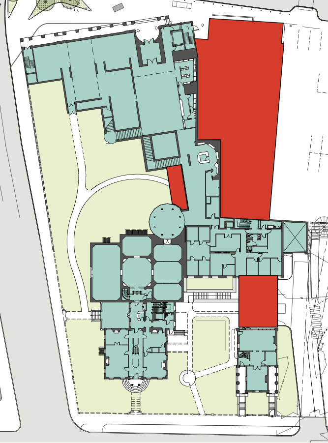
From the competition website, the red is the area they're intending to work with. Nice to see that connecting the Clapp House is part of the plan! (It's also telling how this diagram really shows the abrupt blank wall and right turn as you go from the Payson building into the Dead Pearl Diver conservatory; I've always found that a bit jarring.)

Screen+Shot+2022-05-20+at+12.18.20+PM.png
 
I remember back in the 80's that there was a development proposal by Vinjay Singh in the parking lot next to the childrens museum. The tear down of the YWCA was only going to be temp and a building was going to be proposed. I know that HIBAY uses the parking lot. I wonder if a structured parking garage would be in the plans? Plans for Spring Street lot?
 
Connecting the Clapp House is imperative and it will also be interesting to see how the architects blend the new structure with the current Payson Building. It appears that the PMA director and trustees are envisioning a striking new building that will stand out in the skyline and I have a feeling that it will be very different than the Payson. Am a little surprised that the new building isn't wider as I thought it would occupy more of the adjacent parking lot which I'm guessing is privately owned. I worked at the museum for a few years and the decision makers were never happy with the location of the gift shop so I expect that will be moved in the future.
 
From what I understand, the initial vision is for a building that will extend all the way from Spring St. to Free St. Because of the topography, they're thinking it will have a 7-story frontage on Spring St. and a 6-story frontage on Free St.

The building is expected to include space for permanent and temporary exhibitions, admin space, classrooms, studios, office space, event space and potentially housing.
 
The museum--and Portland--can now put itself on the international art map, if it wants. Be bold, be daring, as Maine has a rich history with artists. It doesn't have to mean that we must continue to walk around in something with wooden floors and brick walls. Why? Make it a destination. Bilbao, Spain is not a large city, but its museum is one of the most spectacular in the world. The representatives of Colby's new addition and collection has them boasting about how much better that museum is than the PMA. Not for long. Portland is an easy trip from Boston, by car or train, and when people come here, they have exciting places to stay and eat.
 
Connecting the Clapp House is imperative and it will also be interesting to see how the architects blend the new structure with the current Payson Building. It appears that the PMA director and trustees are envisioning a striking new building that will stand out in the skyline and I have a feeling that it will be very different than the Payson. Am a little surprised that the new building isn't wider as I thought it would occupy more of the adjacent parking lot which I'm guessing is privately owned. I worked at the museum for a few years and the decision makers were never happy with the location of the gift shop so I expect that will be moved in the future.
I don't think they want it to blend in with the Payson Building - they want it to be a statement on the skyline. I believe I saw somewhere that Phase 2 or Phase 3 is reworking the Payson facade to fit with the new building.

I also don't like the location of the gift shop nor the transition into the rotunda. I have to be honest, I went recently after not going for many years and completely forgot you have to walk through the gift shop. If they don't want to move it into the new building they could at least do something like the Whitney and just have the gift shop live in the lobby.
 
@Portlander : I am grateful for the left-side crop of that photo! We don't need any details of what was on the State Theater marquee in those days! Also, I love how that and the peeling Chamber of Commerce facade capture the state much of Portland was in in those days.
 
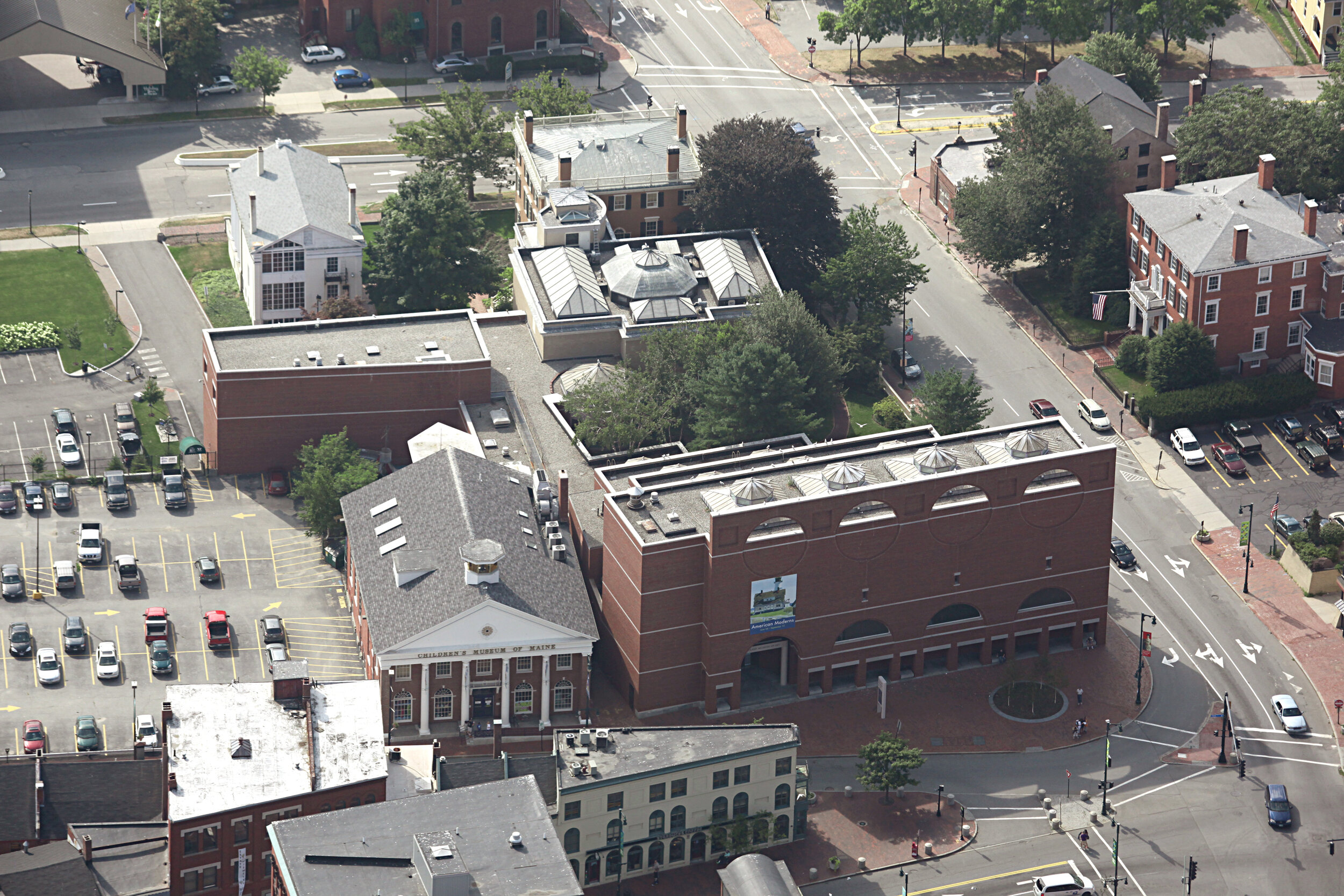
Yes, NOMC, agree it's best to put the gift shop on street level (a la The Whitney). This way, people don't have to pay to go into the museum for that. They will make more revenue this way, especially with relatively easy access to Congress Square (and can be seen from). When I think of a great museum, I think of a building that stands on its own; a building that doesn't have to adapt (compromise) to another, one that is a stand-alone marvel. Interesting how the PPH article or the PMA doesn't mention the demolish of the old Children's Museum. We can understand why, of course. It's kind of a disconnect for Portland--Federalist Brick with columns. Perhaps for Virginia, but not Portland (along with that grossly oversized mansion on the Western Prom). They could have moved it to the piece of land that used to house the YWCA, by flipping it around to front on Spring Street. But that area will probably be designed for increased parking. I do love the idea for a rooftop restaurant and deck as The Whitney has a cafe with an expansive deck that opens to killer views of Manhattan. I'd expect nothing less from this project with the harbor. It will be interesting to see how they blend this addition into the existing buildings. It's not easy. A world-renowned arch firm can but doubt they will do go that route due to the budget. This will have to go through numerous iterations. The PMA did too, with the facade circle and arch theme originally rectangular. It was a dramatic improvement, and that was Henry Cobb, the partner of I.M. Pei. Ideally, this new addition should be stand-alone with a connecting bridge (or underground) to the existing. Not expecting Gehry here, though his museum in Seattle was or still is a big disappointment (colorful turds). Please don't F this up, PMA.
 
Yes, NOMC, agree it's best to put the gift shop on street level (a la The Whitney). This way, people don't have to pay to go into the museum for that. They will make more revenue this way, especially with relatively easy access to Congress Square (and can be seen from). When I think of a great museum, I think of a building that stands on its own; a building that doesn't have to adapt (compromise) to another, one that is a stand-alone marvel. Interesting how the PPH article or the PMA doesn't mention the demolish of the old Children's Museum. We can understand why, of course. It's kind of a disconnect for Portland--Federalist Brick with columns. Perhaps for Virginia, but not Portland (along with that grossly oversized mansion on the Western Prom). They could have moved it to the piece of land that used to house the YWCA, by flipping it around to front on Spring Street. But that area will probably be designed for increased parking. I do love the idea for a rooftop restaurant and deck as The Whitney has a cafe with an expansive deck that opens to killer views of Manhattan. I'd expect nothing less from this project with the harbor. It will be interesting to see how they blend this addition into the existing buildings. It's not easy. A world-renowned arch firm can but doubt they will do go that route due to the budget. This will have to go through numerous iterations. The PMA did too, with the facade circle and arch theme originally rectangular. It was a dramatic improvement, and that was Henry Cobb, the partner of I.M. Pei. Ideally, this new addition should be stand-alone with a connecting bridge (or underground) to the existing. Not expecting Gehry here, though his museum in Seattle was or still is a big disappointment (colorful turds). Please don't F this up, PMA.
@TC_zoid will hate this (lol) ... but is there any specific reason why the Libby Building wasn't completely gutted and refurbished as the Art Museum? It was a seemingly attractive building.

I think I would have preferred they kept Congress Square somewhat original with some of the buildings that were there. And then developed a denser, taller city core around Portland Square or a city boulevard instead of Franklin Arterial. Perhaps an unpopular opinion?

I used to live on the top floor of the Marlborough Building from 2004-2007 and loved walking out the front door and experiencing the life of the city in the West End. The Art Walks were always great too. Though looking at the Eastland Parking Garage wasn't an enviable view.
 

Attachments

  • Libby_Bldg.JPG
    Libby_Bldg.JPG
    4.5 MB · Views: 105
Last edited:
markhb, I do remember seeing "Jaws" at the State Theater during the summer of 1975 and I think the downward spiral started not long after that. You can also barely make out the signage for the Pearle Vision Center in the Schwartz Building which I think was the last time any legitimate business occupied that space.
 
Last edited:
The Libby Building would have been a nice building to restore, a la Porteous to the art school, but I think museums--or today's--have to make a big bold statement. Sometimes they are just as much about the outside as the inside. How else do you get paying customers to see art they've seen dozens of times before? When Cobb designed the Payson addition, he had a heck of time assimilating its scale, forms, and materials to the buildings in Congress Square. The PMA addition will be an assimilation task of the Cobb build (the Payson bldg), the original art museum, and the two Federalist houses on Spring Street. Not easy. That's why the addition should be a standalone. We don't need another embarrassing national accolade (UMaine law building top 10 ugliest college buildings in America).
 
Last edited:
36176121_1866270313437386_6143741470416306176_o.jpg

The Libby Building was deemed not worth the expense of saving and the Portland Historical Society was in full force back then and I think they would have fought to keep it if it wasn't.
 
50280431_2161866843877730_5791596401737596928_o.jpg

The impressive church in the center was also demolished in the late sixties to make way for the current WCSH TV building.
 
Last edited:
They demolished that wonderful and interesting church for the building that WCSH is in! Somewhat sacrilegious, if you ask me. Don't miss the billboards though. Thanks for posting.
 

Back
Top