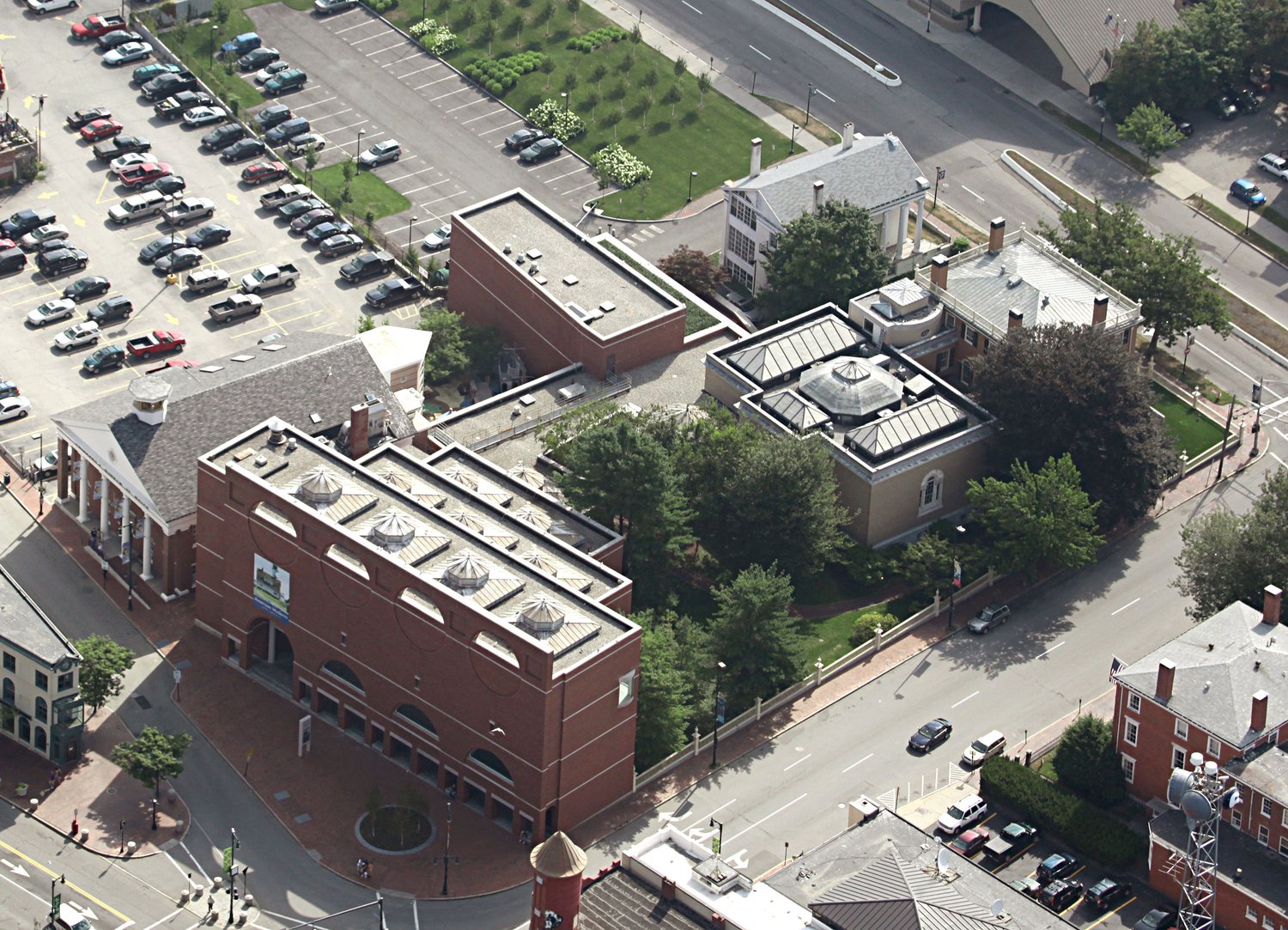
Portland Museum of Art Expansion | Portland

This actually does a great job at depicting the need for something unique, that it's "time", to build UP, and how they will exceed space within X# of years. Then tying in the Congress Square redevelopment pics to make it cohesive. Smart.
 
Thanks for sharing the PMA link.

This is exciting, but I'm far from convinced that what is going to happen will maximize the potential of what the new build will be, or even come close to. The necessary ingredient for truly great architecture is to enhance or improve the human experience--substantially. Simply adding more diverse and connecting exhibits in a new space is good, though not something new. I have seen many radically different types of curations in museums and galleries across the U.S. in the last decade. Attendance only spikes in the beginning.

The new building needs to dramatically shift the patron experience from staid and educational to fun and educational. The architect has to interact with more forward-thinking museum curators on new ideas. The architect simply delivering a design to get notes will not work. The collaboration needs to be from the start, with creative ideas from both sides. A third collaboration is implied from the following:

Since many or most public entertainment venues today thrive with food and drink options, this must be incorporated, though tastefully and in select parts of the museum. Otherwise, it will not survive in the way they have imagined.

(please bear with me to the end and think it through before a REACTION)

--Some exhibits can have a themed time period, i.e., 20s or 50s or 70s. If it's art and design from the 50s, perhaps a real working soda fountain true to the era with shakes and ice cream (though smaller tasting sized servings) can be in the background.
--The top floor of this building could be all glass with stunning views of the harbor. Small samplings of Maine's food economy could be purchased or included in the admission ticket. Patrons can choose a ticket price with or without food. This rooftop space would have shorter height partitions to display noted historical photographs of Maine. Why don't we ever see old photos of the OOB from the 30s? Lindbergh landed his plane on the beach. Big bands played at the end of the pier. It could also be leased out at night for special events. That's additional revenue for the museum. It would be a sophisticated place to look back at Maine history while enjoying food and drink.
--A floor designed for art that connects to Maine's new immigrants. Again, with small food tastings. (Why do we love going to Costco so much? The small food samplings!)
--A floor for kids, with tables to make things and hang them on the walls (or from the ceiling). It would be supervised and select materials used. They've done this before. I went to a First Friday a while back and kids were at a table making birds out of construction paper to hang from above. They were having a great time. And give them snacks too. Adults can't really join in, but can walk around to see the art they've done.
--At least two floors with select contemporary art with a stunning lounge space prescient to the future of living. Make it fun and changeable. Fun sample mocktails to serve. Ever been to the Blade Helicopter retro styled lounge at the East 34th Street Heliport? Google that. One doesn't want to leave. It has an immersion of history within.
--A gift shop that is HIGHLY visual. Make it fun, with a feel like the old FAO Schwartz on Fifth Avenue. Maybe little retro planes travel around near the ceiling. The PMA logo should be creatively places on a range of trendy clothing--including higher-end designers. Patrons will buy this. The PMA needs to also look at itself as a business model to making profit so that it doesn't have to beg for it all of time, like now.

Naturally, there would be another floor or two for the less exciting exhibits. The key is to incorporate some food and drink into the experience (not alcoholic except for the top floor space). I've been visiting many of the most popular and successful public entertainment facilities in the U.S. for my work (though mostly sports) the last two years, and they all have something in common--fun and easily accessible/simultaneous food and drink options. The only fun museum I've been to, or one with good food and drink options, is the relatively new Kinder in Houston.

I also believe that the new museum building should be stand alone, or not associating with the main one, and access is through the underground level from the existing building.

Expanding the collection is important, but it will not alone make the museum a substantially more exciting experience. The new Judy Glickman gift is great to have, but once you've seen the photos, why go back? This has been proven many times. And, making exhibits conducive to Maine's emerging diverse population is great, but that will soon grow stale unless continual out-of-the-box attractions and food and drink are offered.

From the PMA's call to action (paraphrased): We need a paradigm shift that delivers on the promise of art for all. If so, you will have to rethink the entire experience with how people want to be entertained and educated TODAY.
I for one am giving them the benefit of the doubt until we can see the actual musings of the architects on the 18th. Until then I will withhold judgement and opinions.
 
Looks like there could be an announcement as early as tomorrow on the winning design team:

“Concept designs are due mid-fall, followed by a public display and comment period, where drawings, models and videos of the proposed designs will be on view and available to the public at the PMA Nov. 18 - Dec. 9, 2022.”
Is that how its going to work? I guess I assumed the viewing/comment period was so that the public could view all submissions and give thoughts about which should win.
 
Is that how its going to work? I guess I assumed the viewing/comment period was so that the public could view all submissions and give thoughts about which should win.

More from the competition site:
“ Shortlist final submissions will be displayed for three weeks at the PMA in Portland, Maine as well as online on the competition website. Comments from the public will be collected and will only be provided to the Jury. In addition, all finalist teams will be requested to present their concept designs in a public forum to be held at the museum and will be given the opportunity to engage in a Q+A with this audience prior to their presentation to the competition Jury.“

All the details here:
 
Its really too bad tomorrow night's presentations aren't being live streamed - they're only being recorded for upload later.
 
The PMA offered this preview in an ad placed in today’s PPH
 

Attachments

  • D1A34E4E-2383-4E28-9632-BBCBF81CD8D8.jpeg
    D1A34E4E-2383-4E28-9632-BBCBF81CD8D8.jpeg
    893.8 KB · Views: 186
Not the height I was expecting with two of them but the bottom entry looks out of the box and quite eye catching. I'm looking forward to seeing the renderings from Free Street side which will have a greater impact in my opinion.
 
Last edited:
Interesting. Not at all what I was expecting. I also didn't realize there was going to be this much of an emphasis on the High St side - I guess that would now be the main entrance? Kind of a weird place for it. I'm sure all will become clear in the presentations.
 
Does it look like the LEVER design proposes cutting an arch through the Payson building?
 
Maybe High Street will be used for the main entrance and the current Congress Square portal will be the future exit which will disperse the visitors to the new pedestrian friendly plazas.
 
I was under the impression that the new entrance would be to the left of the current one where the old Children's Museum is (or was as its due for demo). Agree that it is seems weird being on High Street. Free Street makes more sense because there is less traffic. When the light is green traveling on High Street it's almost like a racetrack on this street. Why have that scene out front? And you could close Free Street for special events--not High Street. Have they really thought this through? If Frank Gehry can design a disaster museum (the one in Seattle) then I'm sure it can also be done in Portland, Maine.
 
Maybe High Street will be used for the main entrance and the current Congress Square portal will be the future exit which will disperse the visitors to the new pedestrian friendly plazas.
It seems clear that unless the architects were asked to move the main entrance to High street that there was some condition that warranted doing that since all of the proposals are doing it. As with anything the move is surprising but we will get used to it and probably come to like it even better.
 
Wasn't the primary point of the new Congress Square design to make the entrance around the museum and the traffic flow to Free Street more pedestrian friendly? Seems kind of like a wasted act if the museum entrance is going to be on High Street. But with good arch, anything can work. Even the back of the building on Spring Street. Hey...
 
I only like the Lever and Toshiko renderings.

I don't like that there would be an "entry" on High Street, unless they were trying to use that grassy area and turn it into some kind of plaza. Maybe some kind of outdoor eating/restaurant thing too? But they'd have to cut down that ancient tree, and that would sadden me. Right now that area is just used for rock art and other forgotten things. The only thing I can say is that this will make that space more useful.

However, I think Free Street (or even Spring Street) makes more sense for a primary entrance. Perhaps with cutting into that parking lot with the birches on Spring Street to create a drop-off arch for school busses and tours.

With an entrance on Free Street, this would also be better for creating an in-cut for vehicle drop off where the old Children's Museum is. Turn right from High Street - and presto, there's a lovely pedestrian friendly drop off.
 
Well I got my "sail" inspired design with the Toshiko rendering.....but that is my #2 choice. I like the LEVER design better....sleek & modern.....yet organic and understated. Love the curved roofline.
 

Back
Top