You are using an out of date browser. It may not display this or other websites correctly.
You should upgrade or use an alternative browser.
You should upgrade or use an alternative browser.
Roxbury Infill and Small Developments
- Thread starter czsz
- Start date
Brad Plaid
Senior Member
- Joined
- Jan 17, 2013
- Messages
- 1,310
- Reaction score
- 1,559
Good urbanism so kudos for that but the fauxstoric fakery is overwhelming. A future eyesore in the making...
Good urbanism so kudos for that but the fauxstoric fakery is overwhelming. A future eyesore in the making...
As long as they are using real materials (brick/etc), I don't see the problem - just let it weather and it will look like all of the 'real' old stuff eventually.
odurandina
Senior Member
- Joined
- Dec 1, 2015
- Messages
- 5,328
- Reaction score
- 265
Yes! What is it? Bribe Tito with good cladding? Now add a few more units.... Whether it's near the Adams Courthouse, Burial Grounds, Beacon Hill or Roxbury, stuff should match, even to the point of being fake. They did Lovejoy Wharf right. In 35 years people will hardly remember Rowes Wharf is a recent addition. In 45 years, it'll still be here, and people will truly, think it's old. in 90 years, it will be. Why not Roxbury? What does the signature say; "A city is old. It's learned to wait."
Tombstoner
Active Member
- Joined
- Mar 5, 2010
- Messages
- 707
- Reaction score
- 2
Good urbanism so kudos for that but the fauxstoric fakery is overwhelming. A future eyesore in the making...
I don't this is trying to be fauxstoric at all--yeah, it's got the mansard elements and gables, but the fenestration is very contemporary--yeah it's making a gesture towards Haussman style but it's not being too Disney about it. That being said, I think if it was 2 or 3 stories taller it would be better as, currently, the scale makes the relentless symmetry a bit institutional.
Jouhou
Active Member
- Joined
- Nov 3, 2015
- Messages
- 683
- Reaction score
- 51
It's the modern take on second empire which is in fact in reference to the French second empire in which that "Parisian" look came to be in France shortly beforehand. Many of the buildings around here (including the one I live in) were built in this style.
Edit: it would look "right" if they made some decorative feature rise above the rest of that flat roofline. The Parisian buildings have chimneys, what I live in has a chimney and a slightly taller portion of roof with an oval window in the center.
Edit: it would look "right" if they made some decorative feature rise above the rest of that flat roofline. The Parisian buildings have chimneys, what I live in has a chimney and a slightly taller portion of roof with an oval window in the center.
Last edited:
Good urbanism so kudos for that but the fauxstoric fakery is overwhelming. A future eyesore in the making...
It certainly is a huge improvement and Im all for the size (maybe even a florr or two more)... BUT... the chance that quality materials are used is extraordinarily low and I fear that the facade will end up looking very, very cheap and within a few years of weathering look horrendous. Dudley Street has been jam packed these last few years with banal garbage and I certainly would hope for something better than that, but I am very worried that this will be a tawdry eyesore, as Brad Plaid said.
Edit - if the BRA/BCDC would actually hold their feet very close to the fire on decent materials, then fine. But they never do that.
- Joined
- Jan 22, 2012
- Messages
- 5,078
- Reaction score
- 1,661
whighlander
Senior Member
- Joined
- Aug 14, 2006
- Messages
- 7,812
- Reaction score
- 647
It doesn't look Parisian from this picture.

TySmith -- Yes it does -- outside of the covered parking -- there a many Parisian blocks where there is a hidden courtyard and some alley or something
These are very prevalent in many cities in Poland where the most important entrance is actually off the courtyard
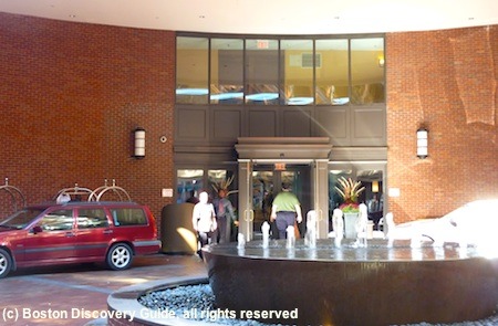
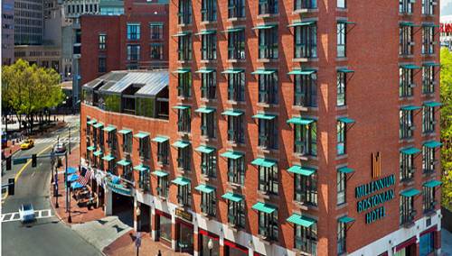
Come to think of it we have a key example with the Millennium Bostonian Hotel where the main entrance to the lobby is hidden from the street


A new development near Roxbury Crossing has broken ground according to Bldup
New five-story mixed-use transit-oriented building featuring 40 affordable residential apartments, 27,000 square feet of office space and 4,577 square feet of retail. Apartments will include 9 one-bedrooms, 21 two-bedrooms and 10 three-bedrooms. 32 apartments will be reserved for households earning up to 60% of area median income (AMI), three apartments will be reserved for households earning up to 30% of AMI and five will be reserved for households earning under 30% of AMI.
^And just saying Whigh I was referring to the covered parking not being Parisian. I agree that the rest of the building does have some French flair to it.
- Joined
- Jan 7, 2012
- Messages
- 14,062
- Reaction score
- 22,726
^This development is already covered, either in Mission Hill thread or in its own thread.
Correct. It's Phase 1A of the Parcel 25 development. And found on this thread.
Mission Hill Parcel 25 / Tremont St Roxbury Crossing.
http://www.archboston.org/community/showthread.php?t=4860&page=6
reverend_paco
Active Member
- Joined
- Oct 15, 2012
- Messages
- 401
- Reaction score
- 261
http://www.bostonglobe.com/metro/20...t-while-can/lIhK48ib0C5RyDcJSt3PUP/story.html
Looks like Boston finally won the $30 million in money to redevelop the Whittier Street apartments. These will be on the corner of Melnea Cass and Columbus right next to the new Tremont Crossing development.
Looks like Boston finally won the $30 million in money to redevelop the Whittier Street apartments. These will be on the corner of Melnea Cass and Columbus right next to the new Tremont Crossing development.
BostonDrew
Active Member
- Joined
- Mar 2, 2014
- Messages
- 487
- Reaction score
- 0

More housing coming to 1065 Tremont Street - looks like they are basically doubling the size of this thing.
http://www.bostonherald.com/business/real_estate/2017/02/expansion_planned_at_roxbury_site
Current conditions - you can see there's a parking lot behind it now
https://www.google.com/maps/@42.335...HdCdquj2sUQKatB-pg!2e0!7i13312!8i6656!6m1!1e1
Developers of a proposed six-story, 23-apartment building in lower Roxbury say the project would help further transform a once sparsely populated and high-crime area into a vibrant mixed-income neighborhood.
http://www.bostonherald.com/business/real_estate/2017/03/more_apartments_planned_for_roxbury
