Seaport Sq. Block N | 350 Summer Street | Seaport

Equilibria

Senior Member
Joined
May 6, 2007
Messages
6,959
Reaction score
8,040
Credit to dshoost for posting first on the other thread, but this should have its own:


p.9 or look at his post for renders.

This was originally programmed as residential, but they say they have a life sciences tenant, hence the need for an NPC. Residential is being made up in other buildings, but in terms of units, not NFA. Units are being maintained by making individual units smaller and "less" luxury-focused.

Also, no arts center (Yanni had implied that it could be relocated to N when it was dropped from P). Another middle finger to the community from WS. The building is very nice looking, though.
 
Thanks, Equilibria.

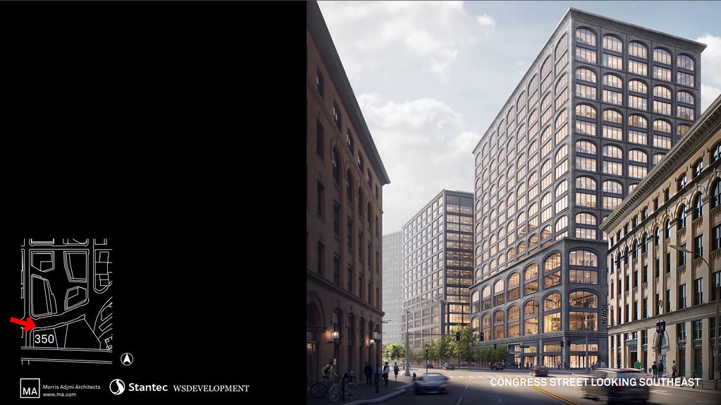
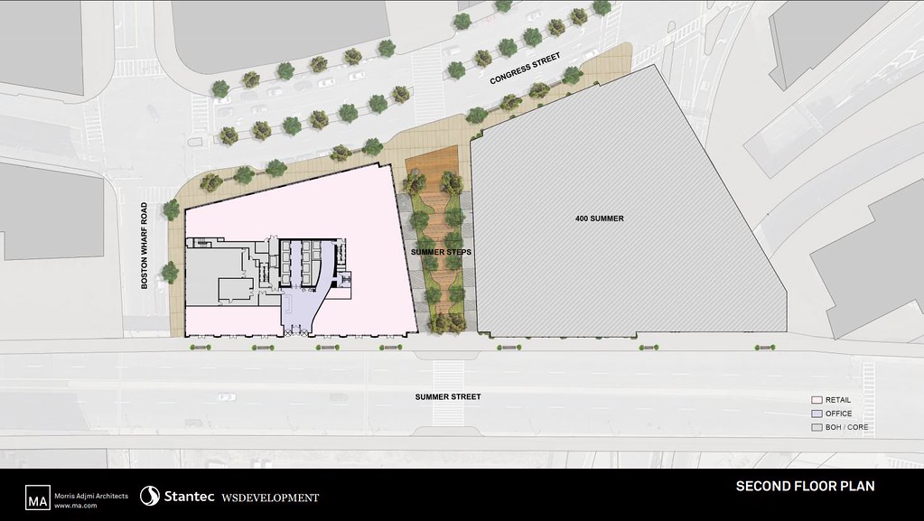
There was a Notice of Project Change filed today for Seaport Square Block N (350 Summer Street). There is also a slide deck downstream in the PDF with several beautiful images of the project (switching from residential to office/research).

350 Summer NPC - 1 by Derek Shooster, on Flickr

350 Summer NPC - 2 by Derek Shooster, on Flickr

350 Summer NPC - 3 by Derek Shooster, on Flickr

350 Summer NPC - 4 by Derek Shooster, on Flickr

350 Summer NPC - 5 by Derek Shooster, on Flickr

350 Summer NPC - 6 by Derek Shooster, on Flickr

350 Summer NPC - 7 by Derek Shooster, on Flickr

350 Summer NPC - 8 by Derek Shooster, on Flickr

350 Summer NPC - 9 by Derek Shooster, on Flickr
 
LOVE IT. Nice transition from Fort Point buildings to new Seaport designs.
 
I love love love the design here (and its fraternal twin across the staircase) but the loss of the cultural/arts center is really shitty. I really hope the city tightens the screws- I might be wrong here, but I feel the area is running out of space to support such an amenity.
 
Such a nice design with lots of details that seem to emerge the longer you look at it. The pessimist in my wonders how this will get VE'd down to something cheaper.
 
The faster this end fills up the better so then the focus moves to D and E st. Right now were in the downtown area equivalent, as it moves inland just like mainland Boston well get things that start to look more like chinatown, south end etc..
 
Last edited:
It's quite weird that L4, P and N have all moved forward where the one that got to BCDC approval (D) hasn't been touched. This seems like a huge benefit to the streetscape though, so I'm not ccomplaining
 
Credit to dshoost for posting first on the other thread, but this should have its own:


p.9 or look at his post for renders.

This was originally programmed as residential, but they say they have a life sciences tenant, hence the need for an NPC. Residential is being made up in other buildings, but in terms of units, not NFA. Units are being maintained by making individual units smaller and "less" luxury-focused.

Also, no arts center (Yanni had implied that it could be relocated to N when it was dropped from P). Another middle finger to the community from WS. The building is very nice looking, though.

Eq - Actually I think the document says the arts center goes to Block L5 at the corner of Boston Wharf Road and Congress Street - probably a better place than up on Summer Street.
 
Parsing the NPC, it mentions res on L3/G and still has an office component, so that will probably go L6. That leaves L5+D for office and the dev is done
 
Last edited:
This is a joke, it will end up being as cartoony as International Place (with all those absurd Palladian windows) and the ever-wretched 500 Boylston. Oversized colossal order arch windows repeated endlessly and an exaggerated cornice are PoMo conceits from the 80s that should have stayed dead and buried. This is the third building from this developer with a dull and dark repetitive grid. No creativity, no originality.
 
Eq - Actually I think the document says the arts center goes to Block L5 at the corner of Boston Wharf Road and Congress Street - probably a better place than up on Summer Street.

So it does! I retract my criticism for now. Expect to see it again if they back out of L5, too :)
 
This is a joke, it will end up being as cartoony as International Place (with all those absurd Palladian windows) and the ever-wretched 500 Boylston. Oversized colossal order arch windows repeated endlessly and an exaggerated cornice are PoMo conceits from the 80s that should have stayed dead and buried. This is the third building from this developer with a dull and dark repetitive grid. No creativity, no originality.

I think it's contextual and attractive, a strong link between brick and mortar Fort Point and glass and steel Seaport. There's also no Colossal Orders on this structure as presented.
 
I think it's contextual and attractive, a strong link between brick and mortar Fort Point and glass and steel Seaport. There's also no Colossal Orders on this structure as presented.

He means - I think - that each window is two floors. And the windows towards the bottom may be three? It’s hard to tell. I agree it can go in the PoMo cartoonish direction if it’s not done with high quality materials.
 
Some of that brick detailing doesn't look like a joke for modern standards. This looks great.

Edit: however, the closeup appears to have only one side having brick?
 
I think it's only one side without brick. If you look at the renders from different angles, the interior facade on the stairs doesn't have a cornice (on either this or P).
 

I guess I missed the part in the document that said this:

The 600-seat SeaPAC, as WS calls it, would go in the lower floors of the building at Congress and Boston Wharf Road. If Amazon takes its option for that building, construction could start next year.

SeaPAC would appear promising, then, since for construction to begin next year, L5 would need to be pretty deep in design at this point. Also, Amazon wouldn't want to be associated with broken promises to neighborhood groups.

Countdown to SeaPAC becoming the "Amazon Performing Arts Center"... also, how did this skate by?

WS also confirmed, in a roundabout fashion, that the $20 million in transportation improvements the state offered Amazon as part of its Seaport expansion will be passed on to the online giant, not kept by the developer. The Globe last year reported that the funds — which supplanted $20 million in spending that WS had promised as part of permitting — would be passed on to Amazon in the form of lower rent, though state officials have declined to answer questions on the complex deal. In its letter to the BPDA this week, WS said it “will not retain any portion” of that money.

That sounds... pretty bad! I read the linked article, and it sounds like the Baker Administration agreed to forgive $20M of promised private investment in transit so that the money could be funneled to one of the world's richest entities. Essentially, they're hiding an incentive to Amazon by laundering the money through WS. That's pretty sketchy, Charlie!
 
Last edited:
Though renders can be deceptive, I like this. It seems contextual to my eye, not PoMo. What Johnson did was, well, for lack of a better word, cartoonish. This seems more respectful. I hope the materials pass muster. It's good to see something other than bland walls of glass.
 
There's something reminiscent here of the Chicago School. Some combination of the well-articulated piers, the large windows, the masonry (faux I'm sure), the repetition, the cornice.... Add some terra cotta panels and you might really have something. Is it a reduction? Sure, but I'll take a Sullivan-esque presence along the street wall like this any day over another glass box.
 

Back
Top