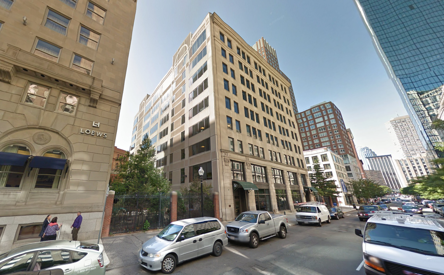
The gerbil tube is definitely permadead on this project given the ownership change. Thats a win... still, I hate it.
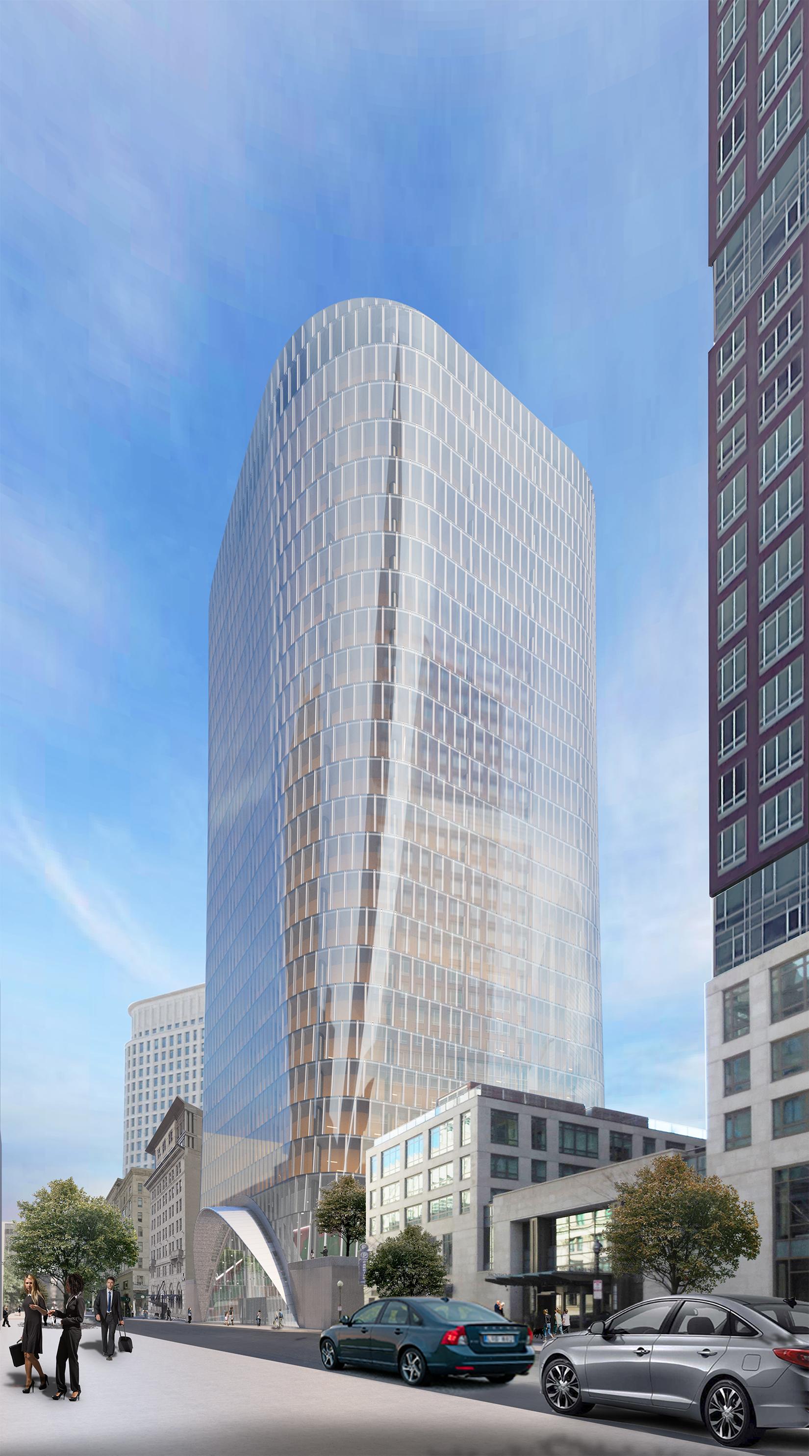
It’s frustrating to lose buildings like this for boring commercial architecture. Its one thing if the replacement was interesting or even tall but this is neither.
I have little confidence in Skansa coming back to the table with anything other than minor tweaks.
It’s frustrating to lose buildings like this for boring commercial architecture. Its one thing if the replacement was interesting or even tall but this is neither.
I have little confidence in Skansa coming back to the table with anything other than minor tweaks.
/cdn.vox-cdn.com/uploads/chorus_image/image/65514362/380stuart1.0.jpg)