South Station Tower | South Station Air Rights | Downtown


SIDE ENTRANCE TO SOUTH STATION

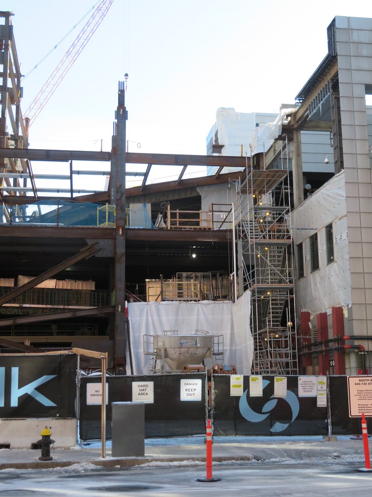
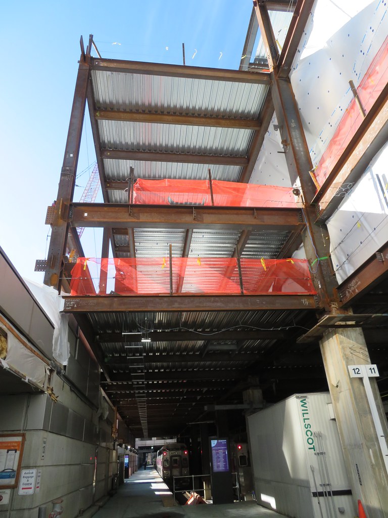
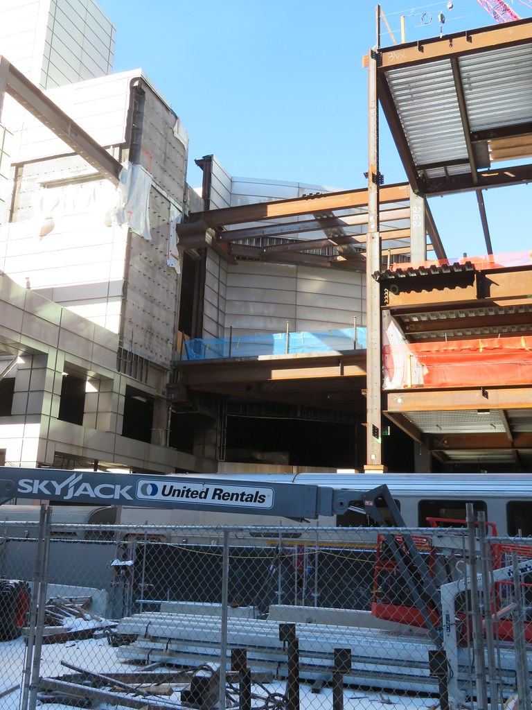
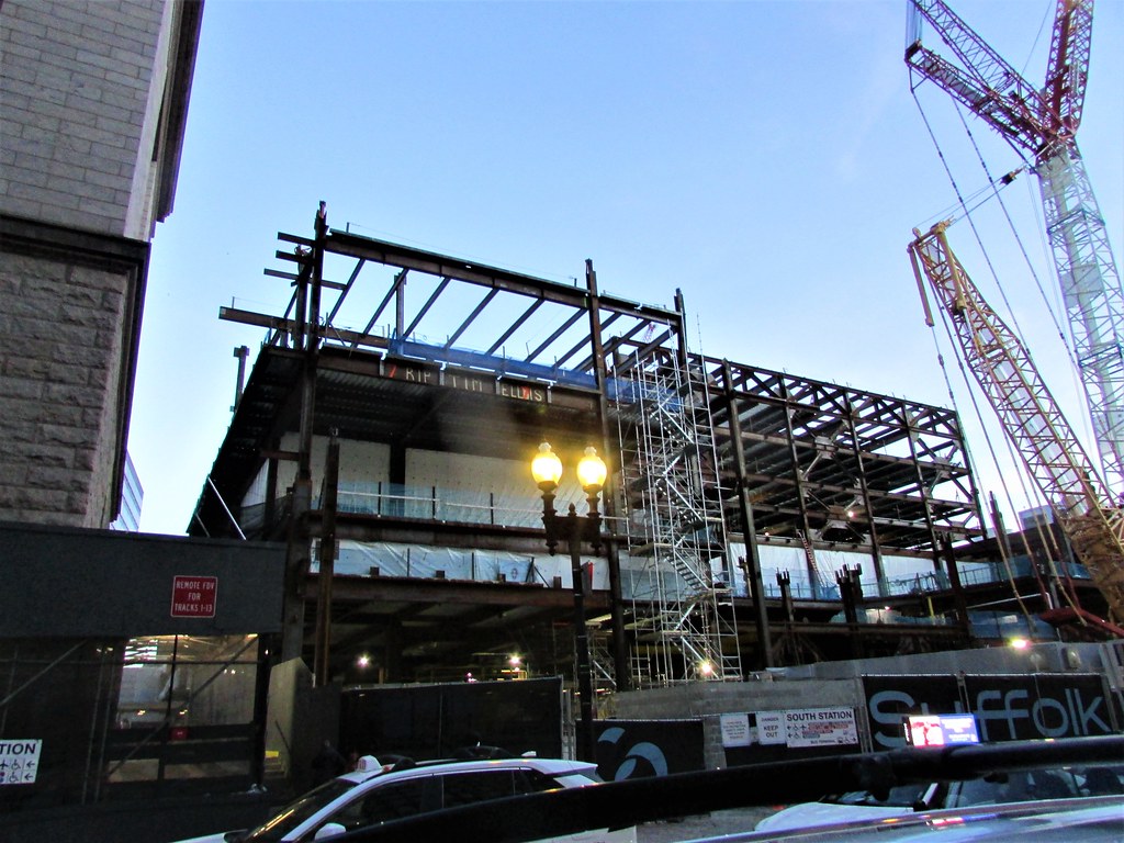
Only joking. The SS main front entry does not WOW because of the low drywall ceiling ( I think the second floor was built in at a later date?) but the main space is amazing. The seating area on the second floor East side is a nice space as well if I remember. The side entry will be more inspirational to walk into the "arches" area if they begin to look as light as they do in the renderings.
 
Like a large clock with an eagle statue perched on top?

Oh yeah, Statler, that's well in line of sight. That awesome eagle statue is so obvious from there.........


We have enough anonymous office building entrances, dontcha think? And by the way, no cab, shuttle, Uber or Lyft brings people to the eagle statue entrance. They drop on Atlantic.

This isn't the PWC cube at the Seaport. It's the freaking flagship transpo center for New England. Yes, it is the side entrance and it doesn't have to be grand - - but at least have signage, a picture of a choo-choo train or something more than it being the Coolidge Corner Eastern Savings Bank. But hey, I understand, Statler. There are still Bostonians perfectly content boiled beef.
 
Last edited:
SIDE ENTRANCE TO SOUTH STATION

Only joking. The SS main front entry does not WOW because of the low drywall ceiling ( I think the second floor was built in at a later date?) but the main space is amazing. The seating area on the second floor East side is a nice space as well if I remember. The side entry will be more inspirational to walk into the "arches" area if they begin to look as light as they do in the renderings.

Exactly! Look at the render.......if you squint, you can see the spectacular arches in the development .......almost completely blocked from Atlantic Ave by .the staid, plain 90 degree cornered small passageway.

Unbelievable. Seriously, why the hell are they hiding those great arches? These Houston developers are drowning filet mignon with Purity Supreme ketchup.

.
 
Last edited:
SIDE ENTRANCE TO SOUTH STATION

Only joking. The SS main front entry does not WOW because of the low drywall ceiling ( I think the second floor was built in at a later date?) but the main space is amazing. The seating area on the second floor East side is a nice space as well if I remember. The side entry will be more inspirational to walk into the "arches" area if they begin to look as light as they do in the renderings.
I would just call it SOUTH STATION. SS has more than one entrance, and this is one of the main ones.
 
[url=https://flic.kr/p/2n2vfvZ]IMG_1538 by Bos Beeline, on Flickr
51869292448_8612f75e55_b.jpg
IMG_1531[/URL] by Bos Beeline, on Flickr
IMG_1533 by Bos Beeline, on Flickr
IMG_1532 by Bos Beeline, on Flickr
IMG_1539 by Bos Beeline, on Flickr
IMG_1540 by Bos Beeline, on Flickr
IMG_1541 by Bos Beeline, on Flickr
IMG_1543 by Bos Beeline, on Flickr
IMG_1545 by Bos Beeline, on Flickr
IMG_1547 by Bos Beeline, on Flickr
IMG_1548 by Bos Beeline, on Flickr
IMG_1549 by Bos Beeline, on Flickr
IMG_1551 by Bos Beeline, on Flickr
IMG_1559 by Bos Beeline, on Flickr
IMG_1560 by Bos Beeline, on Flickr
 
Last edited:
Reminds me - wasn't this all supposed to be tied into the South Station Expansion project (with the claim that the expansion would be funded by the air rights development)? Sorry... the view of the post office triggered me.
 
Does anyone else think this is really missing signage or SOMETHING that celebrates that this is THE major transportation center of New England?????
Yes, but this is not the main entrance. I suspect there will be some signage, just not something grand or spectacular.
 
Yes, but this is not the main entrance. I suspect there will be some signage, just not something grand or spectacular.


Absolutely - - nothing major, just something HELPFUL to the traveler????

Boston is notoriously awful and unfriendly in it's signage for out of towners. If it really wants to be a "world-class city" it's going to have to start upping its game to be at least minimally traveler friendly. The render (and yes, I know it's only a render) was pathetic in that regard considering this is the major multi-modal transpo center of New England.

BTW - not only is there no signage in the render - but take a gander at that nondescript square pass-through "entrance". It is HIDING the sweeping archways of the platform!!!! It is like a bandage covering beauty. Not only that, it completely ANONYMIZES the entrance and hides to the public that this is South Station. That pass-through should at least mimic the fucking arches. The architects could not have actively hidden the function of the building more if they tried. It's almost "Architectural Intransigence".

We don't need those old Bostonians with the Pepperidge Farms guy accent nasally intoning "You can't get theyuh from heyuh". A sign and more functional entrance won't kill anyone.

1644860431724.png
 
Last edited:
“Boston is notoriously awful and unfriendly in it's signage for out of towners”

?!?!

I’d love to know where you got this impression. Boston has plenty of well-discussed good and bad points (some of which are more to do with legend/reputation than present-day reality), but I really don’t think “oh, Boston? Nice town, but there aren’t enough signs!” is one of them.


I didn't say "enough signs", Chris - - it's the quality of the signs and their effectiveness at informing. I, and people I've traveled with , particularly downtown and by North Station (just off the top of my head - coming up Causeway to North Washington intersection - explain THAT one - left hand side sign, hidden on the LEFT side of the pole - no middle of the street hanging sign on the street light wires at all, hundreds more like that) have had terrible difficulties with signage. To this day, the signs for exits in the artery tunnel are sudden and way out of whack in not informing the driver in time regarding their exit.

This render of South Station doesn't even address signage or function.

It's a local attitude. Just look at the pushback Durgin Park waitress attitude in this very thread to putting up a simple sign on Atlantic Avenue for the side entrance to South Station. You'd think a tax increase was at stake. We are talking a simple sign.

The function of good architecture and urban planning is not only beauty - - but to make the transport and flow of humans more efficient. It need not be a guessing game for out of towners on Atlantic Avenue to see if this indeed is South Station. That entrance should have a sign, and mimic the archways that it is hiding (for whatever reason the architect decided to hide them).
 
Last edited:
I agree with you that this side entrance is an important one, and probably the one I use 95% of the time. However, to play devil's advocate for a moment - South Station consists of 3 or 4 interconnected transit areas and is heavily trafficked by regular commuters. There're the subway tunnels under Dewey Square, and most people going to use those take one of the glass headhouses instead of entering the station and U-turning down the stairs. There's the bus station, and most people going there will be using the entrance facing Beach Street as opposed to walking along Platform 1. And then there's the Commuter Rail/Amtrak, and most regular daily users of those services use the side entrance here to avoid the heavy foot traffic inside the main station.

The main station contains amenities like the departure board, restrooms, CVS, ATMs, MBTA/Amtrak ticket booths, food and other vendors, and the police/help desks. The people most likely to use the grand station entrance are the people most likely to need those services, such as tourists, infrequent visitors, intercity commuters, etc. People who do a daily Red Line or Worcester Line trip don't need signage to know where they are or where they're going, while people who would be most confused probably need more than just the CR platform signs, so plopping them into the new arched area isn't most helpful. Once this project is completed, someone who has no idea where they're going are best-equipped to make it to any service South Station offers by going through the main entrance.

TL;DR: It may be a feature, not a bug, that signage is designed to route people who need signage to the main entrance rather than the limbo space between the indoor station and the Commuter Rail platforms.
 
The round thingy that's several pics down, that has the glass wall around it, is that where the tower is gonna go? 🤔
 
Last edited:
Absolutely - - nothing major, just something HELPFUL to the traveler????

Boston is notoriously awful and unfriendly in it's signage for out of towners. If it really wants to be a "world-class city" it's going to have to start upping its game to be at least minimally traveler friendly. The render (and yes, I know it's only a render) was pathetic in that regard considering this is the major multi-modal transpo center of New England.

BTW - not only is there no signage in the render - but take a gander at that nondescript square pass-through "entrance". It is HIDING the sweeping archways of the platform!!!! It is like a bandage covering beauty. Not only that, it completely ANONYMIZES the entrance and hides to the public that this is South Station. That pass-through should at least mimic the fucking arches. The architects could not have actively hidden the function of the building more if they tried. It's almost "Architectural Intransigence".

We don't need those old Bostonians with the Pepperidge Farms guy accent nasally intoning "You can't get theyuh from heyuh". A sign and more functional entrance won't kill anyone.

View attachment 21464

This side entrance and façade remind me of the refurbished malls in Southern California like the Century City Westfield in LA. Its not bad looking, but it doesn't have a "transit station" ambiance.
 

Back
Top