South Station Tower | South Station Air Rights | Downtown

To be fair though, niether is completed yet.

Except making that equivalence glosses-over the fact that Winthrop Square is nearly done! (whereas SST has years to go...).

It's hard for me to see how the Winthrop Sq. lobby wouldn't be done by New Years, given the progress that is plainly visible from walking around the site perimeter these days...
 
The arches are super cool but mainly only make sense because they have to build over the existing train platforms. The building is losing a lot of usable floorspace due to this. It wouldn't make sense for other buildings to give up the first 5-6 floors of usable space just because it looks neat to some people on an architecture site. That's what makes this one extra special!
 
The ground floor(s) at Winthrop Sq. was/were never going to be the Great Hall effect imagined in the early renderings. Those renderings were pure imagination, and completely ignored the one floor elevation difference between the two ends of the hall, that have to be bridged with ADA compliant means for high volume traffic.

I also don't think the Great Hall was ever as dramatic as these arches. It was always a glorified lobby, the question was how glorified.

And sitting at a (hopefully) increasingly prominent entry point to the city, the drama is more important here.
 
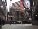
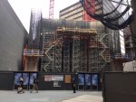
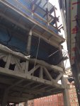
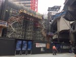
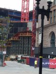
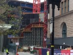
Formwork coming along. That’s going to be a lot of concrete in that arch!

87641E87-6C62-45D8-A7D1-E72E25D2D674.jpeg
 
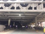
I still think it is the height of Idiocracy that they are not continuing the archway theme out to the Atlantic Avenue entrance - - - some moron decided to kill the theme at that point and make the entrance rectangular.

I mean just LOOk at that rectangular entryway corridor - - - and the juxtaposition between its 90 degree angles and the graceful archway one can partially see further on. It's sloppy.

1660419701348.png
 
Last edited:
I still think it is the height of Idiocracy that they are not continuing the archway theme out to the Atlantic Avenue entrance - - - some moron decided to kill the theme at that point and make the entrance rectangular.

To be fair, I doubt the architect and developer are viewing the archway as a theme. They see it as a structural solution in order to build the tower in that location. There is no reason to deploy that solution at Atlantic Ave, and even worse it would cut into their usable floor space above.

The tower is also being built on spec. They're not going to opt for every (unnecessary) bell and whistle just because it might look slightly better in a localized area, in this case right by that side entrance and that's it. There's still a lot of uncertainty and risk involved with this building.
 
Also there will be something dramatic in walking through a smaller, more regular opening and being released into a grand arching space. I design imersive theater and one of the big spacial concepts we work with is compression vs. expansion. Walking though a small space to get to a big space gives a sense of awe and wonder. Honestly if they continued the arches all the way out to the street they would likely be less impressive to view.
 
I'm impressed with the design, the renderings, and what we see so far but more importantly thrilled that this is actually happening. I would have bet and lost that this project would have been scrapped outright a few years ago.
 
To be fair, I doubt the architect and developer are viewing the archway as a theme. They see it as a structural solution in order to build the tower in that location. There is no reason to deploy that solution at Atlantic Ave, and even worse it would cut into their usable floor space above.

The tower is also being built on spec. They're not going to opt for every (unnecessary) bell and whistle just because it might look slightly better in a localized area, in this case right by that side entrance and that's it. There's still a lot of uncertainty and risk involved with this building.

To be clearer, I was referencing the doorway and corridor to the street (not the entire side of the building). It would not cut into any interior floor space The cost would not be exorbitant.

And architectural themes and aesthetics are "unnecessary" in some peoples' opinion. Different people have different priorities. Others think height fetishes are unimportant to what makes a vibrant and dynamic city.
 
Last edited:
To be clearer, I was referencing the doorway and corridor to the street (not the entire side of the building). It would not cut into any interior floor space The cost would not be exorbitant.

And architectural themes and aesthetics are "unnecessary" in some peoples' opinion. Different people have different priorities. Others think height fetishes are unimportant to what makes a vibrant and dynamic city.

It's worth noting that there are windows on that short side of the headhouse, and it's hard to tell from the renderings whether the glass wall of the new building also extends to over the 'corridor' (it clearly doesn't reach all the way to over the concourse arches), which makes me wonder if they were obliged (or just preferred) to prevent obstructing light reaching those windows, which a full high arch might well have done. A bit of a facade-arch doorway would have been nice, but I don't know if that would have unduly narrowed the entrance (if not, then that would have been an acceptable aesthetic concession that they should have done).
 
Also there will be something dramatic in walking through a smaller, more regular opening and being released into a grand arching space. I design imersive theater and one of the big spacial concepts we work with is compression vs. expansion. Walking though a small space to get to a big space gives a sense of awe and wonder. Honestly if they continued the arches all the way out to the street they would likely be less impressive to view.

Good point, and I appreciate what you are saying. But I'm not advocating for the same sized arches - it could've been a small arch for that entryway/corridor. Why the 90 degree angles that disregard what is inside? Great architecture communicates to the street the form, function and excitement of what is behind the wall. Don't we have ENOUGH blocky labs going up now????? Why do they have to make the facade of a grand old train station (where they are currently making a dramatic grand arched interior) look like it's in Cambridge Crossing?

They pitched a perfect game for 8 innings only to lose it in the 9th.
 
Last edited:
...a la FLW!

;)

Also there will be something dramatic in walking through a smaller, more regular opening and being released into a grand arching space. I design imersive theater and one of the big spacial concepts we work with is compression vs. expansion. Walking though a small space to get to a big space gives a sense of awe and wonder. Honestly if they continued the arches all the way out to the street they would likely be less impressive to view.
 
"Does the analysis indicate we should make this out of steel or concrete?"
"Yes"

That sounds like the dialogues I used to have with my dear departed mother as she got older:

She: Could you please bring me a soda?
Me: Do you want Coke or ginger ale?
She: Yes.

She also developed some interesting word usage, such as:

She (as I'm leaving her bedroom): Please turn off the door.
 
Change it to 500 feet and taller and the result is the same. There are 5 potential miracles that I can think of, but otherwise we might be stuck at 23 500'+ buildings for the next 10 years after SST is built.
1. Aquarium Garage Tower - LFG!!!
2. Copley Tower revival - LFG!!!
3. Developers get bold with Hurley Tower proposal, city goes for it, we get a new tallest downtown 700'-750' range - LFG!!!
4. 1 Bromfield back to residential, probably under the 709' but over 500.... LFG!!!
5. Somebody in Kendall notices the FAA map and says what the heck, the demand is there, let's eclipse 500... LFG!!!
Isn't there a 700 footer proposed for bulfinch triangle?
 

Back
Top