Re: South Station Tower
...in the "new" Boston skyline, it will be the "historical" equivalent of a 1 Financial or Pregnant Building. (certainly fat like Preggers)...
Though I do have a soft spot for the (former) Bank of Boston tower, One Financial might be the most forgettable thing that Pietro Belluschi designed. I think we can set the bar a bit higher.
...since it's working within tight FAA constraints, I don't hold this one to as high of a standard as I would, say, North Station. (Blech to those towers!!!)
The North Station tower proposals are both repulsive. Height has nothing to do with my distaste for Pelli's 677' sleep-aid.
The negative feedback for this would be better served focusing on sites that could potentially eclipse the (tower formerly known as the) Hancock.
I'm quite sure I'll be heaping scorn on the proposals you've listed as details become more clear.
Due to the airport we'll never get the visual game-changers in the heart of downtown...
Of course, but there are may ways to enhance a building's visual interest and personality, and Pelli has done exactly none of those things. The flat, inert glass facade only serves to make this tower look fatter. Ribbing, in dark metal, terracotta, or stone could make this scheme appear taller and thinner. It's a game of proportion, color, and depth of field.
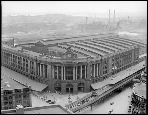
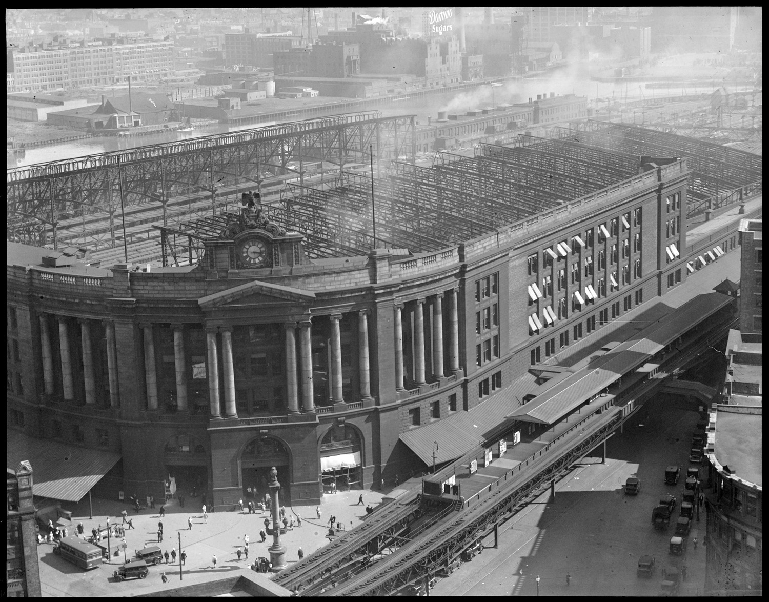
As I think about this, I'd have preferred a design that made reference to the lost train-shed, with dark metal ribs rising up the facade. Without adding an inch of height, this would be a great spot to "make the engineering visible." Think 21st Century update of
Victorian-era engineering, elegant in its utility and visually striking. The public spaces could be imbued with the same aesthetic. I think a scaled-down version of
Norman Foster's First and Mission tower in San Francisco, executed with dark ribs and clear glass, would be just the thing.


