MrDee12345
Active Member
- Joined
- Nov 28, 2019
- Messages
- 214
- Reaction score
- 348
This seems like a nuisance to take down!!!
I was last in Boston just under a year ago and I figured it would be done by now.
This seems like a nuisance to take down!!!
Couldn't disagree more. "Curtain wall out of the 70's" <---are you serious?! "metallic mullions..make the skin look busy and negating any sensual effect.." <--- the mullions enhance the effect and accentuate the curve by holding changing light. If this is 70's, bring back the 70's!This building is way too wide. Grotesquely wide. And that curtain wall looks like something out of the 70s. The raised, metallic mullions contrast starkly with the blue glass, making the skin look busy and negating any sensual effect the building's smoothly curving facade might have had otherwise.
What an enormous disappointment this one turned out to be.
Yeah the visual footprint in the skyline by this bad boy is really unique and needed. It works really well from East Boston, Boston harbor and then Charles or back bay but a crown of uplighting on this one would have been (FLAME EMOJI).
When you walk from the Garden to South Station now, it's almost urban skyline the entire way. With out all of North Station, One Congress/Bulfinch, and The Millennium's. Now with SST, I mean seriously. These last 10 years have been arguably the greatest development years in the history, and we aren't even talking about Seaport and ALL non-Boston Proper development.
Sometimes I think we all have to pinch ourselves that we've had such an incredible and lively forum the past decade, for the city we love, and an immense passion we all share. This has nothing to do with anything anyone wrote, I just started thinking while I was writing and it's honestly amazing.
The end.
Also the issue here isn't the width, it's the height to width ratio. Using google maps, the width of the State Street Tower at it's widest point looks to be about 260ft which is similar in width to the Wilshire Grand Center in LA. However, because the WGC's roof height is 900ft+, it looks well proportioned.Couldn't disagree more. "Curtain wall out of the 70's" <---are you serious?! "metallic mullions..make the skin look busy and negating any sensual effect.." <--- the mullions enhance the effect and accentuate the curve by holding changing light. If this is 70's, bring back the 70's!
Also the issue here isn't the width, it's the height to width ratio.
 IMG_0061
 IMG_0052
 IMG_0111
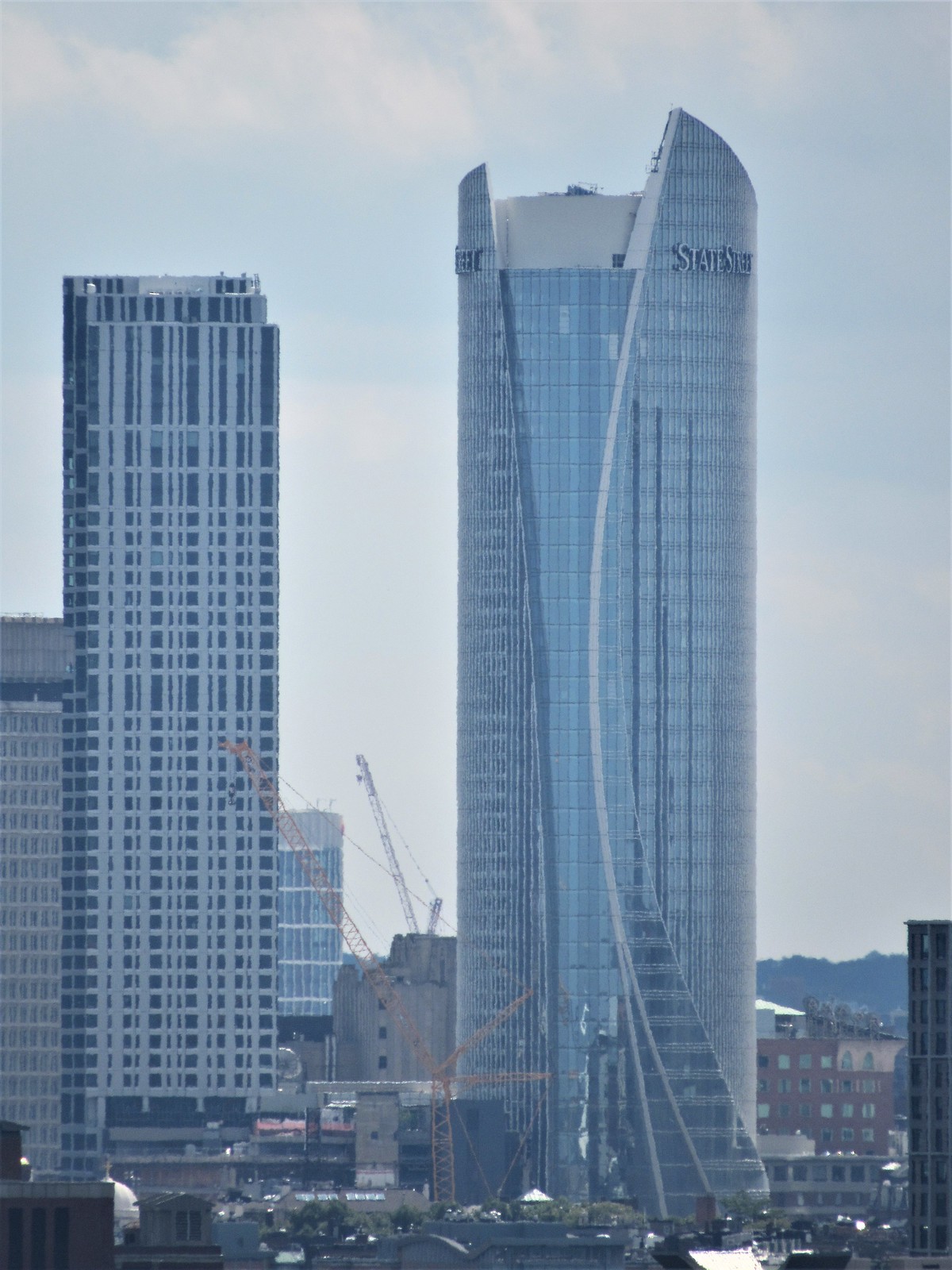 IMG_0113
 IMG_0141
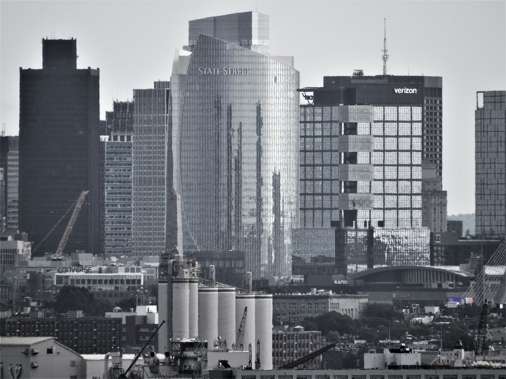 IMG_0252
 IMG_0275