- Joined
- Jan 7, 2012
- Messages
- 14,173
- Reaction score
- 23,688
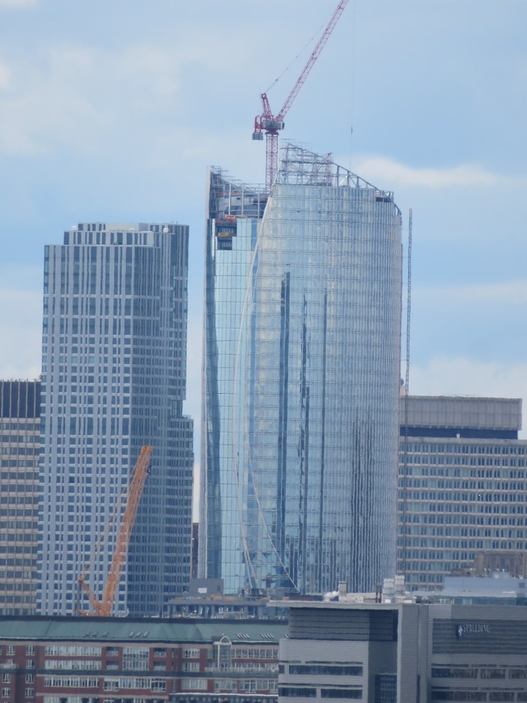 IMG_4647 by Bos Beeline, on FlickrIMG_4647 by Bos Beeline, on Flickr
 IMG_4665 by Bos Beeline, on Flickr
 IMG_4666 by Bos Beeline, on Flickr
 IMG_4681 by Bos Beeline, on Flickr
 IMG_4684 by Bos Beeline, on Flickr
I've noticed this a handful of times now, but with more and more glass going up it looks insanely fat from the north
More to the point, State Street isn't a retail bank - being a custodial bank (the biggest globally) it's customers are large institutions. (sic) [...]
That said, would it kill them to put the clipper ship up there? [...]
")
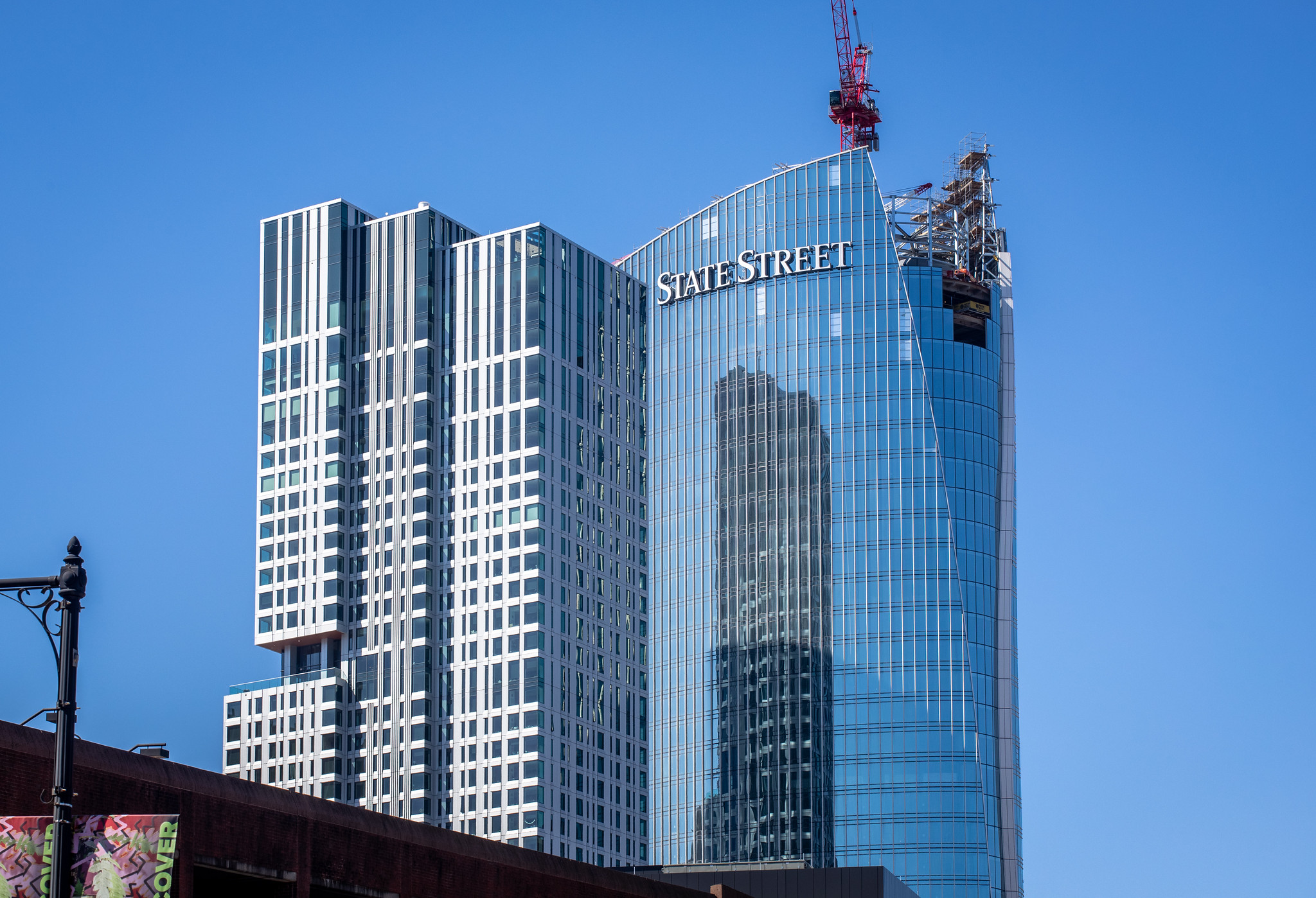
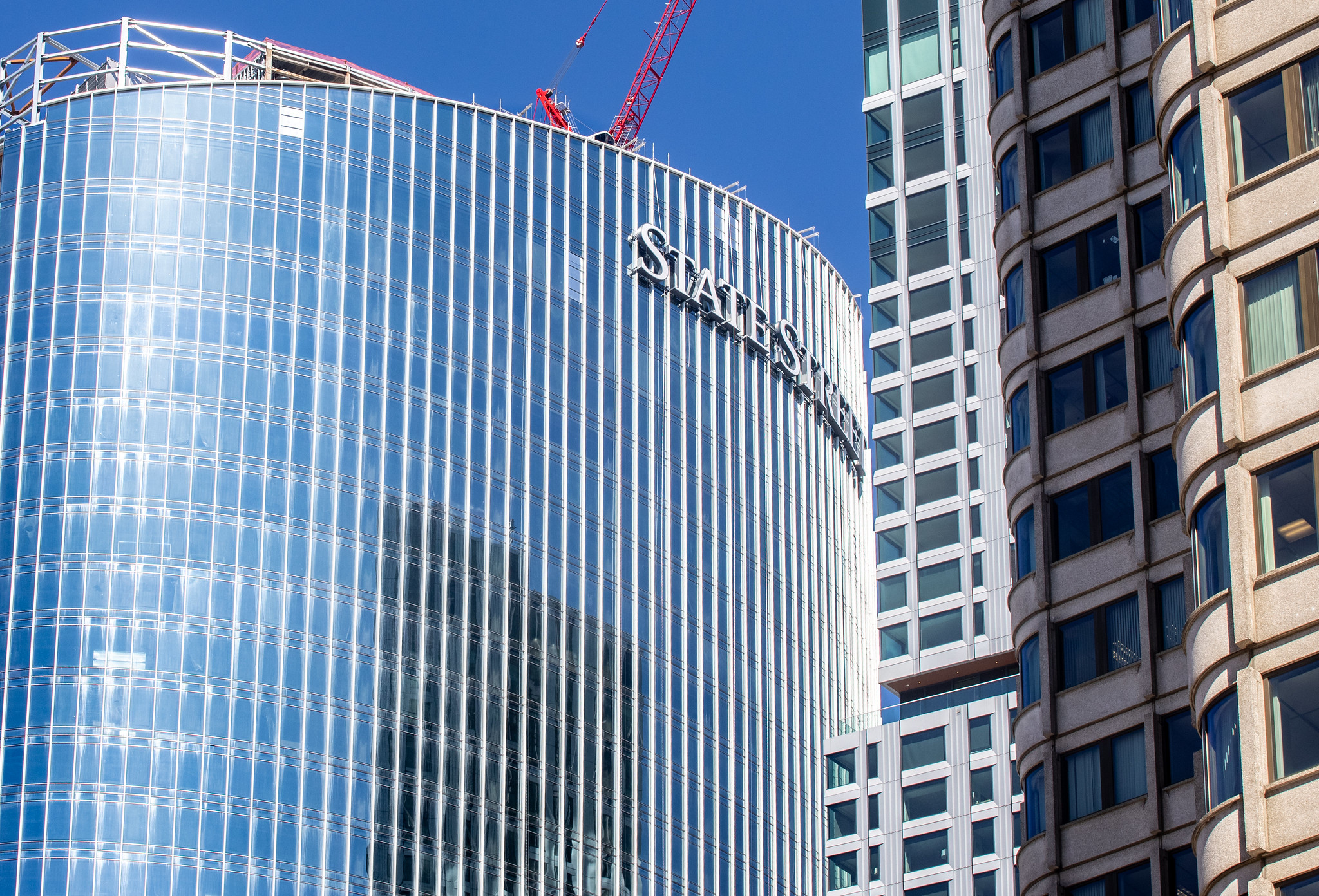
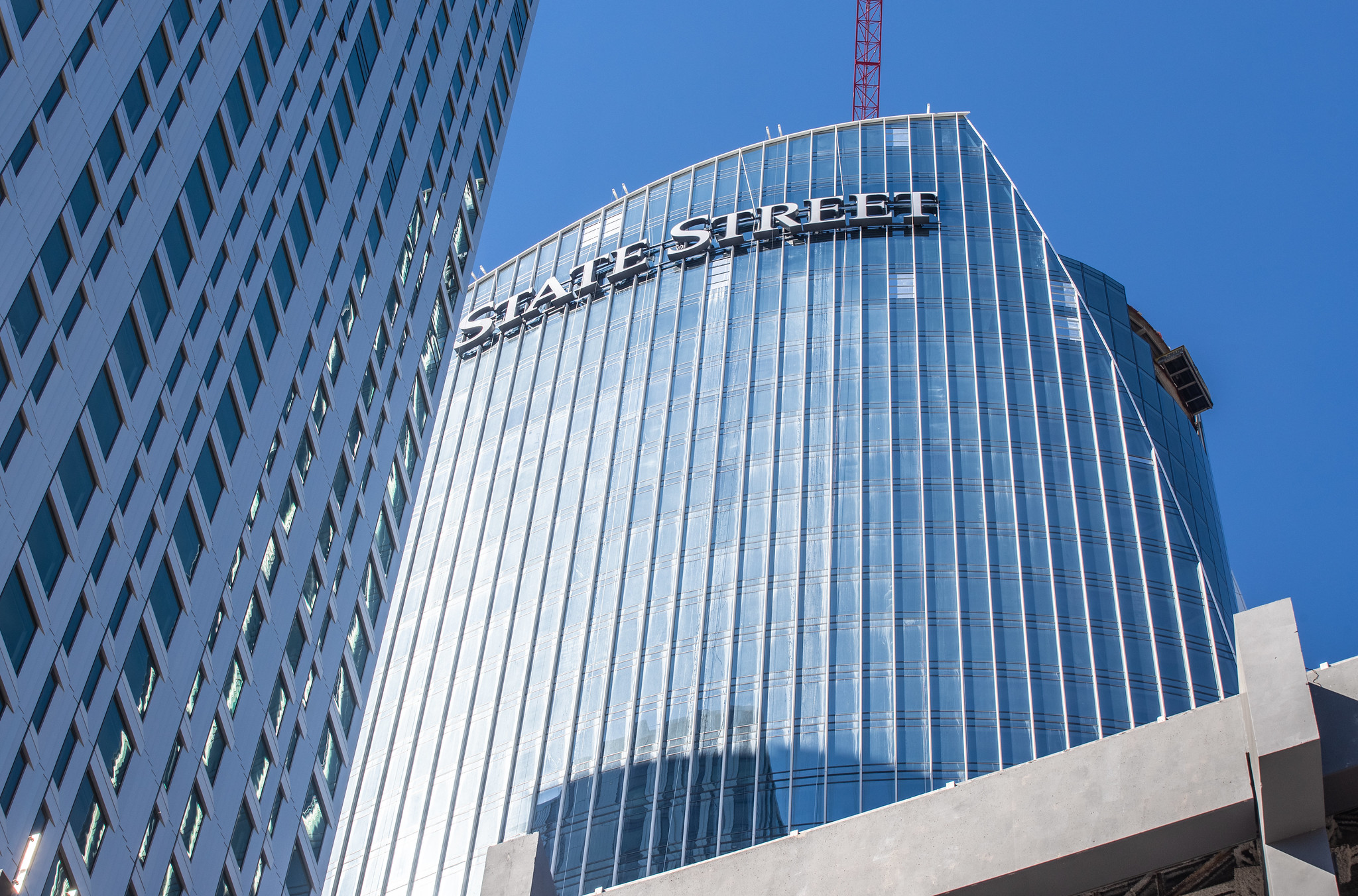
Never knew the logo was going to be put on there, it looks horrible. I think it’s disgusting how over regulated Boston signage is, but for giant companies with money they always get their way.Today
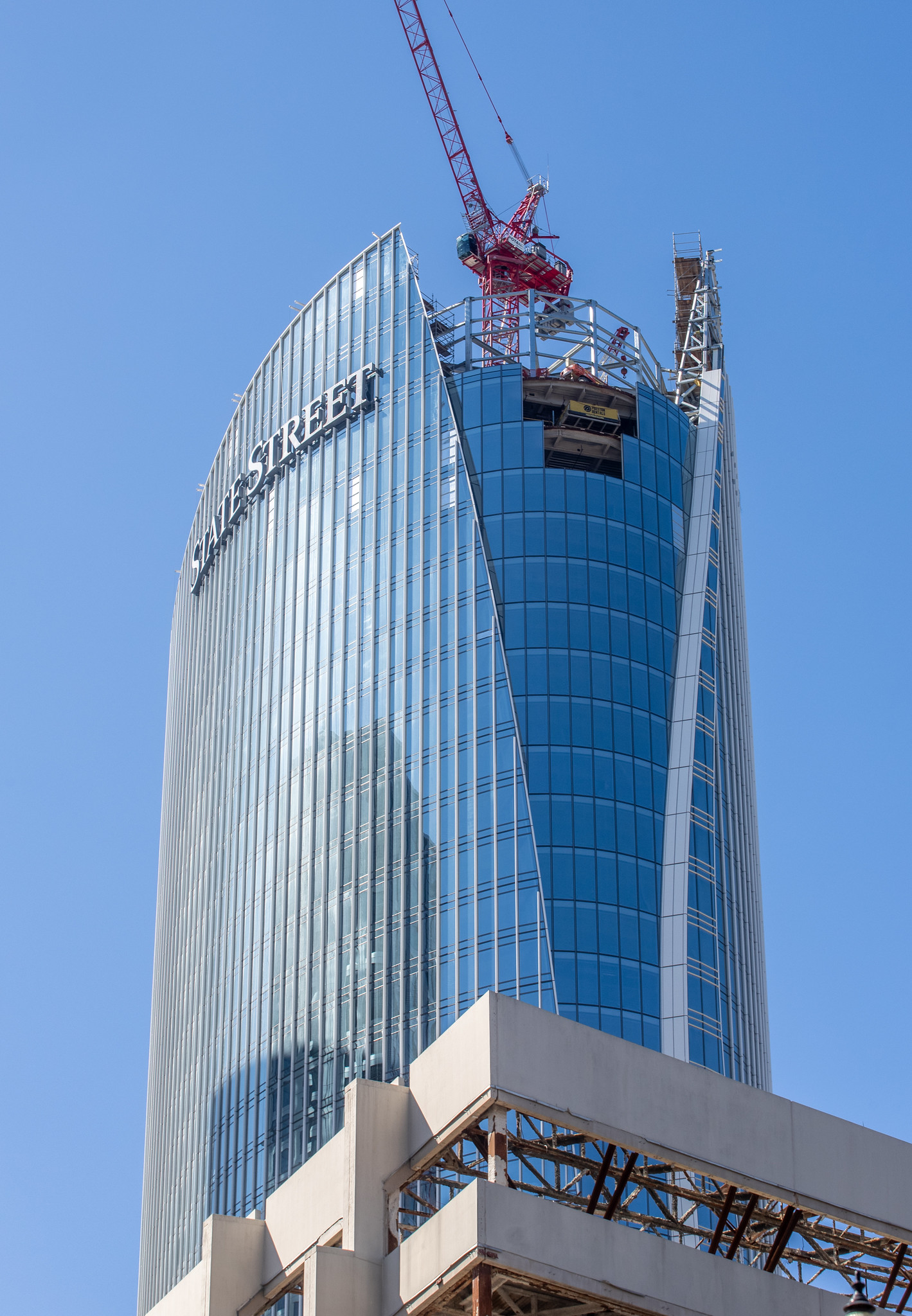
I've noticed this a handful of times now, but with more and more glass going up it looks insanely fat from the north
Never knew the logo was going to be put on there, it looks horrible. I think it’s disgusting how over regulated Boston signage is, but for giant companies with money they always get their way.
there’s been a lot of excitement about this project for a long time, but I have to say that I only ever thought it was good because it was decent height and a part of downtown that needs it, and it wasn’t a boring rectangle. The more I see this thing, the less I like it. It just screams unbridled capitalism and makes me think of Dubai.
I know. But the Lincoln St tower looks like it was designed to accommodate the logo, given all the horizontal lines at the top… although I’ve never liked the font. Simply from an aesthetic standpoint, the new building is going for a smooth, clean, and hence unadorned look. The logo looks stuck on. And the fact that it’s a logo of finance that is stuck on makes it feel all the more gross to me.There's been a "STATE STREET" sign on a building in Downtown Boston for many decades. I actually think it looks good on One Lincoln. Less so here.
It certainly is surprisingly fat-looking in the pics. So far, I have only seen it in real life peeking above other buildings so will have to see if it looks as wide/fat in person or not. I think for its location it's a nice height but could have been taller, if only by 10 stories.I actually think the logo helps a little bit with the fatness sides though the ship would have been better than the name.
The one thing that always grinds my gears with these developments in Boston is that yeah I get we can't get great heights in this city but it doesn't mean that everything has to be the same height. Variations in height of each building would go a long way even if one or 2 has to be a 100ft shorter.
I was thinking the signage actually helps break up the fatness a bit too and hopefully will do the same on the taller north facing side. The horizontal lettering draws the eyes away from the swoopiness and white vertical lines which kinda tricks the eye into thinking it's a bit taller, giving some perspective I guess. I live near the Montvale Ave exit in Woburn and drive in on 93 south pretty much every day and I don't think it looks as fat in reality compared to photos, but another hundred feet would've been ideal to stretch it above its neighbors that are all roughly the same height.I actually think the logo helps a little bit with the fatness sides though the ship would have been better than the name.
The one thing that always grinds my gears with these developments in Boston is that yeah I get we can't get great heights in this city but it doesn't mean that everything has to be the same height. Variations in height of each building would go a long way even if one or 2 has to be a 100ft shorter.
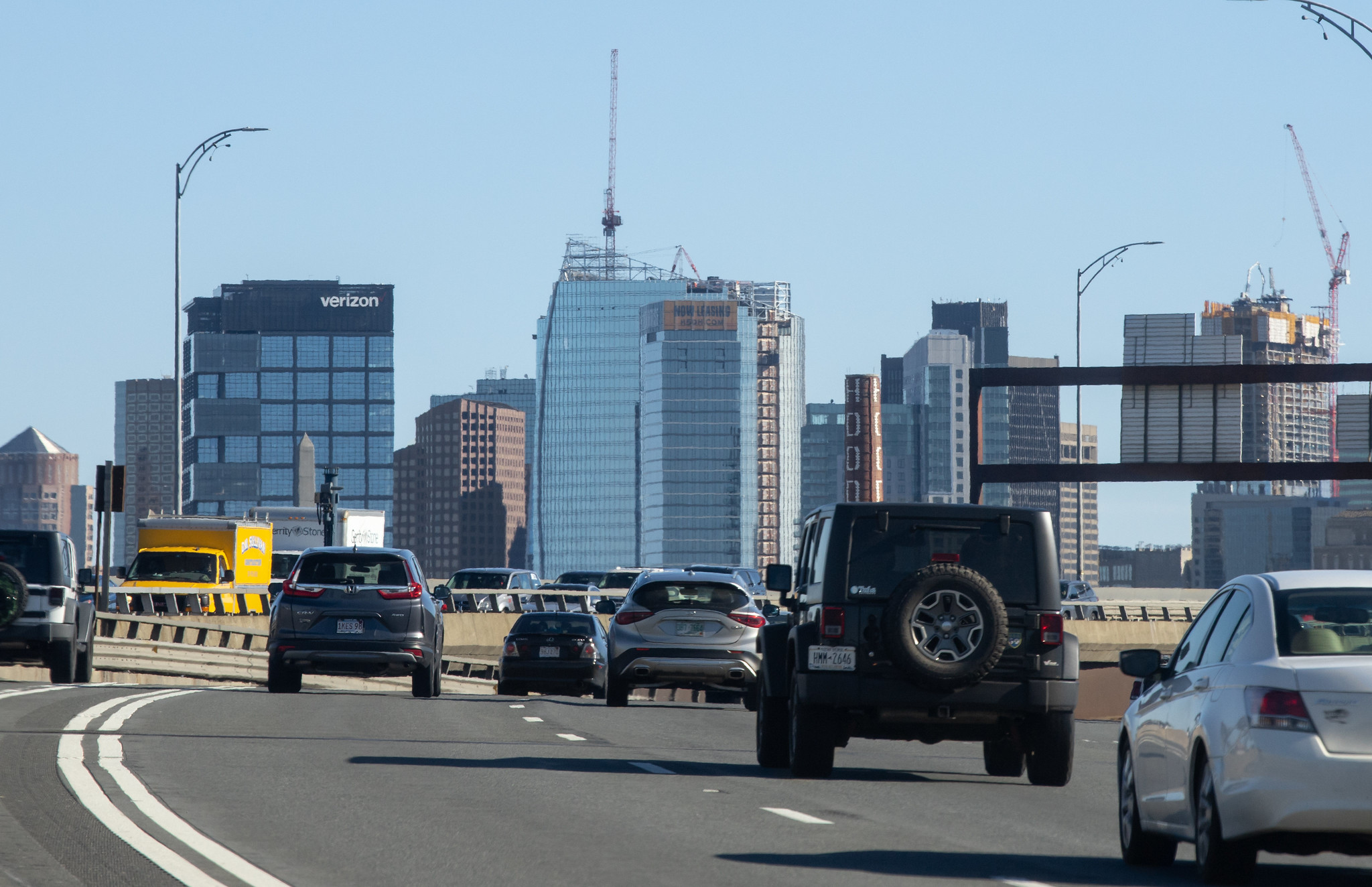
For a moment I thought, "But 1 State Street is the address..." then I realized it's 1 Congress.Tourists will think that's the street address of the building.
The current and soon-to-be previous State Street building is actually on Lincoln Street (1 Lincoln) and not on State Street, so I don't think anyone, tourist or not, is going to look up to a skyscraper and see "State Street" and automatically assume that's the address. I think it's a very well-known investment bank corp and really won't confuse that many people.Tourists will think that's the street address of the building.
It's got to be at least the fourth iteration of State St. Bank's headquarters in Boston. The first: John Hancock, Massachusetts' first governor, signed the bank's charter on June 25, 1792. The bank, named the Union Bank, was located at the corner of State and Exchange Streets and had as its first president Massachusetts Lieutenant Governor Moses Gill. Much later, the big move to Post Office Square on Franklin St.. Then the shift to the handsome 1 Lincoln, and now this magnificent specimen on Congress St. Keeping the brand "clean" by maintaining a consistent font for 230 years is brilliant IMO.The current and soon-to-be previous State Street building is actually on Lincoln Street (1 Lincoln) and not on State Street, so I don't think anyone, tourist or not, is going to look up to a skyscraper and see "State Street" and automatically assume that's the address. I think it's a very well-known investment bank corp and really won't confuse that many people.
It's got to be at least the fourth iteration of State St. Bank's headquarters in Boston. The first: John Hancock, Massachusetts' first governor, signed the bank's charter on June 25, 1792. The bank, named the Union Bank, was located at the corner of State and Exchange Streets and had as its first president Massachusetts Lieutenant Governor Moses Gill. Much later, the big move to Post Office Square on Franklin St.. Then the shift to the handsome 1 Lincoln, and now this magnificent specimen on Congress St. Keeping the brand "clean" by maintaining a consistent font for 230 years is brilliant IMO.
 IMG_9263
 IMG_9268
 IMG_9311
 IMG_9312
 IMG_9313