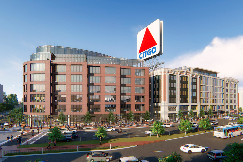
Both of the "plazas" seem very private to me and not successfully urban. There's no connection through/over them - they just dead-end into the residential entrances.
This new plan does better at creating an edge along Beacon and breaks down the scale well enough. But it lost some of the more public gestures of the old one.
Luckily this is a half block further away from the pike, but the usability of outdoor space in general here is pretty f'd by noise pollution. The plaza and passthrough of the direct neighbor, 725 Beacon, is always a ghost town (albeit they're in the absolute worse spot). If a proposal for Parcel 6 would come in soon I'd be sooooo happy...
A plaza doesn't need to be a connection or connect two places. Infill plazas are great areas for rest and relaxation. This plaza seems like it was designed straight from watching The Social Life of Small Urban Spaces. It's just up to Scape to include Landscape Elements (chairs and activities) that invite you in and up from the street). Though as you note, noise is going to be a pain, but hopefully the area will fill in and mature over time, and with it, lose some of the noise.
Is it too soon to be all negative and worry all that textured brick facade will be VE'd and look like Kenmore North?
Kenmore North comparisons at this phase are quite an insult. We haven't seen a facade sampler for Scape's other ongoing project (which includes a copper facade); I'd hold on until there's something up for 1252 Boylston Street before making assumptions about Scape's VE abilities, then hold off until this project has a sampler.
However, construction prices are going up, so I wouldn't be entirely surprised.


