Czervik.Construction
Senior Member
- Joined
- Apr 15, 2013
- Messages
- 1,932
- Reaction score
- 1,162
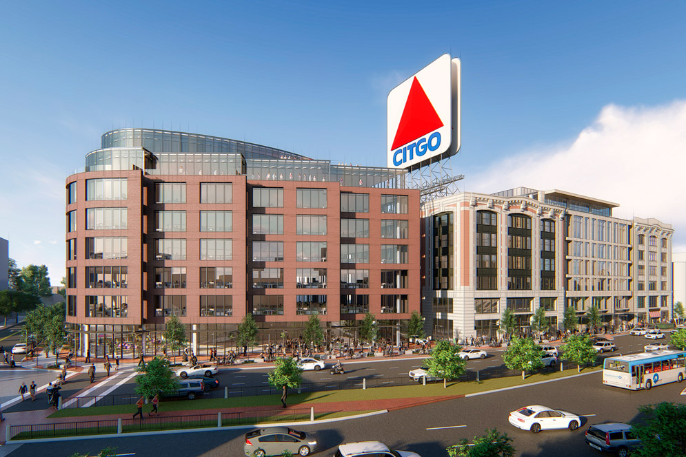
Is it too soon to be all negative and worry all that textured brick facade will be VE'd and look like Kenmore North?
Both of the "plazas" seem very private to me and not successfully urban. There's no connection through/over them - they just dead-end into the residential entrances.
This new plan does better at creating an edge along Beacon and breaks down the scale well enough. But it lost some of the more public gestures of the old one.
Luckily this is a half block further away from the pike, but the usability of outdoor space in general here is pretty f'd by noise pollution. The plaza and passthrough of the direct neighbor, 725 Beacon, is always a ghost town (albeit they're in the absolute worse spot). If a proposal for Parcel 6 would come in soon I'd be sooooo happy...
Is it too soon to be all negative and worry all that textured brick facade will be VE'd and look like Kenmore North?
A plaza doesn't need to be a connection or connect two places. Infill plazas are great areas for rest and relaxation. This plaza seems like it was designed straight from watching The Social Life of Small Urban Spaces. It's just up to Scape to include Landscape Elements (chairs and activities) that invite you in and up from the street). Though as you note, noise is going to be a pain, but hopefully the area will fill in and mature over time, and with it, lose some of the noise.
What really strikes me about this project is the degree to which it feels like it was truly designed. So many projects in recent years leave the feeling that not much actual design effort went into them. They're semi-standardized cut-and-paste off-the-shelf developments that could have worked on any of many potential sites. Draw up a rectangular massing, add a few angles/setbacks/cantilevers so it's not a total box, sprinkle in 6 different cladding materials, and call it a day. Practically every single Elkus building gives me this feeling, for example.BCDC: https://bpda.app.box.com/s/27fufw6kztfxid6oghg3bbfatxie0qva
Makes the Fenway Center look even more awful by comparison.
Is it too soon to be all negative and worry all that textured brick facade will be VE'd and look like Kenmore North?


It looks like a cross between a hospital and a i495 office landscaper.

Ground breaking ceremony happened yesterday for this much needed housing project!
Ground breaking ceremony happened yesterday for this much needed housing project!
