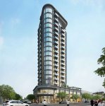
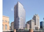
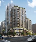
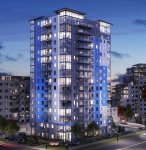
The Casco | 201 Federal Street | Portland

I really hope this gets built as rent is through the roof in Portland. Is the Tim Soley 20+ story building still in the works? I know they mention it in the PPH article. I find it extremely frustrating how citizens of Portland fuss about parking, when any successful city is short for public parking. This is the section of the city where high rise buildings (over 15 stories) should be considered/zoned for it.
A side note, I am surprised the population of Portland has not increased with all the construction of residential units over the past 10 years. Census shows Portland's population only growing by a small fraction.
 
I'm hoping that by the end of the year after all of the new census numbers are crunched Portland's 2020 population will hit 70,000 which would be the first time since the 1960 Census we've achieved that mark. My prediction is that we'll end up just shy at around 68,500 seeing the city only has 22 square miles to work with. Density and family units has changed tremendously since Portland's 78,000 peak after WW2 and the exodus to suburbia was not a friend to all cities in the frost and rust belts.
 
Last edited:
The fenestration is very conservative. Is there a fixed rationale behind the window rhythm? It seems caught between arbitrary and an attempt to highlight two vertical bays with that lighter stone. Maybe embrace those more, break up the rigorous grid some more and create some double-height figures on the facade.
The base looks solid, but almost imposing since it separates the tower from the street completely. The dark brown tinted glass also adds to the dated look to it. Not a fan of that corner in the 2nd rendering using the stone material instead of just brick. The other two visible corners are wrapped with the stone from a bay on either side, and this other one just has a single broken line inserted so it feels strange and disjointed. That looks like an area you could create those larger facade figures. Doesn't need to be a full glass corner like that Providence example, but that one has the right idea of breaking the plates with openings yet embracing them with the light horizontal banding.
 
Of course some of the comments out of the gate from the PPH is parking. The garages are full they say...well no one mentioned the garages at night? all are empty at night. People who are coming from away are used to Public Trans, walking, biking, uber, taxi...they want no cars and can live with out them., Us Maine people are car eccentric and will never give up a car even when I have to go to the store. Its stuck in our head. I would offer an incentive, no car = less rent. I do like the lower level, I would like to see a nice grocery market to fill up the space. I look forward to the planning process...
Parking will surely be a big question as we go through the Site Plan process, but we have more than ample parking already secured in the Chestnut Street garage. It is a few blocks away, but quite suitable for downtown living. Also there is a very complementary relationship between residential parking and commercial parking. Many of the downtown garages are empty during the evenings and weekend when residential parkers tend to be home. There are quite sophisticated algorithms that can manage this parking demand.
 
Hi All - First time poster here, but have been following for some time. I love this forum and seeing what's happening in Portland's development. I also hope that this project gets built. Redfern has a great reputation, especially with urban in-fill. There are so many wasted empty lots in Portland, and I've always been frustrated with the misguided antics of the groups that protest growth. Redfern would be taking a rather unusable lot and turning into something the city desperately needs. This can only be a positive. I agree that we need to get over our predilection towards cars and parking garages and invest more in (and erase the sigma regarding) public transportation (I would love to see a rail line or trolley system). I used to walk from my apartment on High Street to my first job at One Portland Square while my car sat parked for a week. With car shares, Uber/Lyft, bike shares - there are plenty of ways to get around. Perhaps the Rock Row hub could support parking while a commuter rail brings people into the city. At any rate, I do like the rendering here. It is simple and clean, though it mimics a lot of what we see at Portland Square. Is glass too expensive to cover a building in? I would further love to see the rest of the Portland Square project come to fruition as well as the Canal Plaza tower. I also like the renderings of the proposals on Congress street next to city hall. Portland NEEDS to grow and in a sustainable and meaningful way. This comes with exactly what Redfern (and JB Brown) is doing - filling in empty lots. We need to build UP not OUT. The suburban sprawl is not sustainable and not suited for public transportation. It destroys habitats and ecosystems that are so fragile right now. It is more important for the greater Portland area to look upward and change zoning to allow for taller structures. The culture and values of Portland will always evolve, but the heart of what made it such a wonderful place will always exist. Especially if we do this right. That comes with making Portland affordable for the working class, artists, and those working in service industries. We owe it to those people who made Portland such an interesting destination to include them in the process. It's time to get to work! :)
 
Welcome to the forum Daniel. And you are correct, it's always the vocal minority that tries to derail development plans with numerous measures including the attempt to stall projects with legal action. Which is why members on this site can be an asset for developers who are investing time and money to improve Portland by becoming more proactive when it comes to attending public planning board and city council meetings to help counter the NIMBY groups when necessary.
 
I really hope this gets built as rent is through the roof in Portland. Is the Tim Soley 20+ story building still in the works? I know they mention it in the PPH article. I find it extremely frustrating how citizens of Portland fuss about parking, when any successful city is short for public parking. This is the section of the city where high rise buildings (over 15 stories) should be considered/zoned for it.
A side note, I am surprised the population of Portland has not increased with all the construction of residential units over the past 10 years. Census shows Portland's population only growing by a small fraction.
Population was 78,000 in 1950 census. I think the reason for the modest increase now is the type of occupancy...it's primarily younger and older (pre-children and empty nesters) who are buying or renting the new units. 70 years ago it was large families.
 
I'm hoping that by the end of the year after all of the new census numbers are crunched Portland's 2020 population will hit 70,000 which would be the first time since the 1960 Census we've achieved that mark. My prediction is that we'll end up just shy at around 68,500 seeing the city only has 22 square miles to work with. Density and family units has changed tremendously since Portland's 78,000 peak after WW2 and the exodus to suburbia was not a friend to all cities in the frost and rust belts.
I should have just read this post before responding above. Bingo.
 
The fenestration is very conservative. Is there a fixed rationale behind the window rhythm? It seems caught between arbitrary and an attempt to highlight two vertical bays with that lighter stone. Maybe embrace those more, break up the rigorous grid some more and create some double-height figures on the facade.
The base looks solid, but almost imposing since it separates the tower from the street completely. The dark brown tinted glass also adds to the dated look to it. Not a fan of that corner in the 2nd rendering using the stone material instead of just brick. The other two visible corners are wrapped with the stone from a bay on either side, and this other one just has a single broken line inserted so it feels strange and disjointed. That looks like an area you could create those larger facade figures. Doesn't need to be a full glass corner like that Providence example, but that one has the right idea of breaking the plates with openings yet embracing them with the light horizontal banding.
My strong assumption is that Jonathan Culley and team (I assume RSA), who are veterans of the entitlement process in Portland and therefore understand what the City staff and more importantly planning board members are looking for (in a general sense) have designed this to have a good starting point in that context (rather than designing it in a vacuum or for architectural wow effect). I think your comments would be great to have expressed at a planning board meeting -- they hear far too often from the nay sayers and not enough from enthusiastic pro-development / design individuals. That said, there is a balance to be struck here too between cost and appeal. It's not uncommon for a developer to state that minimal wow effects are necessary (or max height is necessary) in order to be profitable, but often times this is misinterpreted by people as an ability to lower heights/density and increase design features until cost and profits basically break even. There's a risk factor and frustration element that deserve a premium to be paid on projects like this, which cuts against (in my opinion) going too bold and also does as a matter of fact (to respond to any critics of the comment in the PPH article) necessitate the higher height -- not that you were disputing that, but figured I'd address here as it relates to the same reason why sometimes design features are not optimized from the perspective of urbanists).
 
Of course some of the comments out of the gate from the PPH is parking. The garages are full they say...well no one mentioned the garages at night? all are empty at night. People who are coming from away are used to Public Trans, walking, biking, uber, taxi...they want no cars and can live with out them., Us Maine people are car eccentric and will never give up a car even when I have to go to the store. Its stuck in our head. I would offer an incentive, no car = less rent. I do like the lower level, I would like to see a nice grocery market to fill up the space. I look forward to the planning process...

There are a lot of people in Maine reluctant to give up their cars and trucks but it's notable that Portland has the 7th highest walkshare of all cities in the nation with over 30k commuters. 14% of commuters in Portland are able to walk! That's something that should be both celebrated and built upon. Providing more rental housing, as this proposal does, certainly helps maintain and even grow that percentage.
 
Much respect for Redfern, this is the first thread that I can remember that a developer has taken the time to participate in the discussions concerning their own project.
 
Thanks for sharing the info here, Redfern. I'm excited about this project as well and am confident it is in capable hands. I agree wholeheartedly with the comments around the benefits of building "up" instead of "out." This sort of density is important in order for the city to grow in a more sustainable manner and this is a perfect spot for this type of housing.

A few random thoughts/opinions/suggestions on the design: I like the pedestrian-scale of the base and the overall proportions of the tower given the building lot. Curious to see how wide it looks compared to the rest of the skyline. While you wouldn't notice except from a distance, the top does seem a bit anticlimactic to me. It's nice that the utilities are hidden at the very top but maybe the surrounding walls could have a little flair. As a taker of photos, I'd love to see some sort of lighting element at the top for my nighttime shots. Doesn't have to be as elaborate at the Empire State Building, but some mood lighting may look nice. Example from the Liberty Mutual building in Boston:

15_CBT_Liberty_Mutual.jpg
 
That is a great idea and classy example Corey. Other than the flashing bulbs on top of the Time & Temperature Building, Eastland sign and the floodlights on City Hall Tower, there's not a lot of visual excitement along the Portland skyline at night. Even if a similar treatment like the lighting effects on the top of the Hilton Garden hotel on Commercial Street was added. Not sure how illumination would potentially effect residents on the upper floors trying to sleep but it would be cool to give Maine's tallest building a unique effect on top so it really stands out form the interstate and waterfront.
 
Last edited:
Thanks for sharing the info here, Redfern. I'm excited about this project as well and am confident it is in capable hands. I agree wholeheartedly with the comments around the benefits of building "up" instead of "out." This sort of density is important in order for the city to grow in a more sustainable manner and this is a perfect spot for this type of housing.

A few random thoughts/opinions/suggestions on the design: I like the pedestrian-scale of the base and the overall proportions of the tower given the building lot. Curious to see how wide it looks compared to the rest of the skyline. While you wouldn't notice except from a distance, the top does seem a bit anticlimactic to me. It's nice that the utilities are hidden at the very top but maybe the surrounding walls could have a little flair. As a taker of photos, I'd love to see some sort of lighting element at the top for my nighttime shots. Doesn't have to be as elaborate at the Empire State Building, but some mood lighting may look nice. Example from the Liberty Mutual building in Boston:

15_CBT_Liberty_Mutual.jpg
I agree with Corey and Portlander. Some kind of illumination would be great. The mock-ups look awesome, but are reminiscent of the Portland Square buildings at the top. It'd be nice to have something a little different/unique that makes the Portland skyline stand out. Perhaps something more architectural at the Top or Corner, maybe like the corner of the Hyatt Place on Fore Street (but with straight clean lines). I really like the idea of interesting architectural building corners, but straying from the building-block look.
 
Just some concepts I came across. The Wells Street Tower in Milwaukee and McKinney Building in Dallas (both renderings from 2016). These materials may be more expensive, so potentially unrealistic.
 

Attachments

  • McKinney Texas.jpg
    McKinney Texas.jpg
    130.6 KB · Views: 216
  • Wells Street Tower.jpg
    Wells Street Tower.jpg
    75.9 KB · Views: 209
Portland should be called the brick city by the sea. I understand after the great fire that we should utilize bricks, but we need to move on. I would like to see some glass incorporated. Not so much glass as in the Seaport district in Boston. The design reminds me of the lincoln square project proposed. 80's look with brick. But we have to cow tow to everyone and not think outside the box for design. I love the Redfern design on congress street where several materials are incorporated. Also I dont know what the regulations are for light pollution on buildings(illumination). But I would want something that is hip maybe incorporate a rooftop garden, or restaurant. Car Share service, etc to please the progressives...LOL
 

Attachments

  • Seaport.jpg
    Seaport.jpg
    119.9 KB · Views: 231
  • the-alyx-at-echelon-seaport-boston-ma-building-photo.jpg
    the-alyx-at-echelon-seaport-boston-ma-building-photo.jpg
    156.8 KB · Views: 171
16 Story Bldg..jpg Some aspects of this 16 story building I like such as the glass at the corners and the large glass windows at the top floor of the building. I realize the overall look and color scheme of this building would never work at the Federal Street location but in the end I would like to see a bit more glass incorporated into the final design.
 
Thanks for sharing the info here, Redfern. I'm excited about this project as well and am confident it is in capable hands. I agree wholeheartedly with the comments around the benefits of building "up" instead of "out." This sort of density is important in order for the city to grow in a more sustainable manner and this is a perfect spot for this type of housing.

A few random thoughts/opinions/suggestions on the design: I like the pedestrian-scale of the base and the overall proportions of the tower given the building lot. Curious to see how wide it looks compared to the rest of the skyline. While you wouldn't notice except from a distance, the top does seem a bit anticlimactic to me. It's nice that the utilities are hidden at the very top but maybe the surrounding walls could have a little flair. As a taker of photos, I'd love to see some sort of lighting element at the top for my nighttime shots. Doesn't have to be as elaborate at the Empire State Building, but some mood lighting may look nice. Example from the Liberty Mutual building in Boston:

15_CBT_Liberty_Mutual.jpg

I like the lighting in the Boston image, but this will be (to my knowledge) a residential building, and I would assume the residents would want control over the lighting outside their units (or just not want it at all), unlike a commercial building like this. In addition there are costs associated with that (both environmental and those which would be passed on to consumers) that could complicate it. Just thinking about the obstacles, but in general greater lighting on all buildings seems like a great idea to me, particularly in the core.
 
Small article today in the Bangor Daily News concerning the project. No new revelations or renderings and failed to even mention that it would be Maine's tallest if built as proposed.
 
Would mass timber work instead of concrete and steel? It would appeal to the next gens....
 

Back
Top