The Casco | 201 Federal Street | Portland

I always liked this project that was never built that was to be next to Back Bay Tower on Cumberland Ave. I particularly liked the top portion of the building with the arched roof at each side of the building.
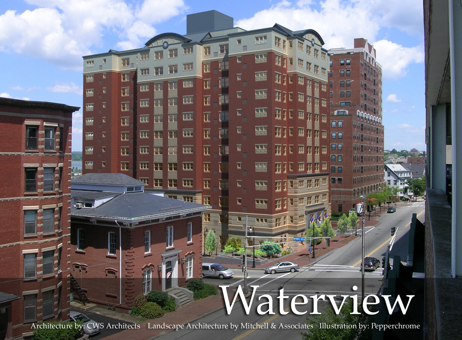
Waterview at Bayside.jpg
 
Ah, Waterview! I always liked the design too! A damn shame it never came to fruition.
 
But we got the green machine in its place...what an improvement..LOL I hope Bay Tower loves their neighbor. Does anyone have any insight of the lot next to the NE Telephone switch building? That lot several years ago, I mean back late 70's , a residential high rise was proposed. Then I thought someone was thinking of building one there?
 
It's sad Waterview never came to fruition, I really liked the design. I lived on the top floor of the Marlborough Building on High Street when this was proposed. I recall hearing all of the complaints from locals about their views being obstructed - including Back Bay Tower. Meanwhile they didn't seem to care that they were blocking views themselves. I don't hate the design of the building that is there now, but it's still such a huge waste. Yes - apparently there was a proposal for a tall building (it was posted here recently, maybe under Failed Projects) on Cumberland. The retaining wall is still there. I haven't heard of anyone looking to develop it, but would be awesome if they did. I'd love to see 380 Cumberland go in the process.
 
I recall hearing all of the complaints from locals about their views being obstructed - including Back Bay Tower. Meanwhile they didn't seem to care that they were blocking views themselves.

While some neighbors may have complained, if my memory serves the primary thing that tanked Waterview was the great recession. I believe they were very close to starting construction in late 2007, they even had the lot cleared and some equipment on site.

Here's a look at their website from the Wayback Machine:
Yeah I guess you're right the recession was part of it too. They tore down a couple houses/apartments in 2005 and 2006 I want to say. I moved out of the Marlborough Building in October 2007 and the lot was still blocked off then.
 
It is an attractive building, though it seems to be a little out of place for that historic section of Mt Vernon. The previous renderings of 200 Federal Street had a similar (not as dramatic) glass treatment on the corners along with all glass with black dividers on the top two floors.
 
Last edited:
Given that Redfern and Senatore produced such a great-looking apartment building at Longfellow Square, I'm sure the design for this tower at Temple Street will get refined and greatly improved — it currently reads as a generic office block so it's hopefully just a rough sketch, for scale.
 
Perfect location for a new tower. Wonder if Redfern has any renderings showing how the building will fit into the skyline from the South Portland waterfront and Back Cove vantage points. My photoshop skills are non existent or I would have attempted it.
 
  • Like
Reactions: GIL
Redfern Downtown, LLC has submitted an application to amend the Downtown Height Overlay Map for the 200 Federal Street tower. If the request is approved it will allow the 40' architectural cap to be used for actual floor space and bring the building's height to 190' and 18 floors.
 
Redfern Downtown, LLC has submitted an application to amend the Downtown Height Overlay Map for the 200 Federal Street tower. If the request is approved it will allow the 40' architectural cap to be used for actual floor space and bring the building's height to 190' and 18 floors.
I hope this goes through. Knowing the planning board this will take forever to be approved, but fingers crossed!
 
A couple architectural drawings are included in the zone amendment application materials. If any of the Redfern folks are reading this: let us know if/when it might be helpful to have public comment in support of the zoning amendment (or project generally), and to who the comments should be directed.


Screen Shot 2020-09-18 at 9.46.25 AM.png


Screen Shot 2020-09-18 at 9.46.41 AM.png
 
Thanks for posting Max. So if you count the mechanical screen which actually looks like an integral part of the structure and not a cheap addition, the building rises to 204'6'' which is a nice benchmark to finally achieve! Have not heard one negative comment yet from the many individuals I run across on a daily basis and I think it's residential purpose, no tax breaks, city center location and Redfern's reputation are important attributes that may help push it across the finish line.
 
A couple architectural drawings are included in the zone amendment application materials. If any of the Redfern folks are reading this: let us know if/when it might be helpful to have public comment in support of the zoning amendment (or project generally), and to who the comments should be directed.


View attachment 7211

View attachment 7212
 
Does not look like Redfern is progressing the design or composition of the facade, but if the base treatment were just continued to the fifth or sixth floor it would make a big difference in scaling with typical Downtown/Exchange Street Street walls, and help the middle portion to feel less extensive. Feels like the overall composition still needs refinement since it’s going to be such a highly visible structure from all around the City.
 
Thanks for posting Max. So if you count the mechanical screen which actually looks like an integral part of the structure and not a cheap addition, the building rises to 204'6'' which is a nice benchmark to finally achieve! Have not heard one negative comment yet from the many individuals I run across on a daily basis and I think it's residential purpose, no tax breaks, city center location and Redfern's reputation are important attributes that may help push it across the finish line.
I truly hope Redfern does not believe this is an improvement over their original design. This new rendering is terribly blase and cheap looking. I see more gray in use as is the current trend. Come on guys, you can do a lot better than this.
 

Back
Top