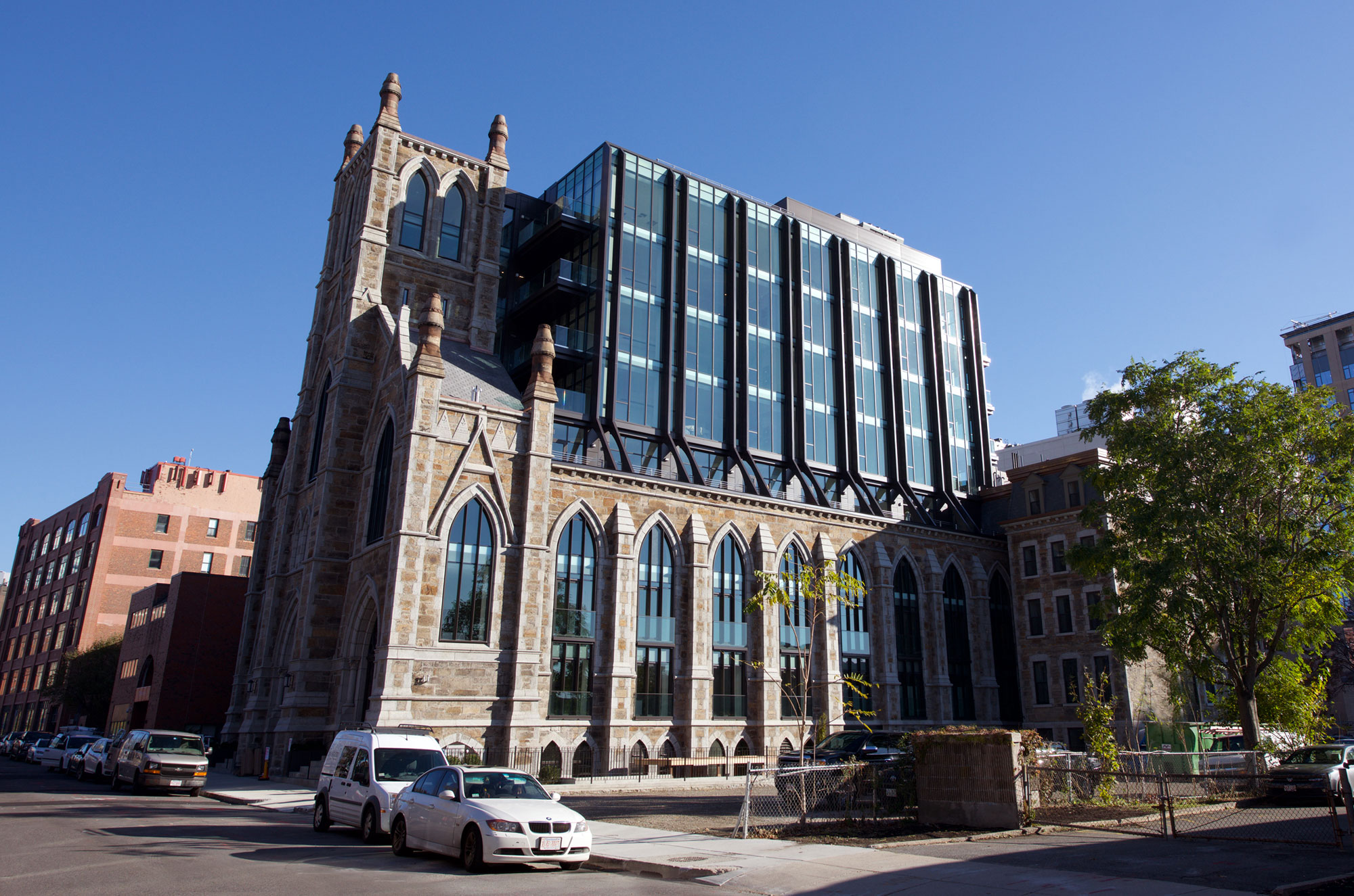
The Lucas | 136 Shawmut Ave | South End

The steeple really needs the pergola-ish thing that was in the original renderings. Overall a fine project.

I much prefer it as is.

To me, this project turned out way better than the renders. It's always a nice surprise when that happens.
 
Bonus points for effort on the flying buttresses

But their effect in the overall composition is very much muted (/transmogrified) (/mutiliated) without any tapering in the upper volume of the building .... as built, they just look like awkward angle braces.

.i.e without an overall upward-directed structural and volumetric aspiration, there's not much 'flying' going on here...

Also yuck roof crap.
 
Also, in the alternative reality where the 70s & 80 trajectory of urban decay continued unabated to the present day, this skeletal ruin would have made an epic location for a basketball court / thunderdome
 
^^absolutely; should have been an indoor athletic facility for South End/Chinatown kids.

or possibly even an an undersized rink with parquet floor!

with arts, crafts, and adult ed in the rafters.
 
While I love the renovation and I think the materials on the new part are great I still think that this just looks terrible together.

I agree. It's a sad end to an historic building...built by German Catholics with a beautiful period interior. It could indeed been converted to a neighborhood center for recreation, the arts, and social services. Once the architect was chosen it would have been better to have torn down the building completely and built the box as a stand-alone structure...that could have been interesting, rather than jarring as it is now. But money spoke and it speaks loudly. And there's never any accounting for taste.
 
Still feels like a backpack to me. It is a quality project tough ... I just wish it did not have to happen.

cca


I didn't like the idea of this at all, but the glass does look really good. In the end it works because most of the time it looks like a church in front of or next to a building with really nice glass.
 
While I love the renovation and I think the materials on the new part are great I still think that this just looks terrible together.

Word up.

It's the corollary to The Harlo, a decent concept (though derivative form), ruined by shit materials. Here, great materials are wasted on a shit concept.
 
Most of the time you see it though you are not right up next to it, and as demonstrated in this picture it usually does look like a church thats just near some short building with really nice glass. In this case it looks like the building is in front of the church. I think this happens because its so ridiculous of a concept that you pretty much assume that thats what it is, so your eye plays tricks on you, even though I know what it is. So it works in that regard, but the concept is shit. At least most of the time the concept doesn't come through though and it looks like two separate buildings so overall the end product is alright.

Landscaping is in progress.

https://flic.kr/p/Y7EqFX
 
Also again the glass is very nice, they need to use this again on something else in the city. Black trim and very dark blue glass always look great together, especially on a tower. I think it'd be cool if they got some in here on something else going up. You never know shit never really matches the renders anyways. I don't want to say it but Copley would have been a great tower to use this on. Maybe the black glass centerline on the hub office tower will use something similar.


I walked by a week ago and my take is this thing photographs poorly. Not that it looks good in person, instead just basically a nothingburger in person, but it's a disaster when photographed.
 
Stick - I say this with much respect and appreciation for your posts on this forum, but you need to get a better phone or a fresher potato to take photos with. What is this? A Motorola Razr? :D.


I didn't like the idea of this at all, but the glass does look really good. In the end it works because most of the time it looks like a church in front of or next to a building with really nice glass.
 
I agree with the 'two great tastes that don't taste great together' opinions.
 
Closings began today. Doesn't even look done! lol

First closing, $1.37 million, 1,784-square feet = $767 / square foot - good for new construction

Second closing, $3.3 million, 2,654-square feet = $1,243 / square foot (includes 2 parking spaces)
 
John, is $767 really good for new construction in the South End? That feels low to me but you'd know better than I.
 
Yep, good for the buyer. Don't know where that is in the building but that's a low price.
 
Even though this is clearly a high end building and the general area is obviously very appealing the immediate surroundings can't be. Next to a very busy grocery store, a verizon switch building or something, low income housing which I think is pretty safe but still the yuppies dont like that too much. And a highway.
 
final form

The_Lucas_136_Shawmut_Avenue_Finegold_Alexander_Architects_Metric_Construction_Group_Bolimex_Construction_CEI_Materials_R4000_5.jpg
 

Back
Top