You are using an out of date browser. It may not display this or other websites correctly.
You should upgrade or use an alternative browser.
You should upgrade or use an alternative browser.
The Residences at Forest Hills | 3694 Washington Street | Jamaica Plain
- Thread starter tysmith95
- Start date

- Joined
- Jan 7, 2012
- Messages
- 14,173
- Reaction score
- 23,688


- Joined
- Jan 7, 2012
- Messages
- 14,173
- Reaction score
- 23,688


- Joined
- Jan 7, 2012
- Messages
- 14,173
- Reaction score
- 23,688
 IMG_9026 by Bos Beeline, on Flickr
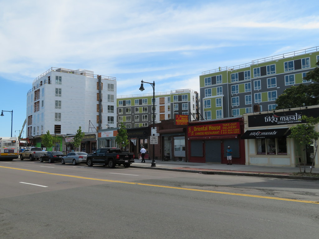 IMG_9028 by Bos Beeline, on Flickr
 IMG_9031 by Bos Beeline, on Flickr
 IMG_9030 by Bos Beeline, on Flickr
 IMG_9033 by Bos Beeline, on Flickr
 IMG_9040 by Bos Beeline, on Flickr
 IMG_9035 by Bos Beeline, on Flickr
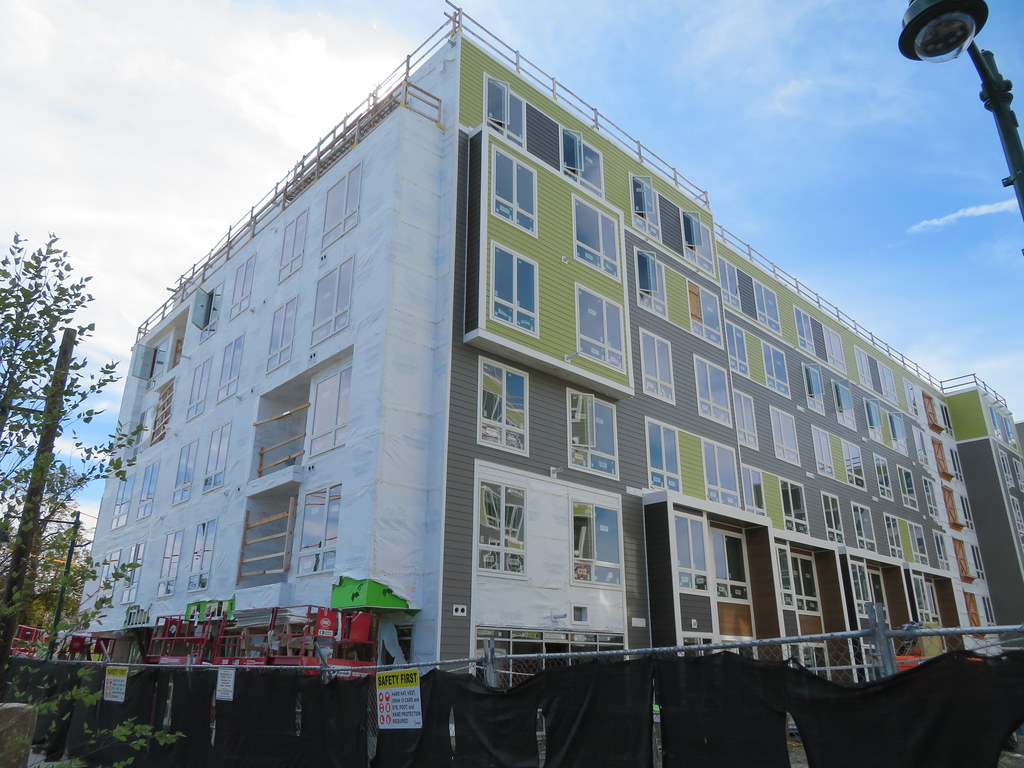 IMG_9034 by Bos Beeline, on Flickr
 IMG_9042 by Bos Beeline, on Flickr
 IMG_9045 by Bos Beeline, on Flickr
- Joined
- Jan 22, 2012
- Messages
- 5,078
- Reaction score
- 1,662
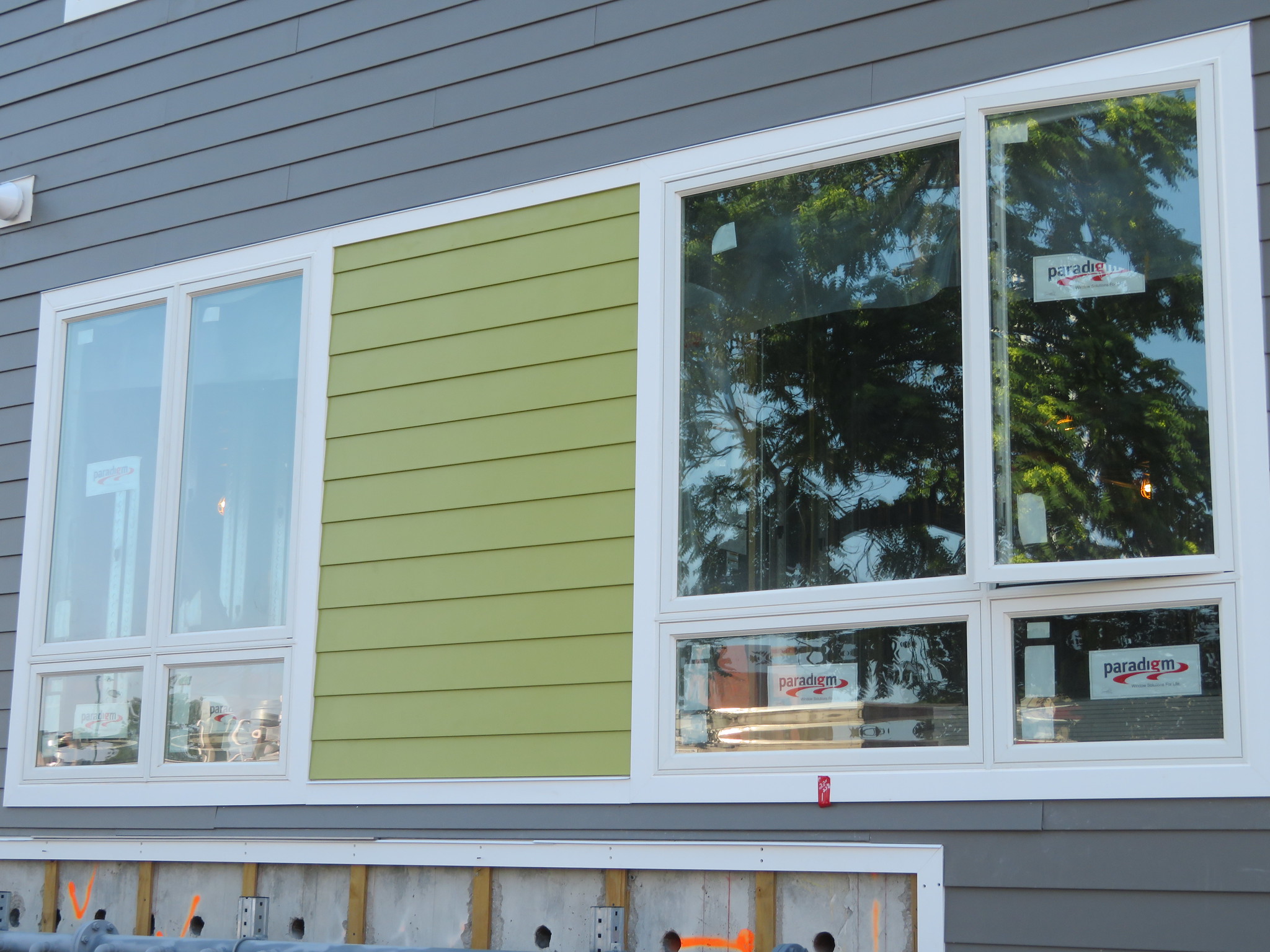
That green is gross. Why?
HenryAlan
Senior Member
- Joined
- Dec 15, 2009
- Messages
- 4,473
- Reaction score
- 5,256
I kind of like the green, though mainly not for the color but for the offset it provides to the gray. There is far too much gray in these buildings, especially when they are just down the street from another group of large apartment buildings that are predominately gray.That green is gross. Why?
cadetcarl
Active Member
- Joined
- Sep 11, 2012
- Messages
- 432
- Reaction score
- 31
Two birds/one stone: it's also what I like to call "elder millennial green". It's the accent color I associate with 2007-2011ish, and people who went to college then will be just about the target demo for this. For the record I fall firmly into the next cohort, and we are the people responsible for the seafoamy minty green and blush-pink-coral that everything is available in now. Think, "iPod Nano colors" vs "iPhone X" colors.I bet they put that green in “as a nod to the historic emerald necklace” which is exactly the type of brainless tripe people at the BCDC eat up
Brad Plaid
Senior Member
- Joined
- Jan 17, 2013
- Messages
- 1,310
- Reaction score
- 1,559
Like the green, it will be a nice color to have in the winter. The white trim is out of control though, there is way, way too much of it.
Czervik.Construction
Senior Member
- Joined
- Apr 15, 2013
- Messages
- 1,964
- Reaction score
- 1,235
More of a bile yellow than a green, IMO.
- Joined
- Jan 7, 2012
- Messages
- 14,173
- Reaction score
- 23,688
 IMG_3743 by Bos Beeline, on Flickr
 IMG_3744 by Bos Beeline, on Flickr
 IMG_3748 by Bos Beeline, on Flickr
 IMG_3749 by Bos Beeline, on Flickr
 IMG_3751 by Bos Beeline, on Flickr
 IMG_3755 by Bos Beeline, on Flickr
 IMG_3754 by Bos Beeline, on Flickr
 IMG_3759 by Bos Beeline, on Flickr
 IMG_3761 by Bos Beeline, on Flickr
 IMG_3764 by Bos Beeline, on Flickr
- Joined
- Jan 22, 2012
- Messages
- 5,078
- Reaction score
- 1,662
I know I've said it before, but I really despise the green.
Randomgear
Active Member
- Joined
- Jul 7, 2012
- Messages
- 364
- Reaction score
- 46
My biggest issue about what's been built is the thinness of the trim, it might work for a single-family or even a triple decker, but it just doesn't read on a 5-6 story building. A 1/2"-3/4" difference in thickness between the clapboard field and the trim vanishes; with the windows in the same plane the facade just appears as a tight membrane. That and the contrasting flat white trim just makes the facade look cartoonish.
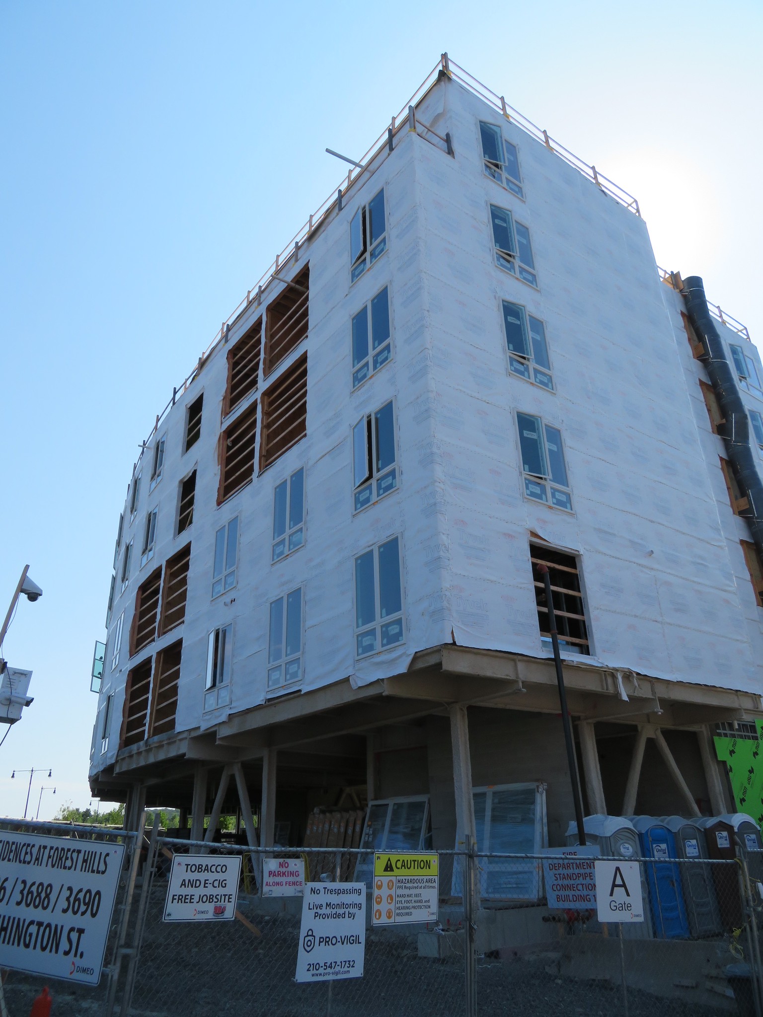
The grey facades that abut Washington and the Casey Arborway are more promising.
The Metromark, on Washington across the Casey Arborway, did far better.
The grey facades that abut Washington and the Casey Arborway are more promising.
The Metromark, on Washington across the Casey Arborway, did far better.
- Joined
- Jan 7, 2012
- Messages
- 14,173
- Reaction score
- 23,688
 IMG_8682 by Bos Beeline, on Flickr
 IMG_8680 by Bos Beeline, on Flickr
 IMG_8684 by Bos Beeline, on Flickr
 IMG_8690 by Bos Beeline, on Flickr
 IMG_8688 by Bos Beeline, on Flickr
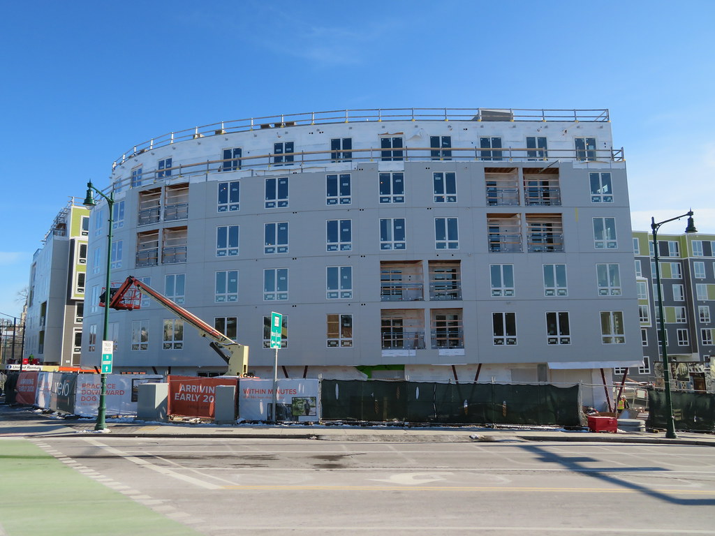 IMG_8693 by Bos Beeline, on Flickr
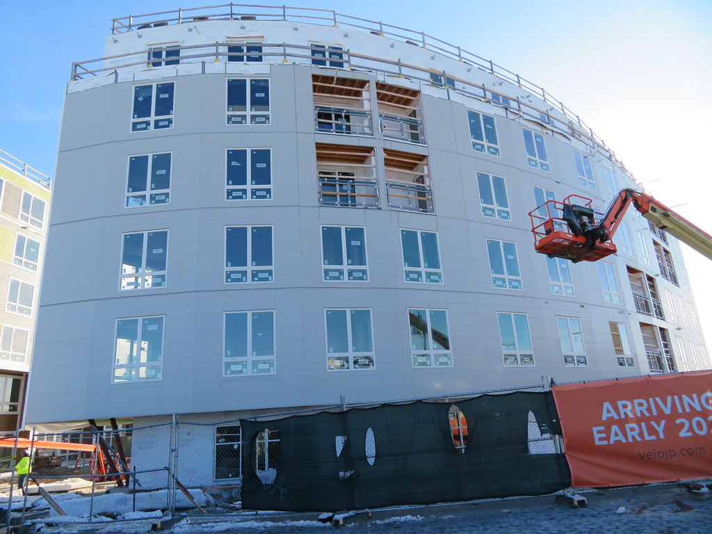 IMG_8695 by Bos Beeline, on Flickr
 IMG_8699 by Bos Beeline, on Flickr
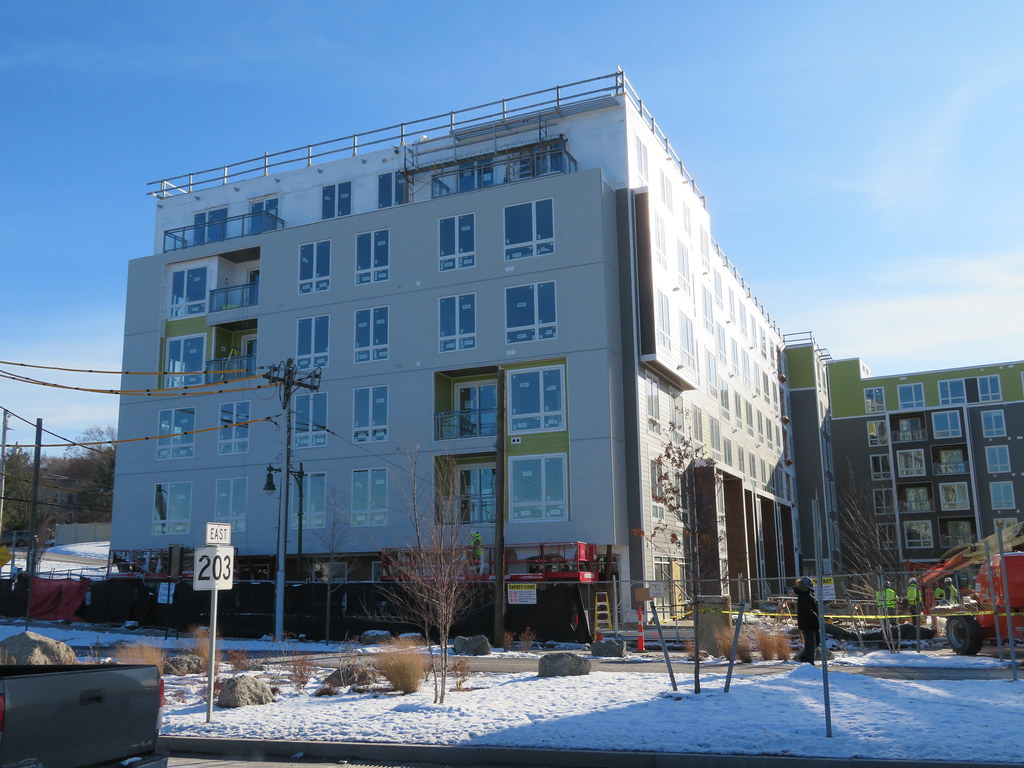 IMG_8697 by Bos Beeline, on Flickr
 IMG_8698 by Bos Beeline, on Flickr
BarbaricManchurian
Senior Member
- Joined
- Mar 12, 2007
- Messages
- 1,067
- Reaction score
- 65
Wow that curve is a major missed opportunity. I don’t mind the green/black parts though.
odurandina
Senior Member
- Joined
- Dec 1, 2015
- Messages
- 5,328
- Reaction score
- 266
i like green, but not sure if this is very good.....I know I've said it before, but I really despise the green.
on the plus side--the turnaround since the thread posted is a just bit over 3 years--
a rarity in too much of the City--
Last edited:
atlantaden
Senior Member
- Joined
- May 31, 2006
- Messages
- 2,679
- Reaction score
- 3,344
[QUOTE="BeeLine,
IMG_8684 by Bos Beeline, on Flickr
[/QUOTE]
Nice development! Now if they could only take down that damn billboard!
IMG_8684 by Bos Beeline, on Flickr[/QUOTE]
Nice development! Now if they could only take down that damn billboard!
My primary reaction is that this looks cheap. It is flat as a pancake and big. The green is clearly there to "break up the mass," which it can't because the mass is too big to preak up with color changes. And I totally agree that the small-residential scale detailing is silly on buildings this size. They couldn't even be bothered to color match all of those vents.
Compare to the Whitter Choice buildings where strict monetary controls and wacky rules from Washington DC have resulted in a much nicer looking building. We desperately need the housing and this location is perfect. I just wish it was a little be better in materiality and execution.
Compare to the Whitter Choice buildings where strict monetary controls and wacky rules from Washington DC have resulted in a much nicer looking building. We desperately need the housing and this location is perfect. I just wish it was a little be better in materiality and execution.
My biggest issue about what's been built is the thinness of the trim, it might work for a single-family or even a triple decker, but it just doesn't read on a 5-6 story building. A 1/2"-3/4" difference in thickness between the clapboard field and the trim vanishes; with the windows in the same plane the facade just appears as a tight membrane. That and the contrasting flat white trim just makes the facade look cartoonish.
The grey facades that abut Washington and the Casey Arborway are more promising.
The Metromark, on Washington across the Casey Arborway, did far better.