You are using an out of date browser. It may not display this or other websites correctly.
You should upgrade or use an alternative browser.
You should upgrade or use an alternative browser.
Two Congress | Bulfinch Crossing East Parcel | West End
- Thread starter Equilibria
- Start date
RandomWalk
Senior Member
- Joined
- Feb 2, 2014
- Messages
- 3,713
- Reaction score
- 6,502
A lab needs large floor plates to amortize the air handling and utilities. Splitting the mass wouldn’t work.
Equilibria
Senior Member
- Joined
- May 6, 2007
- Messages
- 7,219
- Reaction score
- 8,728
I like their design study better but one thing that the Central Plaza can teach us is that concave forms are MUCH better at defining space then convex forms. I don't get why you'd put a convex façade facing the park.
That's a great observation, but I'd rather enclose Congress Street than the Greenway. This building can't do much to define a space as wide as the Greenway.
navigator4
Active Member
- Joined
- Aug 5, 2015
- Messages
- 226
- Reaction score
- 97
Hug or shield - both ugly!I like their design study better but one thing that the Central Plaza can teach us is that concave forms are MUCH better at defining space then convex forms. I don't get why you'd put a convex façade facing the park.
View attachment 17697
guitarguynboston
Active Member
- Joined
- Dec 11, 2009
- Messages
- 254
- Reaction score
- 318
Thank God Boston isn't in the North East or there would have been some missed opportunity for not having the whole bus stop area covered to shield the winters.
stick n move
Superstar
- Joined
- Oct 14, 2009
- Messages
- 13,361
- Reaction score
- 23,946
They also make the mistake of providing their initial design study. Should have stuck with this one, folks:
View attachment 17697
Seriously, do they not have eyeballs? This version is a billion times better than that jumbled disaster theyre proposing now. Hopefully the normal VE circle of life brings it back. I REALLY hope so, we dont need a mega turd front and center on the skyline and greenway.
That's a great observation, but I'd rather enclose Congress Street than the Greenway. This building can't do much to define a space as wide as the Greenway.
I am all for enclosing Congress and while this cant do much for defining the Greenway the concave, or a well textured/stepped back option, would be a lot less hostile.
- Joined
- Jan 7, 2012
- Messages
- 14,172
- Reaction score
- 23,677
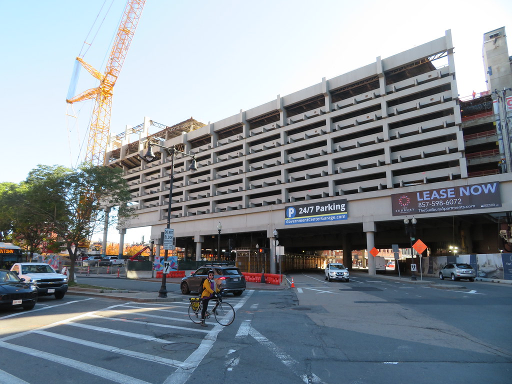 IMG_6301 by Bos Beeline, on Flickr
 IMG_6302 by Bos Beeline, on Flickr
 IMG_6305 by Bos Beeline, on Flickr
 IMG_6306 by Bos Beeline, on Flickr
 IMG_6307 by Bos Beeline, on Flickr
 IMG_6308 by Bos Beeline, on Flickr
 IMG_6313 by Bos Beeline, on Flickr
 IMG_6318 by Bos Beeline, on Flickr
 IMG_6323 by Bos Beeline, on Flickr
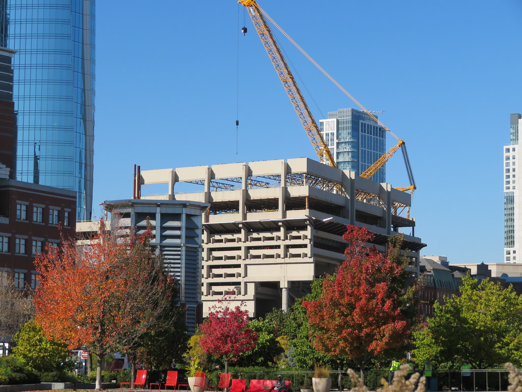 IMG_6339 by Bos Beeline, on Flickr
RandomWalk
Senior Member
- Joined
- Feb 2, 2014
- Messages
- 3,713
- Reaction score
- 6,502
The pile drilling rig working in the midst of the demolition has some strong Penn Station demolition vibes, with the key difference that Penn Station was a worthy piece of the urban fabric.
- Joined
- Jan 7, 2012
- Messages
- 14,172
- Reaction score
- 23,677
 IMG_7104 by Bos Beeline, on Flickr
 IMG_7106 by Bos Beeline, on Flickr
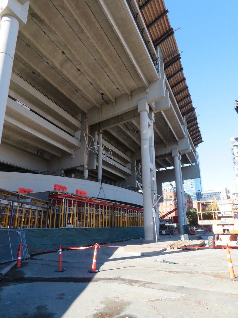 IMG_7107 by Bos Beeline, on Flickr
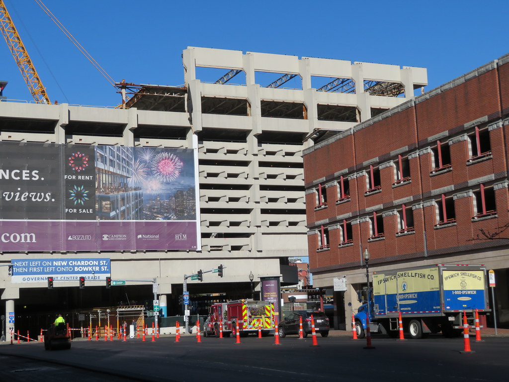 IMG_7112 by Bos Beeline, on Flickr
Charlie_mta
Senior Member
- Joined
- Jul 15, 2006
- Messages
- 5,090
- Reaction score
- 7,617
Are they actually tearing down this hog in its entirety, or just removing the upper office floors added on after original construction?
Equilibria
Senior Member
- Joined
- May 6, 2007
- Messages
- 7,219
- Reaction score
- 8,728
BCDC: https://bpda.app.box.com/s/0rttlslydav9hob6h7vioehdtd3b9fhu
There's a lot of walkthrough renderings in the link. The MBTA seems to prefer stand-alone headhouses to integrated ones, and I'm not sure why - it seems like it would be better to let a developer or landlord handle maintenance of the shelter and potentially even elevator and escalator repairs under contract.
Also, those pergola-style shelters over the bus station will be useless. Build real shelters or no shelters, but don't lie to us.
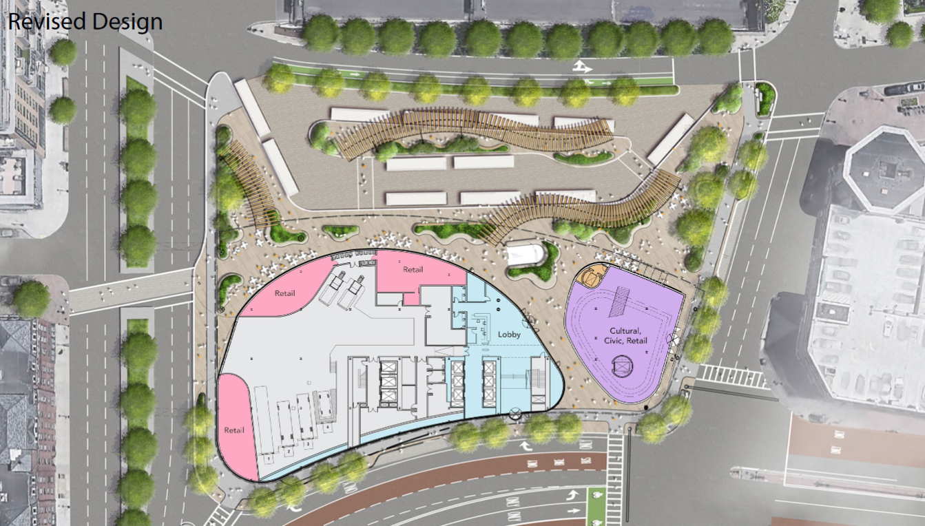
I might be a bit slow, but it's interesting to note that the image above shows that a car lane of Fitzgerald will be dropped as part of this project, if the image above is correct.
I wonder why the bike lane will be on the traffic side of the trees, rather than separated from the traffic by the trees.
I wonder why the bike lane will be on the traffic side of the trees, rather than separated from the traffic by the trees.
Equilibria
Senior Member
- Joined
- May 6, 2007
- Messages
- 7,219
- Reaction score
- 8,728
I might be a bit slow, but it's interesting to note that the image above shows that a car lane of Fitzgerald will be dropped as part of this project, if the image above is correct.
I wonder why the bike lane will be on the traffic side of the trees, rather than separated from the traffic by the trees.
They mention in the slides that the trees may end up being a sidewalk rather than trees.
They mention in the slides that the trees may end up being a sidewalk rather than trees.
Didn't even occur to me that such a pedestrian path was missing. Such is the pitfall of viewing things from bird's eye view... and not walking through that area recently.
That being the case, I'm definitely of the opinion that a sidewalk should be there. As a pedestrian, the bus area always feels pretty unwelcoming.
fattony
Senior Member
- Joined
- Jan 28, 2013
- Messages
- 2,099
- Reaction score
- 482
The subway head house is almost invisible in these renderings and has no orange/green signage in accordance with T design standards. I can only assume that is an oversight of detail and the T will chime in at some point to provide guidance.
Equilibria
Senior Member
- Joined
- May 6, 2007
- Messages
- 7,219
- Reaction score
- 8,728
stick n move
Superstar
- Joined
- Oct 14, 2009
- Messages
- 13,361
- Reaction score
- 23,946
Still ugly
need this instead
need this instead
I like their design study better but one thing that the Central Plaza can teach us is that concave forms are MUCH better at defining space then convex forms. I don't get why you'd put a convex façade facing the park.
View attachment 17697
- Joined
- Jan 7, 2012
- Messages
- 14,172
- Reaction score
- 23,677
 IMG_8071 by Bos Beeline, on Flickr
 IMG_8077 by Bos Beeline, on Flickr
 IMG_8082 by Bos Beeline, on Flickr
 IMG_8080 by Bos Beeline, on Flickr
 IMG_8289 by Bos Beeline, on Flickr
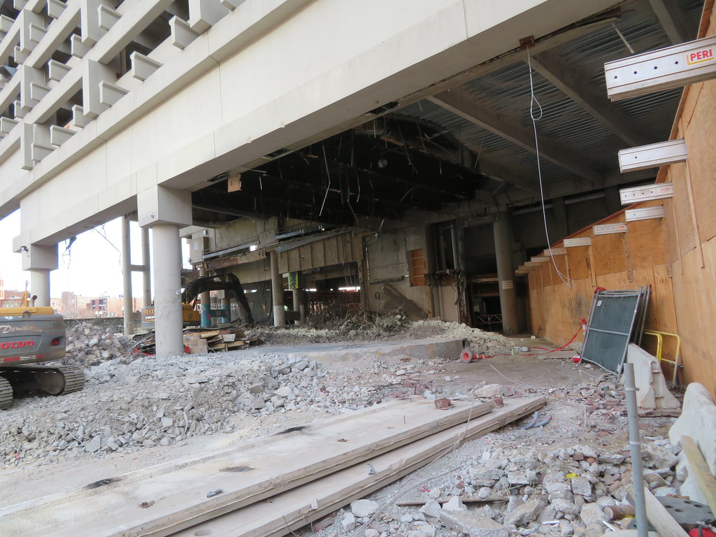 IMG_8300 by Bos Beeline, on Flickr
 IMG_8302 by Bos Beeline, on Flickr
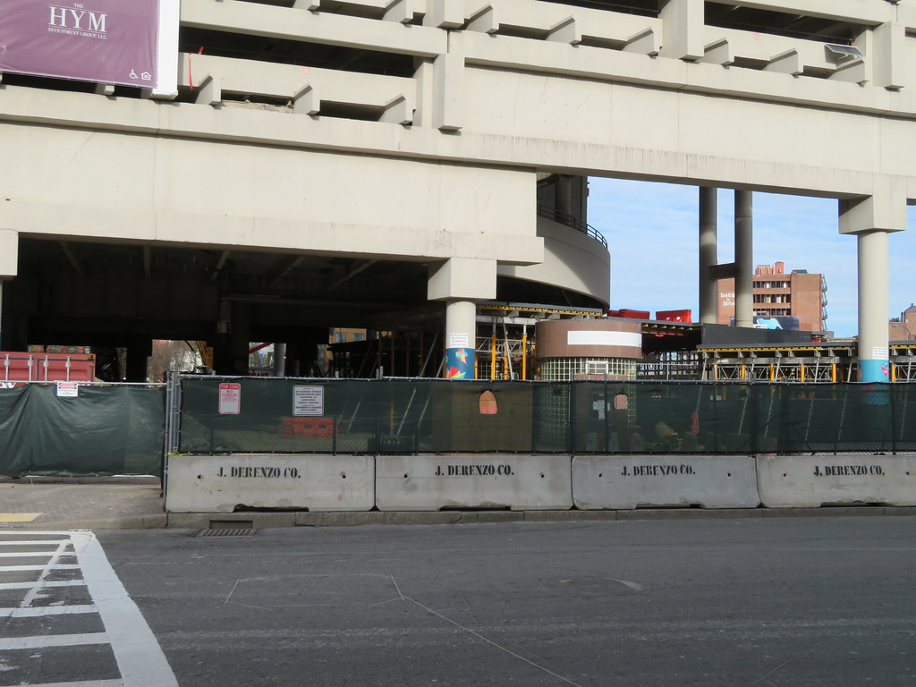 IMG_8303 by Bos Beeline, on Flickr