Two Congress | Bulfinch Crossing East Parcel | West End

c'mon guys. it's way better than a garage. let's see how it turns out, but agree the aesthetics are a bit of a mess. hopefully the mesh well with the new towers.

For those keeping count of the its-better-than-what's-there-now counter so far this month: we've just reached 2

Again, what is this excuse? Should an architect/developer really be flattered that they have a better design/use than an urban renewal parking garage?
 
This is why we need to keep labs out of the immediate downtown proper. We already have the Seaport, Kendall, Kenmore, North Point, Fenway, South End, Assembly, and Union to build all the fat crapola.

That is going to be the ugliest, most prominently shitty building in Boston history, bar none. Right on the greenway. One congress is shaping up to be an absolute icon, with a fat turd shit out right on its doorstep. Why… Do they not have eyes? This would be like throwing up 1 waterside place in front of the hancock directly facing copley sq.

I have been screaming this about that garage next to South Station but nobody seems to care. The few parcels that could support tall, thin residentials should build tall, thin residentials. These labs are a dime a dozen and could go literally anywhere in the metro. Super-block walls don't belong downtown!
 
The opportunity to fuck this up completely has now bared its [un-printable]. I have always believed that this parcel to be the imaginative center of this development, the icing on the reinvention...so to speak....
Oh well.
 
  • Like
Reactions: W-4
Super ugly building. Looks like it's literally melting.

1634138707502-png.17685
 
I get the symbolic importance of this site being more than just another freaking lab, but as for the aesthetics, I mean that money shot looking down Congress.... I think it looks kinda nice? I like how the cladding picks up the curvature of the road and accentuates it, and there's a good balance between glass and metal.

I mean it's barely any better than any other lab building going up, but I don't think it's significantly worse either. Am I missing something??
 
Super ugly building. Looks like it's literally melting.

1634138707502-png.17685
This shot highlights that the real turd here is one Congress. I don't care how it looks on the skyline. I think the lab building looks good. I do agree more residential would help this area more, although not because it would likely produce a taller building.

That road design isn't helping much either, which I think is the main reason this area will never really transform into something significantly better than what was there.
 
That road design isn't helping much either, which I think is the main reason this area will never really transform into something significantly better than what was there.
+1 ^. Having Congress Street be the size of a Wellington Circle type highway is an unfortunate legacy from the 1960's GC urban renewal project, and it should be downsized.
 
I mean it's barely any better than any other lab building going up, but I don't think it's significantly worse either. Am I missing something??

My personal issue is the “plaza” going up on the Greenway side moreso than the Congress side. It was supposed to be a nice center of activity, but I believe the new rendition will just end up as a barren, windswept, trash-ridden stretch of concrete. I hope I’m wrong!

Would be nice if the Congress side had some retail space on it, too.
 
With few exceptions nearly every rendering for proposed building I've seen here has been radically changed by the time the building was finished. Sometimes it was for the best....and often VE'd to death. Let's see what happens with this one. Recall the ability for such structures to change their curtain walls at the drop of a hat...which may end up happening as these lab buildings become outdated and are forced to morph into something else 20 years from now. They are the region's contemporary answer to the brick factories and warehouses that once populated much of Boston, Cambridge, Somerville, etc.
 
With few exceptions nearly every rendering for proposed building I've seen here has been radically changed by the time the building was finished. Sometimes it was for the best....and often VE'd to death. Let's see what happens with this one. Recall the ability for such structures to change their curtain walls at the drop of a hat...which may end up happening as these lab buildings become outdated and are forced to morph into something else 20 years from now. They are the region's contemporary answer to the brick factories and warehouses that once populated much of Boston, Cambridge, Somerville, etc.

I think the biggest problem here is the building's proportions for its location. They could clad the thing in diamonds and it would still be a downgrade from the original plan.
 
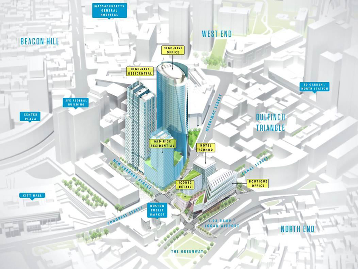
The best part was the pedestrian courtyard in between the glass buildings that lined up with the future pedestrian only canal st. It then curved to place people in front of the public market. With the mega turd its just going to be basically an office lobby along the highway that is congress st. What a pos.

You can see it better here with the dotted line.
GovernmentCenter1200.jpg


This is a tragedy.
 
My personal issue is the “plaza” going up on the Greenway side moreso than the Congress side. It was supposed to be a nice center of activity, but I believe the new rendition will just end up as a barren, windswept, trash-ridden stretch of concrete. I hope I’m wrong!

Would be nice if the Congress side had some retail space on it, too.

It's not a plaza--it's a major bus hub. They should have designed it with a great roof structure. The T certainly isn't going to allow allow all of the planting they are showing.
 
That road design isn't helping much either, which I think is the main reason this area will never really transform into something significantly better than what was there.

+1 ^. Having Congress Street be the size of a Wellington Circle type highway is an unfortunate legacy from the 1960's GC urban renewal project, and it should be downsized.

that rendering is not an accurate depiction of the roadway. Medians along Congress St have already been removed (except for under the garage where the columns are still holding it up for now).
 
I, too, was quite dismayed by the change in the project, but if you read the Globe article, this wasn't just about adding more lab space: "HYM Managing Director Tom O’Brien told the BPDA board the project was shifting in response to requests by the MBTA that no new buildings be placed atop the Haymarket Green Line station itself."

I went on the BPDA's website and reviewed the presentation to the BCDC on Dec. 7 and I'm not quite as let down as I was before looking through it: https://bpda.app.box.com/s/gflfbjlimp3zqgv5x91a3ecchm61uula

In particular, the view on slide 14 looks decent in the context. Not a huge fan of the offset swoops but the exterior treatments looks like they'll be high-quality.
 
the project was shifting in response to requests by the MBTA that no new buildings be placed atop the Haymarket Green Line station itself."

But isn't that ridiculous/infuriating in itself? There are plenty of examples worldwide and even in the city of buildings built upon stations. Why did the MBTA shoot this down?
 
that rendering is not an accurate depiction of the roadway. Medians along Congress St have already been removed (except for under the garage where the columns are still holding it up for now).

Technically it's not even Congress St. here or under the garage, it's Merrimac. The name change happens at Sudbury St. I believe.

Anyway, my biggest gripe about the rendering is that they eliminate Cuppa Coffee and the TD Bank ATM. I don't miss the little parking lot huts.
 
Technically it's not even Congress St. here or under the garage, it's Merrimac. The name change happens at Sudbury St. I believe.
yes, correct. For now anyway. 'One Congress' actually needs to be on Congress and not Merrimac after all.
The medians along Congress on other side of Sudbury are gone too though was more what I was referring to (as well as this view on Merrimac medians from New Chardon to Portland are gone too).

Anyway, my biggest gripe about the rendering is that they eliminate Cuppa Coffee and the TD Bank ATM. I don't miss the little parking lot huts.
artistic license to see more of the building in the render I would guess.
 

Back
Top