- Joined
- May 25, 2006
- Messages
- 7,033
- Reaction score
- 1,865
Glad to hear. The Pru's deck was always small and dated. The JH had a much better one, but they used 9/11 as an excuse to close it and repurpose it as office space.
And the guy who shut it went onto to exploit Orcas at SeaWorld.Glad to hear. The Pru's deck was always small and dated. The JH had a much better one, but they used 9/11 as an excuse to close it and repurpose it as office space.
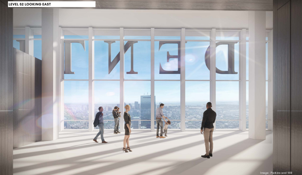
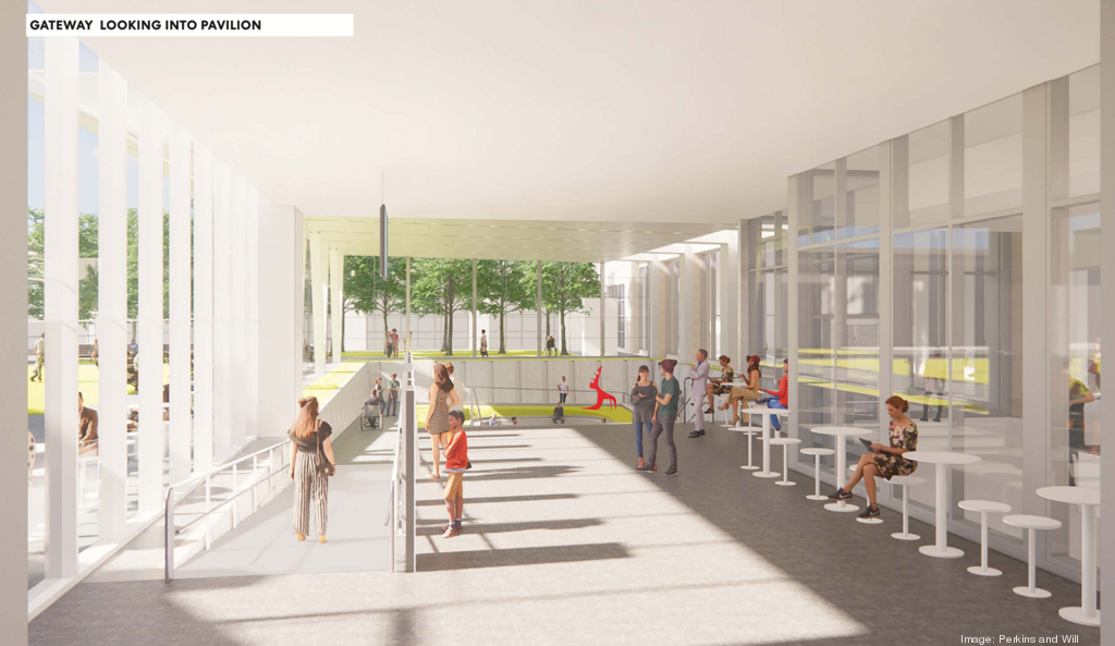
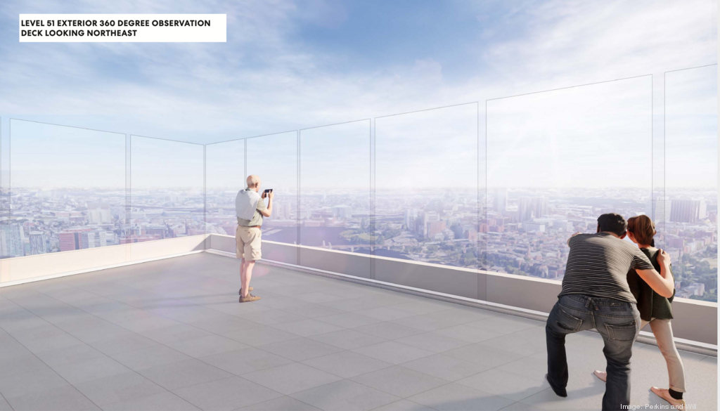
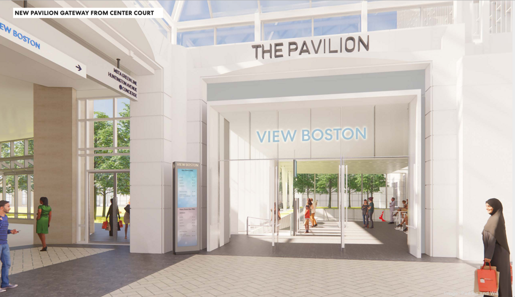
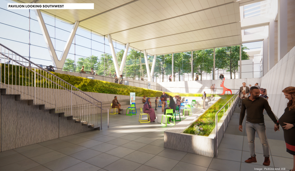
More renderings of the observation deck on Boston Business Journal: https://www.bizjournals.com/boston/...ils-plans-for-reopening-observation-deck.html
There's a damn subscription pop-up that won't let me see the page!! That is so ridiculous!!
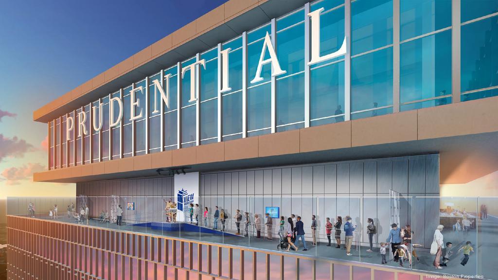
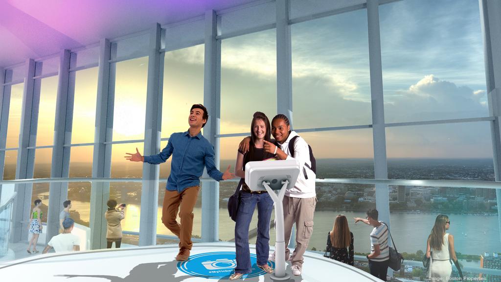
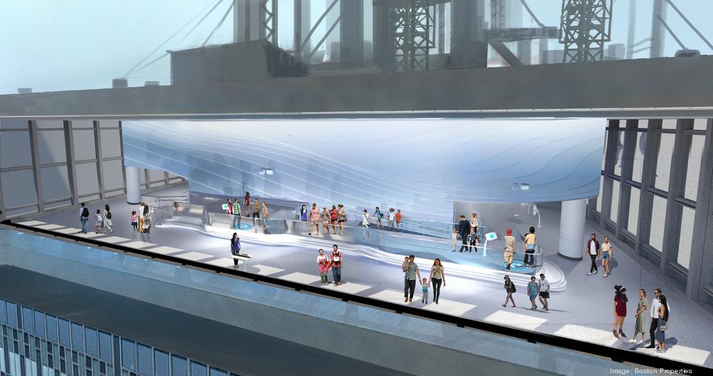
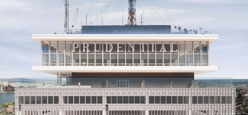
I gotchu bro.


I gotchu bro.

Does anyone know how to interpret this render? I have so many questions.
Top of the Hub, a restaurant atop the Pru that closed at the same time, won't return. But View Boston will have a new bistro on the 50th floor and an indoor and outdoor cocktail lounge on the 51st floor.
The project will include a new bistro and a cocktail lounge according to the BBJ:
You do know that newspaper is a business and they need to make money to pay their workers right? This type of complaining is ridiculousMay I ask a flavor, please? When you post a pic of the link, could you please make sure that there are no ridiculous pop-up ads that block the page? Not blaming you, but those damn pop-up ads are so damn annoying, ridiculous & stupid!!! No one should have to pay to see a link by being forced to sign up for prescriptions to a newspaper or magazine ad!! Thanks.
I thought exactly the same lmao. What a bland and soulless set of renderings.My favorite part is where they seem to assume that people would rather take selfies with their logo - which is at the top of a dedicated ramp for the purpose and is depicted as generating a long queue - than with the panoramic view from 650' 180 degrees away. This may be the most unintentionally hilarious render of the year.
It's a cross-section of the cab with a wall deleted. It shows interior space.
You do know that newspaper is a business and they need to make money to pay their workers right? This type of complaining is ridiculous
Ugh how I wish they could've added some kind of cool looking screen above to hide all the mechanicals and various little antennas and turned the central one into an actual spire, incorporating the big antenna within. It could look so cool plus add on about 100 feet to the actual height. Plus they could've made that spire light up with the weather or various other ways, like the old JHK one does.I gotchu bro.


Haha thanks Equilibria, I was being a bit facetious.It's a cross-section of the cab with a wall deleted. It shows interior space.
