- Joined
- May 25, 2006
- Messages
- 7,064
- Reaction score
- 1,990
Look at all the room for activities!
Re: 115 Winthrop Square | Financial District
I'm interested in how the "Great Hall" will deal with the change in elevation between Devonshire and Federal. 101 Federal St, the building immediately next door to this, also has a publicly-accessible lobby that cuts through between the two streets, and there are two small staircases that make up the roughly 6-8 foot (obvious from this angle on Franklin Street) difference.
The "Great Hall" renders show the floor being just below level with the top of the "dark granite" on the Federal side of 101 Federal next door, but I'm pretty sure this is below street-level on Devonshire. Devonshire and Federal both slope up from Franklin, so I doubt the Great Hall being south of 101 Federal will make any difference as far as east-west grade change is concerned.
Don't think so...I think its just a mini-ampitheater type thingIs the purpose of the zig zagging part between the steps the wheelchair ramp?
Don't think so...I think its just a mini-ampitheater type thing
I think it is. You can see the flat landing on the left is pushed back and then lines up perfectly with the diagonal ramp that goes up and to the right to meet the flat landing on the right, and so on and so on. The gaps in the hand rails also line up perfectly to someone wheel up.
Is that a conference room that hangs over that space like a gondola? I want a boring 4 hour training session in there, if so.
Good call. I'm impressed whenever accessibility is included as part of a unique architecture--rather than throwing it in as an afterthought. These interior photos are stunning, and a little disorienting.No biggie, its a pretty sleek way to integrate it. Im sure it could also be used as seating too if they ever do any of the fashion show type stuff they had talked about before.
One thing is for sure and thats that they didnt skimp out on the materials here. The bronze ceiling is definitely a nice touch also. Almost has an art deco vibe to it.
Good call. I'm impressed whenever accessibility is included as part of a unique architecture--rather than throwing it in as an afterthought. These interior photos are stunning, and a little disorienting.
Yeah, that was my first thought some time ago when I saw the design. Yes, it works, yes, it's elegant in a way, but what it mostly seems to be, is a way for the architect to thump their chest and use accessibility for the sake of an extravagant display, rather than as the normal and expected element of all good designs that it should be.I’ve hesitated posting this but will anyway. I find the “wheelchair accessibility” architecture a bit inappropriate where an easier design for those in wheelchairs could have been incorporated, for instance, one of the two staircases that bookend it could have been a accessible incline. Also, the switchbacks just add another layer of effort to what can already be a challenging task. Not to mention, they made it the main feature of the entire hall, no doubt drawing attention to those who will require use of it.
I have a feeling it will be redesigned in a few years.
 IMG_0089
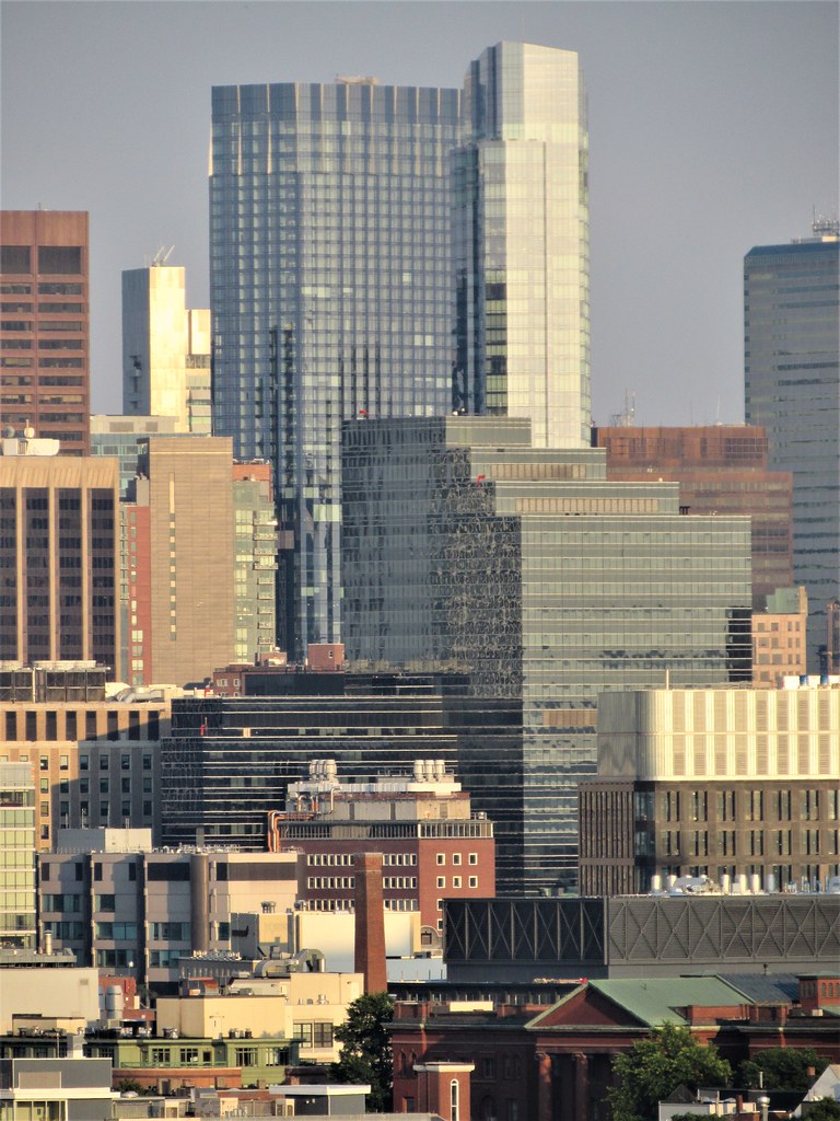 IMG_0140
 IMG_0171
 IMG_0180
 IMG_0181
 IMG_0272
 IMG_0275
 IMG_0280
 IMG_0184
 IMG_0208
 IMG_0210
 IMG_0213
 IMG_0270