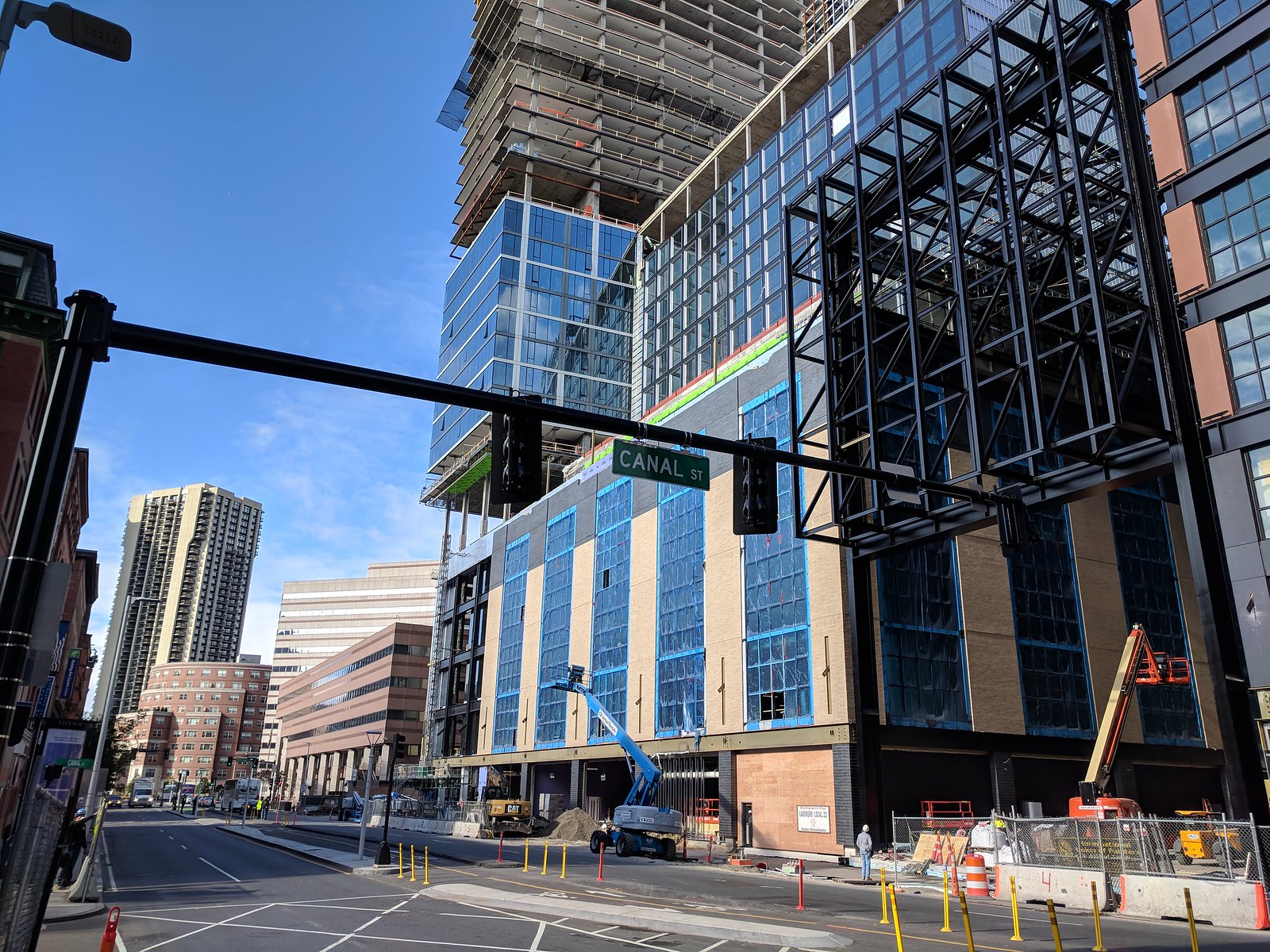
The Hub on Causeway (née TD Garden Towers) | 80 Causeway Street | West End

What makes this a shitshow/repellent?

It's difficult to argue in matters of taste, but I'll bite....

First off, I'll grant that polystylism is a successful and enduring approach within postmodern classical music. Perhaps bricolage is a concept more closely aligned with the architects' intentions here. Assigning a name to it is in the province of academia, and that certainly isn't my gig.

With all that out of the way, I have a strong preference for design that willfully integrates all of its elements. It can be bold or subtle, serene or aggressive. But it all needs to belong together, each element needs to belong to its peers within the composition. And honestly, this preference for belonging and integration extends to the music I gravitate to, the films I love, the books I revere, and the art I hang on my walls.

Since this scheme was first revealed, I had a strong and visceral distaste for it. A distaste at least as strong as what some folks feel for City Hall or the State Services Center. Blond and gray brick, terra cotta panels, digital camouflage Alucobond, mirror glass, bare black I-beams, steam-punk cantilevers with soffits clad in wood(?) -- van and Ruari used the word mess. That's a diplomatic understatement.

Taken as a whole, this is about as subtle and unified as a toddler's masterpiece. The clash of colors, materials, and disjointed articulation makes me wonder if designers from Fisher-Price have decamped from the toy factory for drafting tables in Gensler's offices.

I have no doubt that this will be a wildly successful development. But as a piece of design, it should have never made it past the BCDC.
 
Last edited:
A patchwork of elements and styles, okay. Overly reliant on historic references, perhaps. Proud Coney Island bona fides, agreed. But for me, I believe I'll probably prefer walking past this when completed more than just about anything in the Seaport. Maybe that's apples and oranges, not a fair comparison. But this is what we build in Boston. We don't really do architecture in this city, we do real estate development. We call window treatments design. We take commercial risks, sure, but we rarely take artistic ones. (Finger pointed at the two local firms who do most of the work in town.) Are there exceptions, yes - 1 Dalton, for one - but too few to crow about.

Esthetics aside - The Hub has credible curb appeal, an obvious front door, made with familiar materials and will likely welcome pedestrians and not turn a cold and glassy shoulder on them. After all, it's all about the street.

Would I prefer a bolder result? Sure. But this is Boston.
 
Thanks Brut,

Trying to almost understand. All i know is, you moved me.

i'm not worthy, but i count 5 obvious problems;

lack of diversity of height.

lack of iconic height,

the fat office turd's a/r

the fat office turd's ugly, crazy, loudly-clashing cladding sections.

trying to fit so many styles into 1 street wall block without the public having a prayer of understanding why, or the attempt to pay respect/connect with the past.

remove the gloom of the office tower's anticipated arrival for a moment.

the current progress looks very good (to me)... definitely not cartoonish. But, i'm Paulie Gaultieri (The Soprano's) in Naples opting for linguini and gravy, and the butt of the Neapolitans' jokes. i always order the Fettuccini Salonica at my favorite restaurant.
 
A patchwork of elements and styles, okay. Overly reliant on historic references, perhaps. Proud Coney Island bona fides, agreed. But for me, I believe I'll probably prefer walking past this when completed more than just about anything in the Seaport. Maybe that's apples and oranges, not a fair comparison. But this is what we build in Boston. We don't really do architecture in this city, we do real estate development. We call window treatments design. We take commercial risks, sure, but we rarely take artistic ones. (Finger pointed at the two local firms who do most of the work in town.) Are there exceptions, yes - 1 Dalton, for one - but too few to crow about.

Esthetics aside - The Hub has credible curb appeal, an obvious front door, made with familiar materials and will likely welcome pedestrians and not turn a cold and glassy shoulder on them. After all, it's all about the street.

Would I prefer a bolder result? Sure. But this is Boston.

I totally agree with this sentiment. It creates a bit of neighborhood (even if a bit disjointed) in a place formerly devoid of that sense.

Also, let's talk context. Does anyone want this development to sing harmony with the O'Neill Fed building next door? Really folks, context can be overrated.
 
It's difficult to argue in matters of taste, but I'll bite....

First off, I'll grant that polystylism is a successful and enduring approach within postmodern classical music. Perhaps bricolage is a concept more closely aligned with the architects' intentions here. Assigning a name to it is in the province of academia, and that certainly isn't my gig.

With all that out of the way, I have a strong preference for design that willfully integrates all of its elements. It can be bold or subtle, serene or aggressive. But it all needs to belong together, each element needs to belong to its peers within the composition. And honestly, this preference for belonging and integration extends to the music I gravitate to, the films I love, the books I revere, and the art I hang on my walls.

Since this scheme was first revealed, I had a strong and visceral distaste for it. A distaste at least as strong as what some folks feel for City Hall or the State Services Center. Blond and gray brick, terra cotta panels, digital camouflage Alucobond, mirror glass, bare black I-beams, steam-punk cantilevers with soffits clad in wood(?) -- van and Ruari used the word mess. That's a diplomatic understatement.

Taken as a whole, this is about as subtle and unified as a toddler's masterpiece. The clash of colors, materials, and disjointed articulation makes me wonder if designers from Fisher-Price have decamped from the toy factory for drafting tables in Gensler's offices.

I have no doubt that this will be a wildly successful development. But as a piece of design, it should have never made it past the BCDC.


The O'Neil building next door isn't disjointed and doesn't clash with itself at all! Yet it is a complete suburban disaster in that location.

This is a polyglot development in a location that is perfect (not all are) for a polyglot development. Location context is the key here. North Station screams out for this in a way that the proposed BU Comm Ave "Stack of Books" proposal location does not.

That being said, although I for the most part disagree with you concerning this project, I very much appreciate your thoughtful and informative post on the matter. My opinion (and it's only that) is that you are viewing this in a vacuum, like a sculpture on a pedestal, and not within the fabric it is located.
 
Last edited:
That's a tall order for anyone who takes the greatest pleasure in art (regardless of medium) that is born of a commitment to organic unity (between its elements and its surroundings).

[...]

As I've said before, urbanistically, it's probably a win.

My point was simply that these are in fact two distinct buildings, both structurally and aesthetically. As someone who is generally unhappy with the superblock landscrapers (such as those directly across the street) I am grateful that the developer has taken this approach.

I think the fact that these buildings are being constructed simultaneously is affecting people's judgment. If they had been built even five years apart this would be a very different discussion. I believe that is the discussion we should be having. I'd very much like to hear your thoughts (or any of the detractors' thoughts) on how these buildings fail individually.

Now you may be equally repulsed by each building on its own, which is fair. I'll agree not to argue matters of taste, though personally I'd grade both above average for what they are. I would never suggest that this is good art, but so little of what we build today is, and while this may offend your idealism, I think that is setting the bar too high. In 2018 I'll always hope for and be pleasantly surprised by good art, but I'll take good urbanism any day.
 
At best, it's a collage. At worst, a cartoon of the past it tries to embody. Where the needle points for individual judgement of the whole is driven by personal taste and experience. I vacillate between feeling that too much or too little thinking went into this cut-and-paste shitshow.

As I've said before, urbanistically, it's probably a win. Aesthetically, it's a repellent exclamation point on the most unimaginatively executed collection of buildings in a well-established district of the city. Somewhere, Charles Bulfinch is tossing up his roast mutton...

To people not familiar with Boston who see this, it will read as follows:
- Industrial buildings, those must be old
- Oh look, this atrium passageway with these trusses- must have been added later. Clashes a bit, but it makes for a really creative and cool space, not to mention a convenient way of getting into and out of the station.
- Hey, that glass tower's built on top of the building. Whoa. Shiny and new!

BB and Van - I take your aesthetic concerns to heart, but I also think that the clashing styles *are* in this case what actually layers this into a successful urban development and creates instant integration into the neighborhood and city. No one piece of this is knock-out astounding. And taken together, it doesn't feel cohesive the way Paternoster Square in London does. But - I think it's better for it.
 
Is there some design-theory reason to make the topmost floor of each podium a different color? Because, to my lay eye, it just looks lame, and in the case of the west building the gray distracts from the Olde Garden homage that the yellow accentuates.

I don't know, but my guess is that it creates a sense of resolution of the elevations. It gives them both a considered and defined top, a way to end the building as the eye moves upward. The first thing that comes to mind is Louis Sullivan's discourse on the composition of skyscrapers--a building that tall should have a base, shaft and capital like a classical column. I don't really mind except I think the gray is too dark for the yellow and makes that building look top-heavy.

___

To throw my two cents into the general discussion: I agree with everything that Beton Brut said (though I don't feel those things quite as viscerally for this project as I do for the ugly colossus on Harrison.)

And I would say that for me authenticity is important, even if we're never going back to those days. I agree that the conversation around this would be totally different if these came together some dozen years apart. Maybe that makes me a hypocrite. But something definitely rubs me the wrong way about deliberately making the buildings look as though they were developed independently and that they weren't totally contemporary. We all acknowledge the appeal of that kind of evolution and layering of different eras and styles. I wonder about the implications of accelerating that process.

We're not fooling anybody--the parts of this project (and others like it around town) are made of the same pieces at the same time. They'll wear at the same rate, they're owned by the same people. I am not naive to the conditions under which this phenomenon arises, I just don't think it's going to work forever.

Best case scenario, we fool ourselves (and tourists) into feeling all the pleasures of architectural diversity, different heights and colors and materials for the eye to wash over (though I don't think the quality is here to really suspend disbelief).

Worst case, we look back on this as a time when we put ever shinier lipstick on the same pigs, happily ignoring the underlying conditions of superblocks and apathetic development.

We might pull it off now. But sometimes the problem with a lie isn't so much that it has victims, as it turns you into a liar. Maybe that's too deontological, idk. I also know that this is a kind of hand-wringing that can be totally separate from the question, "is this particular project going to be a net-positive for this neighborhood," the answer to which is obviously "yes."
 
I like it for the most part. It breaks up the superblock in interesting ways and alludes to the old garden that once stood there. The lack of "cohesiveness" is actually what I think makes it work. Otherwise a superblock wirh cohesiveness looks like a superblock.
 
...this is what we build in Boston. We don't really do architecture in this city, we do real estate development.

[...]

Would I prefer a bolder result? Sure. But this is Boston.

Your analysis of how the impact of the "invisible world" of finance impacts the "visible world" of architecture and urbanism is as accurate as it is dispiriting. Kudos!

"(T)his is Boston" has never sounded more like a surrender, to financiers and the elected officials and paper-pushers who enable them.

...i'm Paulie Gaultieri (The Soprano's) in Naples opting for linguini and gravy, and the butt of the Neapolitans' jokes.

Never laugh at Paulie. He's definitely still breathing at the end of Made in America. The elegiac final scene with Paulie and Tony that ends with him sitting in the sun with the orange cat is one of my favorite moments in the entire series...

Also, let's talk context. Does anyone want this development to sing harmony with the O'Neill Fed building next door? Really folks, context can be overrated.

The O'Neil building next door isn't disjointed and doesn't clash with itself at all! Yet it is a complete suburban disaster in that location.

The O'Neil is an irredeemably bad building by a competent (and sometimes great) architect, Hugh Stubbins. Its charmless street presence is exascerbated by out post-OKC / post-9/11 securtity priorities. I'll celebrate its demolition with everyone else.

My opinion (and it's only that) is that you are viewing this in a vacuum...

I view and judge it within the context of the other new buildings in the Bulfinch Triangle. Because it's the biggest project, one would expect it to have the most refined and compelling design palate. Alas, it barely does.

I think the fact that these buildings are being constructed simultaneously is affecting people's judgment. If they had been built even five years apart this would be a very different discussion.

I won't disagree with this.

In 2018 I'll always hope for and be pleasantly surprised by good art, but I'll take good urbanism any day.

In this day and age, good urbanism is art. I wish this were more artfully rendered.

To people not familiar with Boston who see this, it will read as follows:
- Industrial buildings, those must be old
- Oh look, this atrium passageway with these trusses- must have been added later. Clashes a bit, but it makes for a really creative and cool space, not to mention a convenient way of getting into and out of the station.
- Hey, that glass tower's built on top of the building. Whoa. Shiny and new!

Precisely.

...authenticity is important, even if we're never going back to those days...something definitely rubs me the wrong way about deliberately making the buildings look as though they were developed independently and that they weren't totally contemporary.

We're not fooling anybody--the parts of this project (and others like it around town) are made of the same pieces at the same time. They'll wear at the same rate, they're owned by the same people.

Best case scenario, we fool ourselves (and tourists) into feeling all the pleasures of architectural diversity, different heights and colors and materials for the eye to wash over (though I don't think the quality is here to really suspend disbelief).

Thank you. Your thoughts remind me of one of my favorite Jello Biafra tunes.
https://www.youtube.com/watch?v=kODOHodMqck


[T]he problem with a lie isn't so much that it has victims, as it turns you into a liar. Maybe that's too deontological, idk.

Two of my favorite quotes about lying:

"The bigger the lie, the more people will believe it."

"Don't tell any lies. There's less to remember."
 
Last edited:
I don't know, but my guess is that it creates a sense of resolution of the elevations. It gives them both a considered and defined top, a way to end the building as the eye moves upward. The first thing that comes to mind is Louis Sullivan's discourse on the composition of skyscrapers--a building that tall should have a base, shaft and capital like a classical column. I don't really mind except I think the gray is too dark for the yellow and makes that building look top-heavy.

___

To throw my two cents into the general discussion: I agree with everything that Beton Brut said (though I don't feel those things quite as viscerally for this project as I do for the ugly colossus on Harrison.)

And I would say that for me authenticity is important, even if we're never going back to those days. I agree that the conversation around this would be totally different if these came together some dozen years apart. Maybe that makes me a hypocrite. But something definitely rubs me the wrong way about deliberately making the buildings look as though they were developed independently and that they weren't totally contemporary. We all acknowledge the appeal of that kind of evolution and layering of different eras and styles. I wonder about the implications of accelerating that process.

We're not fooling anybody--the parts of this project (and others like it around town) are made of the same pieces at the same time. They'll wear at the same rate, they're owned by the same people. I am not naive to the conditions under which this phenomenon arises, I just don't think it's going to work forever.

Best case scenario, we fool ourselves (and tourists) into feeling all the pleasures of architectural diversity, different heights and colors and materials for the eye to wash over (though I don't think the quality is here to really suspend disbelief).

Worst case, we look back on this as a time when we put ever shinier lipstick on the same pigs, happily ignoring the underlying conditions of superblocks and apathetic development.

We might pull it off now. But sometimes the problem with a lie isn't so much that it has victims, as it turns you into a liar. Maybe that's too deontological, idk. I also know that this is a kind of hand-wringing that can be totally separate from the question, "is this particular project going to be a net-positive for this neighborhood," the answer to which is obviously "yes."

Idk man I think your thinking too much into this. The left building is an homage to the Boston garden. Its not a new garden built in art deco style, its just a masonry building that will evoke it. I think thats cool. Then the building on the right is a box with red precast panels. How is that faking anything? Yea the feel is that its two buildings connected by the trusses... but it is two buildings connected by trusses. It breaks up the form vs having 1 style taking up an entire street. How is it faking any style... I dont see it. Is Lovejoy wharf or Rowes wharf doing the same? What do you want built here a glass landscraper that takes up the entire street. The left building isnt even limestone or art deco it just has similar colors and windows to give it the feel it once had, but new. I dont understand the prob here. If anything those pos towers going up on top are the problem. I think it would have been cool to have much better towers going up here and continuing them down to street level also to show their real height. Thats really all I would have done different.
 
30536890217_6a7fd4d41a_h.jpg

This is pretty barren, any plans for any trees here? Thats an ongoing theme in Bulfinch theres a lot of streets with not a single tree on them. Im not sure why that is but this is by far the least green area of the city. Haverhill st- not 1 tree, Friend st not 1, Portland st- not 1, Lancaster- there is... exactly 1 tree, Causeway on the side of the street where the Garden is has 4.... Wtf? Is there any reason for this that is not obvious because theyve had a lot of chances. Some of the streets have no retail on them like Haverhill st, so it would GREATLY benefit from trees here because there is nothing at all on that street besides a T entrance at the end. At least with some trees you get some color while your walking. The image above shows how bad theyre needed its devoid of life and too rigid where trees break the shapes/colors up.
 
Last edited:
This is pretty barren, any plans for any trees here? Thats an ongoing theme in Bulfinch theres a lot of streets with not a single tree on them. Im not sure why that is but this is by far the least green area of the city. Haverhill st- not 1 tree, Friend st not 1, Portland st- not 1, Lancaster- there is... exactly 1 tree, Causeway on the side of the street where the Garden is has 4.... Wtf? Is there any reason for this that is not obvious because theyve had a lot of chances. Some of the streets have no retail on them like Haverhill st, so it would GREATLY benefit from trees here because there is nothing at all on that street besides a T entrance at the end. At least with some trees you get some color while your walking. The image above shows how bad theyre needed its devoid of life and too rigid where trees break the shapes/colors up.

The renders above show a few dinky sidewalk trees. There's also an existing cluster just east of the building.
 
How any of this different from Greek Revival, Neo-Classicism, Federalist Revival, etc?

Maybe these styles are being reused not out some rose-tinted, misplaced nostalgia but rather because they are, in fact, good?
 
How any of this different from Greek Revival, Neo-Classicism, Federalist Revival, etc?

Maybe these styles are being reused not out some rose-tinted, misplaced nostalgia but rather because they are, in fact, good?

That is an easy one. All of those revivals are based on a set of languages that was legible and understandable. This is a collage at best. A weak attempt at taking a massive project and breaking it down into smaller scale pieces. Mr. Brut is not wrong to be disappointed.

All the others who like this project are also not wrong to like it but it is the difference between having an original piece of art made just for your living room, or buying a "Chat Noir" poster. Both look fine. One has more weight than the other.

cca

Ps. I cant affort original art ... so I settle for the best I can get.
 
While you guys get all lathered up about architecture and design like this is some type of architecture forum, I will just offer that this is great for the North Station neighborhood, good for Boston, it is progress, and it beats the parking lot you guys has there.
 
This is pretty barren, any plans for any trees here? Thats an ongoing theme in Bulfinch theres a lot of streets with not a single tree on them. Im not sure why that is but this is by far the least green area of the city. Haverhill st- not 1 tree, Friend st not 1, Portland st- not 1, Lancaster- there is... exactly 1 tree, Causeway on the side of the street where the Garden is has 4.... Wtf? Is there any reason for this that is not obvious because theyve had a lot of chances. Some of the streets have no retail on them like Haverhill st, so it would GREATLY benefit from trees here because there is nothing at all on that street besides a T entrance at the end. At least with some trees you get some color while your walking. The image above shows how bad theyre needed its devoid of life and too rigid where trees break the shapes/colors up.

Have to agree - even putting some decent trees in the middle median would be nice.
 

Back
Top