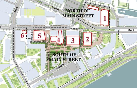
“I’m baffled because it’s still a diagram to me,” architect Tom Sieniewicz said. “I just don’t get it. I really don’t get it. I don’t understand what the proportional program is. I don’t understand the overall massing of it. I don’t understand why it belongs here.
“MIT’s got one chance to build Kendall Square – one chance to get it right. And if they don’t get it right the students will go to Stanford and they won’t come to MIT, and that would be terrible. We have to be really, really careful with each of these buildings.”
“This is a really, really, thoughtful, careful, extraordinary firm,” he said, referring to Perkins+Will. But it has produced a project where “I just don’t understand what I’m looking at. I’m deeply deeply puzzled by this.”
“I share Tom’s inability to understand and comment. I think I understand the first-story elevation from the renderings, and I think that’s fine,” said architect and board member Hugh Russell. “Yet I can see it’s going to work visually – if you’re trying to get something that’s absolutely featureless.”
“All of these buildings have puzzled me. I was pleased that the next building developed a palette of color, a scale to the curtain wall that you can relate to in some ways, even though it’s 27 stories tall. So I don’t know what to say about this. And I’ve been a practicing architect for almost 50 years,” Russell said.
Russell and Sieniewicz said the façade of the new building was featureless compared with the texture and scale of the historic clock tower building it abuts.
Chairman H Theodore Cohen, an attorney, continued the trend: “I have difficulty with the building too. I don’t quite understand the comment that it relates to 238 Main St. If the idea is that it’s a blank wall setting off 238, maybe that works? But I don’t see how the buildings relate to each other at all. I thought my not understanding was just my ignorance: that I was not an architect.”


