Massachusetts State Flag (we need a better state flag)

Arlington

Moderator
Staff member
Joined
Dec 10, 2011
Messages
5,599
Reaction score
2,696
1)Because the current flag is truly awful
255px-Flag_of_Massachusetts.svg.png


2) Because we've known what makes a good flag since 1912 when New Mexico & Arizona joined the union
255px-Flag_of_New_Mexico.svg.png
255px-Flag_of_Arizona.svg.png


2a) And Alaska and Hawaii did a decent job of keeping it going
241px-Flag_of_Alaska.svg.png
255px-Flag_of_Hawaii.svg.png

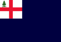
(Hawaii's has heritage back to 1816)


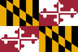
3) Old states should change if they can. Maryland's brand-tastic flag dates to 1904
255px-Flag_of_Maryland.svg.png


What's the "business case" for a new flag?
  • A clear, simple image good one is useful for tourism--for evoking/recalling past positive messaging about a state.
    • "I ❤ NY" happens not to be the state flag, but it is a state brand (even having been re-used by New York Air in the day)
  • Self-marketing; encouraging people to stay in-state as part of a distinctive thing.
  • Compared to other marketing/tourism it is likely a cheaper way (over the life of the flag) to market the state. Amortize over 100 years (as Maryland has)
 
Last edited:
Here's how the pitch meeting for the current flag went down:

1) we start with a solid color bedsheet because when we call up the militia, we expect them to tear a sheet off their bed.

2) It is a white bedsheet, see, because you might need it to surrender. Also, indigo is still expensive and synthetic dies haven't been invented

3) In the middle we put a shield because shields are really useful unless the other side has gunpowder. The shield is small because indigo is expensive.

4) Ok, but get this, we put a native dude, in gold because it might be Chief Massasoit or we might be racist

5) He's holding something, because he's handy with things, but we don't want you to be able to see what he's up to until you get real close

6) And Latin! Lots of Latin! Just in case people's eyesight is actually good enough to read from a distance, we're going to put little gold letters on a blue ribbon, and the joke will be on them because it is encoded in latin!

7) Float a little nod to the Bedford Flag at the top by having a arm and sword emerging from a braided loaf.

Perfect, right?

8) Um, I hadn't thought about putting a white star on, but sure, if that's what the Committee wants.

9) What's the Latin going to translate as? Well, it'll be the state motto, such as we sing in the State Motto Song, and it translate as By the Sword We Seek Peace, But Peace Only Under Liberty which I think we can all agree is the catchiest sentiment since Virgil.

Can I get unanimous consent?

Hearing no objections, Meeting Adjourned.
 
Last edited:
It's about how we conquered the natives, note the sword over the emblem with the native man on it. Metacom's War and all that. It needs to be redone in a big way.
 
Hmm, I'd rather not go all the way *there.*

Yes, if you look hard enough at the past you realize that most of our flags and street names were made by racist people doing racist things (so I end up concluding that that is not a useful standard when things have to change).

I would put it this way: our flag is too open to a racist interpretation to be a symbol for the whole state.

Or positively: a flag should be a rallying point for (or even beyond)political consensus.

The current one fails at that (on any number of aesthetic and cultural dimensions).
 
I'd definitely go all the way there, uncomfortable as it may be. It's not a matter of looking "too hard" in this case. It's both a bad design and bad imagery in context.

While this is from an advocacy group to change the flag, this graphic is historically accurate as far as my research has born out. Perhaps the tone is too biased or strident for some, but it's time for MA to make a change.

ma state flag.png
 
I love the idea of redesigning the state flag. I was looking around to see if anyone has attempted this in the past and stumbled upon the work of Adam A. Smith who is a professor at the University of Puget Sound. He did a redesign of all of the state flags to varying degrees of success. Here is his redesign of Massachusetts:

Annotation 2020-02-29 140813.png


You can see the rest of his work here: http://mathcs.pugetsound.edu/~aasmith/flags/
 
I do like the idea of incorporating the fir tree. It has a longer history as a symbol of New England than anything currently on the state flag.
 
Here is another one I found, this time from graphic designer Ed Mitchell. He attempted to bring a more cohesive visual language that all of the flags follow. Here is the design for Massachusetts:

View attachment 3842

Here is the rest of the flags for reference: https://www.bresslergroup.com/blog/united-we-stand/

I like what Ed Mitchel is trying to do with the homogeneous color palette across all states, but I'm not crazy about the blue that he uses and I don't think that the proposed Mass flag is really seem representative enough of the state.

I came across this site that has I think most of the proposed alternative flags.

I'm a fan of this one, which is similar to the New England Governor's Council Flag, and the Bunker Hill Flag.
200


The Bunker Hill Flag
200


One thing that I think would be cool is to have every state flag being a variant of the national flag. You could replace the stars of the canton with a design unique to each state, but the stripes (based on the sons of liberty flag) would show unity among all states. Something like this one that I just crudely through together in paint.

1920px-Flag_of_the_United_States.svg.png

Based on this flag by "sammy"


Edit:
I know there is a general desire to move away from the Native American seal, but I think it could be redesigned to be more celebratory of the local Native Americans. Not exactly this (for the reasons outlined in George_Apley's post above), but maybe something like this:

Possible MA State Flag 2.png

Based on this flag by "Andrew Cusack"

and just one more, based on what is apparently a US savings bond flag.

Possible MA State Flag 3.png
 
Last edited:
If there is a flag redesign it should definitely still incorporate symbolism for the Massachusett. Metacomet is in the current flag. Metacomet or Massasoit should be represented on the flag, because they're important figures in the start of Massachusett. I know the flag right now comes off as racist, but it represents a history that really happened, and we shouldn't just erase that. Also white, blue, and gold, should still remain the primary colors of the flag, as they have historical value. I would like to see the fir tree included though, since it is a very old symbol for New England. It would be cool if all New England states adopted the fir tree on their flag, but doubt that will ever happen.
 
To be pedantic, Massasoit and Metacomet led the Wampanoag coalition, not the Massachusett. If we were to include native symbology on the flag, I'd want modern input from regional tribes.
Metacomet and Massasoit were the Sachems of the Massachusett and the Wampanoag, where do you think the name "Massachusetts" came from? If it weren't for the peace treaty Massasoit made with the Plymouth and Massachusetts Bay Colony in 1620, the colony would have likely been abandoned.
 
Metacomet and Massasoit were the Sachems of the Massachusett and the Wampanoag, where do you think the name "Massachusetts" came from? If it weren't for the peace treaty Massasoit made with the Plymouth and Massachusetts Bay Colony in 1620, the colony would have likely been abandoned.

Hah. I said I was being pedantic. I'm a history teacher, so I promise I know what I'm talking about. So allow me to correct and expand on a couple things. Here's a grossly oversimplified history of native peoples in eastern Massachusetts.

I am well aware of the Massachusett people, who were akin to, but distinct from the tribes of the Wampanoag. The Massachusett were centered around modern Boston Harbor, while the Wampanoag dominated southeastern New England from the eastern shore of Narragansett Bay. Massasoit and Metacomet were Sachems of the Wampanoag. Massasoit did indeed make a peace with the separatist pilgrims at Plymouth in 1620 which lasted to the 1670s. The Massachusett were a less organized political entity who also had fairly peaceful relations with the Winthrop Puritans who founded Mass Bay in 1630. The "Indian Praying Towns" (such as Natick) were mostly of the Massachusett people who were converted to Calvinist Christianity by the zealous English settlers. It was the Wampanoag, led by Metacomet, who united with the Nipmuc and several other New England peoples during King Philip's War, which started in Plymouth and overflowed into Mass Bay and Rhode Island. The Massachusett largely remained neutral in the fighting of the 1670s, though they still suffered greatly by being interned by paranoid English settlers. King Philip's War was a devastating conflict on all sides, but especially so for the natives. Native peoples of southern New England never recovered from it. Communities were shattered and dispersed. Many survivors were sold off into Caribbean slavery, or fled north to the Abenaki in Quebec and Mohican to the west. The Praying Towns that remained were gradually sold off to white settlers. By the 1770s, there were barely any organized native groups left in Massachusetts. The Mashpee and Aquinnah Wampanoag have been the bridge for cultural preservation and revitalization in the present day. While 19th Century native studies is (rightly) dominated by American Westward Expansion and native removals and wars of conquest, there are really interesting, and frustrating stories about the Mashpee fighting for rights over their land in the 1830s (read up on the Mashpee Revolt and William Apess; cool stuff).
 
Would any of these tribes have had symbols or colors that were meaningful / Iconic (to them or representing them?)
 
For the record I have always admired the process and results for the new South African flag, which successfully combined:
1) The Dutch (Boer) Tricolor (red/white/blue)
2) The Union jack. (diagonals & color)
3) The African National Congress Tricolor (black, green, gold)
4) The idea of merger (read left to right)
 
Why should I/we care about sub-national flags? This seems highly esoteric, and about as worthy of discussion as State Insect. I expect that flags meant a whole lot more in the early nineteenth century when state power was a good deal more abstract and governance relied more heavily on a shared narrative and values. I simply don't see it as having much if any relevance today.

(I know this comes off as trolling, but I swear it isn't)
 
Why should I/we care about sub-national flags?
Branding.

For about all the reasons that most organisations, particularly large ones, brand themselves:

1) For Customers: To deliver messages that influence the choices that users make to initiate and sustain a relationship
2) For Employees: To communicate values to employees; to encourage/educate in the consistent delivery of services
3) For Everyone: as a useful non-verbal "handle" that reduces the effort of explaining "this the the Massachusetts version"
4) Competitively: so as not to have only sports teams or Universities defining the look of "From Boston" or "From Massachusetts" or "From New England"

States with great "brand identity" usually start with a flag, or flag elements, that they can repeat on "all their stuff" across all of their
- state-level services & agencies
- Cities (e.g. re-use of Dutch-Flag elements in the flags of NYC & Albany)
- Tourism messaging
- "Made In" labels (e.g. Nissans made in Tennessee repeat TN's "3 stars" motif)

When your polity has a great brand that includes visual elements (often echoed on the flag) they use it (Texas/Lone Star, Maryland/BlackRedYellowWhite, Alaska North Star, Arizona Sunrise, New Mexico/Sunburst, Chicago 4 stars, DC 3 stars & 2 bars....)

If you've mostly lived in Massachusetts you've never seen it done.

Choosing Tennessee nearly at random

Image result for made in tennessee

Image result for made in tennessee

"3 Stars variant then repeated for Tennessee Titans
Image result for nissan made in tennessee three stars logo
 

Attachments

  • 1583158524121.png
    1583158524121.png
    7.5 KB · Views: 341
  • 1583158527280.png
    1583158527280.png
    10.2 KB · Views: 352
Last edited:
Just a few more thoughts on "competitive" branding.

A better visual shorthand for Cambridge would allow it to claim for itself some (more) of the value of being home to both MIT & Harvard, without being at the mercy of MIT & Harvard to say what that is (it involves shades of reds, apparently)

A better visual shorthand for Boston would allow it to claim for itself some (more) of the value of being home to the Bruins, Celtics, & Red Socks without being at the mercy of them, and to assert its role as namesake for BC, BU, and host to Emerson, Suffolk, & The Longwoods.

And we delegate too much to Puma, Wolverine, New Balance, Reebok who mostly fail to add "and we do it in Massachusetts...a great place to do business"

And, relevant here, a better visual shorthand for Massachusetts would allow it to claim more of all of these things above AND a grab-bag of other stuff (Basketball, Volleyball, Stock Ticker, Telephone, Raytheon).
 

Back
Top