Shepard
Senior Member
- Joined
- Mar 20, 2009
- Messages
- 3,518
- Reaction score
- 69
Just a few more thoughts on "competitive" branding.
A better visual shorthand for Cambridge would allow it to claim for itself some (more) of the value of being home to both MIT & Harvard, without being at the mercy of MIT & Harvard to say what that is (it involves shades of reds, apparently)
A better visual shorthand for Boston would allow it to claim for itself some (more) of the value of being home to the Bruins, Celtics, & Red Socks without being at the mercy of them, and to assert its role as namesake for BC, BU, and host to Emerson, Suffolk, & The Longwoods.
And we delegate too much to Puma, Wolverine, New Balance, Reebok who mostly fail to add "and we do it in Massachusetts...a great place to do business"
And, relevant here, a better visual shorthand for Massachusetts would allow it to claim more of all of these things above AND a grab-bag of other stuff (Basketball, Volleyball, Stock Ticker, Telephone, Raytheon).
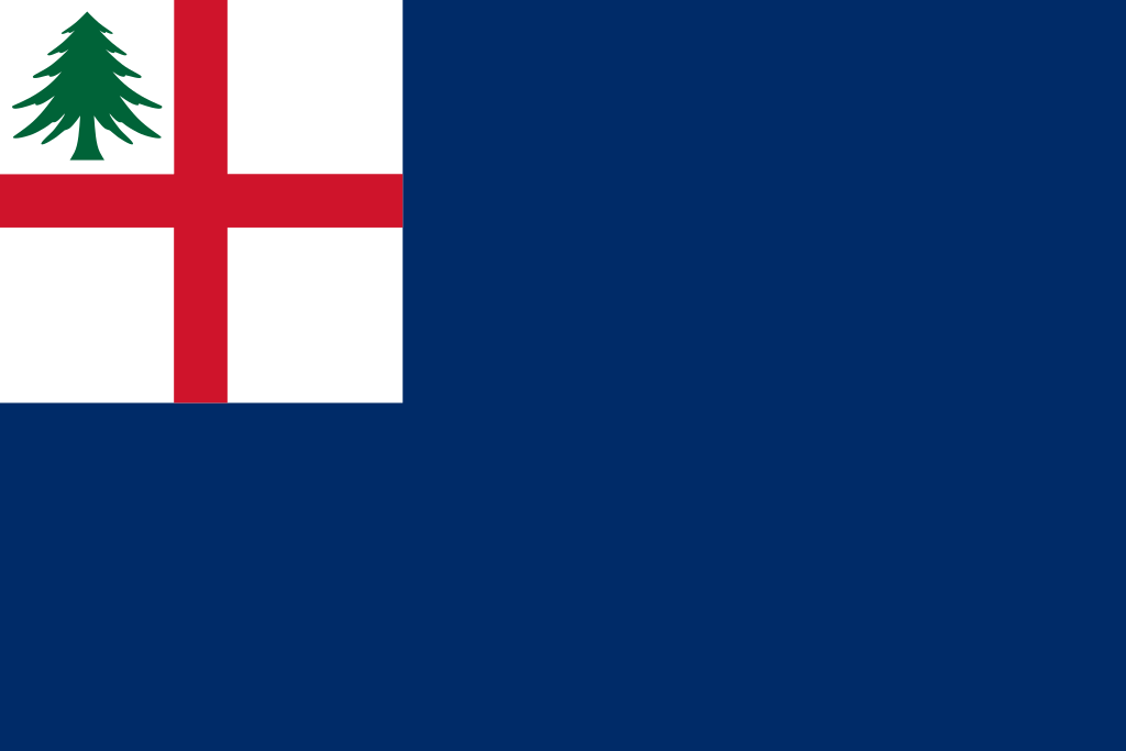
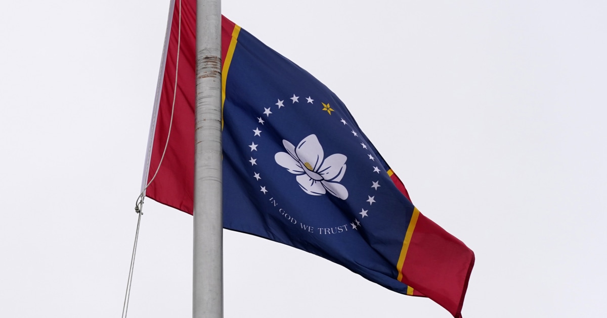
Oookay... I get branding, but all these efforts look like an exercise not in branding but in archaic symbology. Anyway, I'll shut up and let all you vexillologists get back to it


 IMG_2719