Massachusetts State Flag (we need a better state flag)

Just a few more thoughts on "competitive" branding.

A better visual shorthand for Cambridge would allow it to claim for itself some (more) of the value of being home to both MIT & Harvard, without being at the mercy of MIT & Harvard to say what that is (it involves shades of reds, apparently)

A better visual shorthand for Boston would allow it to claim for itself some (more) of the value of being home to the Bruins, Celtics, & Red Socks without being at the mercy of them, and to assert its role as namesake for BC, BU, and host to Emerson, Suffolk, & The Longwoods.

And we delegate too much to Puma, Wolverine, New Balance, Reebok who mostly fail to add "and we do it in Massachusetts...a great place to do business"

And, relevant here, a better visual shorthand for Massachusetts would allow it to claim more of all of these things above AND a grab-bag of other stuff (Basketball, Volleyball, Stock Ticker, Telephone, Raytheon).

Oookay... I get branding, but all these efforts look like an exercise not in branding but in archaic symbology. Anyway, I'll shut up and let all you vexillologists get back to it
 
Oookay... I get branding, but all these efforts look like an exercise not in branding but in archaic symbology. Anyway, I'll shut up and let all you vexillologists get back to it
Really? You can't see that NM, AZ, AK, HI and MD, TX, TN did a branded flag, versus the 35 other states (including Mass) that have a bedsheet with a coat of arms--usually with latin and ribbons and an unreadable picture? (Boston's "view from the Harbor in the Arbitrary Past" is particularly bad)

Coats of Arms are the thing freighted with archaic symbology--like whether our Native holds his arrow point down (a state seal problem, perhaps for another thread).

Good flags, like good brands, are very basic shapes and colors that can be easily summed up in words
- The bicolor (Ukraine, Poland, Indonesia )
- The tricolor" (Germany, France, Netherlands, Russia)
- The ONE thing: Maple Leaf, Bear, Southern Cross, Big Dipper, Star of David
- The shape: Lone Star, 3 Stars, Sun
 
Last edited:
The flag is fine and doesn't need to be touched. It's classic.
 
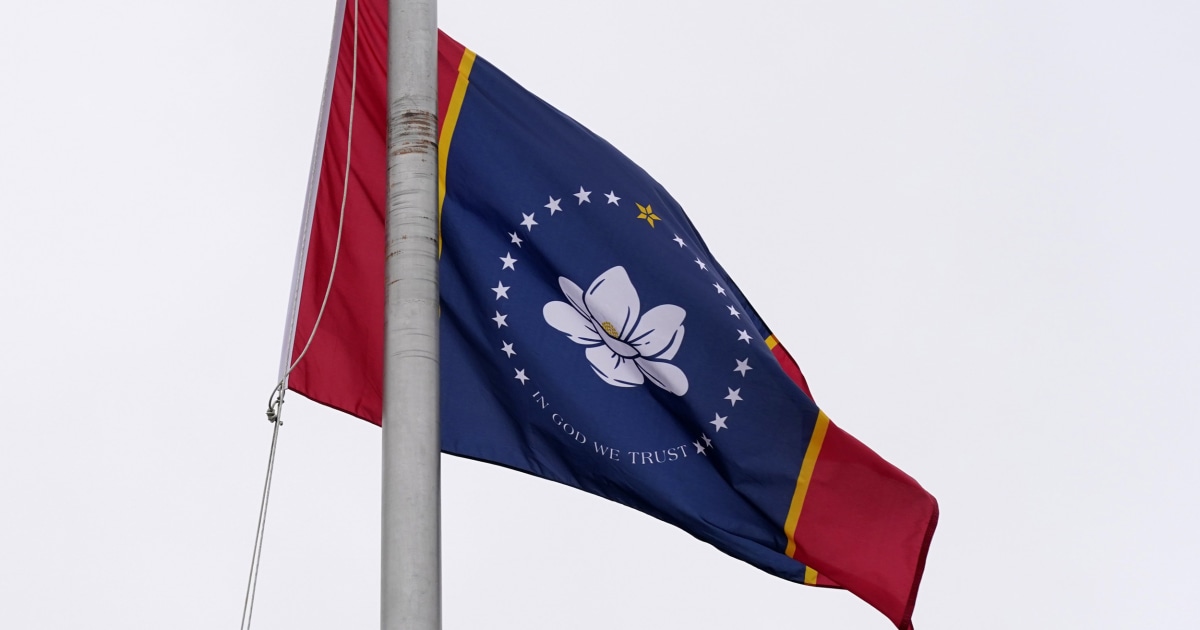
Kudos to Mississippi for the design of its new flag (that requires a referrendum).
Not quite as elegant as Canada's "Maple Leaf and Two Bars" but close enough, (I'd have dropped the stars and text) and it is vastly better and quickly vaults to a "top quartile" among state flags. Clearly "on brand"

[The 20 stars are clearly reference to Miss. being the 20th state in the Union, but I'd have dropped the whole encriclement and doubled the size of the flower and maybe put the gold star at its center, amongst the flowers pistels/stamens/whatever ]

It also appears proportionally wider than many state flags (more "HD" and less 3x5)

Mississippi Wants Magnolia to Be Centerpiece of New State Flag
02Mississippi-flag-finalist-05-jumbo.jpg
 
Last edited:
Sooo close!

(I get why the "In God We Trust" is on there, but UGH)
 
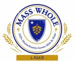
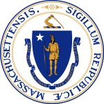
I was enjoying a Wormtown Mass Whole not too long ago and thought that the logo grabbed the essence of what could be a compelling seal and flag from the existing. I like the white background with blue and gold color scheme. I like the blue shield motif. I like the star which could be the north star. It does away with the sword. It does away with the native figure. It does away with the ribbon and motto. It generally cleans it up nicely. While I quite like hops, the space could be filled with something else that symbolizes the state such as a tree, a cod, or some feature of the landscape. Simplified, the shield with a symbol, without circles and text, could make a flag that meets some of Arlington's criteria for design.
beer-2829017_8c8f2_hd.jpeg1200px-Seal_of_Massachusetts.svg.png
beer-2829017_8c8f2_hd.jpeg
 
I was complaining about the Mass flag last week, when I decided to look up some examples of some other state flags. Aside from a few good ones, most state flags are crap.
 
I was complaining about the Mass flag last week, when I decided to look up some examples of some other state flags. Aside from a few good ones, most state flags are crap.

As noted (bemoaned) by critics, about 35 states are bedsheets with a wax seal (including Mass)
In any hall of (US) flags, you'll see that
Bedsheets come in 3 colors: Blue, Light blue, or White
Seals
come in 2 shapes: Hubcap or Shield.

Sometimes the effort is so pitiful, they resort to spelling the name out (Looking at you, Kansas, Wisconsin, Iowa, and Montana)

Boston = Hubcap on light blue (but easily could be awesome)
Mass = Shield on white
All make for awful, undifferentiated messes.

But let's not do butwhataboutism for flags, which would be "ours may be bad, but 34 others are worse"

Instead, let's directly ask: what benefits can a flag confer on a state, and does ours confer them?

My answer: the flag could (but isn't doing) any and all of
Express ideals of our commonwealth to an INTERNAL audience
Convey unique, positive attributes to EXTERNAL audiences
- Reasons to live here
- Reasons to do business here
- Reasons to come as a tourist
Actually power tourist merchandise business (bling, swag) that is more attractive and sold by local merchants
 
Last edited:
I was out by the Airport this weekend and noticed this flag being flown at a Massport facility. Is this offical or fantasy. It has 6 stars which I have not seen before. In Charlestown you see this flag often flown, but it does not contain the 6 stars. I'm guessing the stars may represent the 6 New England States, but to my recollection only 4 New England States existed when the original flag was in use. Anyone got the skinny?

IMG_2719 by Bos Beeline, on Flickr
 
^ that has familiar elements (the red on white St George's Cross of England, the pine tree for Massachusetts and later Maine) but I've never seen themassembled like that
 
Fantasy transit map fans please let me introduce you to fantasy flag fans:
 
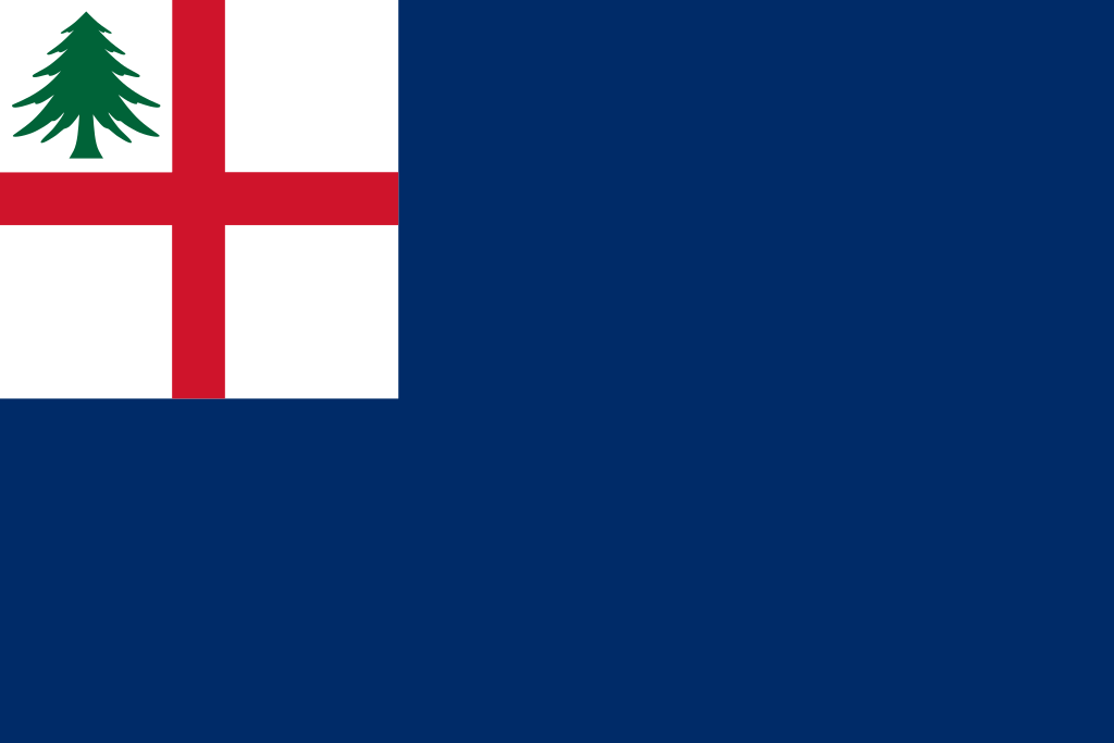
Got it, so in Charlestown, we're probably seeing the Bunker Hill Flag:
1024px-Ensign_of_New_England_%28St_George%27s_Cross%2C_blue_field%29.svg.png


or the 1998 version for the 6 states of New England (that BeeLine pictured at Massport)
 
I was curious about this because I hadn't heard anything since January. The flag is racist as all fuck and needs to go so I was happy to see this pass.

Seems the "Special Commission Relative to the Seal and Motto of the Commonwealth" met in July and
The panel has until Oct. 1 to submit a revised or entirely new design for the seal and motto. Any design will be accompanied by an educational program.
Hopefully we will be seeing an update this week.

Also feels worth pointing out with all the references to pine trees in the thread that the symbolism predates colonial New England and is currently used by six nations of the Haudenosaunee to symbolize their confederation.
1632871174617.png
 
I found this one online a while back and I like what they're trying to do. I wouldn't mind going somewhere in this direction for the new flag.

1632877245557.png
 
I found this one online a while back and I like what they're trying to do. I wouldn't mind going somewhere in this direction for the new flag.

View attachment 17258
Where’d this come from? I’d love to hear the designer elaborate on the symbolism.

Regardless of what happens to the state flag, I really hope to see an increase in usage of the Flag Of New England. New England has arguably the strongest regional identity of anywhere in the country and we should show it off. I love the way the Revs have embraced it:
1632915504946.jpeg
 
Last edited:
Where’d this come from? I’d love to hear the designer elaborate on the symbolism.

Regardless of what happens to the state flag, I really hope to see an increase in usage of the Flag Of New England. New England has arguably the strongest regional identity of anywhere in the country and we should show it off. I love the way the Revs have embraced it: View attachment 17260

It seems someone on reddit designed it:


Here are some more that I've found online:

1632956091171.png
1632956099699.png
1632956107893.png
1632956116644.png
1632956129982.png
1632956142078.png
1632956153236.png
 

Back
Top