Massachusetts State Flag (we need a better state flag)

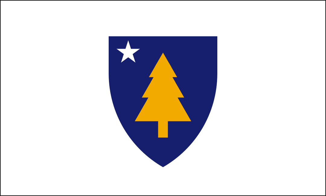
Utah has done a super job changing their flag from seal-on-blue-sheet to a real logo (compare new flag, top, to current flag, bottom)
Image


Flag of Utah.svg


An (obviously joking) idea from tumblr:

1677706726601.png


" Reminded by flag discourse about my proposal for a new Massachusetts state flag. The looming black triangle represents the creeping dread one experiences in Massachusetts, the white represents the horrible weather, the blue represents microplastics, and the slogan represents I saw it on a pack of cigs and thought it sounded sick "

 
Some more cool ideas for the flag that Ive come across.

IMG_8418.jpeg

7y4s6vhmo4m61.png

77ruf32z6iz81.png

indiana-tricolor-png.271708

IMG_8411.jpeg
IMG_8410.jpeg

IMG_8412.jpeg

3ve5z7y8udp61.png

IMG_8415.jpeg

IMG_8413.jpeg

proposed-massachusetts-flag-redesign-very-simple-combo-of-v0-e78zze5qzja91.png

01-proposed-flag-of-massachusetts-2-black-border.png

PRv5VfW.png


And for historical purposes theres the first massachusetts bay colony flag
1280px-Red_Ensign_of_England_%28Square_Canton%29.svg.png


And the second massachusetts bay colony flag.
1280px-New_England_blank_flag.svg.png
 
Last edited:
An update! https://commonwealthmagazine.org/opinion/why-we-need-a-new-state-seal-and-motto/

Work resumes next month, apparently.

Second, Massachusetts should incorporate symbols and terms in a new seal and motto that are aspirational and inclusive of the diverse perspectives, histories, and experiences of Massachusetts residents. We presented a list of appropriate symbols in the categories of flora (examples: eastern white pine, elm tree, cranberries), fauna (chickadee, cod, feather, turkey), and geographic features (ocean, hills, coastline, state shape). We recommended terms including “Commonwealth,” “For the common good,” “equality,” “hope,” “liberty,” “peace,” “reciprocity,” and the names of tribal nations.

I think I'm a no on the turkey or the state shape (one of the big no nos of flag design).

They also note that a survey is coming later this year and that they'd need to change State Law to make the flag anything other than a seal-on-a-bedsheet, which they hope to propose to do.
 
I don't like any flag that has a person on it - that's why I hate the current Mass and Maine flags.

I like broad symbols of the state: Colors to represent the sea, land, ocean and the cities. Maybe a symbol that represents unity of the people and our educational institutions. A number of the above flags give us a good starting point.
 
I have to say now that some time has passed the one Ive kept going back to is the one based on the sons of liberty flag. It is by far my favorite proposal that has been proposed.

First and foremost it has the 3 essential elements that all good flags have. Its instantly recognizable, its simple so as a kid could easily draw it from memory, and it has important meaning.

It takes the flag of the sons of liberty (responsible for carrying out the tea party) and adds the pine tree from the new england flag into the top left corner. Thats basically it. Simple, effective. Instant icon imo. With flags less is more most of the time. Most flags are just some variation of 3 different colored stripes and it works great. According to the site it was also ranked #1 out of all proposals as well.

one-of-the-first-ma-redesigns-ive-seen-that-a-really-dig-v0-pnyde89nuida1.png


https://briancham1994.com/2022/02/07/proposed-flag-of-massachusetts-2/


Its just a badass flag imo.
IMG_1660.jpeg
 
It’s probably a non-starter because the vertical stripes will generate jokes about prison bars.
 
It’s probably a non-starter because the vertical stripes will generate jokes about prison bars.

More likely, the issue with that flag is what other similar flags currently symbolise; namely, the Coast Guard ensign and the CBP flag - While the CG is politically uncontroversial, CBP... Not so much. (the only difference between the two flags is that the CG flag adds the CG crest.) It's not spectacularly common, but by law it's supposed to be flown at every border crossing.

Screenshot_20250129-130255_Chrome.jpg


Frankly, I prefer we reach into the bag of existing flags and grab one of the following: MA Maritime ensign, previous reverse of the existing flag, or Flag of new England.
 

Attachments

  • Screenshot_20250129-124117_Gallery.jpg
    Screenshot_20250129-124117_Gallery.jpg
    216.7 KB · Views: 9
I've always thought we should incorporate Cranberry (the color) into our flag. Blue, Yellow, White, and Cranberry, maybe something with the Sacred Cod. I know we have a lot of modern industry in our state's history, but highlighting our iconic industrial history (Maritime, Fishing, Cranberry bogs) would be a cool look!
 
I guess I’d vote for the flag in Trumbull’s Bunker Hill painting. The painting depicts one of the most stirring moments in local history, and it represents something that was “our moment”.
 
I guess I’d vote for the flag in Trumbull’s Bunker Hill painting. The painting depicts one of the most stirring moments in local history, and it represents something that was “our moment”.
Thats already used as the new england flag, the one in my avatar.

There is a historical massachusetts flag which is very similar. Its the same flag just without the pine tree, the massachusetts bay colony flag. I wouldnt be against using that due to the history. Also it would be pretty cool for the MA state flag to be one of the parts that make up the new england flag. It would be like how the union jack is made up of the different flags of the constituent countries of the uk combined together.

1738244822335.gif


https://en.m.wikipedia.org/wiki/Massachusetts_Bay_Colony
 
Last edited:
The way the tree seems to float half way off the edge of that stripe gives me anxiety.

View attachment 59910
Agree -- a flag that combines a clean field with stripes should not have any of the stripes be the same color as the field. In this case, we would want to leave the white and red stripes, and make the square some other color. Or at least outline it in a contrasting color, maybe the same green used in the tree.
 
So the coast guard ensign and cbp flags are wrong then.
Aesthetics are not necessarily objective, so I wouldn't say they are wrong, so much as that they don't appeal to my personal sense of design. Seems to be true for a few other people, too. But most of us will rarely see either of those flags. The state flag should be a bit more prominent in our lives. If we are discussing new ideas for it, I'd like to not see the stripes bleed in to the corner field.
 
I wish we could use update the An Appeal to Heaven flag from Maritime to state flag, but it seems that the white nationalists have been using it as well.


1738262178329.png
 

Back
Top