HenryAlan
Senior Member
- Joined
- Dec 15, 2009
- Messages
- 4,473
- Reaction score
- 5,256
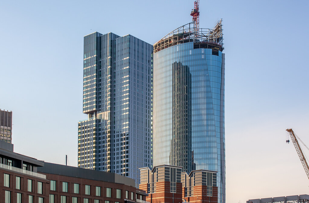
I think it's also helped quite a bit by the presence of several non-glass dominant towers in the same area. It really pops all the more for that reason, along with the uniquely spectacular design.What a high quality design this is. I can see future copycats coming for sure. In the days of glass towers everywhere its pretty rare to get something so vastly different from everything else, that looks this good. This tower really is a 1 of 1 and they hit it out of the park. Glass can be boring, but it can also be incredible when used right and playing up its strengths.
 IMG_9861
 IMG_9860
 IMG_9871
 IMG_9872
 IMG_9874
 IMG_9885
 IMG_9889
 IMG_9893
 IMG_9900
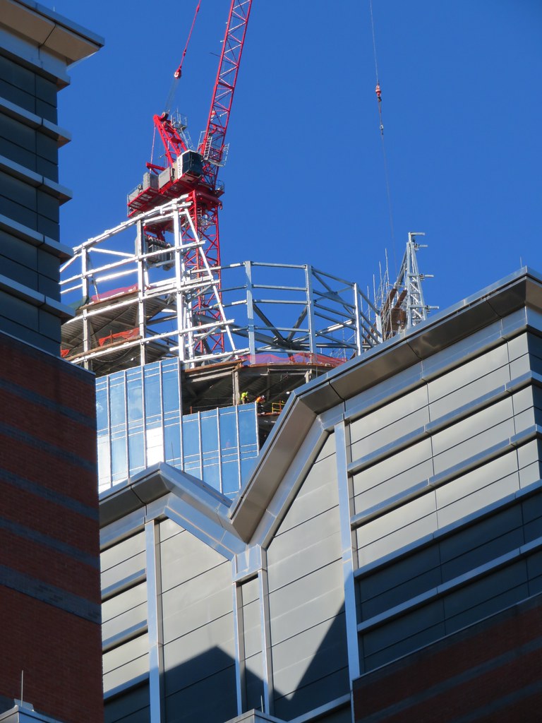 IMG_9911
 IMG_9914
 IMG_9917
 IMG_7592
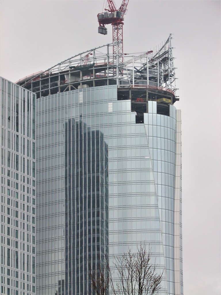 IMG_7598
 IMG_7601
 IMG_7602
 IMG_7607
 IMG_7609
 IMG_7615
")

 IMG_7638
 IMG_7639
 IMG_7657
 IMG_0198
 IMG_0199
 IMG_0234
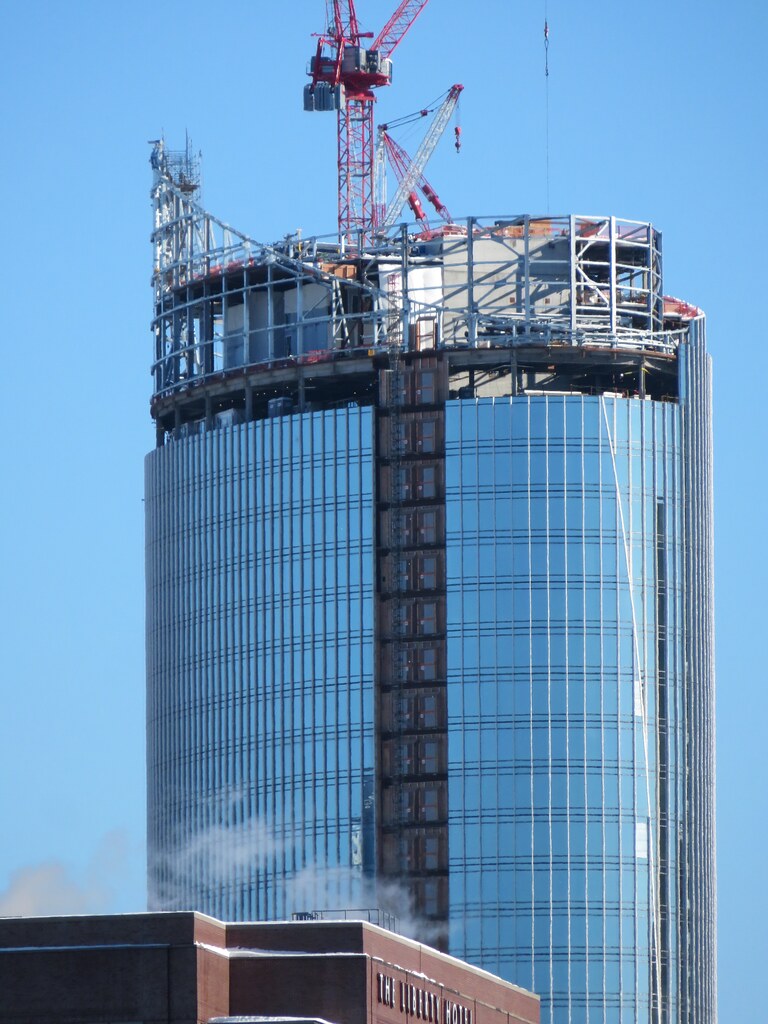 IMG_0235
 IMG_0238
 IMG_0320
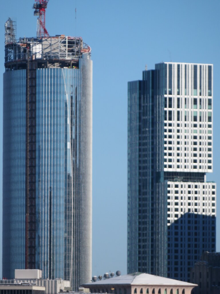 IMG_0319
 IMG_0324
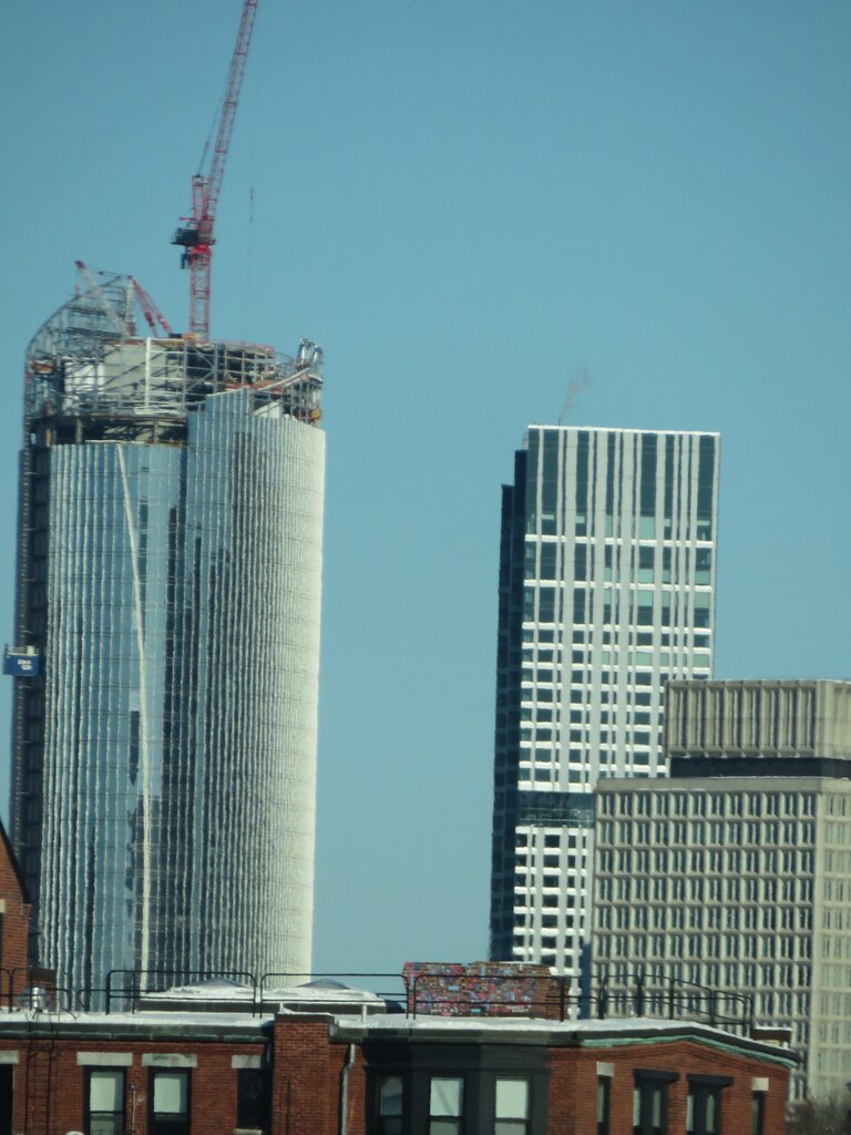 IMG_0368
 IMG_0366
 IMG_0369


