- Joined
- Jan 7, 2012
- Messages
- 14,172
- Reaction score
- 23,677
 IMG_2118 by Bos Beeline, on Flickr
 IMG_2125 by Bos Beeline, on Flickr
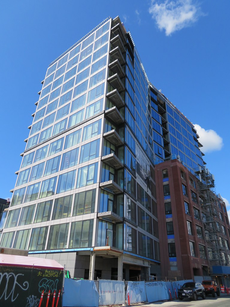 IMG_2127 by Bos Beeline, on Flickr
 IMG_2135 by Bos Beeline, on FlickrIMG_2118 by Bos Beeline, on FlickrIMG_2125 by Bos Beeline, on FlickrIMG_2127 by Bos Beeline, on FlickrIMG_2135 by Bos Beeline, on Flickr
I'm struggling with this one. I don't feel like the two facades are "talking to each other."
I'm struggling with this one. I don't feel like the two facades are "talking to each other."
The original, brick portion is handsome on it's own and I don't find the newer portion to be unattractive in isolation; it's fine. I'm struggling with how they relate (acknowledging that the introduction of the gray grid on the newer facade appears to have similar proportions to the window clusters on the old building).
From this angle, the setbacks and dramatic contrast in massing almost makes the glass portion to appear as if it's behind the brick building from this vantage point; maybe that was the point...
Reminds me of that awful pasting on of The Lucas a few blocks away.
Why can't an architect aim for compatability?
 IMG_3703 by Bos Beeline, on Flickr
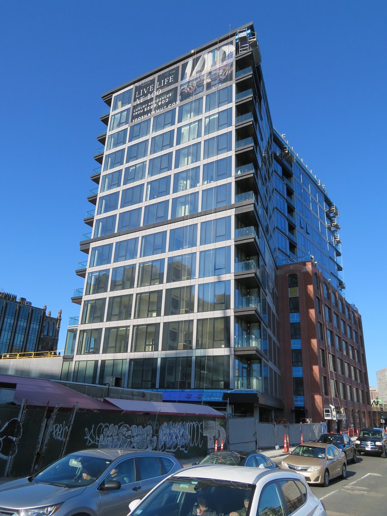 IMG_3707 by Bos Beeline, on Flickr
 IMG_3715 by Bos Beeline, on Flickr
 IMG_0343 by Bos Beeline, on Flickr
 IMG_0353 by Bos Beeline, on Flickr
 IMG_0355 by Bos Beeline, on Flickr
 IMG_0356 by Bos Beeline, on Flickr
 IMG_0362 by Bos Beeline, on Flickr
 IMG_0372 by Bos Beeline, on Flickr
 IMG_1894
 IMG_1937
 IMG_8072
 IMG_8073